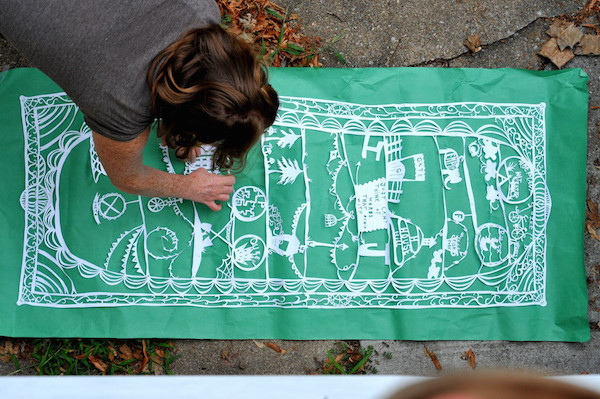
BmoreArt Interns Alexandra Oehmke, Emma Jo Shatto, and Cat Thomas share their top picks from MICA’s Senior Thesis Exhibit
Cat: I went to Art Walk with an open mind and zero expectations. I left, (three visits later), completely blown away. I’m excited to see the work coming out of this institution and, more importantly, I’m excited for all of the creative energy that hasn’t been stifled.
The exhibits and installations I visited were all curated exceptionally well and there were many artists newfound careers that I look forward to following.
Emma Jo: I walked into Art Walk 2016 skeptical. I wasn’t sure I was going to come out enjoying too much of it because I was disappointed the year before. I am happy to report I was surprised. Several seniors’ work really interested me. The amount of installation, handwork, and exploration that went into the class of 2016’s senior theses was well-done.
Alex: At ArtWalk I was first and foremost interested in how the work was installed. If the installation was distracting or seemed like an afterthought I did not spend much time with the work. There was too much to look at for me to spend time looking past the installation to then see a piece. Apart from that, I picked worked I found aesthetically appealing, intellectually engaging, and made me aware of how I felt existing in a space with it.
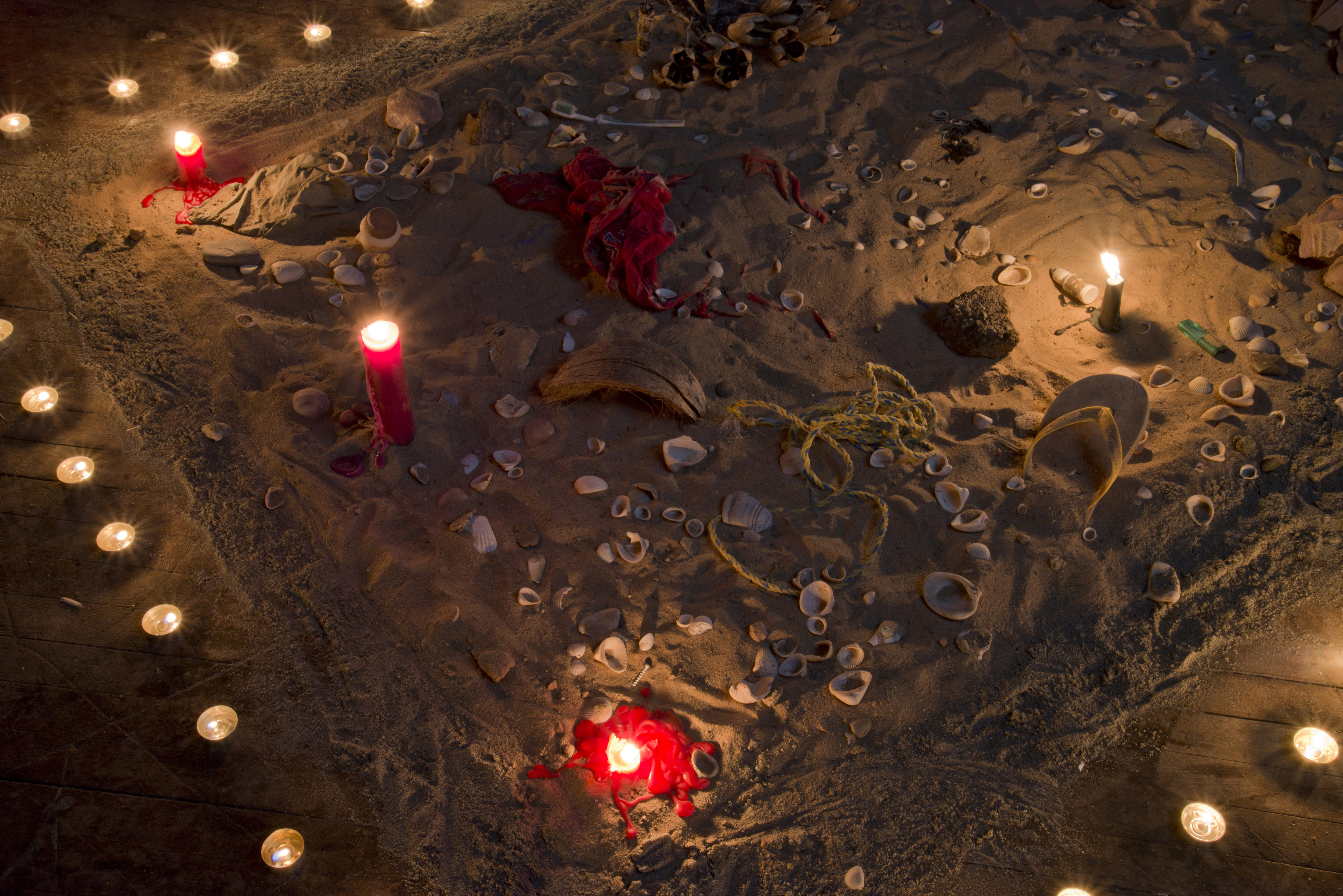
 Hannah Jeremiah
CT: Jeremiah’s work, which was strategically placed in Leidy Atrium, took full advantage of the natural light streaming into the space. Textural and bursting with color, every sculpture challenged me to think about Jeremiah’s process.
AFO: There was a lot of material exploration in this work. I really enjoyed discovering what a piece was made of, but the whole thing felt a bit too much like an exploration for me.
EJS: Jeremiah provided a list of all of the objects and the materials they were made from. It was exciting to uncover her thesis during the MICA Office of Diversity Benefit Show. During Art Walk, to be up close and personal with her pieces was fascinating.
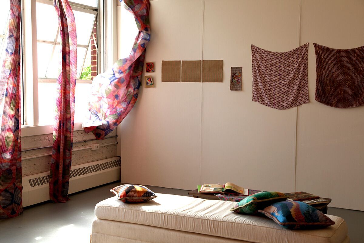 Kira Keck
CT: This installation was pure bliss. The choice of curtain fabric and hue affected and radiated a rose-colored tone across the room. This setting, paired with the perfect windy day, was insatiable.
I sat and watched the breeze come through as I took in the energy of the room (and actually lost track of how long I stayed). For some incredible reason I was lucky enough to be the only person in the space for quite some time. If I could go back to that moment again I would.
AFO: There was a lot of detail in all of Keck’s work. It was really interesting to approach it from afar and see how it changed as I got closer.
EJS: This was one of the most calming rooms I stepped inside throughout all of Art Walk.
CT: It was calm without trying too hard and that’s what made this so lovely to view… I definitely appreciated the quiet simplicity. This was by far one of the best installations in the entire show.
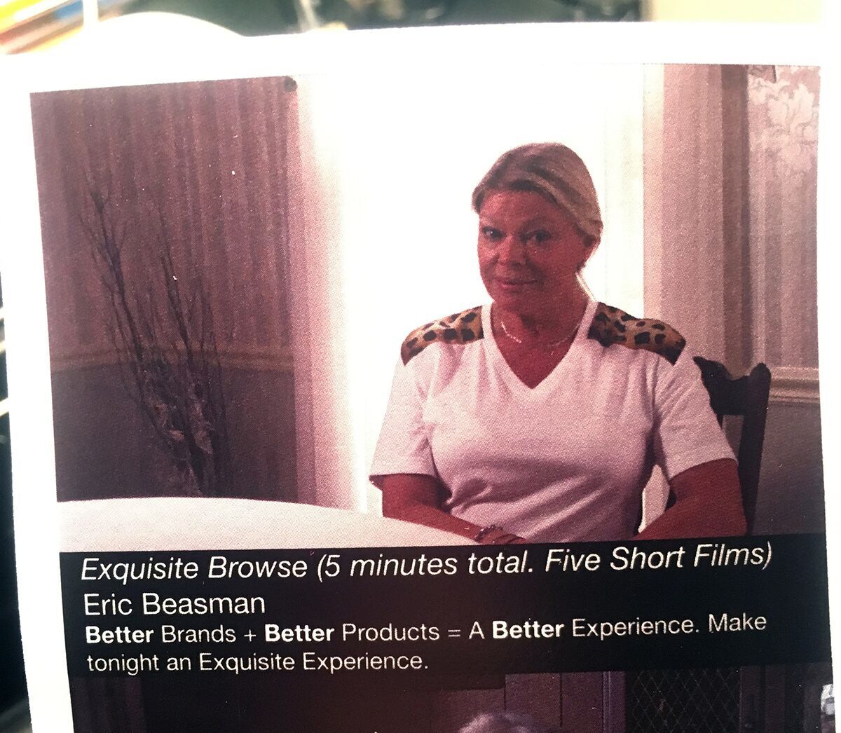 Eric Beasman
https://vimeo.com/166436644 (Link to trailer)
EJS: Exquisite Browse was hysterical. I walked outside of Falvey Hall and the artist was selling the shirts with a huge smile on his face. It was one of the strangest combinations of graphic design, film, and consumerist critique.
AFO: This piece stood out to me because of how it was screened. Exquisite Browse is a series of advertisements that played between other films. Breaking up the piece was a smart choice and helped with its comedic strength.
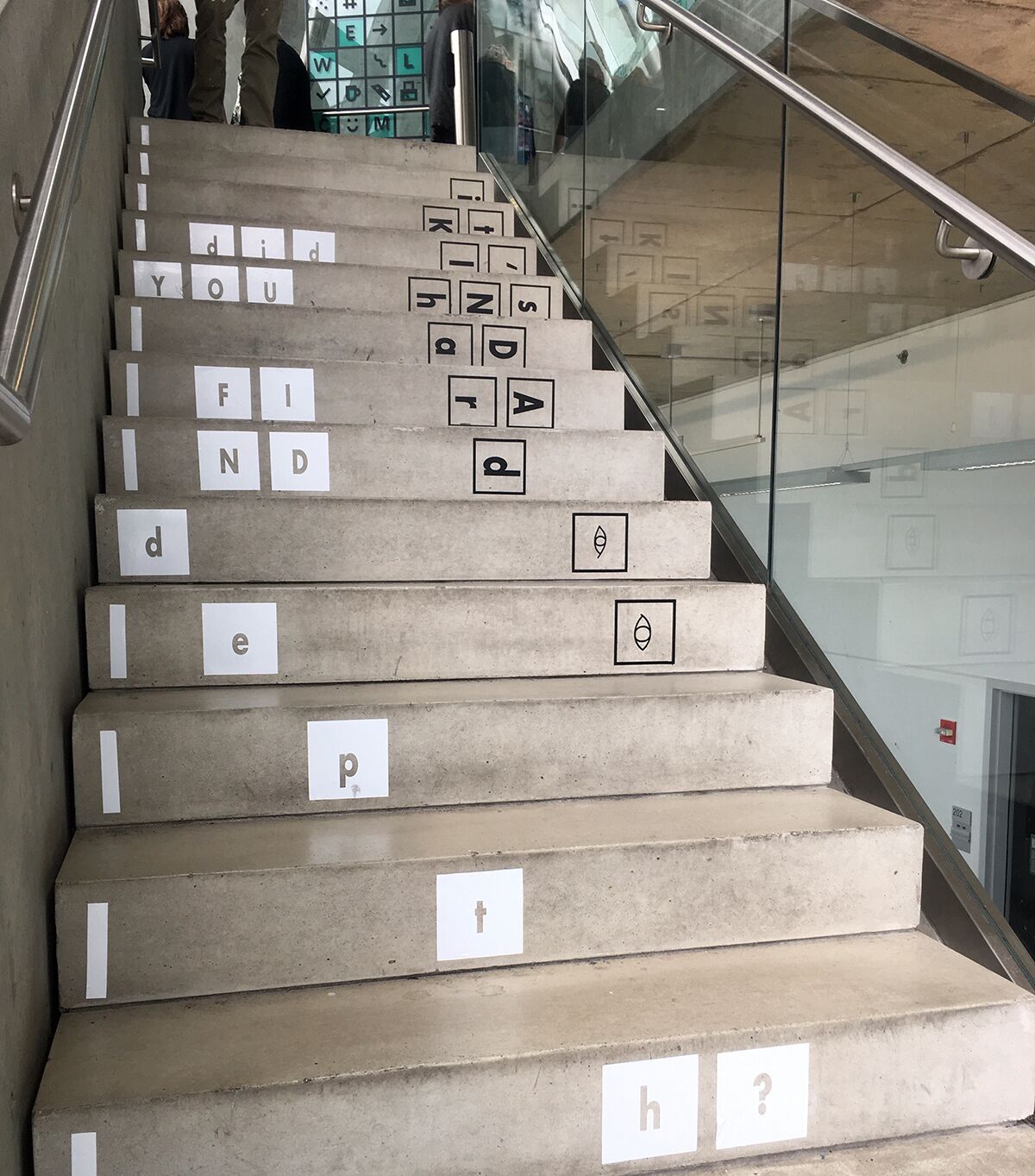 Sanskruta Chakravarthy
EJS: Context with No Context demonstrated a physical solution to an emotionally challenging condition of human thought: breaking up what we see and looking at from a different, often surprising perspective.
CT: Perfectly poignant and meaningful: Did You Find Depth? It’s Kinda Hard. Located on the third stairwell in the Brown Center, Chakravarthy caused me to stop in my tracks as I embraced the stage he set: organically strewn blocks of typography that climbed upward, requiring me to ponder what the message spelled out. Interactive and fun, this was a surprising treat as you entered the third level of Graphic Design exhibits.
AFO: The strength of this piece for me was how it created contrary motion. If I tried to read the piece as I walked up the steps I would lose the end of the question, I would lose the depth.
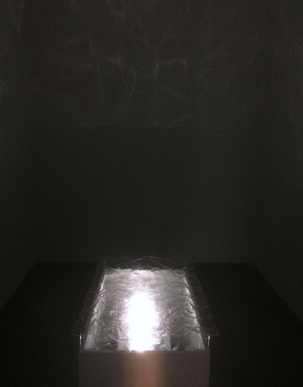 Cathy Kwon and Elaine Lin
AFO: This piece also had an audio element and made me feel like I was underwater. It was a nice to only have one thing to focus on.
EJS: I got dizzy because of lack of food, but that just made it better. It was a trippy little black box. The movement and the lights mesmerized my senses and overwhelmed me.
CT: Floating or Sinking was remarkable and unexpected. The lighting, sound, and motion synced together so well. The choice to keep this installation hidden away in it’s own tiny room was a nice surprise.
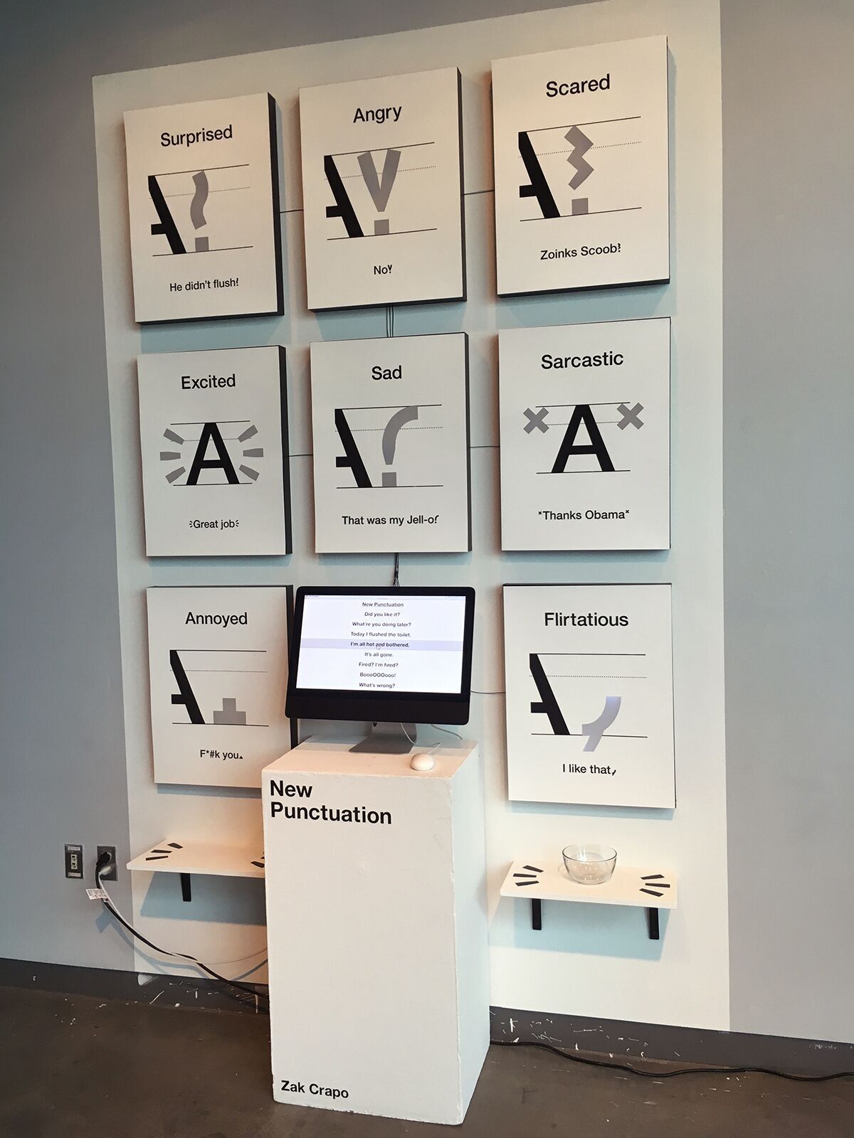 Zak Crapo
EJS: New Punctuation is a more clever set of emojis. Give me an Apple keyboard for my iPhone next.
CT: Brilliantly executed. Designers (and artists) are always looking for new ways to share expressions, sans emojis. Zac’s thesis shows us there is in fact a fun, humorous way to solve that problem. This exhibit resonated with many designers in the industry.
AFO: I liked this more when I realized that when the mouse moved, it highlighted a different piece of New Punctuation.
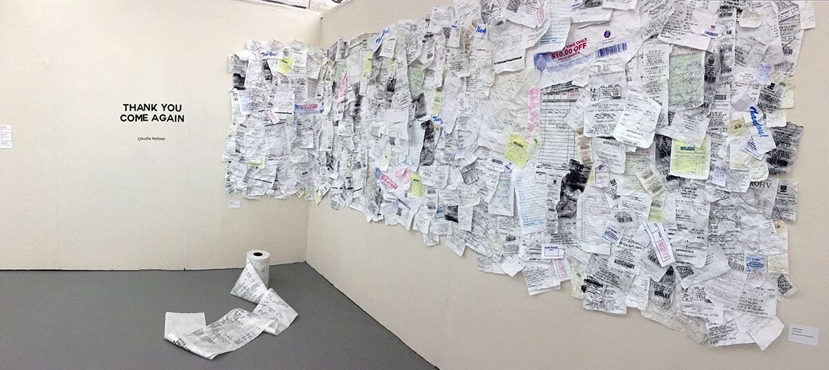 Claudia Heitner
EJS: What is even a checkbook nowadays?
CT: Incredible texture. Thank You Come Again tackled the current relevancy/dealing with waste on many levels, (financial, environmental, etc.). I found it was an interesting topic to address and Ms. Heitner managed to take something so literal (ugly even) and create an intriguing installation.
AFO: What is a checkbook but also what do we spend money on? What is this going to look like when all receipts are just emails? What kinds of place have paper receipts? I this it is really interesting to think about the design of a receipt and the kind of business that it is from.
EJ: Or even how like can send them as text messages now too? We used to stock receipts and use them to document our expenses and now we can do that electronically. It’s also so easy to just log onto our savings/checkings accounts on bank websites/applications on our phones.
Also WHERE are the businesses that still use paper receipts (urban, rural, suburban areas). And what are their area/region’s demographics social mobility determined or defined by? We live in an urban neighborhood alongside an open college campus.
AFO: It’s funny, I most often associate paper and electronic receipts with small coffee shops and restaurants.
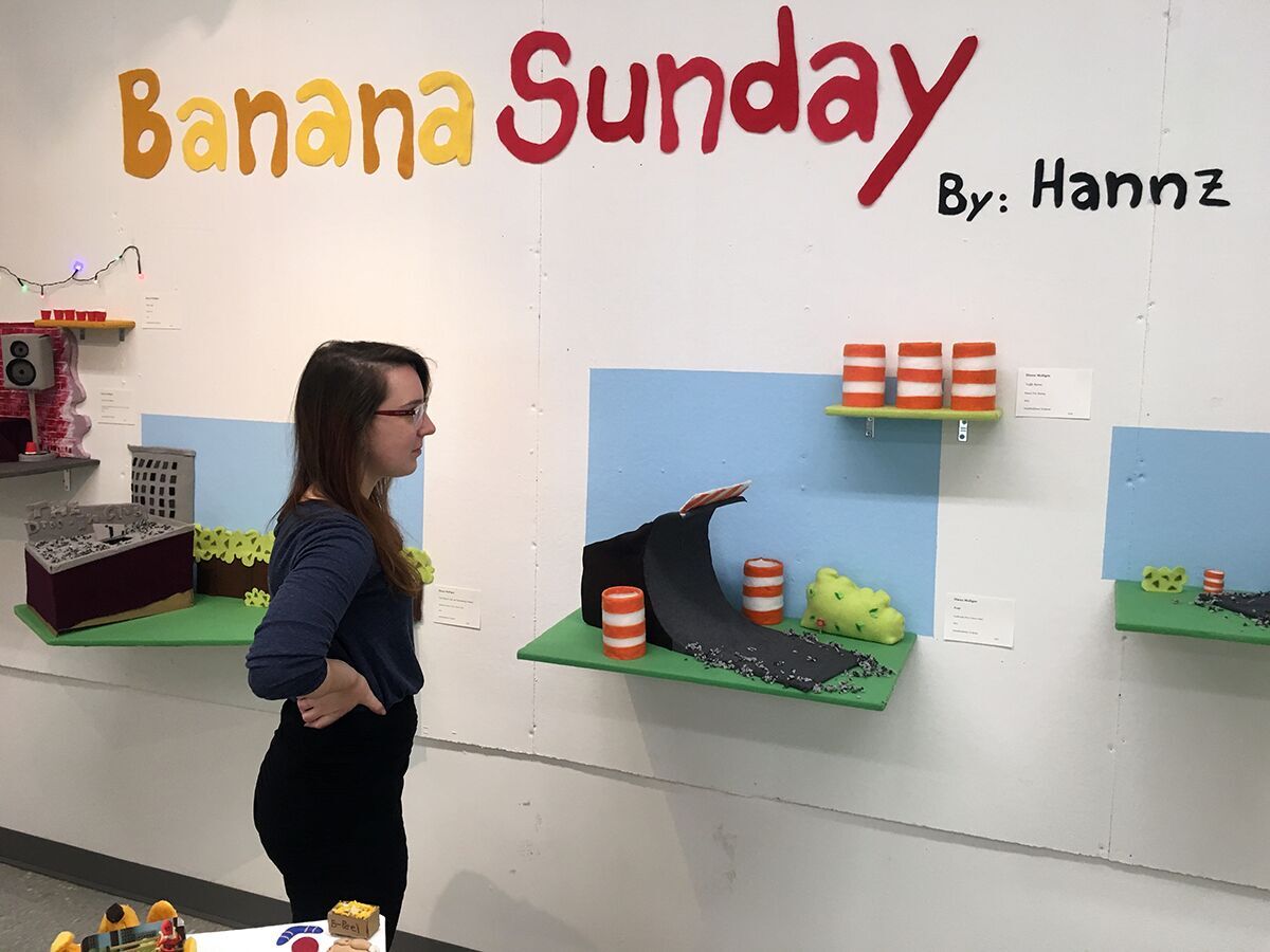 Hannz Mulligan
https://vimeo.com/166241272?ref=fb-share&1&fb_action_ids=1194805590532064&fb_action_types=og.shares
EJS: Bad-grandpa all the way. Incredibly entertaining and very well executed.
CT: Banana Sunday was a treat! The choice to create stop animation was a nice surprise.
AFO: Part of the installation felt like a game of hide and seek. The piece was fun and funny.
May Kim
EJS: While spending time on May Kim’s website, I was thinking that we have to find ways to organize information for ourselves. I think it’s is really fantastic that on Kim’s website you have to trudge through information to find more information. Along the way you begin to personally curate the website’s layout.
AFO: I thought this was interesting but more as an archive. I think it starts to question archiving something physical into a digital space and vice versa. And similar what you said, Emma Jo, how do we archive ourselves?
EJS: I don’t think ‘archive’ is the correct word for that question. We can self-curate our lives all we want on social media, but I think that we take our surroundings, our sentiments, and our ideas and archive those. I think we can take pieces of ourselves, but that’s about it. If they make us up and define us are they really ‘us’ or just fragments? Like words in a sentence.
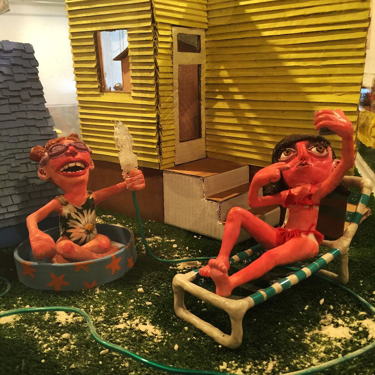 Caroline Kunka
EJS: I couldn’t stop laughing at these small figures. By far my favorite illustration work in ArtWalk 2016. There was critique, tiny and expressive figures, and lots of stories throughout Kunka’s work.
CT: Kunka’s ability to take every day subject matter and present it in such a colorful, spirited way is what makes her body of work stand out. Each characters exuberant interaction with the world they’re placed in brings to life the entire scene.
AFO: There was a lot of play in this piece. It did not take itself too seriously.
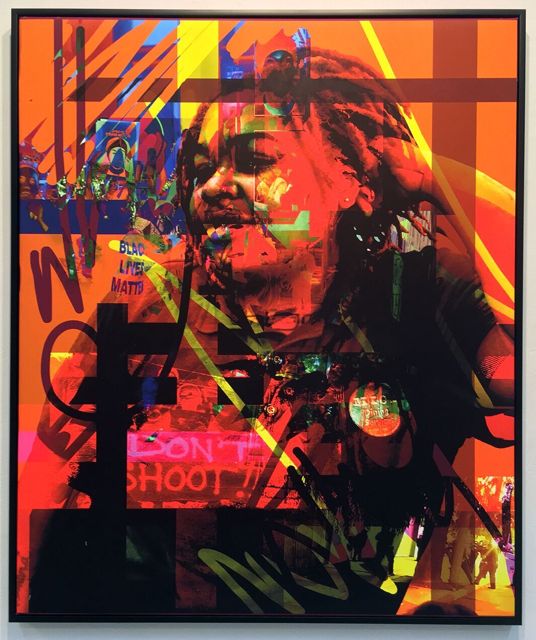 Amani Lewis
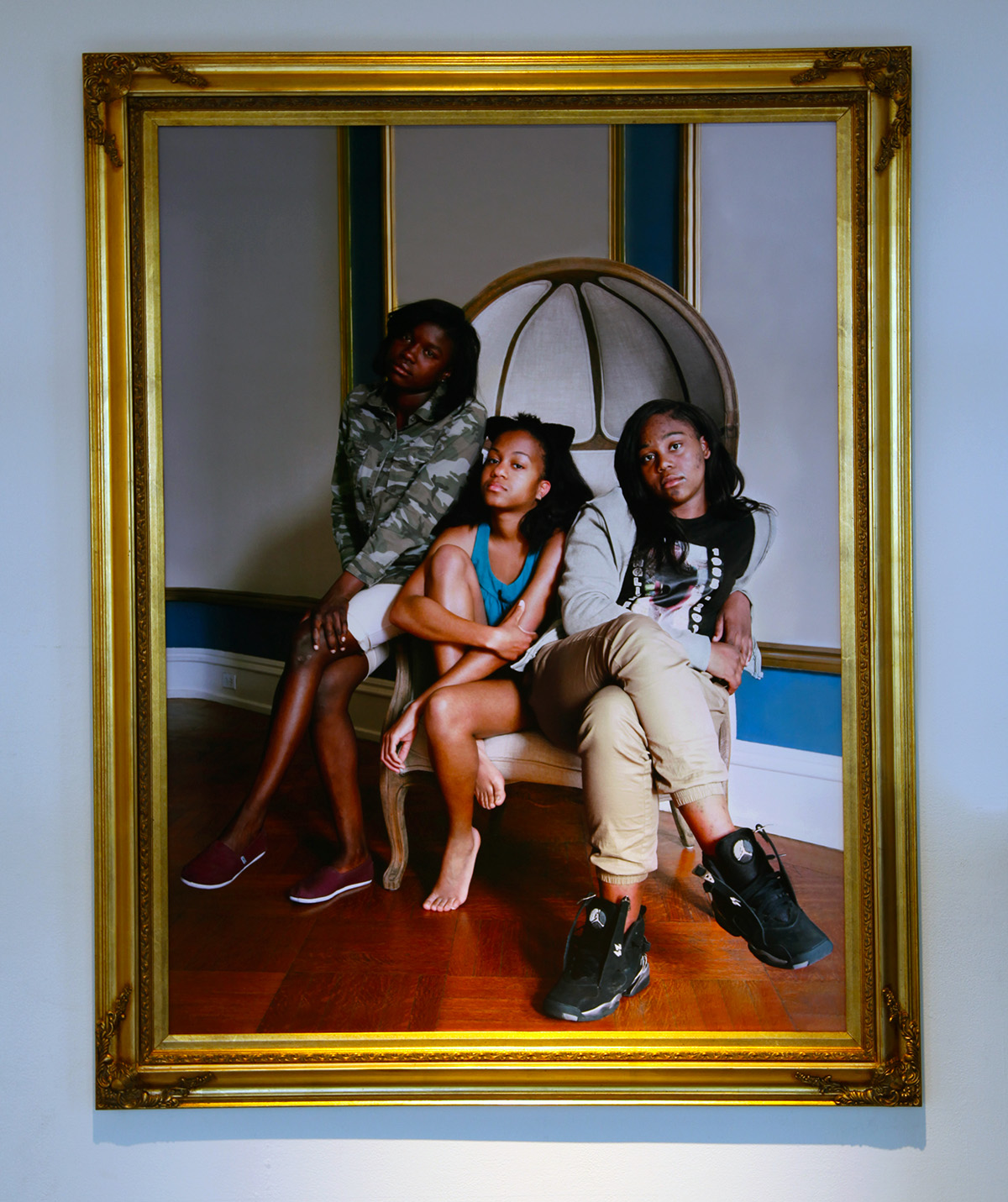
EJS: I haven’t seen a lot of Amani’s work before, however I was speechless when confronted with the beautiful overlay and composition present in these portraits.
CT: Amani Lewis’ ability to combine imagery, color, shapes, and photography has a seemingly-magical way of falling into perfect place. Her installation was ingenious as well; walking up to her space, I was immediately captivated–excited to stand and stare at her work. Ms. Lewis is definitely an artist to watch.
AFO: This piece is so “of the now” but speaks to something that has hardly changed over the past 60-70 years, racism in America.
 Lucas Novaes
EJS: I visited this in person and to see Novaes and the community surrounding this piece create something so beautiful in their space by their own hands was amazing.
CT: I’m looking forward to seeing Novaes mural in person. I’ve heard incredible commentary about this project and, while this image alone is breathtaking, I’m sure a camera doesn’t do this mural justice.
AFO: It is hard to do work that engages with a community or neighborhood that might not be your own. I think the success of this piece is that the community it is in also created it.
 Nandan Sam He
EJS: I thought it was so cool to take a literal and physical approach to a personal perspective. This installation was rough and vibrant. I felt like instead of stepping into the artist’s shoes, I was asked to put on their glasses and see through the artist’s eyes.
AFO: I liked to concept behind the piece, and it is an interesting perspective. It was a really ambitious installation.
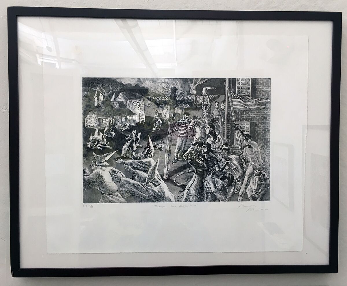 Terron Sorrells
EJS: Hella political. This piece and others done by Sorrells are in my top picks for commentating on our current socio-political climate in 2016. The juxtaposition of the characters and the narrative left me nervously giggling and entranced by the detailed etching. Gleefully, I wonder what Sorrells’ pieces would like positioned next to historic cartoonists like Thomas Nast.
CT: Sorrells collection, Minstrelsy, was executed beautifully. His etchings are hauntingly accurate; you can see the detail in every inch of paper which led to a humbling viewing experience.
AFO: I would agree, Sorrells’ work is always political. The action he took to make this work political is simple but highly effective.
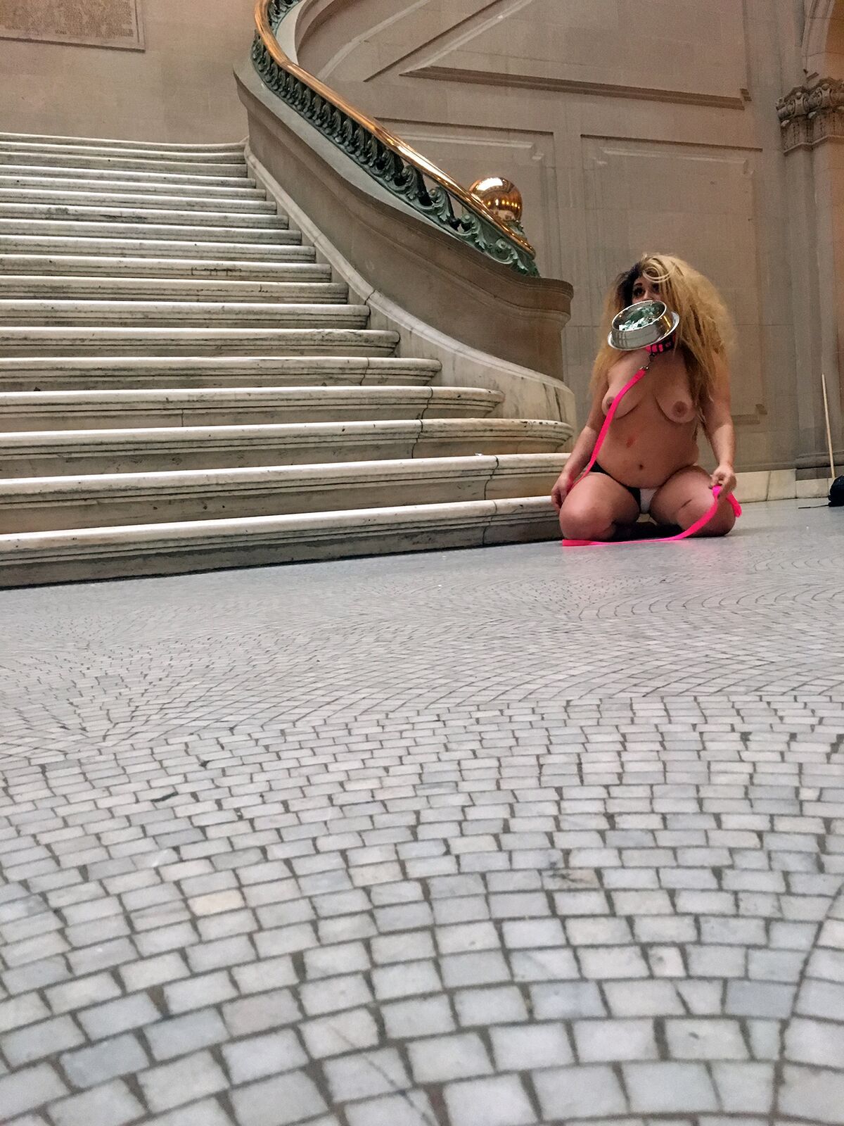 Laura Weiner
EJS: Every time they barked I felt that same abrupt fear that fills me when I am being catcalled on the street or followed home from the lightrail. The performance was long. They worked to isolate characteristics of their collaborative senior thesis performance, The Student Lounge, and boldly reintroduce them into MICA’s historic Main Building.
AFO: There was a lot going on here. I agree with what you said Emma Jo, but because of that I think the piece missed an educational opportunity.
EJS: I agree there could have been more of an opening for conversation, however I feel like that was not a goal of Laura’s performance. I think this piece pointed out an on-going frustration with educating individuals on larger social issues. Sometimes an artist needs a space to vent.
AFO: I understand that, I just wish maybe there was a take-away that had more information on it, or the address of a website we could visit? There were also no trigger warnings, which I think is integral to the work but could have been problematic because of its location.
EJS: Yea, they only seemed to be concerned with the immediate performance instead of the consequences of it, or the questions in response to it. You make a really solid point about both of those things. I feel like they got exactly what they wanted from the performance.
I think a lot of choices were made specifically because of the timing and the space, and those decisions actively disregarded what we think was missing from the overall performance. There was an artist performing in a space, however no artist statement was found. Was this performance a cumulative response to The Student Lounge? How do others feel about it?
 Angel Bilotta
AFO: I loved this installation because it allowed all of the work to breath. I think it was super smart way of inviting people to look at the book on the table. Having the book with the other photos from series let all of the work have space and made it easier for the viewer to consume. It made me want to sit for hours with a cup of tea.
EJS: How do you make hundreds of images easier to swallow? Settle in with a book. This display was comfortable.
CT: Bilotta’s installation was a welcome setting, tucked away in it’s own corner. The photographs displayed on the wall were rich, saturated, and lush. The choice to create a book allowed the viewer the opportunity to literally sit and flip through the pages.
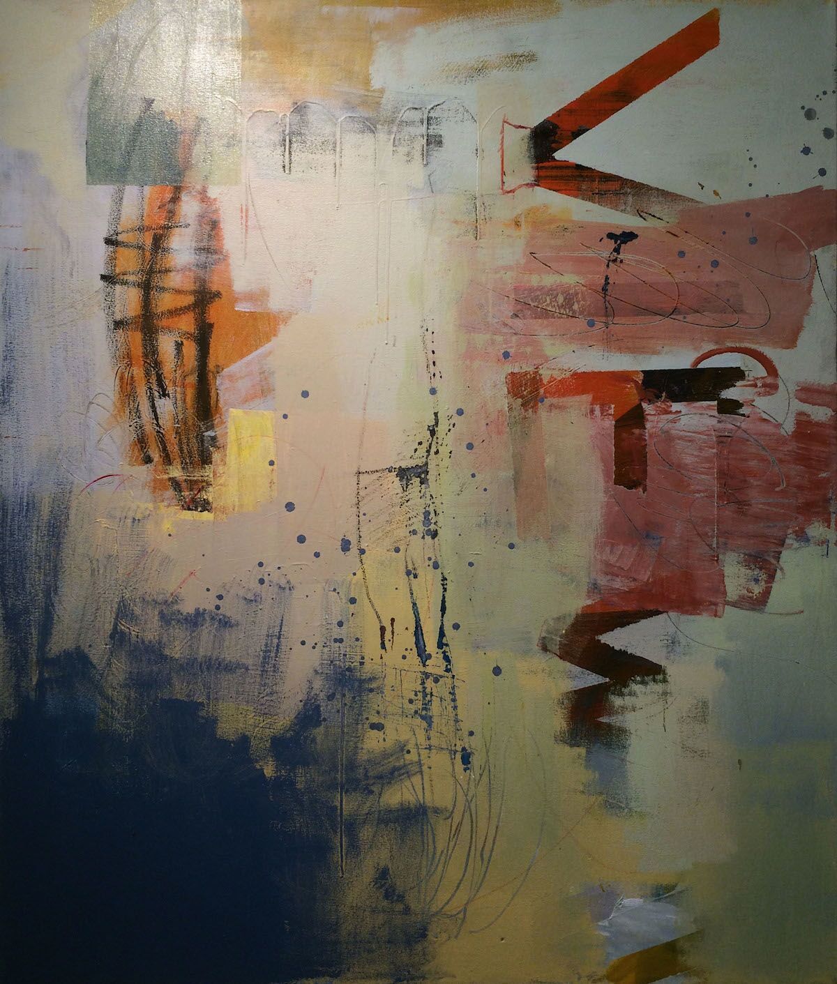
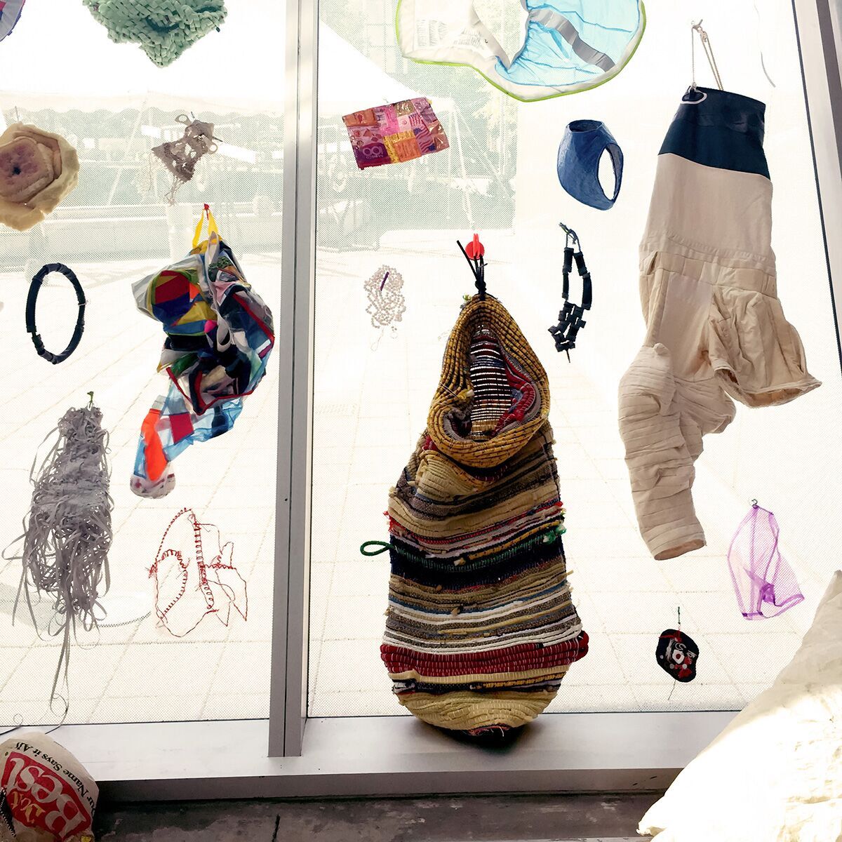
Dominique Samarco
AFO: I just found this piece pleasing to look at, and there was just enough for me to think about. I did not have to work hard to engage with it, and I did not get bored looking at it.
EJS: Samarco’s work truly translates a developing and exciting visual language through abstraction. I cannot wait to see how she continues to grow and create.
CT: Color and texture worked together nicely.
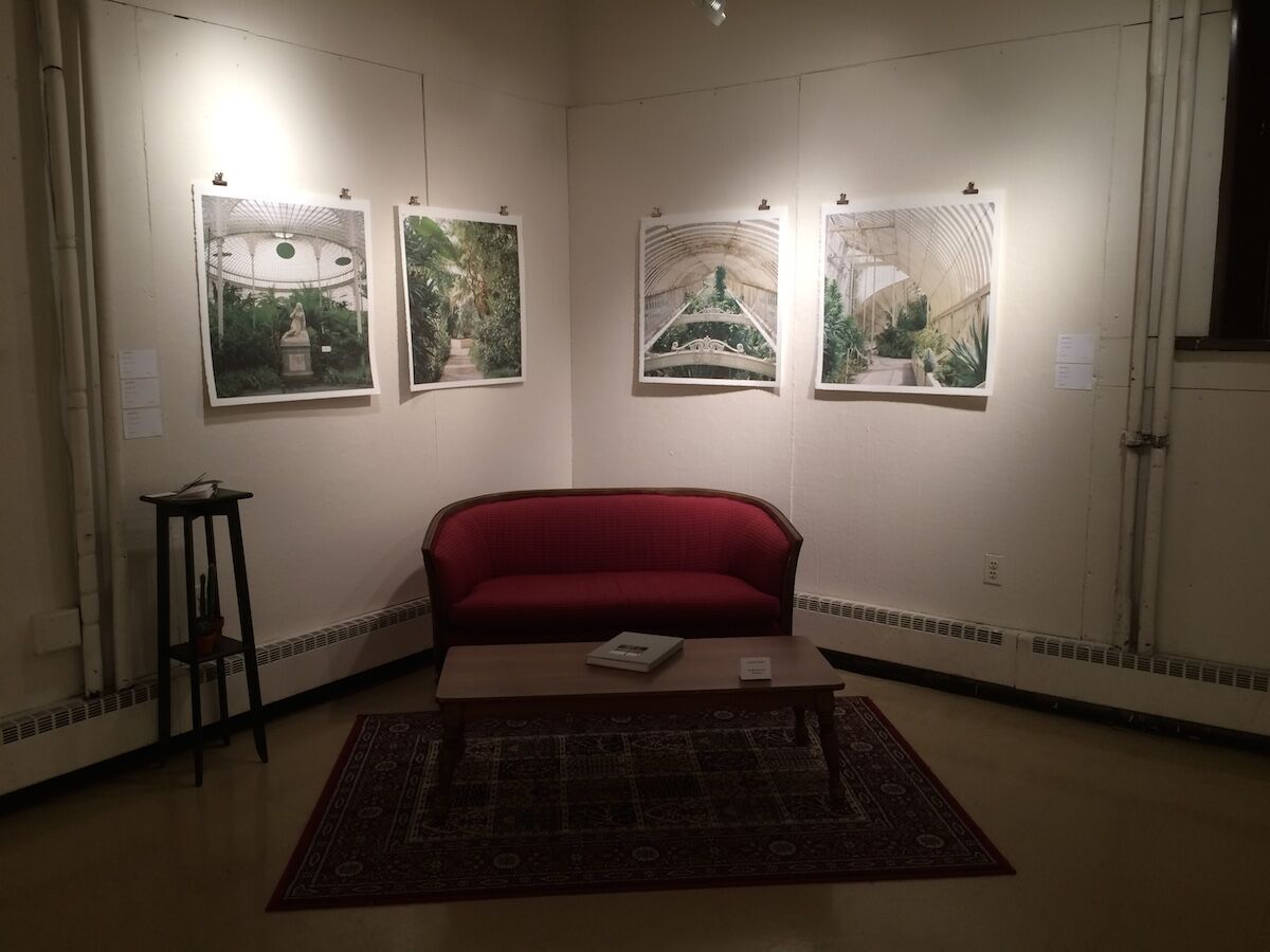
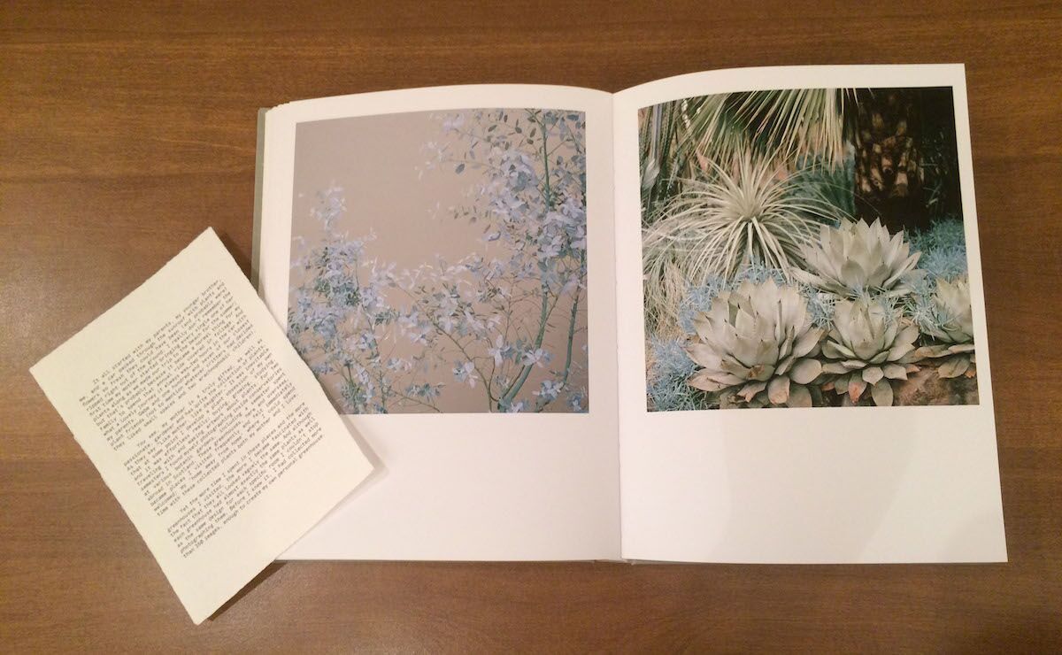
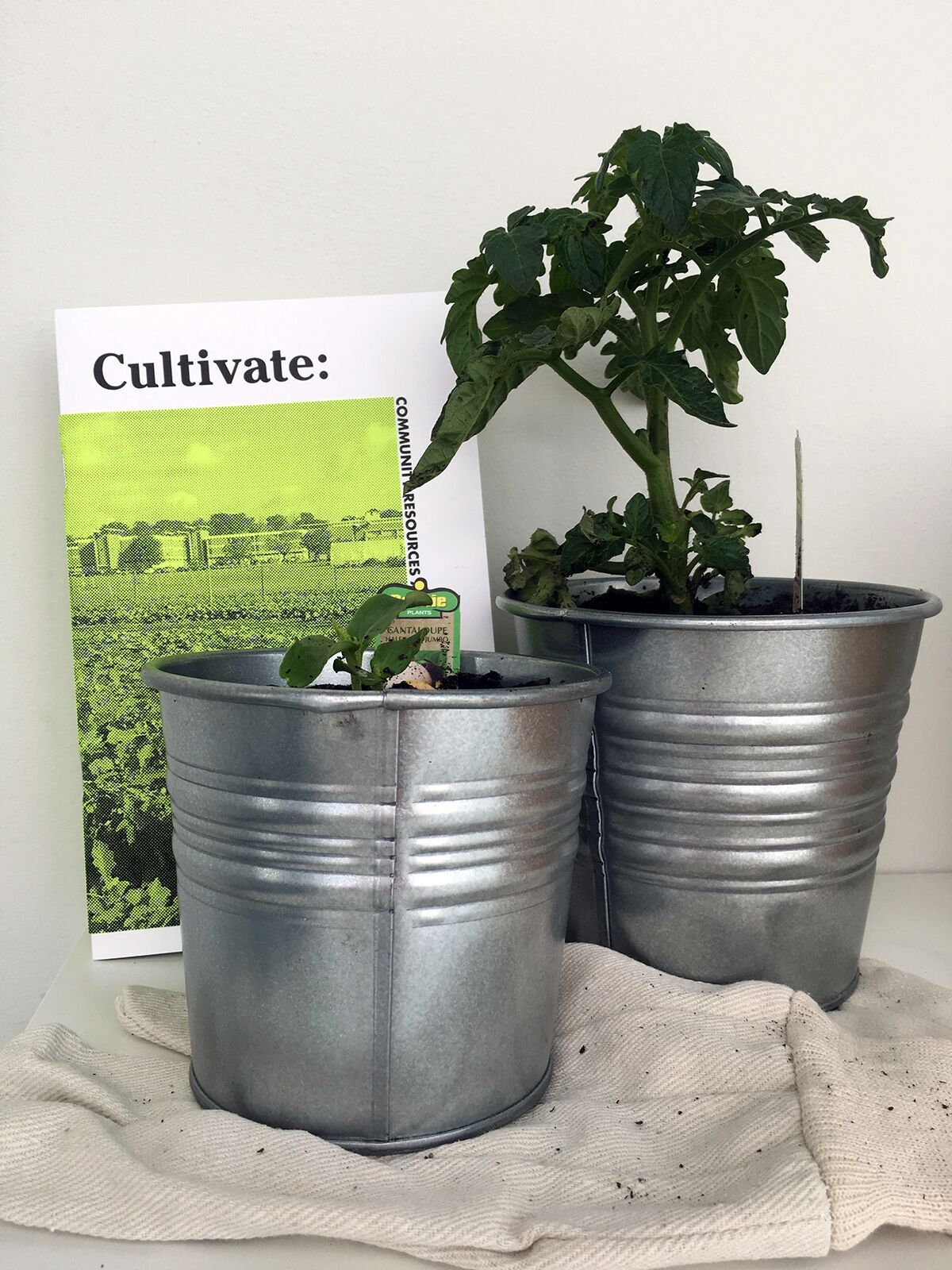 Hayley Frazier
EJS: So adventurous and cool. An amazing part of Baltimore that is harvesting economic and social capital for Baltimore residents.
CT: Well-thought-out and beautifully done. Frazier took a passion for cultivation, collected resources many didn’t realize they had access to or couldn’t find on their own, and managed to package it all in a collection of perfectly-bound publications. The color palette was pertinent, friendly, and Ms. Frazier was very successful in carrying her brand across multiple platforms (booklets, an interactive site, social media, etc). In a time where social design and sustainability are being considered more in the graphic design industry, Frazier wasn’t afraid to forge her own path in this direction.
AFO: I enjoyed the publication and thought it was well done, but I think the care in the book could have carried through the installation more.
 Esther Yi
AFO: I love the surface of this piece! Even more, I love that when I look at this painting I know that it is exactly how Yi wanted it to be.
EJS: I wish I could touch a painting without harming it.
AFO: Yaaassss! I want to touch it too!!
CT: There’s an incredible amount of texture and depth in Yi’s work.
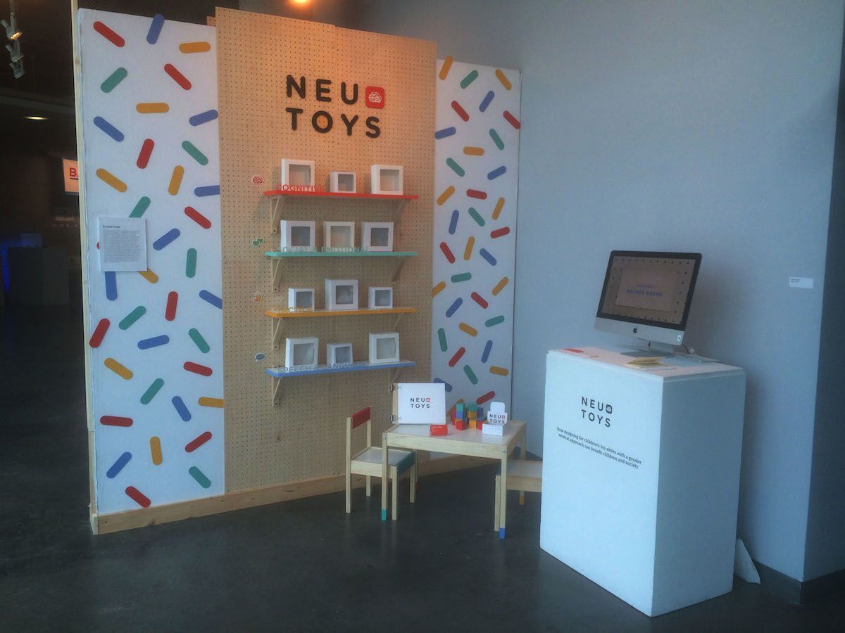 Rachel Frank
AFO: Instead of categorizing toys based on gender, Neu Toys separates them based on function: cognitive, social & emotional, tactile, and speech & language. I really enjoyed to design of the piece, and how the toys were recontextualized.
EJS: Really important questions were brought up in this display. I completely agree with Alex on her comments.
CT: Frank’s decision to focus on gender-neutral toys is a standout amongst other work in this department. It is socially-driven, engaging, playful, and relevant. From an educational/developmental perspective, the level of which Neu Toys is executed exceptionally well. Ms. Frank should consider taking this prototype into full development.
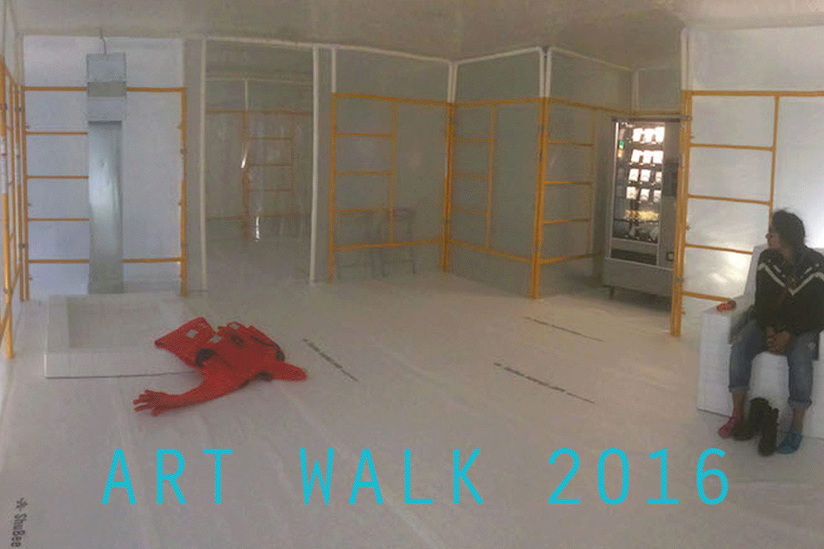
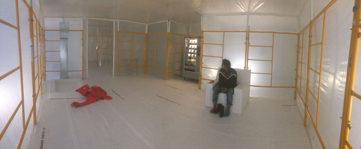 Ryan Griffin
AFO: This would be my top pick of the exhibition. The piece and its installation where beautiful, no detail was spared. It was amazingly lit and engaged all of my sense as soon as I walked in. There is also something funny about the idea of a Cleanroom with a vending machine where the only identifiable things available are hot sauce and TUMS.
CT: This space was very interesting to enter; stark and full of contrast. I was intrigued and am on a mission to have a conversation with the artist to understand the concept more.
 Erin L. Scott
CT: Visually stunning. Scott’s use of the term “passing” resonates in many ways through this image. The composition itself is set in a way that you’re not initially looking for the title to help define the moment captured in the image. This photograph is drenched in saturated goodness and has me excited to watch Ms. Scott’s career over the coming months/years.
AFO: I love how Scott uses the term “passing.” She uses the term to speak about age but inevitably draws links to race—the intersection makes the work more compelling.
EJS: Scott successfully bridges categorizations of ‘identity’ together, both challenging and analyzing them. She brings to light conversations about intersectionality and the complexity of experience. These women are beautiful and the photograph captures that beauty.
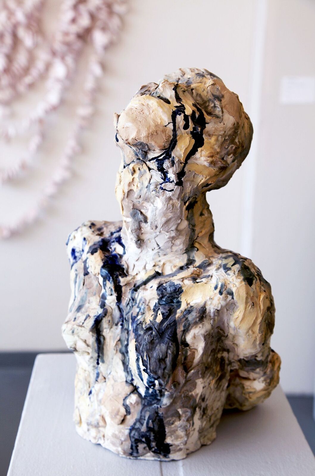 Hannah First
CT: First’s Wonder is stunning. Bathed in light, you can feel the release this sculptural form portrays. Mouth open, head tilted toward the sky, Wonder reminded me to breathe and let go. The color, texture, and earthiness all assist one another and I inevitably found myself staring at every detail for quite some time.
AFO: The pose is striking. Looking at it is a very tactile experience.
EJS: I can find small, curious drawings within the sculpture and that excites me.
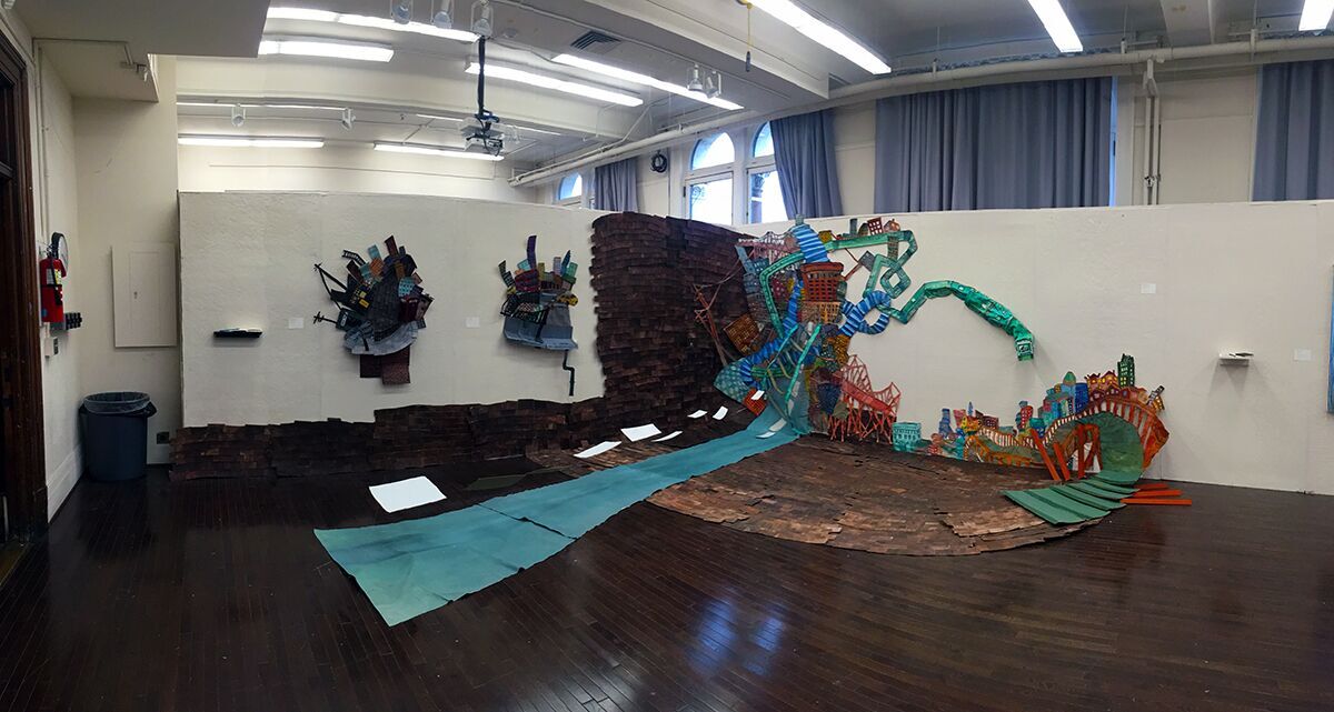
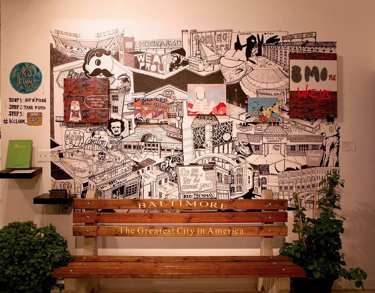 KC Linn
CT: Personally I was blown away with this installation. Perhaps I cheated, but I was lucky enough to watch the progress from sketch-to-final. The amount of time, dedication, and persistence given to Linn’s work shines through. I think the artist is very passionate about living and working here and this was her personal way of honoring that. Extra love for scoring “The Greatest City in America” bench.
AFO: This feels like an insider-tourist map of Baltimore.
EJS: I agree with Alex about the ‘insider-tourist map’ idea. It feels like its missing parts of Baltimore, historical landmarks seem to take a front seat. With the inclusion of the ‘Baltimore: The Greatest City in America’ bench, I question what it means to move inside Baltimore as an outsider, and how to slowly get to know Baltimore more intimately and wholistically. How do we begin learn about a new place, especially one as complex as Baltimore city?
AFO: It is a very specific Baltimore, and it does not seem like the Baltimore that most people here live in.
EJS: The amount of both economic and racial segregation, that exists in this city is abysmal. However I think this piece had the potential to either serve that separation or call it on its shit. I’m not completely sure which path this piece depicts?
CT: It’s as simple as this; the artist, a Baltimore-native, paid homage to her hometown in a way she could best portray it, from her own memories, from her own experiences. “Tourist” landmarks aside, they’re still landmarks, many historical, that have helped shape this city. I appreciate the genuine stance the artist took in making this illustrative collage; perhaps the viewer needs to be there, up-close-and-personal, to appreciate the detailed layers, shapes, shading, placement…it’s all very thoughtful and was seemingly done with purpose.
 Nan Cao
CT: Initially I was drawn to the color palette in Nan’s work. As I got closer and realized how much detail was in this print, I was in awe. Every intricate detail is visible and was painstakingly made while the creature positioned mid-step provides us with a sense of mystery. Her trepidacious look, combined with the dark background only add to the intrigue found in a closer look.
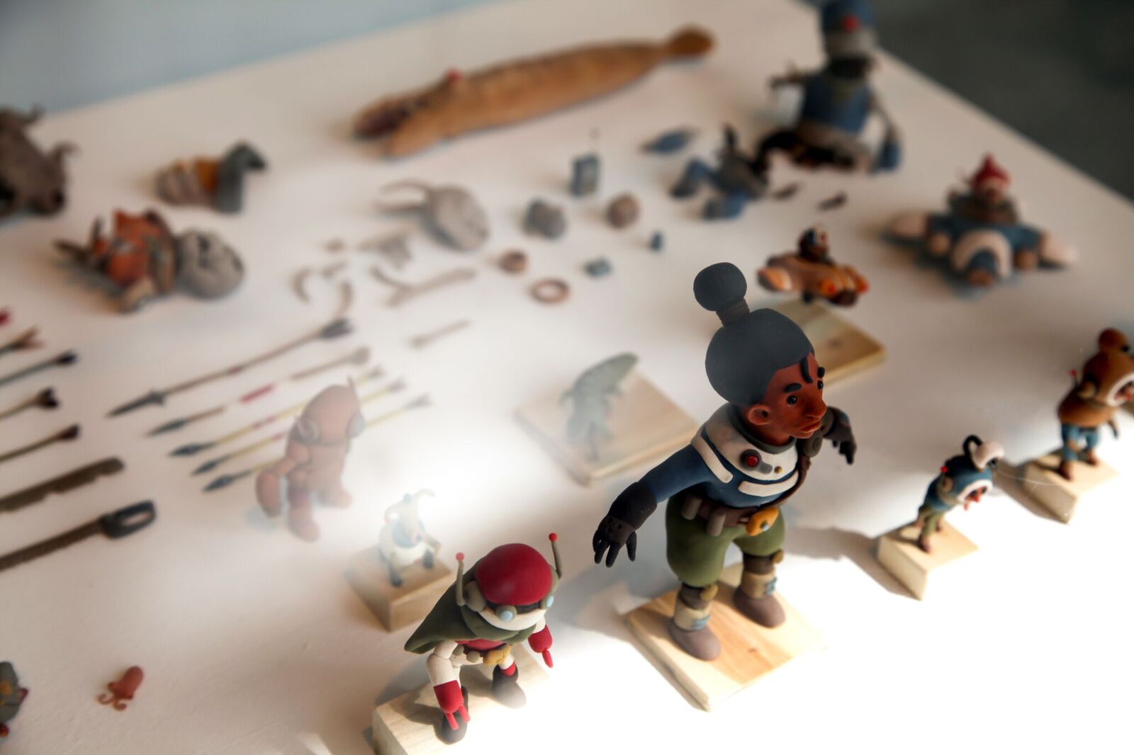
Drew Shields
CT: Nekyia was a stellar installation; beautifully curated, with major attention to detail, Shields’ work was displayed with the same carefulness one might see at the Walter’s or BMA. It’s easy to forget how much goes into creating animated content, and Shields laid it out for everyone to see. Every tiny, somewhat lego-size rock, crustacean, plant, insect, weapon, (and more), increased my level of admiration for the work it took to make Nekyia come to fruition. The film, also in the installation, was a quiet mystery and set the pace to view the rest of Shields’ exhibit.
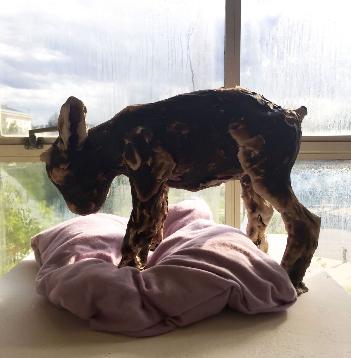 Stephanie DeVita
AFO: DeVita’s work was full of texture. It was interesting to see how the hard ceramic sculptures and textures interacted with soft pillows.
CT: Overlooked left me speechless. It was quiet. It was positioned perfectly against the incoming light. The choice of color within the sculpture. The pose the lamb is positioned in; natural yet seemingly sad. The juxtaposition the fabric the lamb is standing on and the mood that creates. Whether whole or stripped apart, Overlooked was an extraordinary sight to behold.
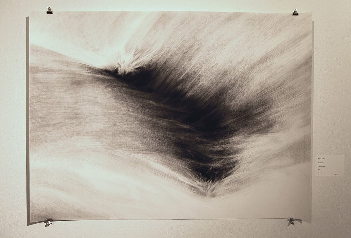
Yiyun Qin
CT: I walked away fascinated with the movement Qin was able to capture. The sense of water rushing into this invisible abyss. The surreal, organic flow and the simplicity in the color palette resonated with me.
AFO: These are aesthetically very appealing. They create a pause and sense of wonder.
+++
Author Alexandra Oehmke is a rising senior at MICA studying sculpture, graphic design and writing. She is one of BmoreArt’s 2016 Editorial Interns.
Author Emma Jo Shatto is a senior painting major at MICA. She is one of BmoreArt’s summer 2016 Editorial Interns.
Author Cat Thomas is a senior Graphic Design major with a concentration in Book Arts and Illustration at MICA. She is one of BmoreArt’s summer 2016 Editorial Interns.