An Interview with Amber Robles-Gordon by Cara Ober
One of my favorite images from the most recent BmoreArt Journal of Art + Ideas features Myrtis Bedolla and Alex Hyman sitting in the front window of Galerie Myrtis in Baltimore. They gaze out toward a gorgeous stained-glass bowfront window up at a series of lively, rainbow-hued reedlike sculptures which dangle from the ceiling. There’s something intimate and seamless about this image despite the fact that it depicts an art gallery, which is typically a public space.
Perhaps it was the photo’s striking cohesion that caused an inadvertent omission of the artist’s name from the photo credits? (In addition co-curators of the exhibit, Lest We Forget, at Galerie Myrtis are Deirdre Darden and Jarvis DuBois) After making a regrettable error in print, I was thrilled to connect with Amber Robles-Gordon, the DC-based sculptor and mixed media artist whose work is featured in the photograph, not only to apologize but to delve much more deeply into her work.
Despite the mistake, Robles-Gordon was gracious and generous. The following conversation has been an opportunity to learn more about her practice – one that is simultaneously emotional and personal, yet formal and structured. Robles-Gordon uses all sorts of materials and symbolic, bold color to explore nuanced perspectives on hybridity, using the physicality of her materials to represent the challenges and celebration inherent in her own existence.
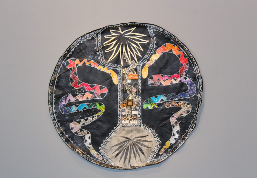
 Photo by Steven Spartana for Issue 3 of The BmoreArt Journal of Art + Ideas of Myrtis Bedolla and Alex Hyman in Galerie Myrtis with Amber Robles-Gordon’s “Above All You Must Not Play At God,” a Mixed Media Installation celebrating the life of Henrietta Lacks.
BmoreArt: Before settling in Washington, DC, you lived all over the world. Can you talk about how your family and upbringing has impacted your life as an artist?
My family is from the Caribbean – primarily from St. Thomas, US Virgin Islands, Puerto Rico, and Antigua, West Indies. I was born in Puerto Rico, raised in Arlington, Virginia, and have lived in Washington, DC for the last 20 years.
I am the oldest of two: my brother Alanzo Robles-Gordon and I are about seven years apart. By the time I was 12 years old, my parents were divorced. My father actively remained in our lives until I was 16 and my brother was about 4 years old. My brother and I were reluctantly indoctrinated to the cycle of being with our Dad every other weekend. My parents’ separation and then divorce tore away at my perception of bliss, of family, and of joy. Watching my mother, brother, and myself manage the cumbersome and overwhelming load of divorce was traumatic. Especially when you, as a 12 year-old, realize that infidelity was the primary reason.
It is my mother’s will and power that supported and nourished my authentic self. My mother, Carmen Robles-Inman, taught my brother and me that creating, writing, and self-expression were integral parts of one’s self and one’s family existence. She made sure to expose us to various visual art forms and cultural experiences. Additionally, through her love of people and languages, and her professional experiences as a public health specialist and social service practitioner, she made sure to envelop my brother and me in a patchwork of Afro-Latino, Caribbean, Central American, and American friends and loved ones.
Can you talk more about your multicultural roots and growing up outside of DC?
Growing up an Afro-Latina within the Arlington County school system during the 80’s was a challenging experience. I looked African-American, but did not act “black enough.” I talked “white” or spoke “too proper” and did not speak fluent Spanish and further did not look Latina. By nine years old I was already “developed.” I never needed make-up, I naturally looked grown. I was always one of just a few minority students within magnet programs from elementary to high school. The dichotomy of my Arlington county school experience made it hard to be multi-anything. I could not be a black girl and be smart or be a black girl and be pretty. I have countless memories of being challenged by for example white Arlington boys because I was assigned the same reading book as they were or in the same AP class and that just “could not be.”
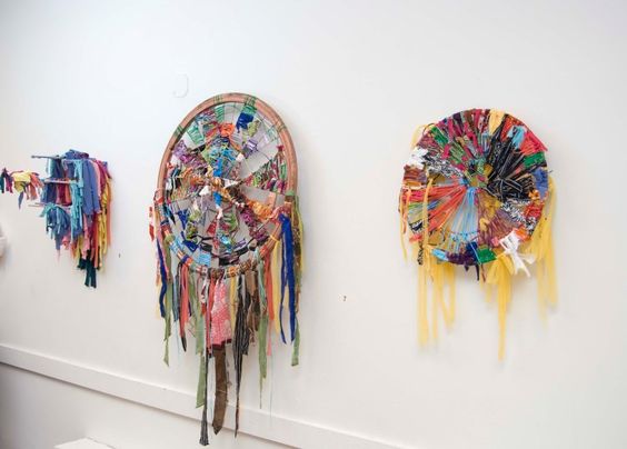
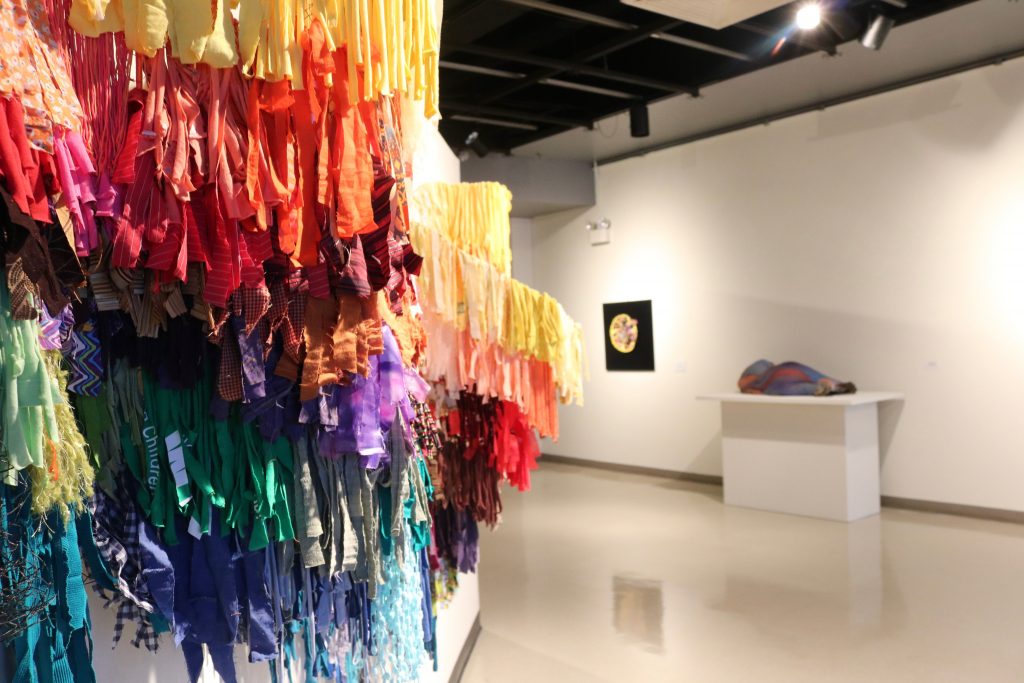 Photo taken by Dianne Smith, detail of “My Rainbow is Enuf,” mixed media on chicken wire, 2014 as part of I found God in myself exhibition, at African American Museum of Philadelphia.
So the art making helped you to create your own identity because it was so hard to be yourself?
From an early age, I found solace, pride, and joy both from the process of creating art and in the artwork I produced. I have known from age 10 that I wanted to be an artist. As a young woman, it was clear to me that creating art was one of my most important personal resources. Having this knowledge at an early age forged a link between my social experiences and my art. My artwork from high school through college focused on drawing, photography, creating collages, and documenting my life experience.
My social constructs of being an Afro-Latina raised by a single mother in Arlington Virginia, has impacted or constructed who I am as individual and therefore impacts the methodology behind my artwork. I believe my Latino, African, and Caribbean heritage is inherent in my artwork. Hence, my artwork is a visual representation of my hybridism: a fusion of my gender, ethnicity, cultural, and social experiences.
 “Of South and Fire,” Mixed Media on canvas, 2015, (Detail of Awakening the Matrilineal), an installation at American Univeristy, Katzen Art Center
You earned your MFA from Howard University in DC. What was your graduate school experience like and how did it impact your work? Can you talk a little about what your work was like before school and how your work and thinking changed by the end of it? Also – what was the impact of attending a HBC on your awareness of history and culture?
At entry into Howard University’s (HU) Department of Art, my artwork was predominantly two-dimensional, figurative collages and primarily about personal contemplations and explorations of self. During my second year of graduate study, the creation of two separates series, Light and Colored Lights Beads and The Matrix, sparked the identification of the matrix or grid as the underlying framework of my artwork. It provides a visual structure and conceptual framework for my art. The matrix symbolically represents both positive and negative aspects of our society and the background of human existence.
The grids and matrices address gender boundaries which have historically limited the opportunities for women in a patriarchal society. I merge colored, feminine objects and masculine forms — the grids and matrices — in order to visually fuse the various materials and female/male energies. The found objects symbolically articulate the need to recycle energy and power inherent to discarded materials.
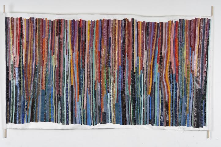
Both series, Colored Light Beads and The Matrix, are iterations of the influence of Alma Thomas and Georges-Pierre Seurat’s work. Colored Light Beads are acrylic paintings. Each grid is set in a white square with slender parallel columns of varying tones of colors rising from top to bottom.
The Matrix Series – Quilt Matrix, Ladder Matrix, and Rain Matrix – became templates for a larger series titled Heal Thyself, which consisted of 3 – 31″ x 60″ panels of sewn, collaged, and/or adhered feminine materials and found objects on canvas. Heal Thyself was my first departure into the fold of fiber or textile arts. My objective was to create artwork that incorporated sewing cloth and adhering objects to canvas. I wanted the work to appear as a wall hanging or a scroll. Working with unprimed canvas allowed me to use a sewing machine to add cloth materials. In addition, the canvas would be able to withstand the weight of heavier objects being attached to it. Just as I previously used various paper materials as my source of color, I began using cloth materials and other found objects as my source of color.
As I began to search for other ways to represent matrices within my work, I came across a 110″ x 110″ piece of chicken wire that was bracketed to a wooden frame. My desire was to weave colored materials through the three-dimensional structure. This structure eventually evolved into the piece titled Flight of the Chicken Wire, a 107″ X 107 in” three-dimensional fiber and sculptural form. This work is a three-dimensional, life-size manifestation of the matrix represented throughout my work.
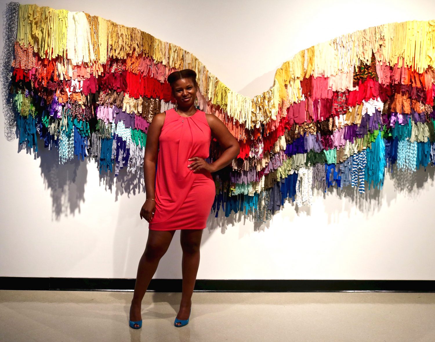
 Photo by Dianne Smith, “My Rainbow is Enuf,” as part of I found God in myself exhibition, at Schomburg Center for Research in Black Culture
Regardless of the physical material used to represent the matrix, be it chicken wire, fabric, canvas, paper or acrylic grids, the matrix is the visual foundation of my artwork and it metaphysically represents the fabric — weft and warp — of our society and the imbalanced interactions between masculine and feminine energy. As I work with colored objects and materials, I am engaging the masculine and feminine energies represented in nature, colors, and objects to balance a form. I view this as a symbolic action employed to produce a transcendent positive social message, feelings, and/or critique.
My graduate experience has helped me to refine my artistic voice and has provided me the ability to create comprehensive series and to articulate the ideas and conceptual framework concerning my artwork. During my graduate studies, I was able to explore a number of media including graphic arts, assemblage, mixed media on canvas, and three-dimensional fiber woven structures. Subsequently, I have increased the range of media I employ and expanded the materials in my visual vocabulary.
Most importantly, the requirement of a written thesis, a visual exhibition, and oral defense forced me to examine and reevaluate myself and also manifest a 43 page paper titled “Matrices of Transformation.” After five years of attending this program as a single parent of a young child, working part-time, creating artwork, exhibiting two separate thesis defense committees, and engaging in one heightened exchange with a committee chair member (not to mention my various roles as part of BADC), “Matrices of Transformation” is to date one of the most important documents in my life. I am now cognizant and supported by both intuition and the academic reasoning as to why I utilize specific colors, materials, and concepts within my artwork and I have the ability to place my artwork within a historical and cultural context. Additionally, my experiences at HU broadened and strengthened my ability to write and speak about my artwork confidently.
 “The Male, The Architect, The Protector,” mixed media on canvas, 2015
You are currently based in Washington, DC and exhibit your work all over the world. You’ve been significantly involved in the arts in DC, building community there since 2004, and an active member (as well as exhibitions coordinator, VP, and Prez!) of the BADC (Black Artists of DC) organization. How would you describe the art community in DC? Can you explain the BADC group – what it is and does? Also why ‘giving back’ to your community is important to you?
I graduated from Trinity University (previously Trinity College) in Washington DC in 2005 with a Bachelor of Science in Business Administration. I pursued a business degree because I planned to manage my own art-based business and needed the knowledge to do so successfully. After graduating from Trinity, I began a search for an art community as well as a graduate program. My 15 year plan included applying to my top five graduate schools to pursue an art degree. However, I was introduced to Black Artists of DC (BADC) and several artists’ educators such as Gina Lewis and Aziza Gibson-Hunter. BADC is an African-centered, multi-generational artist community dedicated to “promote, develop and validate the culture, artistic expressions and aspirations of past and present artists of Black-Afrikan ancestry.”
I joined BADC in 2005 and my initial interactions with BADC convinced me to apply to Howard University’s Fine Art graduate program. In fact, I never actually applied to any of the other four graduate programs of my “top five” list. I consciously choose a Historically Black College/University (HBCU) at which to pursue my graduate degree. I am appreciative of the experiences and opportunities my elementary and high-school education provided however, once given the choice, I could not attend another predominantly white institution. I was determined to find a circumstance that would educate and nourish my spirit. My Masters in Fine Art program was my gift to myself… my authentic artist self.
At BADC, I found an art-family and I jumped in head first: I volunteered, attended meetings and advocated for BADC’s mission and its members. I began to assist with curating BADC’s first exhibits, Hidden Treasures and Found, with lead curator Barbara Blanco. Eventually, I become part of the Elders Council and began to contribute to the process of creating structure and establishing organizational by-laws and a mission statement, among other mechanisms. My work and involvement culminated into becoming the Vice President and then President of BADC.
I have often described dual involvement at BADC while completing my graduate work as “being in a dual master’s program: a Masters in Fine Art at Howard University and a masters in being as Fine Art Artist with BADC.” It was truly an invaluable, expansive and nurturing experience.
My association with BADC has been important to my development as a person and as a professional artist. The experience with BADC was an enriching supplement to my academic endeavors at HU as well as an asset to my understanding of art as an industry. BADC’s African-inspired structure has created an environment that promotes exploration of and awareness of one’s ethnic identity and the relationship to the power of art and community.
 “The Female, The Oracle, The Nurturer,” mixed media on canvas, 2015
Additionally, the more I worked with BADC, the greater my exposure to the DC art scene. For example, through BADC I became aware of and involved with other important local art organizations, among them the DC Advocates for the Arts (a DC non-profit that “support[s] development of public policy for a creative, healthy, sustainable, and economically viable District of Columbia),” Artomatic (a multi-week, non-juried, multimedia arts event in DC), as well as Millennium Arts Salon (an art collector based organization dedicated to enhancing cultural literacy through arts programing).
In 2010, while I was still BADC president, I began having conversations with friend and artistic peer Jamea Richmond-Edwards. Richmond-Edwards is a collage and portrait artist and was also a BADC member and MFA student at Howard University. Our conversations about personal experiences in the art world, cultural influence, the legacy of Howard University, and the examination of artist groups and movements – Spiral, Black Artists of DC, Africobra, and the Black Arts Movement – lead us to co-found Delusions of Grandeur.
Today, Delusions of Grandeur is a collective of emerging artists brought together by shared interest and commitment to our art and to the mission to build a contemporary art cannon. We recognized a need to provide critique and commentary on social infrastructures within American society and to contribute to the prominence of the collective black voice and presence within contemporary art. Delusions of Grandeur is comprised of artists Shaunté Gates, Jamea Richmond-Edwards, Amber Robles-Gordon, Stan Squirewell, Wesley Clark, and Larry Cook.
In 2012, I stepped down from the role of BADC president. Although I am no longer actively involved in BADC, I see Delusions of Grandeur as part of the Howard Univeristy continuum and and influence of Black Artists of DC.
 “Wired,” Mixed Media on Chicken Wire, 2011, Pleasant Plains Workshop,Washington, D.C.
Who are your favorite artists? Who has been most influential on your work?
My artist muse has always been the abstract expressionist painter, Alma Thomas (1891-1978). I was exposed to her artwork around seven or eight. My mother, at that time a student Georgetown University, was taking an African-American Art appreciation class taught by a visiting professor from Howard University. I was the only child at the time, which meant she took me everywhere. A class assignment was given to attend an exhibit featuring Alma Thomas. One of my most vibrant childhood memories is of my first encounter of Alma Thomas’ artwork. I can recall the physiological response of joy and being energized by simply being in front of her artwork. Her use of color and light has always greatly moved me, speaks to my spirit, and raises my energy. Additionally, my exposure to Impressionism, primarily Georges-Pierre Seurat (1859-1891), has also influenced the use of color in my artwork.
Both Thomas and Seurat have inspired my interpretation and use of color in my work. I am fascinated by Thomas’ mastery of color, space, and composition. She is also known for her bold use of primary colors, geometric forms, and her painterly brush strokes. Thomas left small spaces of white canvas in between her brush strokes, creating the appearance of mosaics or stained glasswork. As I began to evaluate the value, purpose, and aesthetic aspects of my art, I noticed similarities regarding the use of color and light, between the works of Alma Thomas, Seurat, and myself. Seurat, was a post-impressionist draftsman and painter who studied color theories, specifically those of Delacroix and the color scientists Herman von Helmholtz and Michael Chervreul. Seurat was interested in the science of painting and the process of optical color mixing. He used white space to enhance the perception of color. He created a technique called pointillism, in which an image is rendered using tiny dots of primary and secondary colors. When the image is viewed from afar, the eye fuses the colors to create intermediate colors.
In my early works, I used torn colored paper to create figurative paper mosaic compositions. Ripping the paper revealed its white fiber pulp, which provided areas of white space between each portion of color. Many of my paper mosaics appear from afar to look like Thomas’ paintings, until you come closer and see the texture of overlapping paper. The manner in which Thomas and Seurat used color and white space has influenced the way I visually perceive color and has informed my placement of colors. While appreciating their paths, I have used their groundbreaking explorations as a point of departure to create a technique or process of my own.
The various fabrics and objects I use provide an extensive color palette. Because I use colored items, I am also working with wavelengths of light absorbed or reflected by the object. I am interested in the energy dispersed, the visual sensation that occurs from viewing colors, and specifically, combined colored materials.
Combining various colored items can increase the visual sensation of the viewer. As a result, I intentionally focus on the distribution of vibrant colors within a composition. Each artwork has a distinctive rhythm, pattern, and sensation because each has a varied arrangement of colored materials.
 Glass, Purse, Belt and Bra Traps, Mixed Media on Canvas, 2007
You work in a range of materials, but you are best known for mixed media assemblages with fabric and found objects. Please explain what these materials mean to you and how they enable you to think differently… how they expand or enrich your creative thinking process?
I definitely have an interest in materials or materiality yet I’m not sure if its equal to my interest in color. Although both are languages that I communicate with regularly, they effect me differently. Materials intrigue me but colors uplift and excite me.
I use the cloth materials and other found objects for my source of color. My color palette is the visual color spectrum and beyond. The perception of the traditional visual color palette has been expanded due to the range of additional colors and textures that now exist because of technological advancements in photography, the production of fabric, clothing, and other objects.
I use fabric, found objects, and color for their color value and perceived meaning. Each object or fabric has a color and colors are wavelengths of light, a disbursement of energy. Each object is absorbing or reflecting all colors but the color you actually see. I work with this process of perceiving color and refer to it as a color sensation or color energy. I purposefully maximize this process by using an array of colors arranged together in bursts. Color value, refers to two things: 1. The color that has been given to or assigned to the object or fabric, and 2. Any additional qualities of the fabric or object that enhance its characteristics, like the texture, shape, or patterns. Additionally, value can refer to actual meaning assigned to the object or color.
Specifically, when viewing my large scale fabric installations people usually initially respond to the arrangements of color. If the installation or mixed media work includes objects, then the viewer focuses on the objects or fabrics themselves. Viewers, tend to see the color arrangement first, then examine the actual materials and objects.
Additionally, energy is inherent in each piece of fabric and object I utilize. Each object has a history, the energy that remains from discarded cloth or objects.
 “My Rainbow is Enuf,” Mixed Media on Chicken Wire, 2014 at Schomburg Center for Research in Black Culture
Can you talk about the issues that really inspire your practice and interest and/or enrage you?
My artwork is a reflection of my experience being a woman of Caribbean, Puerto Rican, and African decent yet raised in Arlington, Virginia. It speaks to the various plains and roles of existence a woman must navigate in order to take on the societal constructs imposed or imprinted upon them within this patriarchal society. However, selfishly, I use abstraction, color, found objects, and mixed media as my methods of communications and not figuration. Primarily because these languages and tools are familiar and rewarding.
Using figuration, specifically the female form to question or challenge sexist societal and cultural notions of inequality, just (at this point) doesn’t quench my artistic sensibilities. I would rather present my queries and commentary using a framework grounded in universally systematic concepts such as grids, matrixes, color, and energy that should fundamentally be valued equally because they pertain to the human experience, regardless of being presented in gender based visual discourse.
The three central concepts in my artwork are: my love of color, womanhood, and recycling of objects memories and energy. I desire my artwork to embody my spiritual connection to color and project a sense of energy to positively affect others. In my evaluation, because “color begins with and is derived from light, either natural or artificial,” and since colors represent specific aspects of nature and the human experience, this in turn connects me to nature, my art, and to the viewer.
My creations symbolically express and explore my concerns of how contradictory dynamics placed on women effect women’s perceived value, how they are treated, and ultimately influences how they perceive themselves. From what I have observed in my own and in other women’s behavior, it appears that we have been socialized to internalize numerous beliefs, customs, and notions about how we are supposed to act, look, and live our lives. Subsequently, I aim to visually convey these specific social dynamics by symbolically weaving them into the art through colored materials and objects that are used by women.
I choose materials that for me exemplify femininity as well as question my perception of self, other women, and our consumer behaviors and materialistic values. I juxtapose colorful feminine objects and materials with fences and grids, which are symbolically masculine. I interpret these items as masculine forms because they are made of metal and are traditionally used to delineate boundaries. This is done as an attempt to visually transcend the implied social boundaries that the fences and grids represent. Overall, my intention is to create works that attempt to visually parallel the social and gender inequalities that are manifested in our world due to the imbalances of feminine and masculine energies.
I attempt to preserve and recycle memories and time by creating art that incorporates items that once had specific meaning for others and myself. Many of the items are materials I found at thrift stores or have used myself. I am fascinated by what people initially become attached to and how these same “things” are later discarded when deemed useless or unnecessary. I use these pieces to focus on the healing power within myself and to draw attention to the act of creating as a process of recycling, regenerating, and rebuilding.
*****
Author Cara Ober is the Founding Editor at BmoreArt.
Photo Credit: Top Image by Dianne Smith of artist Amber Robles-Gordon standing in front of the her work, “My Rainbow is Enuf,” as part of I found God in Myself exhibition, at African American Museum of Philadelphia.
Additional Correction: Lest We Forget was co-curated by Deirdre Darden and Jarvis DuBois