Maren Hassinger
Cara: I have to admit I was unprepared for the impact of seeing the work in this years Sondheim exhibition in the BMA’s tall and pristine environment. I have seen all of the six finalist’s work in other spaces and had never really considered the effect of the museum ON their work. All of the artists have stepped up their game immeasurably, in terms of display, framing, and also in restraint. The effects of amazing lighting and professional curatorial coaching create a well-groomed and sophisticated exhibit. Let’s be honest – this Sondheim group, compared to the preceding two years, is very young – one artist just finished her MFA last month, and two others are in their twenties and have undergraduate degrees from MICA – and this exhibit could have come off as sophomoric, but it does not.
Jack: I agree. It looks great, spacious—very crisp, and rather cool emotionally. Like a hip protestant church ripe with restrained beatific content. (Isn’t that the current model for the contemporary art space/experience?) The show has an international feel – could be right at home in New York, Chicago or Los Angles—in London, Paris or Berlin. (Maybe not Berlin…but that is another conversation.) All finalists benefited from the BMA exhibition “makeover”. I mean this in the best sense. The artists’ work is generally better than we have seen it in the past. It has been gussied up for the big show— dressed up real fine, a new fancy haircut too maybe—ready for a fine date. That’s what institutions do for you as an artist. Good ones anyway. They get you ready for a real serious date.

Maren Hassinger and Dawn Gavin’s work in the first room.
Jack: Unfortunately only two artists were there for us to interview. They said the BMA’s well-respected senior curator of contemporary art Darsie Alexander worked closely with the artists. (Alexander confirmed her role in a brief interview). She did studio visits and assisted them in bringing their best works to the show and exhibiting them in the most advantageous way. There are 6 artists in the entire upper 3 rooms. Whole historical retrospectives often fill this space. The BMA’s overall commitment to this exhibition and the entire process (as well as their ongoing commitment to the regional art scene) is extremely impressive. This is as important of a statement as the prize itself.
Al: Agreed. The Sondheim is a vital cultural development for Baltimore that the BMA is handling with verve. It’s a handsome presentation that gives one ample air to carefully look into the creative direction and questions of each artist’s work, their importance to Baltimore’s scene, and more to the point, that potential within the international spectrum. This is exemplified in Dawn Gavin’s perfectly placed, succinct, spare map deconstructions that open the show. I found myself looking into the intellectual side of the human condition from another, far larger scale and dimension – a place displaced by a cosmos of tiny, unknowable specifics and laced grids, yet tugging at that universal gut need to identify one’s relationship and location- a theme that has much currency in the often misunderstood art war between generalities and universalities. In her prior gallery shows, that international echo wasn’t what I focused upon. However we personalize maps, they are a highly abstracted form of cerebral logic that, in turn, is at the core of the mind/body disconnect of humanity’s dysfunctional relationship with Earth.

Artist Maren Hassinger
Cara: Jack was asking Maren Hassinger and Geoff Grace about the effects of the Sondheim prize – both on individual artists and on the Baltimore Art Community as a whole. Was it important that just one of them wins twenty-five thousand dollars or, if they could, would they just split the pot and walk away? Artists tend to be a generous bunch and I think that any of these six would gladly share the prize and walk, being grateful to have had an exhibit at the BMA. However, the impact of the prize would be negated. It is hugely important that Baltimore is giving a sizeable purse to ONE important artist each year – it is a news-worth event, it shows a commitment to artistic achievement and is a symbol for the importance of the artist’s role in Baltimore.
Jack: Oh yeah, it has to be one big prize. Then it really means something. And more than just to the artist, but to us all. It promotes the cultural health of the region by proving that artists here are valued. It says they are worth it and one is really worth it. Twenty-five grand worth it. That is some serious art cred.
Jack: I asked the rather insensitive question of the artists (and have of past artists who were in the same position) because I think it is a gateway question that gets to the point of how they are feeling about being in competition with each other and their thoughts on competition in general. This is something artists rarely discuss with the press (I guess we are press here). Competition is endemic in our culture and is always a part of the art scene even when we try and banish it. One assumes if as an artist, one isn’t comfortable with competition as a part of ones personal art practice one would opt out of entering into competitive situations and particularly a competition like this. Grace and Hassinger both admitted some unease with the situation (going through the final interview, awaiting the big award the very night of the party) but they also felt (as am sure all the artists do) that they are worthy of the big prize. That said, each pointed out they sincerely feel they have already won big-time by being recognized for the show. And in that they were now all comrades.

Al Zaruba peruses Dawn Gavin’s installation up close.
Al: Heck, I don’t think that’s an insensitive question, but rather a critical point that all artists need to find a healthy, honest relationship with. We are all subjective in such circumstances. What I most hope is that other artists who visit this exhibition will be encouraged in their own work and to slow down carefully to look with an open mind that is supportive of these artists. Besides a grand venue, it is also a trial by fire: a scrutiny that will draw everything from praise to condemnation regardless of the insulated merits of the work. This context of looking is near impossible in a Baltimore gallery. I find the mix delightfully provocative.

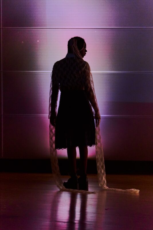
Maren Hassinger
Al: For instance, Gavin’s cool, precise distance is a wonderful foil to Marin Hassinger’s visceral, hands-on process with fear and love. Of all of the artists, Marin’s reductive work slyly confronts the frightening state of our planet, reflecting our warring obsessions and contradictions. The shift between the grounded, wrenching dance of sculptural despair of the twisted newspaper plays powerfully against the loaded ecological implications of the soaring hot pink triangulation of inflated intestinal plastic bags. I see it as stacked like some absurd house of cards in a defensive corner- a pared down oscillating duality of diverse implications and questions that on another hand, can be taken as a witty critique on the currant state of the art world. Regardless, her work grapples with the architecture of this great room in a way that I’ve never seen in her work before. She suspends the viewer between earth and air, and yet dances elegantly with Gavin’s work in the process.
Cara: I liked the way both Gavin’s and Hassinger’s installations confidently filled the front room, but, other than that, I did not see a commonality or conversation between the two pieces, aside from their obvious mastery of their medium. The vast differences which divide them, to me, was striking, and an interesting clue into the jurors’ thought process.
Cara: Hassinger’s message is entwined with the raw materials she chooses, seemingly harvested from the recycling bin. She deals with the emotion of love in her thirty-foot pyramid of pink plastic shopping bags that contain ‘love notes’ in each. Like an ancient pyramid, it towers mightily and functions as either a totem or an altar. Despite the goofy pink glow cast on the walls, there is a conflicting sense of wry cynicism working against a more idealistic vision. Duality also abounds in “Wrenching News,” the twisted stacks of bound newspapers arranged like gridded dreadlocks on the floor transform bad news into a meditative, repetitive, and healing process.

Dawn Gavin
Cara: Gavin’s two installations, by comparison are much more about formal, visual qualities, much less raw and emotive. “Annular” is a breathtaking arrangement of concentric entomological pins, each with a tiny, circular map fragments, that pulses and buzzes in a swarm, reinforced by the delicate shadow of each pin. This piece is a showstopper and has found its natural home, with ample breathing space on the BMA’s thirty-foot wall. Her second wall piece, “Subduction III,” has a different feel. The delicacy in the first piece is echoed in cut paper grids suspended over layers of matte and glossy cut paper shapes, but this piece has a slicker feel. The vinyl paper shapes adhered to the wall remind me of funky wallpaper or car stencils, and the element of color – rich, neutral grays – takes some of the emphasis off of the arrangement of shapes, the core of the first piece. I like that Gavin is trying two very different, equally ambitious pieces out here, even though I have a clear favorite of the two. It’s the artist’s chance to see her work in this space, so why not test out two different ideas?

Dawn Gavin
Jack: I don’t see a “formal vs. emotive” division between the two. Is a flat clean precision cut thin line more or less emotional than an edgy thick irregular one? Naw, it is all about context. Both artists create work that resonates as “formal” and “emotional” to me. By that I mean their work is materially integrated and humanistic. Their commonality is they are conceptualists first who use materials in very decisive visceral ways. Hassingers monumental corner wall of inflated pink bags (each with the word love encased inside) is as much about what happens when you walk away — the retinal green afterimage, the word stuck like a pop song hook in your head—as when you are staring right into it. Gavin’s expansive wall mapping, while appearing rendered in a slick flat graphic style, is in fact just as spectral, just as tumultuous and created of equally simple materials—pushpins, cut paper. The world of the map is full of deception parading around in the costume of bully science. This is why these works commune, ascend and operate in tandem. If we assigned them keywords, and why not, I would put “territory”, ““control”, “identity” “ veracity” “anxiety” and “war”. Also “pleasure”…but I am not sure why I add this one, maybe I need to talk to a therapist.

Dawn Gavin’s map fragments on pins
Jack: Speaking of therapists, I haven’t read any of the artists’ statements. I don’t trust them for some reason. I think artists tend to cover their tracks when they tangle in verbiage they are forced to write as explanation. Museum wall text also annoys me. It often feels like simplistic spin. This is a personal thing for me lately. So really, to be fair, I have to admit I have no idea what they think their work is about and don’t really care. To be more accurate I prefer my reaction to the work instead what they or any curator says they think their work is about. Is this narcissistic or practical? You decide.

Melissa Dickenson
Cara: I did read their artist statements, actually. For the most part, these were well written and enriched my experience with the work. The problem with artist statements, though, is when the artist’s stated aim seems disconnected from the reality of the work. I thought the shortest statements – Dickenson’s claim that her handmade paper’s “imperfections focus us on the organic… things we see less and less in the world today” and Springfield’s statement that she is “simultaneously showing reverence for groundbreaking ephemeral artists, while evincing a dryly humorous take on the uncertain legacy of Conceptual art” worked best, providing the viewer with an entrance into the work. Longer explanations, mounted on the walls next to the works, seemed less accurate and more of a distraction. For example, I found Becky Alprin’s musings on what a landscape is or might be not essential in appreciating her work. I don’t think they need to be understood as landscapes to be understood. Grace’s statement is poetic and matches his installation perfectly: “This collection of drawings, photographs, and objects represents something of my steady search … It is hoped that together they can conjure energies that might be valuable. They are assembled with that intention, bookended by symbols of reverence, vulnerability, and thirst.”
Jack: Nice assessment and reframes some people’s work for me. Also, confirms the nature of text vs. personal interpretation of the work. I understand the practice is a necessary and often interesting part of the overall experience. I still just prefer to stick to the experience for myself. Avoid the spin. At least here, for the purposes of this conversation.

Geoff Grace
Jack: After considering Marin Hassinger and Dawn Gavin, I want to talk about Geoff Grace and his expansive wall installation in the back gallery. His work bookends the work by the two previously mentioned artists. Not because it looks like theirs in any way but because it locks in the exhibition “narrative”. His mostly wall bound installation is lateral and cinematic. It too rides the rails of misty humanistic/political persuasion. It too rides the rails of misty humanistic/political persuasion. Grace has made it to the “final five” each of the three years the Sondheim Prize has been offered, so he must have very complicated connection to the process. I find his work this year to be far more compelling than in years past. Truth is I can’t remember clearly what he did before so that’s a problem for one of us. This years work, with its three wondrous wall-sized giraffes portrayed neck down in awkward sweet drinking mode is pitch perfect effective. (I can’t help but think of the creatures as self-portraits). The rest of Grace’s long wrap around wall is covered in a minutia of ephemera—one off camera obscura images, drawings, his large collection of found washers and other seemingly personal artifacts all placed irregular but with a balance one associates with Eastern art.

Geoff Grace
Jack: Oddly, the back area of this expansive gallery is empty: the exhibition’s one gaffe. Seems they decided to keep it so clean they loped off the last paragraph. Like a short story cut by famed chop minimalist editor Gorden Lish. But unlike what Lish does effectively to a short story by, say, Raymond Carver, here the blankness adds no mystery, leaves the viewer with no sense of what if—instead the show just feels truncated.
Al: It’s no longer truncated. I dashed over yesterday to take more photos, a second look and re-read the statements. The two prior winners, Laure Drogoul and Tony Shore are now powerfully showcased in the final room. The shift in the overall show is dramatic, and for me, both problematic and exactly the jolt of contrast and wrap-up this show needs.
Al: I too, had found the intermediate rooms largely problematic with the exception of Grace. On one hand I want to be fair to these young artists, yet on the other, what’s haunted me from the initial walk-through are the judge’s questionable curatorial decisions, which exemplify an international out of control obsession with the next new ‘thing’ based more often on youth and curatorial career-building tastes and theories than grappling with seasoned talent outside one’s agendas or fashions.

Geoff Grace
Al: While I agree that the show is at times technically impressive, such as Molly Springfield’s drawings of Xeroxed books, I wholly agree with Jack that it’s- ‘a new hip protestant church all ripe with restrained beatific content.’ Less is, at times, simply less development, less content and less risk taking.

Becky Alprin
Al: Of the artists in the show, I was most surprised by the inclusion of Becky Alprin’s slickly designed, attractive black and white plastic reliefs. Again, young and promising, but in this context? These works would look just fine in many galleries. But as the back corner of this year’s award show, closer inspection of content oscillating between plants and architecture evaporates into nothing specific, leaving me with an uneasy sense of the curatorial wisdom in including these highly decorative and very sellable, generic works. I attempted to project a certain apocalyptic desire for meaning into the architectural floor pieces, but found their three visual seconds as silicone coated as her glibly polished technique- shedding both identity and place with alacrity. It is this curatorial misunderstanding of generalities as somehow being universal in implication, that only years of working in the studio clarifies- at least in my experience as a teacher and artist. Are the three curators harboring a few latent interior designer motives?

Becky Alprin
Al: In contrast, Geoff Grace’s panorama of kneeling giraffes, found objects, photos and drawings scattered amid a spare galaxy of washers and circles is relaxed, warm, funny and poignant, with an invitation to pause and consider its myriad associations and metaphors. My second visit was more rewarding than the first, telling me that the work’s visual resonance needs time to unfold. As the artist says, giraffes kneel to drink, which also gives them a prayer-like stance. The small, but potent washers echo the universe, the oldest symbol known to humanity. The holes in them open into a dialogue with the spiritual, the unseen; the still, but potent silence that too often gets easily dismissed in today’s cynical pace. Clichés have power because they contain an indelible truth, which Lucy Lippard wrote so eloquently about. Does Grace’s work refresh this debate? I believe so.

Geoff Grace
Cara: Grace’s work definitely is a fresh and interesting highlight of the show. It’s an odd and layered collection of ephemera. On first glance, Grace’s depiction of three giraffes seems arbitrary – what is the significance of the giraffe to a photography teacher living in Baltimore? Luckily, the artist was there to explain. Giraffes are only vulnerable when they bend down to drink, he said, otherwise they are impossible for other animals and predators to attack. Upon closer inspection, the photos are a combination of personal, pinhole shots, casual snapshots, sketches of circles, and photograms from drawings. The discs on the walls are rusty washers and small metal pieces that the artist found on the ground and thought were beautiful. It’s a total hodgepodge and kind of a mess, with a Zen-like clarity and humility that comes from baring yourself, from soul searching. I know that this idea makes conceptual artists cringe, but Grace’s installation at the BMA is so personal and so loosely bound, that it becomes universal. Looking through someone else’s snapshots and doodles, even without knowing them, is the most intimate form of collaboration. I love the way this piece gently moves me, without attempting to convince me of anything.
Al: His work from last year included a long-handled shovel and glass of water. While they were witty for about three seconds, they quickly shed my engagement. So, this time around he’s clearly pole-vaulted to a new level, which leads to the idea that this dramatic shift promises much for the future. But back to the final room- the immediate issue this raises is the juxtaposition of two prior teams of curators that resulted in these two wonderfully gifted artists at the height of their power. The room is a one-two visual whammy of dramatic black velvet saturated with a complex dialogue between painting, violence, pathos, theatre, and wry wit that carries a wickedly clever, multi-layered punch. This is a distinctly different dimension of work from the current show.

Tony Shore
Al: Tony Shore’s black velvet paintings pack a classic wallop that is oil to conceptual art’s water. They are highly pleasurable presences to look at, even with his increasingly nuanced look into the ugly, horrific side of human nature. In turn, Laure Drogoul’s dramatic Frequencies for Darwin calls us to sing and perform for earthworms- throwing us back on our perspectives, yet also calling us with a tender, sly compassion I find exquisitely delightful. Best of all, it’s luridly erotic pink triangle framing the jar of earthworms between two dramatic black curtains cannily repeats Marin Hassinger’s inflated pink Love triangle in the front room. Then as one leaves the show, there is her dismembered, traumatized victim- Head of the Brave, hopefully singing away in a corner on the exit floor. It single handedly pokes at our war and politics, art history, cozies up to a tête-à-tête with Tony Ousler’s work, and hits a bull’s eye correspondence with Shore’s bludgeoning victims, like a silver bullet ricocheting off multi-dimensional walls.
Cara: I have yet to see the Drogul and Shore end of the show, so I can’t comment on that, except to say that it is an interesting twist – contrasting the last two year’s winners with this year’s contenders. This is something new that hasn’t been done before. I think Geoff Grace’s installation “it’s the linger, not the long” can hold its own against these two, without even competing. This installation has self-assurance and depth, a decidedly non-competitive attitude, and asks many questions of the viewer without answering a single one.

Melissa Dickenson
Cara: Melissa Dickenson’s cut paper pieces possess a similar sincerity and optimism to Grace’s. After a residency at the Awagami Papermaking Factory in Japan, Dickenson began making her own Awa-Washi paper by hand, and then painting on it, cutting it apart, and then stitching it back together. The paper has a presence of its own, stretched over wooded stretcher bars, it seems to be cloth or canvas, and then thin as a tissue in other places. Dickenson’s depictions of birds, flowers, and animals, in mostly sweet color combinations could verge on saccharine if they weren’t so honestly and lovingly crafted. Dickenson truly believes in the power and sanctity of animal and plant life, which is echoed in the rich imperfections and organic nature of the paper. I am guessing this artist spent her Sondheim exhibition allowance on framing, which was money well spent. The simple wood frames add a professional polish to each piece and reinforce their delicate and jewel-like aesthetic.

Melissa Dickenson
Cara: The searching innocence, vulnerability, and intimacy in both Grace’s installation and Dickenson’s collages stand in stark contrast with the controlled works by Becky Alprin and Molly Springfield. I have to say I am still slightly confused by the juror’s decisions in this group – there doesn’t seem to be any one discerning aesthetic or principle. After a closer examination of the back two rooms of work, the contrast between conceptual and cool versus intuitive and emotional couldn’t be more pointed. This rift in the contemporary art world, seen most recently in this year’s Whitney Biennale, tends to divide critics and artists into two opposing camps. Was this a tactical move, on the juror’s part, to include works on both sides of the fence? Is this a deliberate or unintentional contrast?
Jack: Cara, I think you are reading too much into the judges’ decisions. They probably just liked the artists work and the range of styles, age, etc. they represented. They will come and chat with them and then pick based on the artists input.
Jack: Meanwhile, I revisited the dang exhibition today and was knocked out.
Cara: It’s a really GOOD show! I need to go back again, too. I hope that, while we’re dissecting it, that readers do get a sense that all three of us feel that this is definitely a show worth seeing.

Molly Springfield
Jack: Oh yeah. Readers should understand we are just attempting to have a dialog/conversation by e-mail here. One that helps us all think about what we have seen. I for one don’t feel I am some expert telling y’all what is what. What is for sure always is these exhibitions are MORE than worth seeing. Folks should go and enjoy and decide for themselves. I want to affirm again the Sondheim Prize exhibition represents a very progressive move forward in Baltimore. The final night is wonderfully dramatic. I like how the whole town seems to turn out. They even dress up! I think it has become our Oscar night. We all feel like we have some ownership. The region and the hard working arts and culture scene deserve it and are thankful to the people who make it happen.

Laure Drogoul
Jack But I digress…Darsie’s sneaky addition of Laure Drogoul and Tony Shore in the back gallery polishes up the show real neat and tidy removing the one small criticism I had of the curatorial aspect. I agree with all of what Al said, this move heightens the other artist’s work and the sense of overall drama of the prize. Drogoul and Shore are artists who deal in the lexicon of the region more than any of the artists in the exhibition (Hassinger is close). Tony’s series of Baltimore based “beat down” paintings are as brutal and complicated depiction of the interconnected world of violence, masculine display, and issues of class in Baltimore as anything on the HBO’s acclaimed television series The Wire. Drogoul’s work has all the frightful dreamy neo-dada carnie aspects that we have come to expect of her. They are imbibed with coma-jolt of her trademark giddy depth. Quite Baltimore. The addition now also really highlights the question of who will join them in the winners circle and why.

Molly Springfield
Jack: I asked a few guards this question. Museum guards often have strong opinions and interesting insights. They sit with the work longer than anyone, including the curators. They see through the glitz, the one-liners, the zingers and tend to be interested in work that holds up to repeated viewing. All I spoke to agreed they liked Tony Shores work very much. They felt a strong affinity to it because of its overt Baltimore content and they admired his painting prowess. Regarding the current exhibition one picked Dawn Gavin for her ephemeral map pin work, another leaned towards Marin Hassinger’s installation, then a young quite serious guard spoke up stating he felt Molly Springfield was the most interesting, was a certainty for the prize. A slam-dunk. “You sure,” I questioned. He was sure, he said.
Jack: Huh? Really….hmmm, this is the third time this week someone said this to me. I looked closer and as the guard went on, I listened. I considered the fact he was onto something, was really seeing here. He told me he admired Springfield’s attention to detail, her merging of craft and odd content. When pressed he told me he found himself coming back to it — that it was full of mystery for him and he admired her mastery of detail. I noticed the triad of conceptual references. I conceded Springfield, the only DC artist in the show, may then indeed have a chance. She wasn’t there at the press showing after all…not around to point out her own regal giraffes to stir our emotions. I would like to talk to her, I thought.
Cara: Molly Springfield’s work comes off as incredibly brainy and clever, on one hand technically perfect, but, on the other hand, the overall effect looks like a common photocopied page. This can be intimidating at first- where should a viewer start? With the specifics of the texts chosen? With the obvious technical process of hand-drawn graphite? With the dainty white frames that suggest a cynical wit? They are, at once, so simple they are easy to overlook and, on the other hand, so complex that they need ample time and energy to understand. A sly sense of humor ties all of the works together, although visitors will need a degree in art history to get most of the jokes. Springfield’s meticulous, hand-rendered drawings of printed and historical texts are technically perfect and suggest a laborious and devoted process. I get a kick out of the contrast between their spunky attitudes and the dryness of the subject matter depicted, but I find myself wanting more from these. I would like there to be fewer problems solved and more questions asked and am very interested in seeing where Springfield’s work takes her in the future.

Molly Springfield
Jack: I am not sure that she has further to go. This work looks pretty complete to me. And let me be honest here. I now feel I had possibly overlooked her because I knew she is from DC and I harbor some weird turf idea about DC and feel our B-More kin should get the bucks. But more probably more likely is her work just seemed too pat and a bit boring to me. All these graphite on paper drawings that appear to be photographs or photocopies of books I found tiring. Concept heavy and execution lite. The frames bugged me. But I think I didn’t look close enough before. With the guard I got to see it through someone else’s eyes. There are odd glitches of text created running in different directions on purpose this guard points out. Layers upon layers of thought, concept, and creation, deconstruction. They are all presented in a flat calm manner. These come off as academically authoritative on all fronts (another probable reason why I avoided them previously) yet hold sway over many a casual “non-artist” viewer who is willing to pay them serious attention. I now also find them strangely poetic despite their smarty-pants veneer. They deny passion while immersing themselves in it. This may be the very basis of the Protestant American heart of art-ness. Something I, in fact, admire.
Jack: Overall, I agree with your assessment Cara that the work in the exhibition crosses a spectrum of styles but when I returned to view the show alone or in communion with the guards I felt it is not as not binary as you posit, but actually quite interconnected. It is all a bit restrained as we have mentioned. But what hit me this visit is how retro it all is, with its taste for the merits of quality and humanness. Consider here it is two thousand and eight and there isn’t any new media in here anywhere. That is odd. How did that happen? Is it because of the parameters of the guidelines? It was present in the past. And the photography is either simulated or one of a kind and all has a sense of nostalgia about it. Just a few years ago big bright hued digitally produced grand color photos had become the new painting. Where have they gone? On the art trend heap I suppose.

Molly Springfield
Jack: While there is a common thread of anxiety here, there is nothing frenetic, intensely scary, or even bombastic in the show, and there is very little irony. Gads! How can one be an artist and not blanket oneself in irony. Well, look around here buster; this is how you do it. The work is all immaculately hand crafted and maintains the artists’ personal voice across each body of work. Admirable, even when it isn’t my cup o’ tea.
Jack: Even the most post-mod (post-mod meaning “neo-hip” not “post-modern”) of the crew, Becky Alprin—a brand new MICA grad with a hot off the presses wet ink diploma who creates dense stark cut out fictitious 3-d futuristic cityscapes worthy of any bland vacant big city architecture design firm is all about personal vision and transcendent experience (in sort of Japanese influenced 70’s graphic way). Oddly, her works look better, vaster, more girrrly Matrix like in reproduction. Alprin’s work has an affinity to the recent work of Björk. Oddly her complimentary artist in the exhibition is the Dionysian force of the show, Melissa Dickenson, who trades in lush chopped color fields populated with delightful oddball images of lopsided birds. At times it is hard to take this work seriously. It could be seen as cute and sort of vacant. That is what makes me like it. These are works of good-humored sensualist with a focused vision. They are full of impish fun, odd nature and pop grace. Dickerson comes off as Feist to Alpirn’s Björk. So these two round out the show and fit the humanist/well-crafty motif I see throughout.
Al: I’ll stick to my old curmudgeon guns, Jack. Fun and charming, certainly, but is this general kind of work functioning well in the context of the BMA? What, in the view of the judges separates these people from so many other equally competent artists in our region? What are we left with? Especially without such new media, irony, polarized issues, identity, places or passion, etc?

Becky Alprin
Al: Naturally, we’re all subjective in regards to aesthetics and ideas, such as if craft alone is enough to warrant something as significant as the Sondheim. (Perhaps we should consider comparing the runners up exhibition, for the sake of a broader understanding of the judge’s decisions?) But what lingers now most in my mind is the overwhelming context of our times and how, with the exception of Hassinger’s work, it’s largely missing from this group’s insulated concepts. (I admit to wanting to be knocked off my feet.) Yes, Springfield’s and Gavin’s have many appealing aspects, even a residual mystery. Their work ethic is highly commendable and their careers are clearly moving forward. But is it enough, here and now?

Molly Springfield
Jack: Fair enough. Why these artists were chosen will remain a mystery known only to the judges, that’s how the process works and why it is interesting for us to ponder. I think we all agree that while it may be a conservative exhibition when compared to the broader art scene in general (especially when regarding art created in a post-millennium world with its current harrowing sense of existential tailspin) it remains an excellent one. And while Springfield was elevated for me by someone else’s input (someone who I felt it was important to give serious voice), and each of the artist’s have strong merits, strong enough to put forth the argument that they deserve the prize, it is Marin Hassinger’s work that resonates strongest. She addresses personal and social issues in the most profound ways. I have long felt she is a national treasure and deserves more attention than she gets. Also, her work holds up alongside former winners Shore and Drogoul.

Close up view of Hassinger’s ‘Love Notes’
Cara: The Sondheim Prize’s hefty $25,000 price tag is a great opportunity for all artists living in the Baltimore area. These six have proven to all be competitive contenders and I have to say that, based on the work that I saw at the BMA, I have no clear answer as to who the winner will be. If the past bears any pattern, the two preceding winners, Laure Drogoul and Tony Shore, suggest that an artist’s career and contributions to the community outside their studio matter just as much as the work they present in the show. If that is the case, I will put my money on Hassinger. However, you never can predict what this years jurors are thinking, especially based on the rather large differences between these six contenders. Hopefully this show will encourage Baltimore’s artists to apply for next year’s Sondheim Prize – if anything, this year’s group proves that any artist who takes themselves seriously and is willing to do the work has a shot at this.