 I went to the New Museum prepared to hate this show. I expected it to be all bluster and cleverness, lacking a heart or conscience. I had read an Urs Fischer profile in the New Yorker a few months ago, and was completely unimpressed with the idea of an artist grabbing up fistfulls of clay, squishing it around for a second or two, and then casting these turds into giant aluminum sculptures. What is the point? It just seemed like an exercise in shameless art world ego.
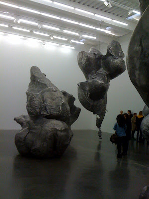 This was the entry point of the exhibit for me and I was startled by the effective application of one simple rule: SIZE makes a DIFFERENCE. I had imagined these clay blobs as a few feet tall, maybe human-scale, and was unprepared for their sheer immensity. They towered over us, like fat cartoon walruses or bulbous whales, threatening and comical at the same time. These sculptures are preposterous and extravagant, quite delightful really, and their power was all because of a shift in scale. Every once in a while you’d see a bit the artist’s finger print, larger than your face, while the visible seams in the metal alluded to the industrial casting process.
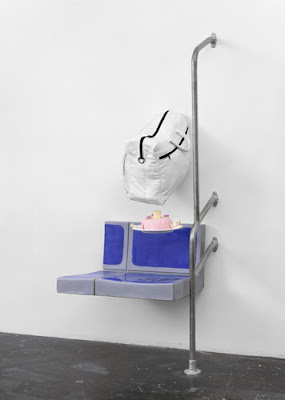
 The other piece I almost missed in this first gallery is titled ‘The Lock’ (pictured below). On first impression, it looks like a lumpy Claes Oldenburg fragment. So what? Made of cast polyurethane, steel pipes, and electromagnets, this sculpture appears to be part of a public bus with a round pink cake levitating in the air over the seat and a white gym bag attached to the wall.
 Spoiler Alert: Finally, we figured it out, after reading the wall plaques, which looked strange, too. The entire room was a site specific trompe l’oeil environment. Fischer had photographed every square inch of the walls, then reprinted these as wallpaper, which then covered the same walls and ceiling. In the photo below you can see it – the actual exit sign over top of the photographed one, the actual round air vent over the photographed one. Every wall plaque, fire alarm, and molding were all there, twice but overlapping, creating a disjointed and subtle image of the architecture itself.
 Last, we ventured down to the second floor, for the installation called Service à la française (2009) – which, according to the New Museum is “Fischer’s most ambitious work to date— a technical tour de force that required more than 25,000 photographs and over twelve tons of steel.”
 More than fifty chrome boxes occupy the gallery, creating a maze of mirrored cubes, each with a 3-D depiction of a random object. The artist silkscreened the images onto the mirrors, some actual sized and others larger than life, and the effect is dizzying, yet friendly at the same time.
 These boxes are banal and cheeky, odd and mysterious. As you gaze around the room, your eyes put it all together like a collage. You can’t really focus on any one thing, but the overall experience is an optical puzzle and feels nice on the eyes. The museum describes it as “simultaneously immaterial and hyperreal,” which is, actually, a fair assessment.

I wasn’t sure if I wanted to shell out the twelve bucks to see this awkward and eccentric maze of oddities, but in the end, I am glad that I did.
