In 1966, Robert Morris’ “Notes on Sculpture” was published in Artforum Magazine. The text attempted to establish a specific contrast between the visual languages of painting versus sculpture, positioning each as either iconographic or iconologic. Researching the two terms, their definitions are very closely related. In the context of the essay, they are defined, respectively, as beholden to an outside, established knowledge base or defined by more immediate experience, in the moment.
The same year, the Rolling Stones released the single “Paint It Black,” a volley of nihilist philosophy into contemporary popular culture, setting the ball rolling into the musical future of punk, metal, and goth. The lyrics of the song are dominated with poetic and symbolic obliterations of acceptable, optimistic symbols like pretty girls, flowers, love and sunlight. The words describe a dramatic rejection of dominant ‘acceptable’ society by youth culture. Similarly, Morris’ essay rejected the dominant language of painting which had been imposed onto sculpture. The combination of these references informs the borrowed name of the recent group exhibition at Guest Spot at the Reinstitute, illustrating the literal negation of the song, but delivering a more complex interpretation including the messages of both of Jagger/Richards and Morris. The exhibition includes minimalist-inspired sculpture, video art, fiber art, editioned paintings, print series and art publications, and off-site installations.
Terence Hannum’s works all use magnetic audio tape as art media. This an obsolete technology. As such, the deliberate choice of this material reads as symbolic, chosen for its history as much as the way it looks and functions. Audio tape is ferrous powder bonded to narrow strips of plastic film; audio tape records sounds through the rearrangement of the iron particles into patterns by an electro-magnetic head, which also decodes those patterns back into audio. This encoding, the rearrangement of particles, is invisible to the eye. With a CDR or DVR, one can see a different pattern in how the surface of the disc reflects light. There, the unwritten portion looks different from the encoded. The tape is uniformly grey/brown and shiny. Magnetic tape is similar to a traditional hard drive; the magnetic encoding is the same. And with each, the recording of information and change to the material does not leave a visible mark or pattern.
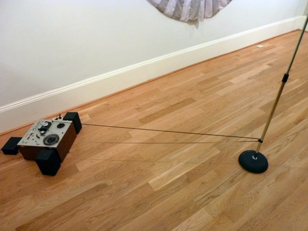
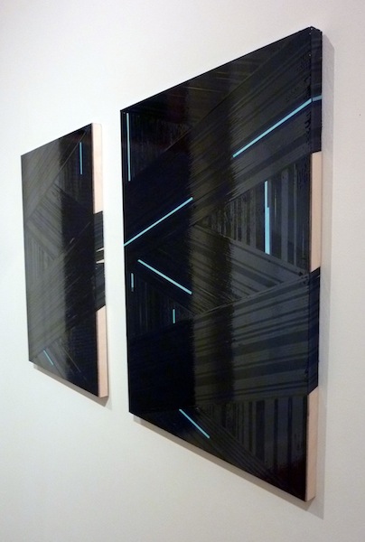
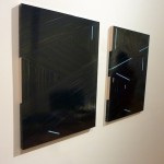
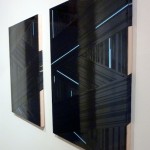
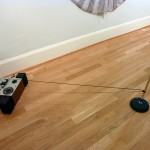
In Hannum’s diptych “Dolby I (091213)” and “Dolby II (091213),” 1/8 inch cassette tape is attached to panels to create fields of iridescent geometry through the repetition of the (just over 1/8 inch) metal-coated strips and the occasional pastel-colored tape ‘leader’ tail. The “Dolby” titles refer to the sound-enhancement technology first introduced in 1966 to reduce extraneous noise in analog (tape) sound reproduction. “Hystersis,” Hannum’s second piece in the show is listed as an audio piece, but appears to be a sculpture. Here, a length of ¼ inch audiotape is fed through a 1970’s vintage reel-to-reel tape player/recorder in a loop. The tape is fed through the head by standard 6-inch spindles, but beyond, its path is extended across the floor roughly 4 feet to pass around a microphone stand, transforming the composition of the tape path from a compressed 12 inch space to a 4-foot drawing composition-as-sculpture. The sound of the loop is a low, repetitive, scratchy murmur; far less captivating than the physicality of the antiquated technology.
In each of Hannum’s pieces, the function of the electronic materials dominate their image, composition, and formal appeal. In the scope of the exhibition, it works together seamlessly. His collages are black without being black, echoing late-60’s Minimalist design while also re-purposing the archaic cutting-edge technology from the same era. In our age of home-computer multi-track recording and Iphone app-layered sound loops, the sound component of “Hystersis” recalls both the quiet monotony of John Cage compositions as well as vintage Beatles. These pieces elevate and depend on understanding the past of art and technology – as the void created by our rapidly recycled culture have also reduced these materials to nostalgic references.
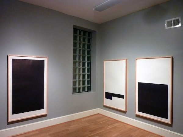
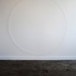
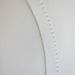
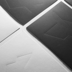
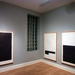
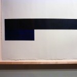
In the gallery’s back room, Vincent Como’s large ballpoint pen drawings are subtle and striking. The compositions contrast simple, dominating blacked-out rectilinear shapes against the cold-press texture of raw paper fields. The long, poster-like framed sheets of deckle-edged printmaking paper read like prints, but upon closer observation are a clever fake-out. Anyone who has ever scrawled and blacked-out drawings on a pad of paper or cardboard notebook cover knows two things about ball-point pens: the gooey black ink has a warm, purple cast, and it’s nearly impossible to get a deep black without the tip of the pen incising texture into the paper. These drawings are deep and inky, but with a satiny sheen that sits on the surface of the paper. The edges of the dark shapes are just barely fuzzy with a purplish halo from pen marks. A fine-weave of vertical and horizontal grain appears both in the mark of the pen and surface of the paper, suggesting that the dark fields were treated with a painted ground before the pen-work was built-up. Further, there are small color shifts that appear at edges of the darkness as regular stripes and cubes, with primary colors beneath an obscuring layer of black. These drawings reject narrative and embrace the material and process-based pleasures at the core of Minimalism.
 Vincent Como
 Ryan Compton
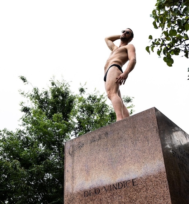
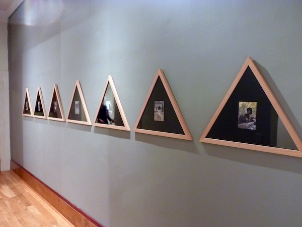
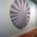
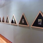
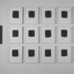
Unlike Como’s sculptures, also included in “Paint It Black,” his drawing rely on the formal and philosophical underpinnings of Minimalism. However, other artists in this exhibit use the visual language of Minimalism as an art historical symbol. Imagine, for a moment, a desktop shortcut icon for Minimalism. Ryan Compton’s seven photo-collages rely on the audience’s understanding of that visual language. His stark geometric shapes function as art historical avatars or call-backs to Russian Constructivism, visual precedents to 1960’s Minimalism. His shapes are generic, but not uninteresting. The blocky symbols are most effectively shown in his series of 10 altered photos, titled as a series, “NMM-01,” “NMM-02,” etc. Each displays a color photograph, approximately 4 x 6 inches of a classical monument, as found in public parks. Portions of each glossy image are overlaid by a cut flat black paper geometric decal, obscuring major portions of the monument. The photos are each individually presented on a matte black background and uniformly mounted into custom triangular wood-grain frames.
Compton’s monuments represent history long past and archaic. The clean formalism of the decals block out significant portions of the sculptures, obscuring both the classical figures and their foundations. This block-out of the figures can be interpreted as the modern overtaking the classical. But they also function as icons for more the more recent, but just as historicized, new classicism of modernism. If each of those subjects moves through specific points in time – contemporary photos of neo-classical sculpture layered with early- or late-modernist forms – the triangular framing points the work towards spiritual symbolism. The triangle is a primary symbol, recurring throughout major religious and occult iconography alike. Each of these framed photo-collages functions as a sigil for worshiping art history. Where blocking out the classical forms could read as negation of value, the blacked-out overlays both reinforce their importance in art history while equalizing their value.
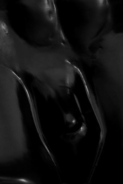
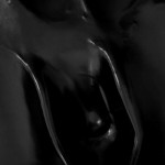
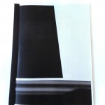
Michael Sirianni’s portrait-sized photograph “Untitled (for Forrest Bess)” is beautifully confusing. The image is very dark but organic. It is best described as a smooth, blackened surface, with muted lighting, and smooth fleshy forms. The texture is similar to the polished leather of the interior of an automobile, shapes abstract, organic and sexual; like a close-up of a leather handbag designed by futurist sci-fi illustrator H.R. Geiger.
 Michael Sirianni
Understanding of the Sirianni’s image is further obscured by its presentation; a mirror-like finish on the clear acrylic the photo print is mounted behind creates reflections, which interfere with reading it. The title of the piece both complicates and simplifies how to consider it. Without the tribute, the image is enigmatic, but its eroticism apparent. Understanding the history of outsider artist Bess, the mystery of the image is clarified, but at its expense. This isn’t a tribute to the paintings of Bess, but to recent exhibitions and writing which have positioned the late artist as an icon of transgender culture. Beyond its literal painted blackness, the gendered and sexual ambiguity of the image implies a void of acceptance and place in both personal and greater social terms.
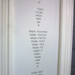
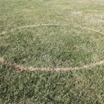
The theme of “Paint It Black” appears to be as much about the void between spaces and physical states as it is about literal interpretations of the chromatic meaning and symbolic language of the title. The idea of the missing or missed is represented cannily by Adam Farcus, quite literally in his cut-vinyl wall-mounted text piece “Abracadabra.” Unlike his other works, which were are placed in hidden spots throughout the exhibition, “Abracadabra,” is installed in the narrow space between two windows overlooking the street at the front of the gallery. It consists of a poetic word-association game in which words are deconstructed by graphic transitions. In it, words are stacked and repeated, with each consecutive repeat removing the last letter. For example, the word “Whisky” degrades through “Whisk – Whis – Whi – Wh – W.” The other words used in the series letterforms are “Hometown-Dirt,” “Hawk-Feather,” “Sunlight” and “Epsom-Salt.” The graphic result is a series of down-pointing triangles of text which read as arrowheads.
With each removal of a letter, the words lose meaning, becoming repetitive symbols while the larger composition implies a downward movement. In their complete form, the origin words don’t form a sentence, but suggest a collected narrative. The piece transforms words from linguistic symbols into graphic ones, without gaining or losing much meaning in the process – they essentially cancel each other out. The meaning of the piece is ambiguous, as is its aesthetic presence. This is consistent with Farcus’ other works included in the show.
 Adam Farcus
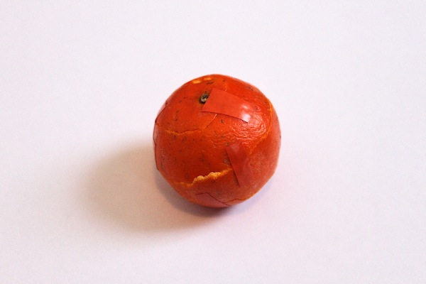
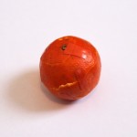
Throughout the exhibition, Farcus’ other works are cramped into increasingly obscure spaces. “Cutie” is a Clementine orange peel re-composed into its original form and installed on an IKEA-style bookshelf unit in the rear of the gallery space. It’s left there as casually as a visitor might leave an empty beer can. The materials remind one of Zoe Leonard’s re-constructed stitched fruit rinds. But where Leonard’s sculptures emphasize the human-like qualities of the rinds in how the desiccating fruit skins are mechanically re-constructed, the few adhesive-taped bonds that hold “Cutie” together look nearly un-altered. From a distance, not only is “Cutie” forgettable, even upon closer observation, it’s uninteresting. It seems like the artist is working hard to transform mundane refuse and re-constitute it into a symbol, which holds weight. Unfortunately, that symbol only works if the audience understands its historical reference.
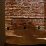
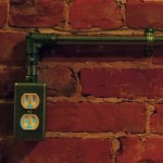
Nearby, Farcus’ “Conduit” is similarly hidden-in-plain-sight, installed on the raw brick of a gallery hallway. It’s a dummy piece of aluminum electrical casing terminating in a standard 110 volt electrical outlet box as if it’s simply a part of the building. Closer inspection of the piece requires either crawling hands-and-knees in the narrow corridor, or backing down an adjacent set of stairs leading to a dark basement. Either point of view reveals a blue light glowing through the holes of the electrical socket. This blue light in particular reads as a symbol. The glow, and the space it emanates from is electronic. It is a low-voltage LED light activating a lower-tech light socket. Additionally, Farcus’ work seems consistently interested in activating incidental or forgotten spaces with clever, occasionally magical moments. They ask viewers to reconsider the differences between empty and ignored.
 Jen Schwarting
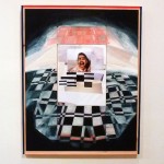
The title of Jen Schwarting’s collage, “Image Search (Drunk Girls) #9” implies that the central photograph, of a young woman apparently wrapped in a checkered blanket on a couch, awkward lurching towards the camera, was found via the Internet. The inkjet printed image is collaged with other print cuttings, to extend the blanket’s pattern into a much larger painted field, where this pattern is further expanded into an abstracted checkerboard environment. Towards the edges of the painting, the values become dark, so the central figure appears spot-lit. The girl’s face has been sharpie-markered with thick eyebrows, a goatee’ and big googley eyes over her lids. The implication is that she’s blacked-out drunk and turned ugly by the cruelty of other party goers. While the painted portion of the piece is beautiful and warm, if fractured, it does evoke the feeling of the fitful rest of alcohol-induced sleep.
“Paint It Black” is an ambitious collection of artwork and ideas; the type of heady presentation one can count on from Guest Spot. While these qualities always impress, in this case the reach of the show can occasionally be confusing. When not plainly apparent (literally BLACK), it takes considerable digging to grasp what binds that work to the rest. There’s a lot to appreciate here, but a little bit of editing would curb the frustration that sets in trying to decode and understand why all these works are gathered together. On one hand this is refreshing – it’s not obvious, and the gallery is not pandering to an audience with wall text and an over-written curatorial statement. On the other, considering the audience just a shade more would soften what can occasionally be a self-consciously opaque gallery experience.
-
- Adam Farcus “Abracadabra”
-
- Adam Farcus “Abracadabra
-
- Adam Farcus “Boil Order”
-
- Adam Farcus “Cutie”
-
- Adam Farcus “Conduit”
-
- detail Adam Farcus “Conduit”
-
- Adam Farcus “White Hex”
-
- Adam Farcus “White Hex” detail
-
- Jason Lazarus “Abandoned”
-
- Jen Schwarting “Construction #4”
-
- Jen Schwarling “Image Search (Drunk Girls) #9”
-
- Michael Siriani “For Forrest Bess”
-
- Ryan Compton “NMM Series”
-
- Ryan Compton “Pennant Banner”
-
- Ryan Compton “Project 2”
-
- Ryan Compton “Project 6”
-
- Terrence Hannum “Dolby I” and “Dolby II”
-
- errence Hannum “Dolby I” and “Dolby II”
-
- Terrence Hannum “Hysteresis”
-
- Vincent Como “Hymns In The Night”
-
- Vincent Como “The Temptation to Exist”
-
- Vincent Como “Untitled 1999”
-
- Vincent Como “Untitled 1999 B” detail
-
- Vincent Como detail from “Untitled 1999”
Paint it Black at Guest Spot @ The Reinstitute will be up through January 4, 2014. There will be a closing reception for “Paint It Black” January 4, from 2-4pm.
The exhibit features Vincent Como, Ryan R. Compton, Adam Farcus, Terence Hannum, Jason Lazarus, Jen Schwarting, Michael Sirianni.
Guest Spot @ The Reinstitute is located at 1715 N Calvert St, Baltimore, MD 21202. Viewing hours are customarily Wednesdays from 5-7pm and Saturdays 1-5pm but holiday hours may vary. For more information, call (718) 541-9672 or email the gallery at [email protected].
*Author Ian MacLean Davis is a Baltimore-based artist and instructor.