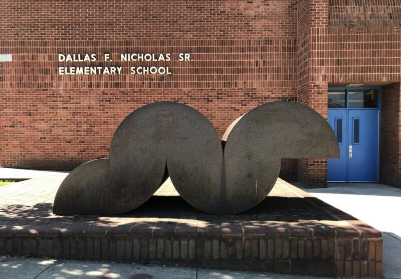
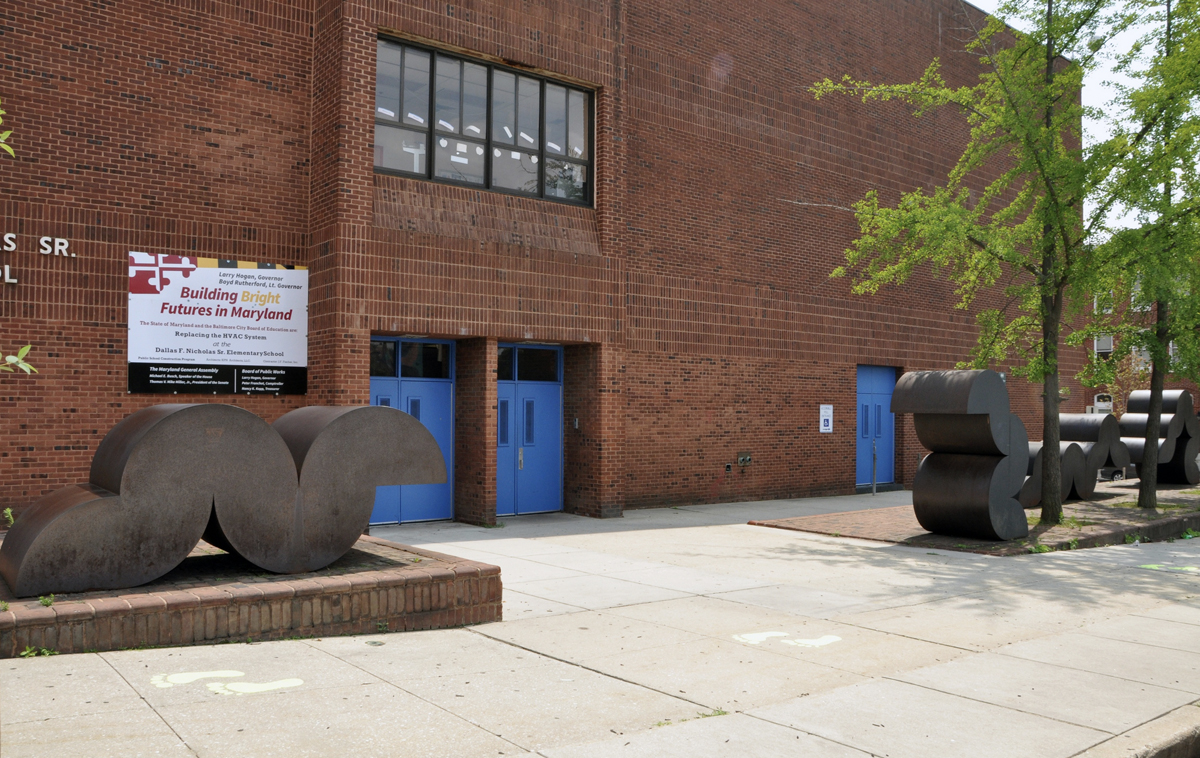
It’s midday, and all is quiet in front of the bright blue front doors of Dallas F. Nicholas Sr. Elementary School on East 21st Street at the corner of North Calvert. But before the 7:45AM opening bell and after the 2:25PM closing bell on Monday through Friday, students, faculty, and staff bustle in and out of those doors, passing alongside and between four metal sculptural forms. Ranging from approximately four feet to eight feet high, one on the left side of the path to the doors and three on the right, each form is made of sheets of metal with curvilinear and straight edges welded together. This ensemble of four sculptures creates a little landscape of abstract shapes.
I happen to know the title of this tableau: “Caterpillar.” So it takes only a moment for me to unsee “just” an abstract scenario and see how the group of four sculptures were, in the artist’s eye, meant to resemble the caterpillar genus of wormlike creatures with sometimes fuzzy, but always segmented bodies and multiple pairs of legs that allow the organisms to go from lying flat to arching their backs, undulating, and flattening again, to move their way through the world. A voracious eater, the cylindrical critter munches leaves, leaving behind patterns of holes (making gardeners crazy but also making for dazzling light shows on the ground when the sun shines through them).
The caterpillar carries on this way for about two weeks before turning into a chrysalis from which, in another two weeks, a butterfly emerges. Here, before us at the school, are stripped-down, geometricized versions of four individual caterpillars, poised at different moments in their movements—stretching upward toward the sky, looking ahead, or reaching toward the ground, as if scouting for fallen leaves on the brick foundation that holds the forms in place.
A unique characteristic and benefit of public art, after all, is that it’s extremely rare to see a 'don’t touch' sign.Kathy O'Dell
For the kids, teachers, staff, neighbors, and visitors walking by the school, however, there’s no signage providing a title-inspired prompt for imaginations to start churning. Nor is there any clue to the artist’s name or date of the work: Norman Kenneth Carlberg, 1976. This seemingly peculiar lack of data will soon be rectified (more on this later in the column). I say “seemingly,” because the vast majority of public artworks in Baltimore City bear no signage. To be honest, I have mixed feelings about this absenteeism.
On the one hand, as an art historian, I crave data points like a caterpillar craves leaves. Besides, museum exhibition practices have included labels for centuries, so why shouldn’t public art be held to the same standards? On the other hand, as a person walking down the street, encountering what appears to be a public work of art, and it has no label, I’m sometimes more inclined to engage with it in ways I might not otherwise. I feel a bit more challenged to create stories about the piece in my own mind’s eye, both as I stand there musing and as I amble on, merrily embellishing the stories as I go. Then, later, if so inclined, I’ll do some digging and pull data threads into a more expanded story, which will be more fact-based, but still garnished with my personalized imaginative nuances.
In my first BmoreArt public art column, which focused on the memorial to José Martí at North Broadway and East Fayette Streets, I argued how that piece “serves as a kind of table of contents for how we might look at public art—because the first level of stories is overt, appearing right there on the surfaces of the four sides of the base holding up Martí’s bust. Not that abstract works, with their curved, geometric, colorful, mixed media features don’t offer this first level of storytelling surfaces; it’s just a different type of information.”
So, what is this different type of information when it comes to abstract public art? The first level, for most of us viewers, will probably still be visual. As with figurative work, if shapes are discerned, they may supply relational information: “What I’m seeing looks like a person. I’m a person. I have lots of ideas about what a person is and does.” Or: “What I’m seeing looks like a horse. I’ve seen horses before and know a bit about what they can do.” And on and on. But with abstract work, though the visual experience might go down a “looks-like” lane (in the case of “Caterpillar,” even those who don’t know its title might think: “looks like caterpillars”), it’s less likely for abstraction’s lines, curves, and geometric shapes to evoke any recognizable look-alike. Instead, concepts, feelings, memories, and sensations can start to emerge, perhaps sprouting from the visuals, but more likely from going down a different experiential lane.
One of those lanes may be tactile. Abstract public artworks’ “first level of storytelling surfaces,” then, can exist at the literal surface of the works, where human hands and fingertips make contact with that surface. A unique characteristic and benefit of public art, after all, is that it’s extremely rare to see a “don’t touch” sign.
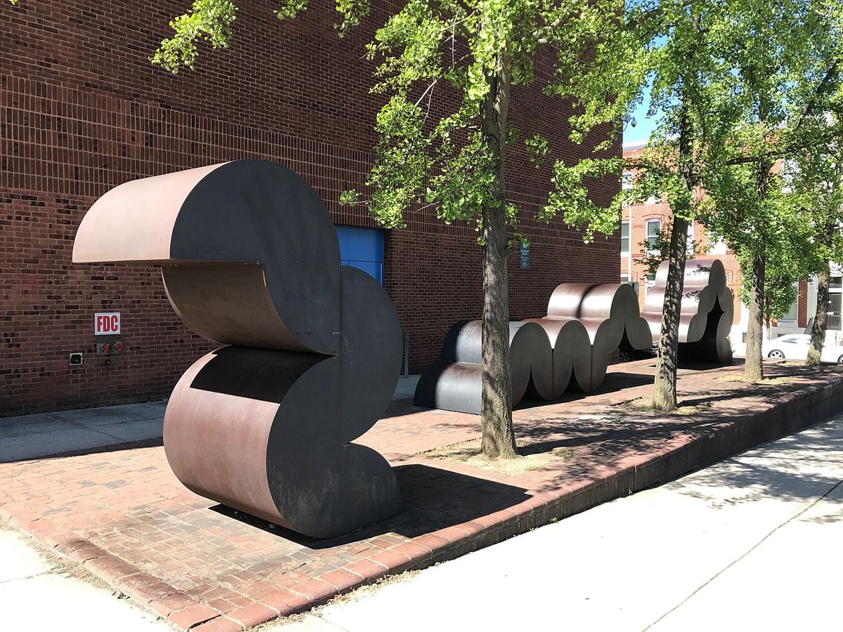
And that’s where my personal journey with “Caterpillar” began as I tried hard to unsee its title. I’ve been a sucker for COR-TEN steel, which Carlberg used for this piece, since learning about it in graduate school as one of sculptor Richard Serra’s primary materials (COR stands for corrosion resistance, TEN stands for tensile strength).
The moment I encountered my first Serra piece constructed with COR-TEN—a mix of steel alloys, made to preclude the need for paint, that takes on a pleasing, increasingly rusty look over the years from exposure to the elements—I had to touch it. My exposure to Serra was aided by the fact that one of my professors, Rosalind Krauss, had written the catalogue for the sculptor’s 1986 exhibition at the Museum of Modern Art in New York. But beyond the wondrous theories she wove about the artist’s work, it was the feel of the surfaces of Serra’s titanic sculptures that got under my skin, literally and figuratively speaking (“figuratively” used here for one of its other meanings, which is …. OK, you get it).
That gritty surface, with its inexplicable warmth, even during the winter (it seemed), gave me the sensation that some of the grit stayed on the palm of my hand and my fingertips. Curiously, though, I would see nothing there as I peered at my hand after removing it from the artwork’s surface. It was as if the grit had disappeared, having seeped into and down through my hand’s and fingers’ epidermal layers to my innermost organisms, where it was providing some weird kind of nourishment. The other “feeling” I got from the grandiosity of Serra’s huge slabs of COR-TEN was the illusion of being sheltered and safe from anything outside the slabs around which I moved.
Obviously, other viewers of Serra’s works report different responses, including being rankled by their grandiosity and its evocation of an authoritative message of power. Of course, there was the tragic accident in 1971, in which a worker was killed during the deinstallation of a Serra piece. Though it was determined that responsibility lay with the facilitator and rigging crew, many still blamed Serra—in part, it’s been argued, because of his innately rankling personality. Hundreds if not billions of additional interpretations fall between the latter and mine. A bit of magical thinking at work in my interpretation? Sure. But the experience was all mine and had me hooked on Serra and COR-TEN steel.
With all due respect to Serra, who died last month at age 85, he was not the first sculptor to work with COR-TEN steel. That claim goes to Beverly Pepper, who started using the material at least a half decade before Serra, having been asked by US Steel in 1964 to experiment with the amalgam at its factory in Pennsylvania. The experiment led to a bounty of abstract works that Pepper kept making right up to the year before her death at age 97 in 2020.
While Pepper and Stella and other internationally well-known artists like Barnett Newman and Donald Judd used the material with a focus on abstraction (and the majority of COR-TEN works in the world are abstract), other artists, like Blackbear Bosin (1921-1980), used it for figurative pieces. The Kiowa-Comanche artist, who should be known internationally, began work in 1968 on “Keeper of the Plains,” a 44-foot-tall figure with arched back, its head-dressed countenance and fringe-jacketed arms reaching reverently upward toward the sky, around the time Serra had only begun thinking about COR-TEN. Bosin’s sculpture was unveiled in 1974 on sacred ground at the confluence of the Big and Little Arkansas Rivers in Wichita, Kansas.

Norman Carlberg started working with COR-TEN steel in the 1970s, sometime during his 35-year tenure at the Rinehart School of Sculpture, Maryland Institute College of Art, which he directed from 1961 to 1996 (he died in 2018 at age 90). His leaning toward abstraction had already taken root during his student years at Yale University, where he studied with Josef Albers, one of the artists at the Bauhaus who’d emigrated to the United States after the Nazis closed the legendary German art school. But it was Carlberg’s fellow student at Yale, Irwin Hauer, who introduced Carlberg to using and repeating structural modules, an approach the two artists developed into a practice called “modular constructivism.”
For me, having learned about this method, then scrutinizing Caterpillar for a few minutes, it became crystal clear how each of the sculptures was “constructed” from “modules,” and that the repetition of identical quarter-circle units was sending a cognitive signal that the forms were on the move. Despite this message, the artist himself went on record in a 1996 interview that he “felt a part of a group that [was devoted to] a kind of formal, critical thinking and was not very much at ease with thinking of art in other terms; you analyzed, you looked at something, but you looked at it formally just for what it was and the message was almost always out of it.”
Is it possible, then, that Carlberg couldn’t have cared less if viewers saw caterpillars? Could it be, given his aversion to messages, that Baltimore’s Percent for Art program, which funded the piece, urged Carlberg to give it a title? Whatever the answers, I have to wonder if he wasn’t drawn to the title because, first of all, the perceived movement of the modules really does evoke that of caterpillars. But second, he had a child at the time. Might he have been reading his son the children’s book by Eric Carle, The Very Hungry Caterpillar, published in 1969? The book was spectacularly popular, having already won seven awards and citations by the time Carlberg was installing his work seven years later, in 1976. Alas, the answer is no. Cindy Kelly, whom I referred to as the grande dame of Baltimore’s history of public art in my first column, reached out to Kenneth Carlberg, Norman’s son, who stated that he did not have the book in his childhood collection.
What I like about my speculation, though, is that Carle’s book generates a highly tactile experience, its pages calling for children to poke their fingers through actual holes punched through the pages, the holes representing the very hungry caterpillar’s eating-as-it-goes path through various, colorful food items familiar to kids, as well as through, inevitably, green leaves. I’d like to think both Carle and Carlberg wanted their viewers to have a tactile experience with their work, using albeit different strategies. On a practical level, I would argue that the book would make a great addition to the school’s curriculum—if the title of the sculpture were known, that is. More on this lack of data in a moment, as promised earlier.
We adults will learn a great deal from the students as they unleash their much-more-story-imbued imaginations. As an art history teacher, I’ve always noticed how kids 'get' abstraction much more readily than we grownups.Kathy O'Dell
First, a little historical background on Baltimore’s Percent for Art program: Originally passed in 1964, the program now “requires that at least 1% of all eligible funds for a [Baltimore City] construction project shall be allocated for artwork for that specific project or another public art use as determined by the Public Art Ordinance.” Only the second such initiative in the country (Philadelphia launched the first), it intersected historically with a surge in the need for new schools in Baltimore in the 1960s and 1970s.
Without the persistence of an advocacy committee, however, headed by artist and educator Joan Cohen, the Percent for Art program might not have been as robust at school sites as it turned out to be. The surge for new schools tapered off by the late 1970s as residents left the City, the overall population dropping by almost 120,000 in that decade, including a decline of some 27,000 students between 1972 and 1976, according to an article by Eli Pousson, with contributions from Ryan Patterson, both public art administrators/ scholars. Even with this falloff and the accompanying falloff of public artworks, the number of the latter sited in schools is well over 120. But today, exactly 60 years after the Percent for Art program was launched, many of these works are in dire need of repair. Thankfully, funding from programs like Maryland State Arts Council’s (MSAC’s) Public Art Across Maryland (PAAM) Conservation Grants, which started in 2021, is available to help address this need.
And thankfully, Carlberg’s “Caterpillar” is the recent recipient of one of these grants. Written by Cindy Kelly and local artists Linda DePalma and Mary Ann Mears, together known as Friends of Public Art, or FOPA, with Jubilee Baltimore serving as lead applicant (Jubilee is a non-profit, and FOPA is not), the grant provides $30,000 toward conservation. Other funding sources have provided $14,000 to complete the extensive conservation, which includes welding of corroded closures between units, installing flashing for water falloff, adding protective coating, etc. And here’s good news relevant to this column: The MSAC grant will also cover signage! Carlberg’s name, title of the work, and date will appear on a plaque outside the building, an educational panel will be installed in the school lobby, and a video about Carlberg will be posted on the school’s website and linked via QR code to the educational panel. FOPA’s been busy with other similar projects at city schools (stay tuned for future columns about those).
At last, information about this marvelous looking, gritty feeling, currently anonymous piece in front of Dallas F. Nicholas Sr. Elementary School will be available within the coming year to faculty, staff, students, families, and neighbors, to say nothing of visitors and tourists. The multitude of data points will no doubt get worked into curriculum, where they can only enhance and be enhanced by whatever story-finding and story-telling the students produce on their own. We adults will learn a great deal from the students as they unleash their much-more-story-imbued imaginations. As an art history teacher, I’ve always noticed how kids “get” abstraction much more readily than we grownups.
A scary example of adult resistance to abstraction comes from an anonymous anecdote passed along to me as I conducted research for this column: A former administrator at Dallas F. Nicholas Sr. Elementary School, who wasn’t a fan of the piece, was overheard saying they wanted to get rid of the work. The person overhearing the comment was a college art student intern, who remarked to the administrator that she was pretty sure the work was a bona fide fine art piece and, as such, should be preserved.
The administrator asked her to gather details, and she came back with the artist’s name, artwork’s title, date, and more. The administrator’s response: “Oh, they’re caterpillars! So, as part of your internship, can you paint them to look like caterpillars?” Thankfully, she declined. And now signage is on its way to avert such near misses in the future.
Introducing a new, regular addition to “The Public Art Chronicles”: A quick lookout alert for public art projects, which have just popped up or are in progress, that you’ll absolutely want to know about, if you don’t already.
Lookout Alert
Take a few extra minutes the next time you’re traveling along Pratt Street to check out ten electrical boxes along the way that were recently vinyl-wrapped with artwork. Some are history-based, some burst with color, some celebrate Baltimore, some are provocative. All are impressive. Send an air kiss to each of the ten artists and art collectives responsible for these visual surprises, as well as to Mayor Brandon Scott and his team—because, you know, why not? The mayor’s Downtown RISE, a Roadmap for Investment, Support and Equity program, managed the “Wrap the Box” project.

The “vinyl wrap boom,” as a Minneapolis public arts administrator once called it, started in the early 2010s, even though the first use of vinyl sheeting for highway signs dates back to the 1940s. Improvements in print technologies, adhesives, and ink led to more affordability by the 1980s, and a variety of fields saw increased usage, from large-scale outdoor advertising to smaller-scale personalization of automobiles. It was only a matter of time until artists making public work picked up the idea and ran with it. While vinyl artmaking materials and printing may be less expensive these days, labor doesn’t (or shouldn’t) come cheap. So, when you send your air kiss to the mayor? Consider attaching a little note: “What? You only paid each artist/collective $500? C’mon, now!” For more details and a handy map, check out Taji Burris’s great article on the project in the Baltimore Banner.