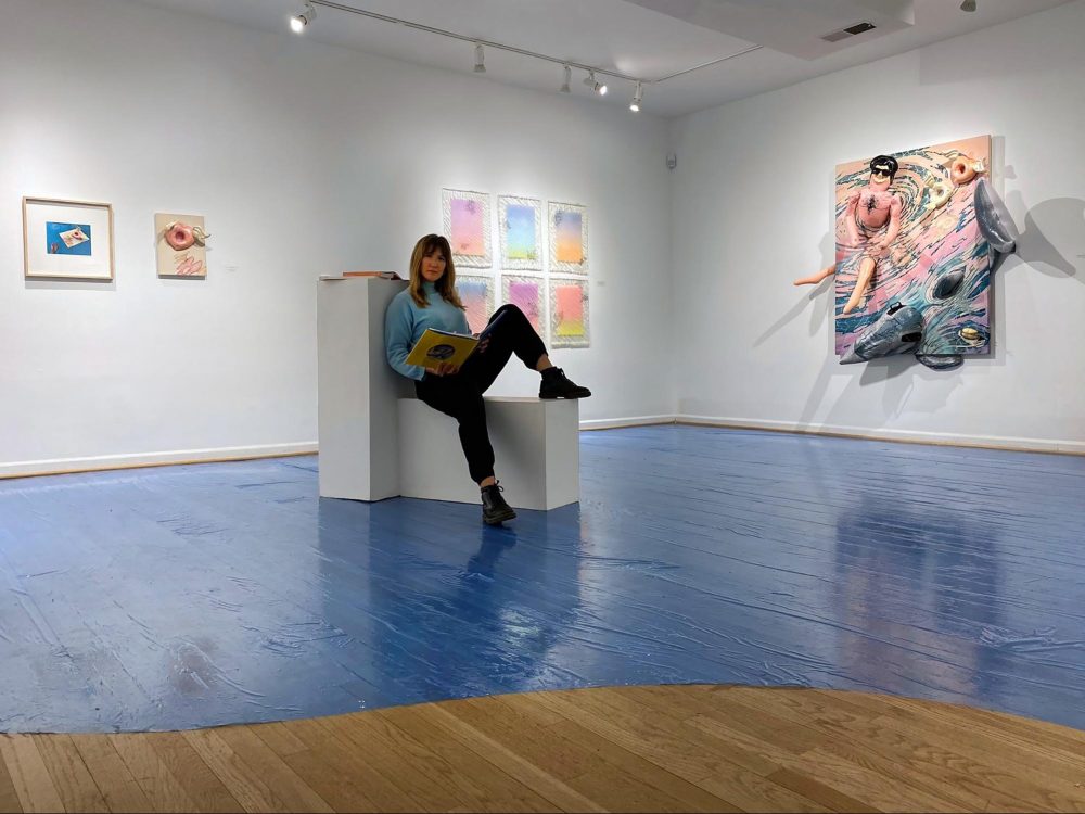
Noel Kassewitz doesn’t want to be known as just another climate-change artist. Originally from Miami, Florida and now based in Washington, DC, Kassewitz’s most recent body of paintings and photographs addresses the climate crisis through connections between the ethos and symbolism of the Rococo period in France and contemporary life in the United States. Kassewitz has spent the last few years asking herself, “How does an artist prepare for climate change?” And her January 2020 show, Rococo Remastered at IA&A at Hillyer in DC, proposed two practical solutions for artists looking to literally reinforce their work for the big flood—encase it in resin or attach it to a pool float! Working across media and committed to burying Easter eggs for her most dedicated viewers, Kassewitz and I spoke about embedding the grid, societal collapse, and why her Amazon “Recommended for You” section is ruined forever.
Suzy Kopf: How did you get started making these works that reference art history so concretely?
Noel Kassewitz: Rococo was a particular artistic style that gained a lot of popularity in the decades leading up to the French Revolution. Greatly admired and funded by the governing aristocracy of the time, it’s marked by this pastel color scheme and focuses on the decorative, frivolous, and playful. This was all during a time of growing inequality between the social classes, yet the aristocracy were keen to ignore the warning signs of a system out of balance and just felt like they could continue business as usual.
I find so many parallels between that time and our present day. Once again there is growing inequality and clear warning signs from our environment that we can’t continue on as we are. My first visual clue to the parallel nature of this situation was that pastels were suddenly in vogue again. What was it about this “millennial pink” that kept cropping up year after year? Do we use these softer palettes to soothe or fool ourselves as outside pressures build? I wanted to take that aesthetic and in running with it, bring the narratives from these 300-year-old paintings into the 21st century.
Once again there is growing inequality and clear warning signs from our environment that we can’t continue on as we are.Noel Kassewitz
So, how do pool parties and Miami tie into all of this?
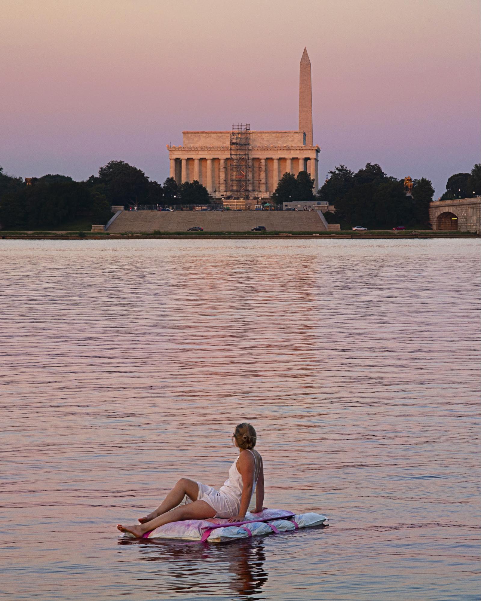
My hometown of Miami is the natural stage for this story to play out upon. Sea levels are rising, without a doubt, and as one of the “canary in the coal mine” cities, Miami is now regularly flooding. Yet, decked out in the pastels of Art Deco (which, in and of itself was a re-examination of the Rococo time period), I still see realtors attempting to sell properties as if the city isn’t in critical danger. Miami, with its over-the-top, celebrity-studded pool parties proudly flaunts its excessive and conspicuous consumption. It is setting the stage for a clash between this late-capitalist “the party must go on!” refusal to capitulate and the climate crisis. I believe people will still be in these pools, continuing to party even as the seas rise and pour in.
Which brings us back to this exhibition. The Rococo Remastered series is a body of my climate-adapted works that draws aesthetic inspiration from the Rococo. Frivolous, tongue-in-cheek, and composed of an abundance of pastel tones, they nod at the absurdities of our contemporary culture, while simultaneously being disaster-ready through their buoyant capabilities. It focuses on that moment when the boundary between pool and sea is erased.
Last year at Art Week Miami it felt like the city was trying to acknowledge climate change for the first time.
It’s kind of weird, isn’t it? Because they’re trying to acknowledge it on one hand and yet simultaneously there’s so much capitalistic bullshit that’s going on even in the way they are trying to address it.
Well, yeah, to really acknowledge it and look at what everybody’s saying about the city being underwater in a short amount of time would require a real change in the status quo. They would risk giving up the status they hold as an arts center.
And everyone for one week is paying lip service and agreeing that it’s a problem, while simultaneously arriving on yachts and private planes to a sinking city. It’s just very interesting. And that’s not to say that I’ve completely nixed out traveling too! We’re all culpable to a degree. I’m very aware of my own footprint and am always trying to find alternative methods when possible. But there’s certainly a sense of heightened conspicuous consumption on display in Miami and that’s what a lot of these works were made in response to.
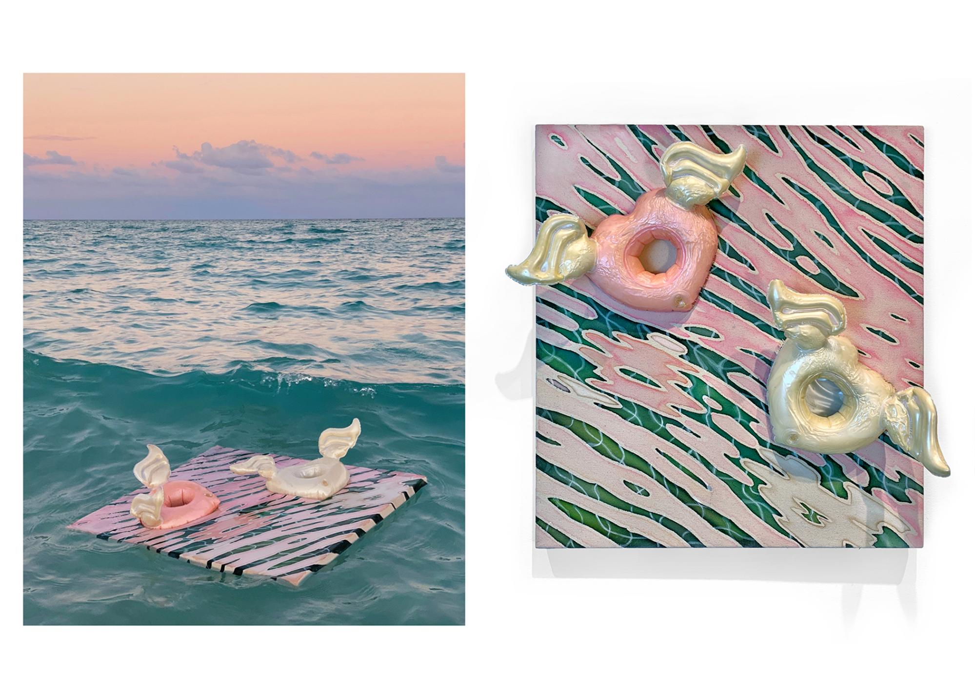
I actually documented this work, Frolicking Putti, off the coast of Miami during Art Basel this year. In all of these, there is a sunset motif which is important because it’s beguilingly beautiful. People get so caught up in the act of the sunset that they forget on the other side of it is “the night.” It’s the final scene. I see the time that we’re in now as the grand finale of everything. Everyone’s distracted by all this beauty and the gadgets and this and that.
Can you walk me through the other works in this show?
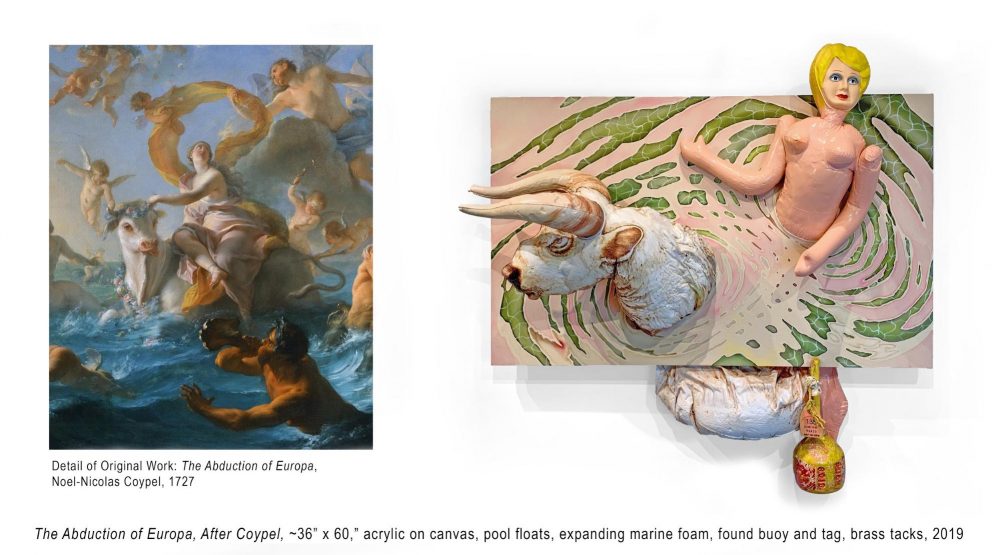
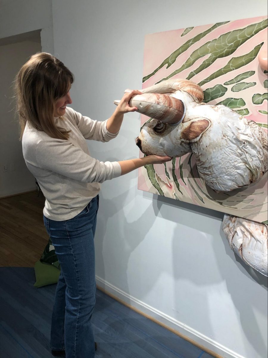
This one is referencing Noël-Nicolas Coypel’s Abduction of Europa. In the story, Zeus disguises himself in the form of a white bull and lures Europa onto his back to then drag her into the sea and have his way with her. There’s so much weighted symbolism to draw from this painting. I think about the bull on Wall Street, the economy, and certain capitalistic mechanisms, it’s a symbol for that. But then going further, I think of the significance of it being this godly white bull representing the baggage that comes from a society that built itself in service of white patriarchy.
The bull becomes a symbol for the whole collective societal structure that’s been dragging us into the sea. I’ve tried to recreate some of the Rococo-style fabrics that are flowing in the air but in the form of sunset-reflected ripples in this pool scene. In certain sections of the painting, it appears that you can see through the water to the distorted and refracted pool tiles below. I often play with an underlying grid structure within my paintings. When I wove works for an earlier floating series, I wove in a grid pattern and then, through the use of bleach and irregularly stretching the canvas across the frame, created ripples and distortion. I find myself greatly influenced by Rosalind Krauss’s essay “Grids,” which interprets grids as a symbol for modernity and humanity because a grid so rarely occurs in nature. So, having the grid constantly in a state of disruption in my work symbolizes the breakdown of society as we know it.
I do get a feminist read on this painting because this is supposed to be a story about her, but it ends up being a story about him and at least in your depiction of it, they’re given equal weight.
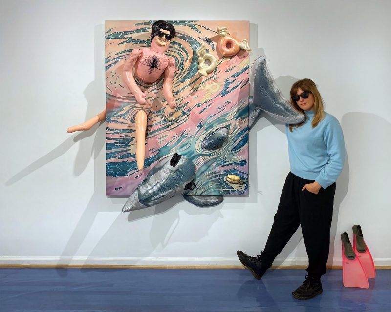
I’m interested in that sort of read. It’s difficult to read on her face whether she’s complicit in this or not. Is she willingly ignoring the direction we’re heading in? Is she actively fighting back? Even in the original interpretations of the story that’s in question—was she a willing participant or did he abduct her? Interesting side note: these are technically sex dolls! I didn’t get like the fully functioning ones, but I needed inflatable human forms and while they’re not to be found under the “pool float” section of the internet, they certainly do exist. Though, wow, I now get all sorts of wild suggestions on my Amazon feed because of my search history! What’s ridiculous is how cheap all these materials are. Not the canvas or paint, but all the floats themselves. To me, the fact that I could get so many of these very bizarre, niche, materials on Amazon two-day delivery is absurd.
Going back to this painting, The Abduction of Europa, I find myself thinking about that willful ignorance, complicity versus fighting back in terms of the last presidential election. How did white women in this country vote and why? I think these are questions we need to grapple with especially in this election year.
That definitely comes across, certainly with the show being in DC. People are always thinking about the past election and the next election. Who’s in power right now? All of that. How do you have a show in DC that isn’t about power in some way?
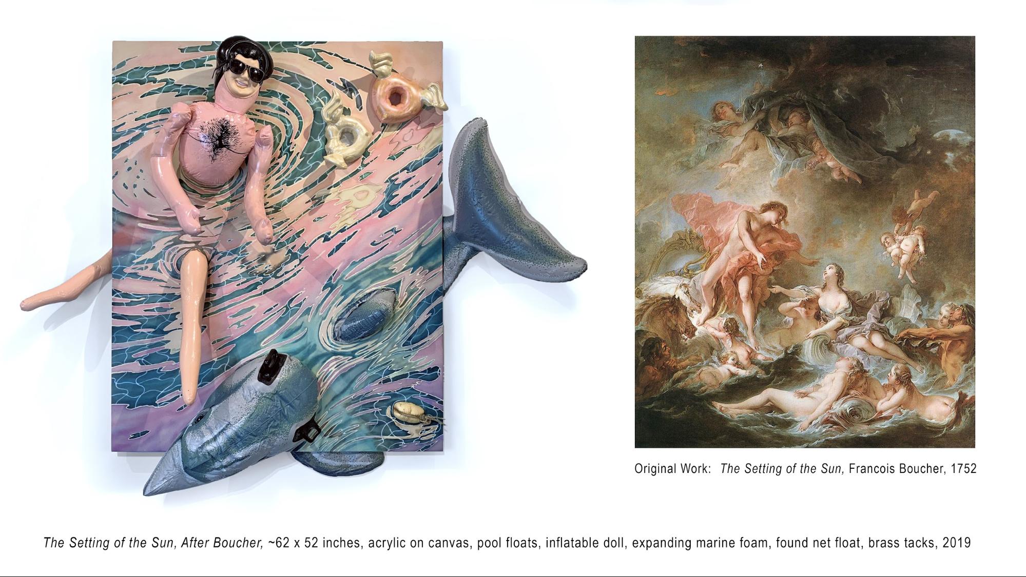
Exactly. This other large painting is made in reference to The Setting of the Sun by François Boucher. This is Apollo, the sun god, sinking into the sea which is the arms of his mother, more or less. I’ve replaced him in this painting with a Miami “pool bro,” completely unaware that the party is ending, even as he slips further and further into the water. I recast the dolphin with an iconic pool toy that a lot of kids had growing up in Florida—I had one of those growing up. I recast the putti as the beverage pool floats which are so ridiculous because they are barely even functional for their intended purpose. There’s even something vaguely sexual looking about them the way they look like an orifice in the center there. That’s so Rococo to have all this underlying sexualization, which I think is also, again, of the times now. You can see the reflection in the water with the same disrupting of the grid. And then this is a little hidden moment that I did mostly for my own amusement: take a look at this sea nymph in the corner of the original painting, and now if you look here, I’ve replaced her with this weathered buoy that looks reminiscent of her butt.
I find the actual breakage of the surface in these works really interesting. When we first walked in here I wondered if you had found sarongs or something that were batiked and were using that material to reference Florida and Miami. But now I’ve realized you painted these.
Yes, it’s a new technique that I’m doing where I stain the raw canvas, which is unforgiving but there’s an odd sort of honesty in that. I only get so many shots at making it work, but when it does it makes for this watery effect that I feel is very appropriate for the subject matter and the aesthetic. These were some of my first (successful) ones to come out of the process. But yes, it does look like batik; are my 1990s Florida-kid aesthetics coming out yet? These were never the colors or materials that I thought I would find myself working in, but they are the color of now, I feel like, and they’re endemic of the way we try to hide from the darker side of these times.
I’m interested in the kinds of practical problems you create for yourself in making these new works. These paintings are large and now firm with all sorts of elements attached and hanging off them, are they hard to move?
They’re almost more sculpture than painting now as a result, so they have to be treated as such. I’m a painter who decided, you know… how do I make paintings more difficult to transport? Let’s try that! It’s a process, attaching and stitching the floats in. By the end, my fingers were raw from using upholstery curved needles. But I’m happy with where this series is going and feel like the use of these plastic elements adds a lot.
I’ve watched what you’ve put on social media to support the layers of meaning here and the way that you present your work in person. A lot of artists don’t educate their audience with how they would like the work read, they put that education on the viewer themselves.
It’s important to me to be accessible. I’m not interested in making these works that only other artists or art historians can possibly ever comprehend, because at maybe 0.000125 percent of the human population that’s a pretty limiting conversation! I love that there’s these esoteric Easter eggs for people who want to dive in to the level I do. But for me, it has to be able to communicate on a variety of levels and to a variety of people.
It’s been interesting because I feel like of all the reviews that I’ve gotten so far with this series, no one has hit on all the aspects of it. I can’t figure out if that bothers me or if I think that’s actually really good. I like that people are getting different things and I’m not spoon-feeding it too much. I had someone come in and I don’t think they realize that they [the objects] floated, despite some of the documentation photographs showing them in action, which I thought was interesting. Some other people have said, Oh, it’s too happy for such a serious topic. Which is sort of the point. I feel like the majority of people get, like, three-fifths of it… and it’s always a different three-fifths!
One thing about art that I always tell my students is that no matter what, you should be making work that supports your point of view and if you do that, it’s not going to resonate with everybody in the same way. If people can look at it and get different things from it, that’s very powerful. And if everybody was to get exactly the same thing from your work, maybe you’ve only successfully communicated one idea. I look at your work and I see it doing a lot of different things.
Thank you, I appreciate that you take on this endeavor. I do try really hard to make sure there are those different levels [of meaning] available to those who want the 30-second experience (“hey, it floats!”), the five minute one, the half an hour one, an hour.
Starting these works with the Rocco masterpieces seems like rich territory for you, are you making more?
I’m actually really excited because some of the comments I’ve had were “Hey, are you considering adding people of color to future works?” and I absolutely am. The problem is, especially in sourcing from 300-year-old French paintings, I don’t always like how those characters are cast and there’s not that many to begin with. Now, again, I’m recasting them for the contemporary day, so I can easily make that kind of edit and put in more people of color. But particularly with these pieces, I feel the sort of underlying cultural problems I’m pointing at weren’t created by people of color. Those communities are the ones marginalized most in climate issues. I feel in both of these larger works from the show, the protagonists are very complicit in what’s going on in these scenes.
I love that there’s this connection back to art history, because to be honest, you’re not even going to look at this Rococo painting unless you happen to be at this museum in Philadelphia, or you love this style. Most people are going to say, “This doesn’t relate to me.” I take my students to the BMA and the Walters and a lot of the feedback I get is, “the only stuff I liked was the Contemporary because that’s the only stuff that relates to me.”
And that’s exactly why I want to recast all these works! They seem so outdated and froufrou that nobody is giving these paintings the time of day they deserve, because they don’t feel fresh and contemporary. But I feel that the issues of their times are so locked in with what we’re going through right now, that we just need to reframe it in a way that allows us to understand and draw on those lessons. There’s all these rising in social issues, and class pressures, but then you just see everything on Instagram is so glossy and distracted.
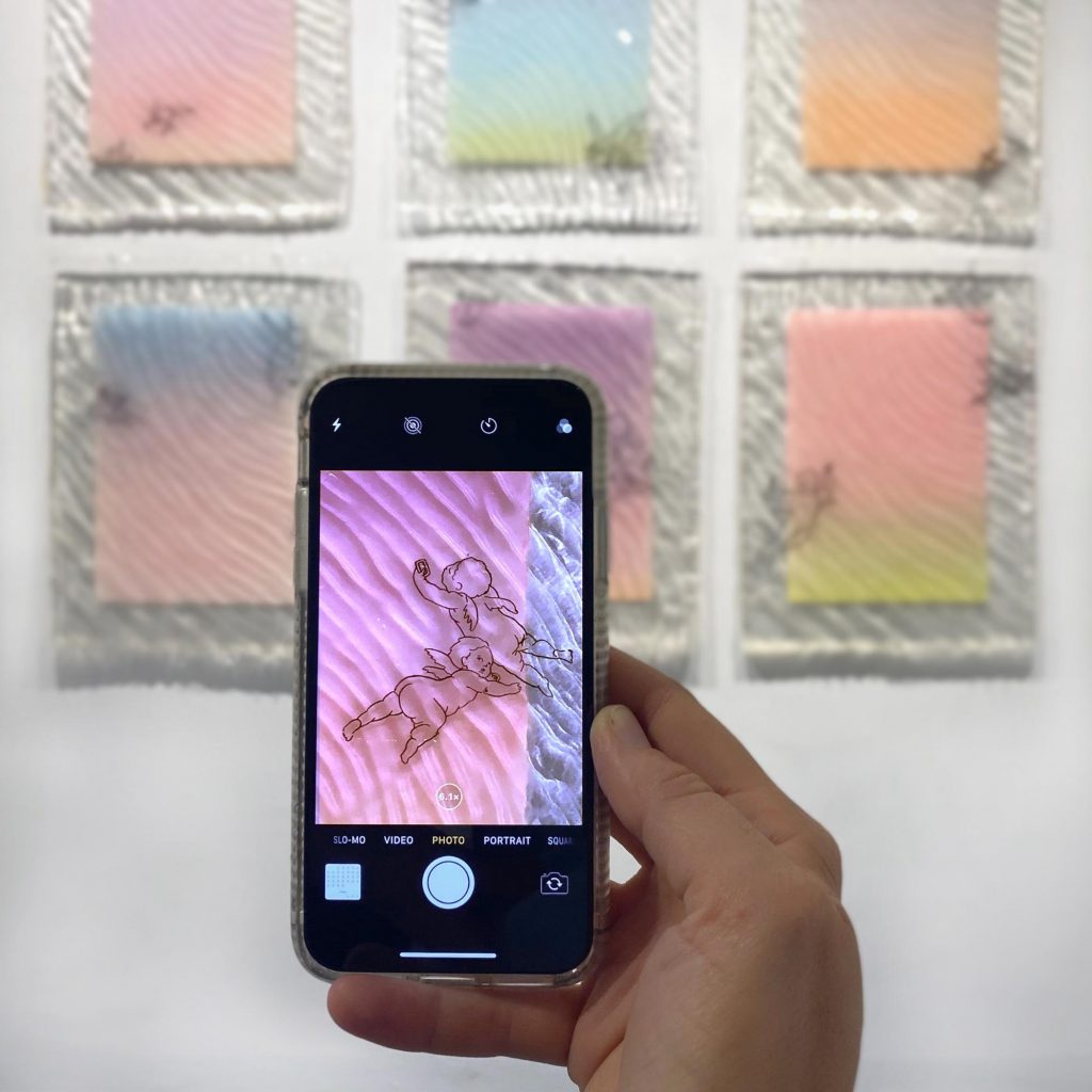
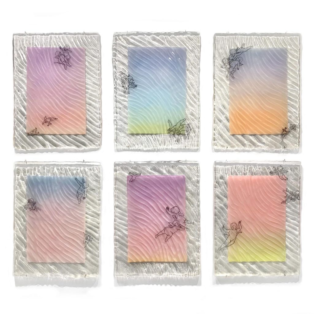
I feel like I really address this idea in Sunsets No.1-6. I wanted to explore a different way of conserving works, so instead of making pieces that were buoyant, I made some that can sink and be archeologically found at a later date, protected like a dragonfly in amber. I started by painting these overly radiant sunset scenes inhabited by transparent ink drawings of putti. Then I encased them all in rippled eco-resin which resembles the surface of water and refracts the ambient light in this really awesome way. These putti function as personifications of our naivety and the baser activities we engage in to distract ourselves, so you see some of them with cell phones taking selfies or sort of wrestling to surveil and film each other while others chase flocking money emojis.
It’s this whole little late-capitalist playground that appears so delightful at first glance. As with all my works, I try to use this initial humor and saccharine palatability as a trojan horse for these heavier topics that people might otherwise avoid engaging with. Of course it’s amazing when these works are in public exhibitions, but I also want these works to function like their Rococo counterparts, ending up in the private spaces of people’s homes, above their couches or beds, where they are really lived with and their charmingly coded warnings can begin to consciously, or subconsciously, sink in and perhaps effect some change. And hey, if not, at least I know their built-in dystopian survival mechanisms will ensure they survive for future generations to find and possibly say, “Wow, these are so outdated, I only like the contemporary stuff.”