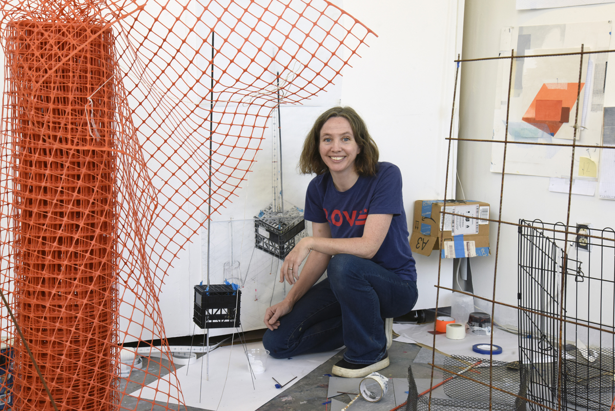
Rebecca Rivas Rogers is an artist, designer, and educator originally from Northern Ireland. She holds an MFA in Studio art from MICA and a BA in Design from Glasgow School of Art. She worked as a designer in Ireland and the US and then became an art educator while living in Columbia, South America. She has been a resident artist at The Museum of Contemporary Art, Arlington since 2020.
I met Rebecca in 2013 while she was still in Zlata Baum’s MFA in Studio Art Program (MFAST) at MICA. I had just graduated the previous year and was back teaching some technology workshops in the program. I distinctly remember how we met, I was outside the Decker Library and Renee Van der Stelt was walking with some students. She introduced us and of course told me Rebecca was Irish, not that this was necessary as she still has a very distinct Northern accent, which I placed immediately. Her animated enthusiasm and sense of humor were immediately apparent, and we have been good friends ever since.
As I got to know her, I realized that we had so much more in common than just being Irish. Her work, her response to being Irish and living in The States, and the way she was navigating the material being presented to her in the graduate program I had just recently completed were eerily similar. Even her background had some connections with mine. She had been a landscape painter in a former life, and that is how I started out in The National College of Art and Design in Dublin. Her work, then and now seemed resolutely rooted in place and her fascination with America’s transitional or liminal spaces, such as highway exit ramps, parking lots and alleyways mirrored my own.
Her exhibition Grey View is on view from February 11-May 14th, 2023. We met over Zoom while she was in the gallery space at MOCA Arlington to talk about the show and some of the concerns in her studio practice, ahead of a live conversation we’ll be holding Friday, April 7th at noon.
Bart O’Reilly: I didn’t realize that you had been a studio resident at MOCA Arlington for so long… Since 2020?
Rebecca Rivas Rogers: The middle of the pandemic! I think it was because I applied for a studio there, and I didn’t get one, before the pandemic. Then when the pandemic hit, they didn’t want to go through interview rounds again so they said, “do you still want it?” And I said “YEESSSSSS!” I taught from here and everything, it was a savior.
Ok so I did write down some talking points so we can stick to them I guess and wander as well.
Bart, I would never expect you to wander!
Never, NEVER! [Laughter]. I have seen so many iterations of your work and even though I have not yet been down to see the show yet…
[Tut- tut gesture]
Tell us a little bit about your background and how you ended up here.
Well, you just gave it all there at the start, what else…?
[Laughter]
Tell us about the show then!
Actually, it’s funny because a lot of the things in the background that you mentioned, they come up in the show such as the title, It’s called Grey View right? Which is actually the name of the paint, it’s the paint color that’s on the walls, that’s where the name came from. But after we had printed the postcards, Amanda suddenly had a heart attack and she’s like “Uhhhh! Do you spell grey with an A or with an E?” I’m like, I don’t know! And she’s like “It’s with an A!” I said no it’s with an E!! So even that thing of grey being spelt wrong in the title, well it indicates that I’m not from The States. I spell it with an E because I am from Northern Ireland. So, starting there has that biography in it. I think it’s a little glitch, you know? That clues people in…
And it relates to the work in that way.
Exactly! As you know, you’ve heard it many other times, I talk a lot about the color grey and about it being ambiguous, even the spelling is ambiguous but also it’s rooted in place, the reason why there are two different spellings is because they are two different places.
Yes, that is really interesting.
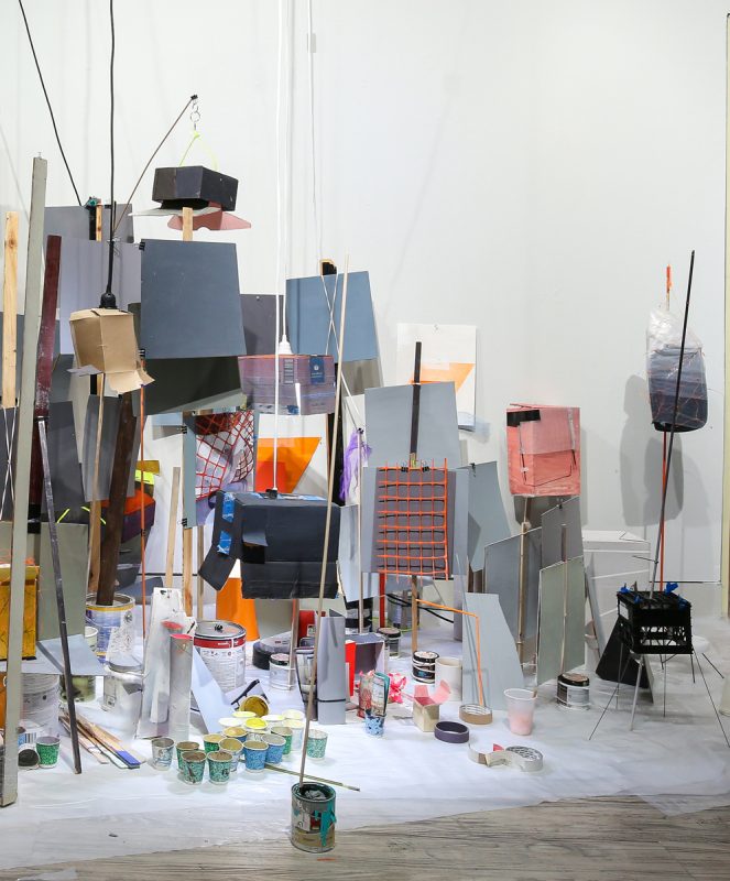
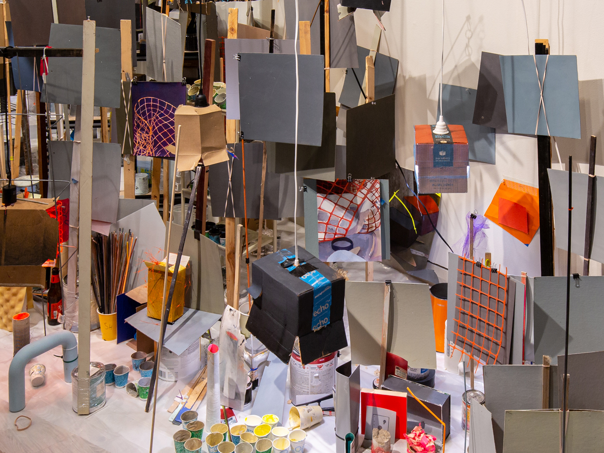
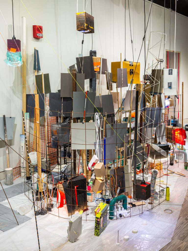
And the work is rooted in place. [Gets up and walks] See talking about the glitch! You see this is great, I can just get up and walk you over. So, here is, let me see, can you see? So, there’s the paint as if it ran out at the door. It’s a really really light shade of grey and you wouldn’t notice it unless you had a glitch that it’s there and it just looks like the wall is in shadow. It also helps immensely with all the greys that are set up, so they are not just against white, but you don’t see it until there’s a glitch.
So that glitch is intentional, where you painted the wall grey and then purposely ran out of paint?
It’s even better than that, Bart! I sent a little mockup saying I want it to look like we ran out of paint so that the very edge of it is left white so that we can see it and then… I didn’t paint it! It’s such a gift to not have to paint your own walls, right? So, Juan who was painting it, he ran out of paint literally, but he ran out of paint too early so he calls me up and he’s like “would this work?” I was like, “No, it has to go further…” so we got more paint to make it look like we ran out, so it was all planned. We really did run out of paint, but we ran out twice!
So, you ran out of paint before you were supposed to run out of paint?
Exactly, so we ran out of paint but then we ran out of paint in the right spot, so we were able to time it.
That’s a really good definition of irony I suppose isn’t it?
Yeah! And the other thing that is really nice is that, because I didn’t paint the walls, Juan painted them for me, so by the time the walls were painted he was part of the exhibition you know. He was invested and involved with it. The same as the guy that helped me install. Do you see those diamonds there on the ceiling?
Yeah, yeah.
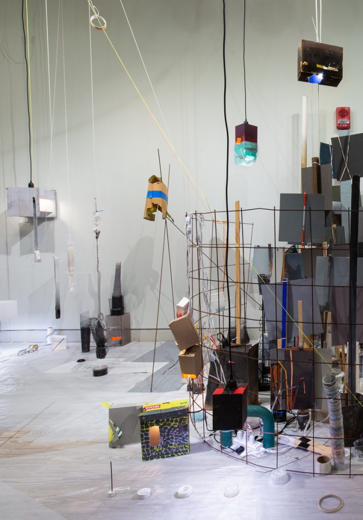
Do you see those lights too? Well just because I have things hanging, those are yardsticks.
Right.
So, they helped me install those, they are just 4 yard sticks zip tied together. It being a collaboration, I want them to go up, I want them to stay up, I want you to see the infrastructure, right? They said we can hang this with invisible thread, wait they don’t call it invisible thread here, what do they call it?
[Pause]
I know what you are talking about.
Filament? Monofilament?
I don’t know what they call it here, I call it fishing line!
Yes, fishing line. They wanted to hang it with fishing line, but I said no, I want you to be able to see everything because that’s the whole point.
The architecture of the thing.
Yeah, the “behind the scenes,” you are looking at the behind the scenes.
I like the idea that when I am in the midst of the mess, I can find things so that I can organize ...but then as I’m working it all sort of falls apart. So, the paintings that I make are paintings of the moments that I look over and I’m like 'oh how I left things sitting there! and the light! and that is gorgeous.' If it was all organized those moments wouldn’t happen, and they are the in-between moments.Rebecca Rivas Rogers
So, before we… well we can’t really leave the color grey, but I have known you for a long time and you have always been into grey, I’ll cycle through colors and have my green phase and my purple phase and try them all, but you’ve been pretty loyal to grey.
This might also just be longer, Bart, because what you guys don’t know is that before I was into the grey, I was really into brown! And I had this whole theory of brown because you know brown contains all the colors right, because it’s mixed with the primaries. When my sister came over to see the show, she was like, “Grey!? You told me brown contained all the colors, not grey!!” And she’s a performer and she and her partner had devised a whole brown outfit. She was disheartened, so I think I am like a serial monogamist. I was with brown for like a number of years, but this grey has been 10 years.
That sounds about right! And the thing I like about grey—and when I teach color theory, I always have students mix greys without using black—I like that you said that it contains all the colors, because that means it’s kind of infinitely interesting right?
Exactly! Because I mean, I think you can even have a yellow grey.
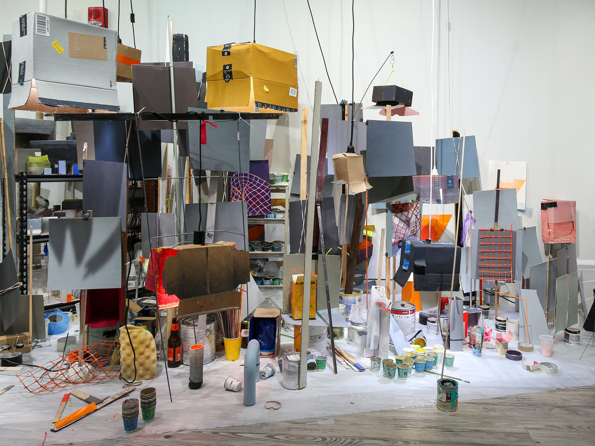
I mean in comparison to something else and then you’re like into your color theory. It covers the entire spectrum but it’s just that the steps between them are really small so you have to pay attention, but then you are into these greys [Turns her laptop towards the large installation behind her] some of them are blue, some of them are brown, maybe, but they look really colorful, there’s such a diversity once you recalibrate so that you are looking at the divisions.
Yes, it’s a very colorful looking installation.
Right, yes, it’s very colorful yet people still step in and say there is still a predominance of this color grey and it’s so city-like, I get that a lot. Bart, you know this, right, so people ask where did the grey come from and I am like, well I was landscape painting for a number of years and not being from here, the freeways really struck me, just the size of them and then in Ireland of course the roads aren’t grey they are black.
Yeah, that’s true.
Right, they are tar, which it couldn’t be here because it would melt, so that’s why they are grey here. So that’s why being drawn into the greys in the landscape is very much from being in The States and coming from somewhere else where that is not the case—a small detail that is everywhere.
Did you paint landscapes when you lived in Northern Ireland?
No, I didn’t start painting until I came to The States. I started painting in California, and it’s interesting, when I look at the landscapes, when I was painting there I often put Alizarin Crimson underneath everything to start with. If you go and look at California paintings you will often see this pink color coming up again and again because the light there is pink, and here it’s not. Here it is much colder, here it is more similar to Northern Europe. In California it is a different colored light.
Right, so that would make sense for artists like Diebenkorn I suppose.
Exactly! If you look, that pink color will come up again and again.
And Diebenkorn used a lot of grey I think, but there’s a lot of under color. There are a lot of other colors sneaking through in your installation as well. Am I right to say I saw a few sneaky paintings?
[Jumps up again with laptop in hand and starts towards her installation] [Smiles] Yes!
There are paintings, like literal paintings hanging in there! [Points laptop towards painting]
I saw that one, and it’s a painting of construction netting.
Yes, there are a number of paintings and the construction netting appears in like three paintings in there.
So, are the paintings new?
You know it’s one of these funny things Bart, where you think it’s something that you just started doing, but this is one of the first paintings that I did since grad school [Gets up again and walks towards installation] this little one in here. So yes, it’s new, but then I think back on paintings I was doing twenty years ago when I was painting little pictures, images of boxes that I had painted, so like I was painting objects and then painting paintings of those objects, so I was like not so new.
It is funny how; I do that too with my own stuff where I think I am onto something new and then I go and look through old work and I am like, “oh I was doing that 7 years ago.”
Yes, but I think it’s because you know your visual interests—they change, but there is always something underlying. But see the end of the exhibition? [points to corner behind her] I call it the tundra. So this is really busy and full this part—and then you slip over here [walks towards the tundra] and it’s much more sparse and the chromatic greys have disappeared and all of the greys here are achromatic; they are all in grey scale.
So, you are interested in that, or you could kind of call it the liminal landscapes of North America, you’re into freeway exit ramps. What’s that all about?
Partly it was practical, you know those are the, I mean I’ve said this for years like, those are the landscapes that we actually spend a lot of time in. You know when someone says landscape painting and you know you think of rolling hills. I’m teaching at the minute and if I say landscape, they all draw sunsets on the beach and I love sunsets on the beach, but how much time do you spend there? Very little. And it was especially being a parent, you know when the kids were young, you spend a lot of time in parking lots and alleys.
[Bart laughs.]
I was commuting back and forth, it was the side of the train tracks at one point, but that’s the kind of landscape that you see. So, this idea of like the freeways and that huge infrastructure was so foreign to me coming from Northern Ireland you know?
Yeah, it is a different space and while you are in those spaces it feels different, you are always waiting or on the way to something or you don’t want to be there.
Yeah, the other thing that I love about those spaces of course is they are not groomed. Funnily enough they are not wrapped in design, they are not trying to tell you something. They still tell you a lot of information, you could learn a lot from them, but it doesn’t come from a marketing department. I worked for years as a graphic designer.
Yeah, it’s kind of like behind the scenes.
Yeah, so that’s why I like keeping all the visuals [Points behind at installation] and letting all the behind the scenes be important and be seen. It’s interesting to me, I mean I know a lot of people do, but I love images of people’s studios. Like Francis Bacon’s studio—I mean, I think I would rather look at his studio than his work.
Do you need the mess to work?
Ah yeah [Laughs]
Does it ever get really tidy and then get messy again or is it always a mess?
Yes absolutely! I clear it all out.
Yes, me too. It’s interesting… I mean, Meaghan, my wife, just asked me recently, “why do you keep tidying it up?”
I like the idea that when I am in the midst of the mess, I can find things so that I can organize … but then as I’m working it all sort of falls apart. So, the paintings that I make are paintings of the moments that I look over and I’m like “oh how I left things sitting there! and the light! and that is gorgeous!” If it was all organized those moments wouldn’t happen, and they are the in-between moments. They wouldn’t be there.
...the landscape is just a foil to get you to hang it on, so you are possibly not interested in landscape; it's the forms and the colors. So, I have the colors and they are all just here in the paint pots and they are better than my paintings.Rebecca Rivas Rogers
Can you talk a little bit about the objects you choose? Why do you choose them, they have something to do with place I guess, right?
I had a back and forth with Amanda [Jirón-Murphy, Curator]. You know when she wrote “found materials”? Yes, I mean some of them are “found,” but there’s a difference I guess, criteria for using them, trying to think what it is, I’m just looking around [looking back at her installation] Well the actually grey squares themselves are card that I have painted and that gives the main color to the whole thing and those are not found they are all painted.
They look like paint swatches.
They look like paint swatches; they are just larger. I bought house paint and mixed it and mixed it and mixed it.
And you left the cups and the cups are a really important part of the installation as well.
I have cups that are 15 years old. Most of those greys, I was mixing them to make some painting and then I look at all the paint that I mixed, and I am like that’s it actually; the painting was just a foil, there are all these different colors. I think that is how a lot of people get into abstraction too. Like the landscape is just a foil to get you to hang it on, so you are possibly not interested in landscape; it’s the forms and the colors. So, I have the colors and they are all just here in the paint pots and they are better than my paintings.
That’s really interesting, because I sort of do that sometimes where I’m like, ok forget about this expressive messiness, I’m just going to paint flat colors where I just mix them and layer them, but I always end up departing from that. But I do enjoy the process of just building up color and I am jealous of artists who can make that just what it’s about sometimes. It seems very Zen almost, to just say well the painting’s actually just this grey color. Like David Batchelor obviously is one of those artists who you look at, and he is just really laying color down and he’s using lights and plastic he finds.
But actually, it’s interesting because I feel like with David Batchelor I prefer his writing.
Yes, some people do say that.
Yeah, and I think his colors are kind of standard colors in a way, but when you read his writing, his writing is really colorful. I feel like his books are illustrated, but they’re not.
Yes, that’s true and he had that reaction against traditional color in landscape and impressionism and things like that. In your work, I have always had an affinity to it because I remember just getting to Baltimore and being fascinated with the bridges underneath i83 and the way people paint over graffiti with these grey squares. They are really good abstract paintings, I think.
[Smiling] Yeah exactly! What I’m painting when I am painting these little paintings are these incidental moments
Yeah, the non-intentional.
Yeah, the non-intentional, which is kind of the same thing as the alleyway as opposed to the front of the shop, because the way the alleyway looks was incidental, was unintentional.
It’s less self -conscious.
But yeah, despite the smell—which is usually an off-putter—it has a richness from the history of just how it’s been made as opposed to designed.
[Pauses] I don’t know… do you feel like? … I dunno… I always found myself kind of on edge in those spaces. Is that part of it? I am not trying to get into psychology and stuff, but are you comfortable in those spaces or would you rather be out in the countryside hiking or something? You seem comfortable in those spaces.
I’m comfortable in them.
[Laughter]
I’m thinking about driving my car into underground car parks and I am stopping to take photos and my kids are like come on no more photos of nothing! I want to capture that. It’s often just the feeling of this white space and these subtle shadows coming in.
I think it’s unusual in a way because most people just block that out. Like they are on autopilot in those spaces. When I’m in a parking lot with the kids in the car we are usually just listening to the radio and like totally off in some other world. It’s interesting that you are stopping and taking photographs.
It might be, the funny thing is that now I take less photographs now that I have more time. It might have been a function of survival.
Yes, I used to do that in MICA when the kids were young, I took more photos of landscapes than I do now. Now I don’t feel the need to do that. It’s like you’re kind of taking a note and you wish you could be in the studio to do something about it, but you can’t, so you just kind of …[pauses]
...the point of being apolitical in Northern Ireland is political. It’s almost unintentionally political. It’s political with a small p. If you’re a teenager in Northern Ireland and your songs are about seeing someone on the street and that actually is a political statement... It’s an insistence on living life when everything around you is against that. Which if you think back to photographing the car parks and the alleyways, it’s the same thing.Rebecca Rivas Rogers
Ok, so often I… I have had a few situations where I sneak politics into a title here and there and you are like usually the only person who notices it.
But you do it kind of subtly too, Bart, because usually when I question you, I am not sure if you put it in there on purpose, but I just read it and…
Sometimes I’ll do it by accident but sometimes I’ll do it on purpose, I like things with multiple meanings. But there’s a little note in the essay that Amanda wrote saying:
“From growing up in the politically fraught nineteen eighties in Northern Ireland, Rivas Rogers admires the punk scene’s ability to exist as a gray zone outside of the extremes of Catholic and Protestant political divisions.”
I’m not going to say that in the ‘80s I was admiring the spaces between these two factions because where I lived, we lived between the two. I mean the troubles were there, but you know. I went to a Protestant school although I’m Catholic, so it’s not as cut and dry as it sounds there, but looking back, that music I was listening to, if you listen to The Undertones and you listen to the lyrics, they are singing about calling a girl on the telephone. They are singing about really normal teenage things; it sounds like they are apolitical. But the point of being apolitical in Northern Ireland is political. It’s almost unintentionally political. It’s political with a small p. If you’re a teenager in Northern Ireland and your songs are about seeing someone on the street and that actually is a political statement.
Right. Is it a pacifist thing?
It’s an insistence on living life when everything around you is against that. Which if you think back to photographing the car parks and the alleyways it’s the same thing. When you are in the midst of raising small kids… you’re… it’s a resistance to what’s going on.
That’s a better word!
Which now I am thinking, in grad school they often asked us, I think, isn’t art resistance or something? I like things if they are political to be political with a small p, for people to make up their minds themselves. And they can miss it completely.
So, it’s not didactic.
Yeah.
For us, those of us who have been through the graduate program we have both been through and have been painting and making art for, well in my case for over 20 years, the aesthetic enjoyment of a show like yours is for a more educated… I don’t know… visually… do you find that it is still hard for people to get into that kind of work who don’t have an art background?
Yeah, it’s really interesting because I think if I had left just a grey wall, super reduced, minimalist, you know? It would have just missed everybody—not everybody—it would have been very niche. But this actually, the color and the mess, the sense of energy in it, the stuff happening here, it pulls people in. Of course, people come in and go, ok what’s this rubbish on the floor? But there is enough visual interest, especially the photographs that were in the catalog from Lauri Hafvenstein, and this is the third one of my installations that she has photographed with me, and we have really worked together. It’s really dense, so it really functions really well in two dimensions, so when you’re in it, it functions very similar to a painting, so I think there’s, it’s visually interesting enough that it pulls people in.
One last thing I’ve got to get in there, it’s really exciting that all my lightbulbs in my lightboxes are smart lights. So even though they are just cardboard boxes with a lightbulb in them, because they are smart lights I can set and adjust the color in them. It’s like painting with light, although that’s something that nobody notices. I just think it’s great! This crazy technology and it’s just a lightbulb in a cardboard box.