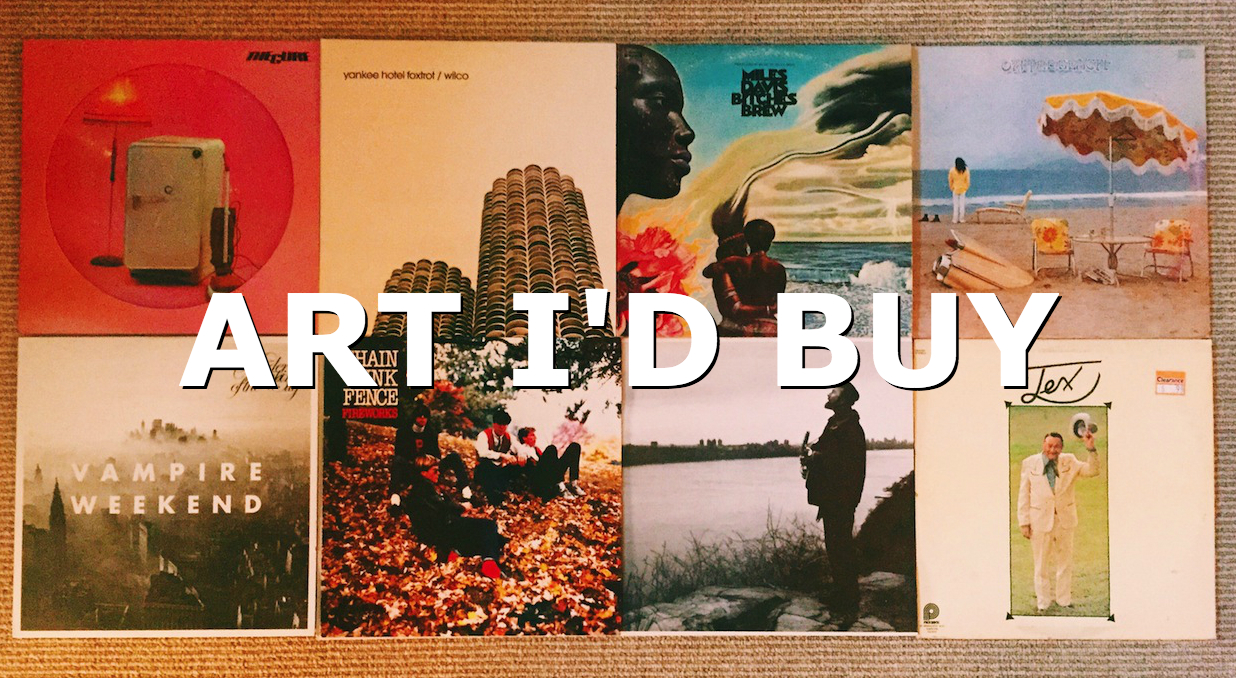
Taylor DeBoer shares his favorite album art
Sometimes on rainy afternoons I go to record stores and just wander. If I’m feeling bold, I may buy an LP or two based purely on the cover. These sometimes come from the dollar bin but I have, on multiple occasions, purchased albums for full price that I’ve never heard of. If it catches my eye, at the very least, it might find a place on the shelf or in some very special circumstances, on my wall. Here are a few of my favorite album covers. Some of these LPs are also great to listen and others standup more for their album art. This is Part 1, with Part 2 coming soon…
The Cure – Three Imaginary Boys
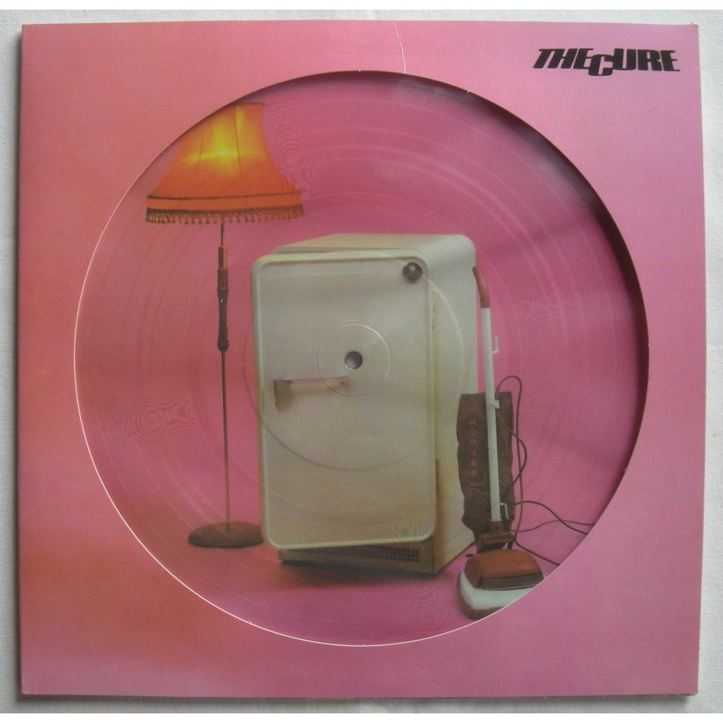
The Cure’s debut album, Three Imaginary Boys, was actually changed when released in the US to Boys Don’t Cry and features a slightly different track listing. This is not the best nor the worst Cure album — I’d probably throw it somewhere in the middle of their discography. I had only heard the US release (Boys Don’t Cry) which has a different album cover when I bought this.
This 50’s-ish cover makes for a great piece in an office or music room — I have it propped up on my desk at home so when I’m suffering from writer’s block I can get lost in the deco pinkness of domestic bliss. OK, I’m kidding, but it’s odd and silly and rad all at the same time. The particular version I have is a vinyl picture disc, which makes it all the more appealing. For those unfamiliar, a picture disc has the album cover, or a portion of it, printed right on the vinyl LP. It’s a total gimmick, of course, but it makes for a kitschy, collectible nonetheless.
Wilco – Yankee Hotel Foxtrot
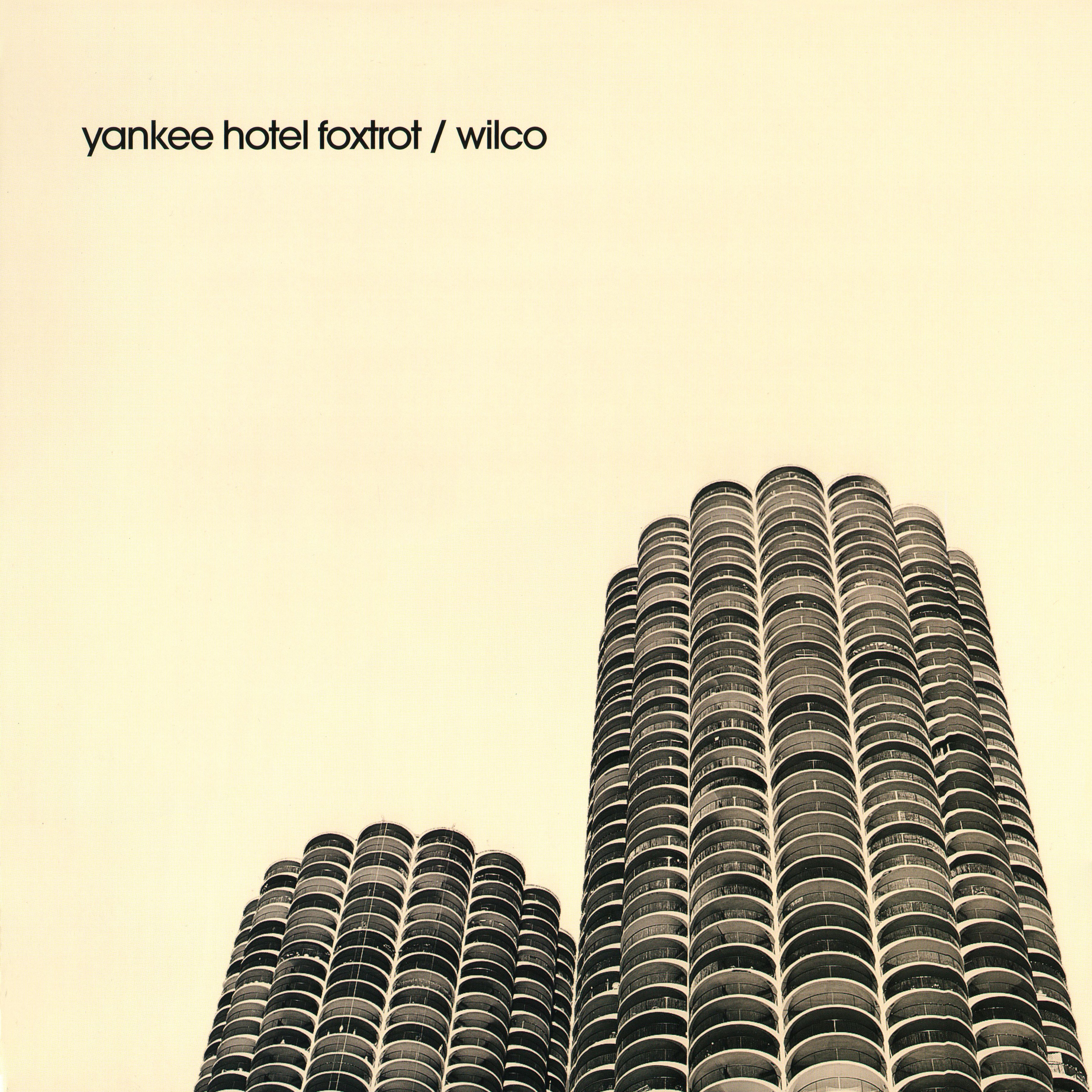
This album is one of the favorites of all time. It set the precedent for music production and style for the 21st century. Try to find a more unique, fucked up, entrancing, yet approachable contemporary piece of music. It is flawless and imperfect. And the album cover is an understated photograph companion piece. Featuring the iconic Marina City towers in downtown Chicago, the cover provokes the same eerie displacement that the songs on the album do. Listen to the topical “War on War” while staring at the sepia tone towers. The once pleasant image slowly becomes ominous. A+ album with an A+ cover. Bravo Wilco, bravo.
Miles Davis – Bitches Brew
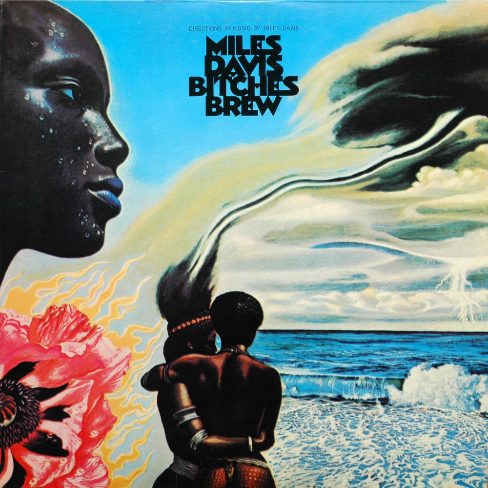
Perhaps this an example of an era defining classic that makes the album cover cool. Meaning, take the cover out of context and it doesn’t hold up and appears quite dated. If an art critic made this argument, I’d probably agree, but still love this cover regardless. It’s this super experimental, free jazz album that turned me on to Davis and Bitches Brew is arguably the least Miles Davis-esque album of his career, excluding some late duds. The transition and nature of this album fits the weird, psychedelic, Afro-Caribbean cover art. You can get lost in it, right?
Neil Young – On the Beach
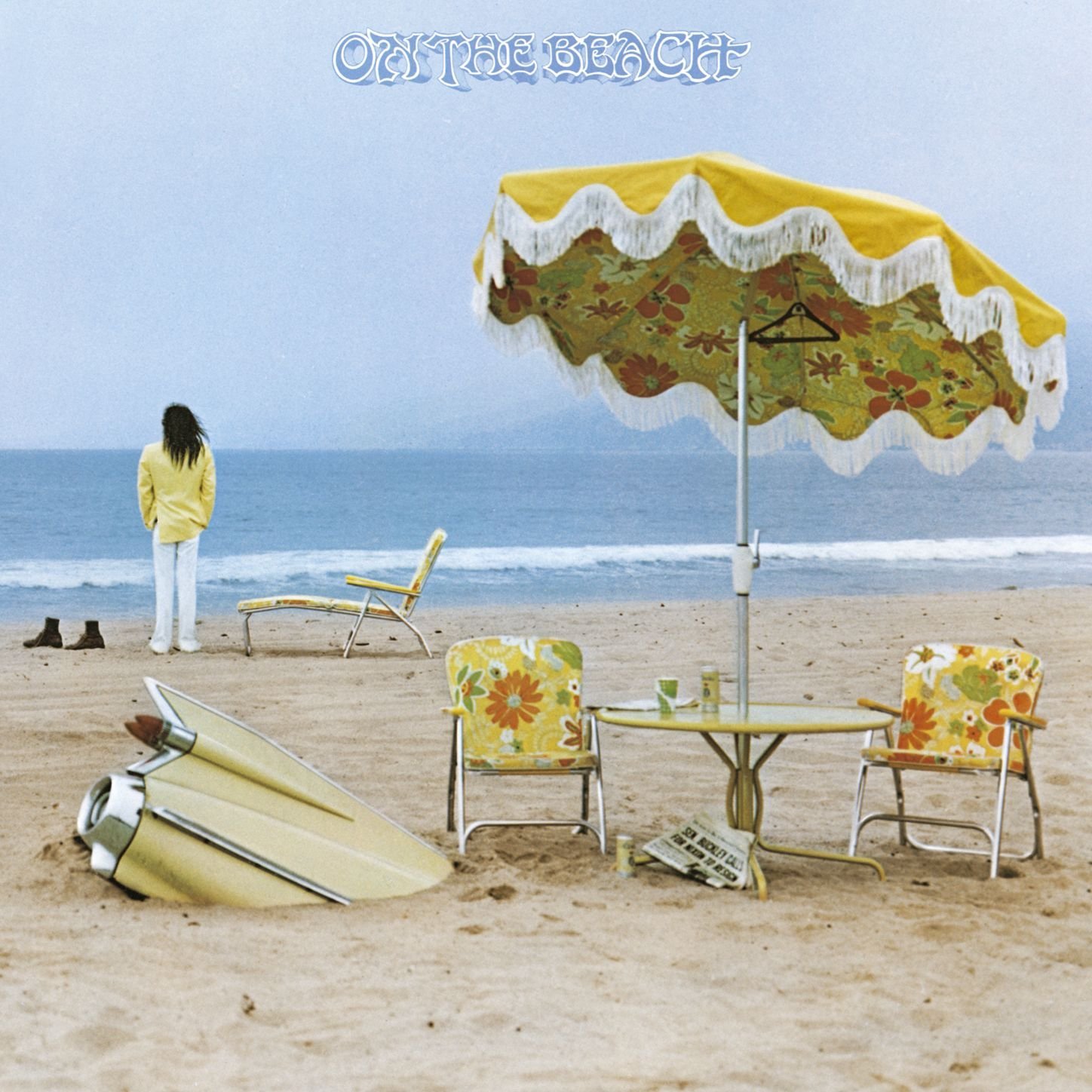
Neil Young has a boatload of great albums and On the Beach is one of my four or five favorites. It’s dark and weird and represents a very transitional period in his life as a musician. He distanced himself a bit from the folkier times of Harvest or After The Gold Rush with this LP. Young stands on on the left side of the frame, long hair and bright yellow blazer, staring into the ocean. In the foreground are two chairs and a funky umbrella that might fit alongside the refrigerator and lamp on Three Imaginary Boys from above. Is this is all a metaphor for the album being a departure from his previous work? Perhaps. Is the “beachy” vibe meant to juxtapose the album’s bleak and raw themes? Perhaps. Either way, it’s a kickass cover.
Author Taylor DeBoer grew up in the Baltimore area and studied Writing and Sociology at Loyola University Maryland. He is a local writer, music lover, and edits a website that he co-founded, Manikmusic.net. Follow him on Twitter at TayDeBoer23.