The simple design and improbable proliferation of the orange belie its complexities. Citrus advertisements are unavoidable around my hometown in Florida, although the only orange trees I’ve seen in the area are singular ones that struggle in people’s yards. On longer drives, a chain of tourist traps advertises live baby gators and fresh local citrus. Seen from the highway, the shop’s bright round oranges and perky lemons arranged on lacquered market stands are attractive. Up close, you realize you’ve been duped by painted styrofoam.
Indigenous to Asia rather than any place in the US, oranges are always available in nearly every American grocery store. They have adapted to growing in the groves of Florida and California, but that is a constant uphill battle for the industry as the climate changes. For my friend and colleague Suzy Kopf, who grew up in California, these concerns have become a major subject of inquiry in her art. Her solo show, Orange Crush at the Gormley Gallery of Notre Dame of Maryland University, is the culmination of years spent pondering the orange—specifically, how such a notoriously difficult-to-grow fruit became cultivated for industry, the infrastructure (farms, towns, factories, logistics) built for production and distribution, and what it has cost and what it has meant.
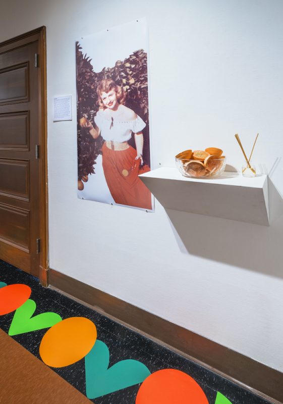
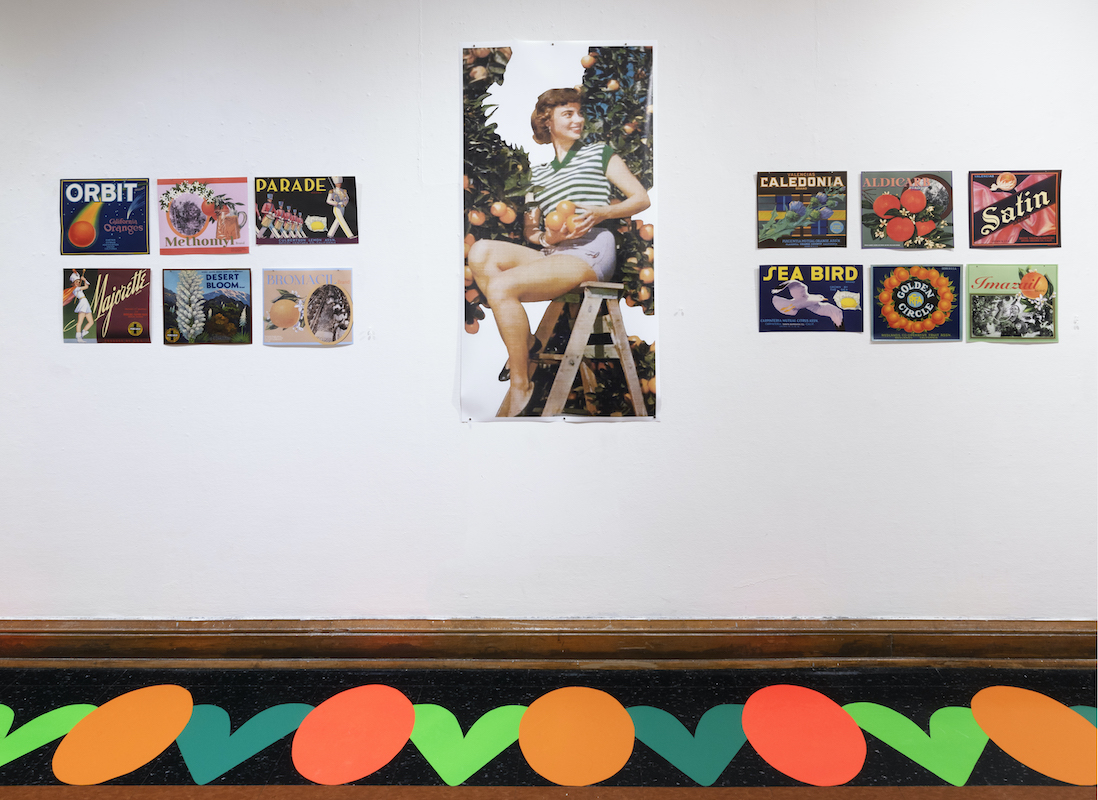
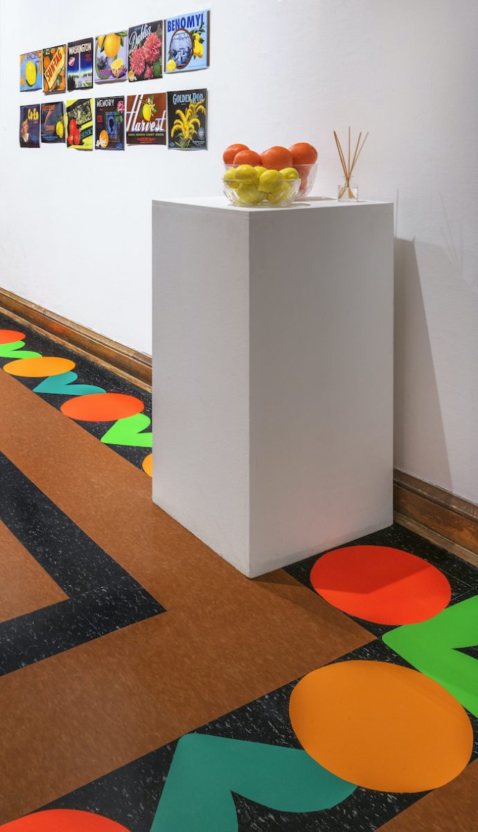
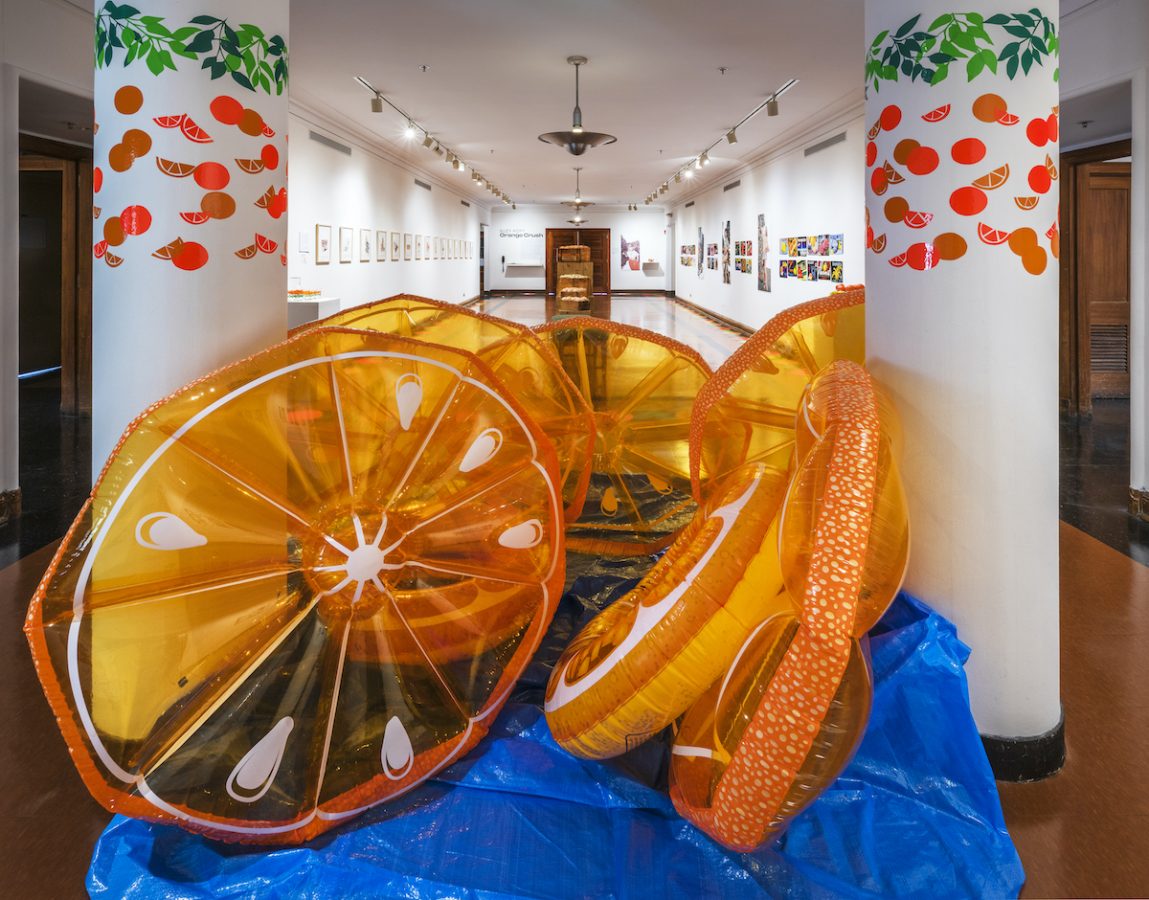
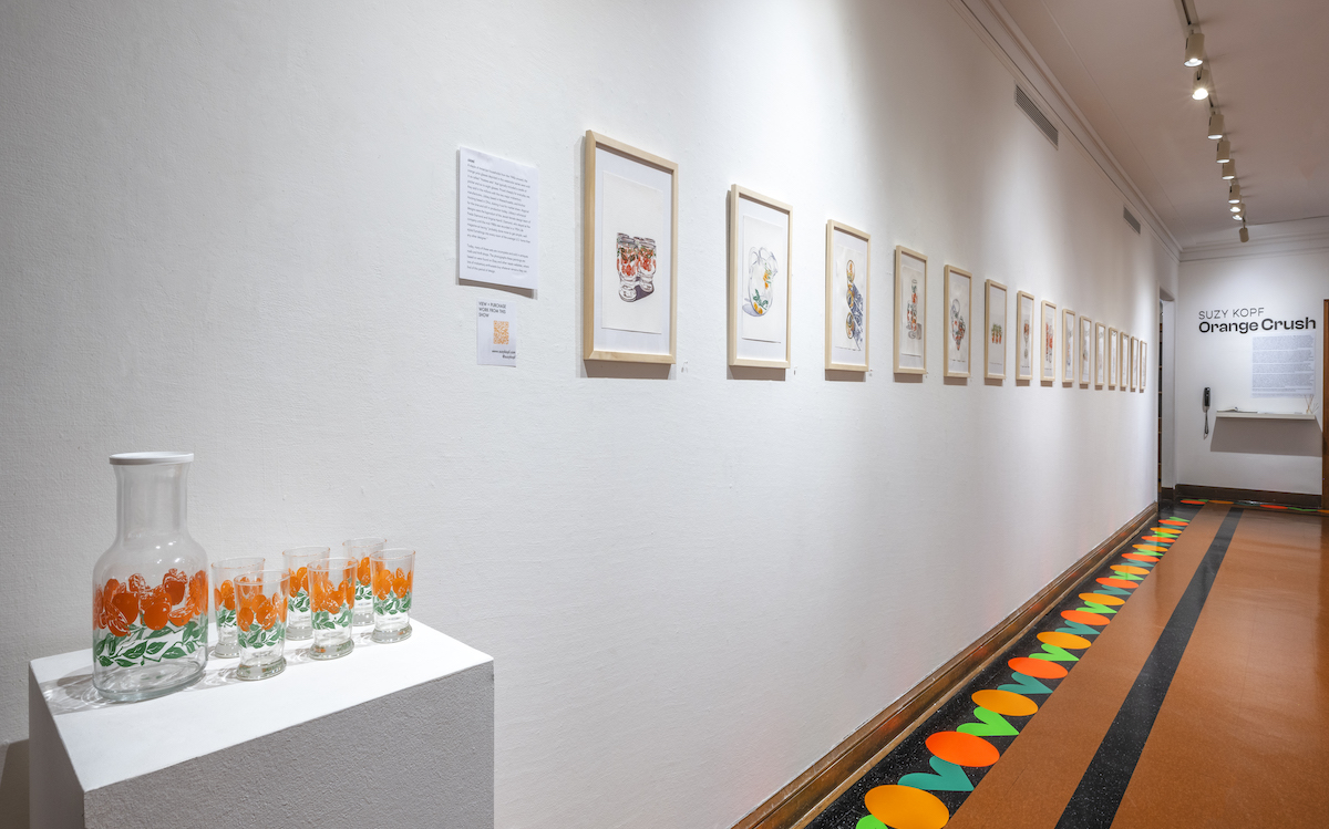
Orange Crush is a well-balanced show that references midcentury advertising and marketing materials for what eventually became major orange corporations, like Sunkist. Using a variety of media—collages, digital prints, and watercolors, as well as a decorative vinyl installation and a faint but pervasive scent of orange—Kopf explores the “mythology erected by advertising, contrasting facade with fact, sometimes within a single work,” as her exhibition statement says.
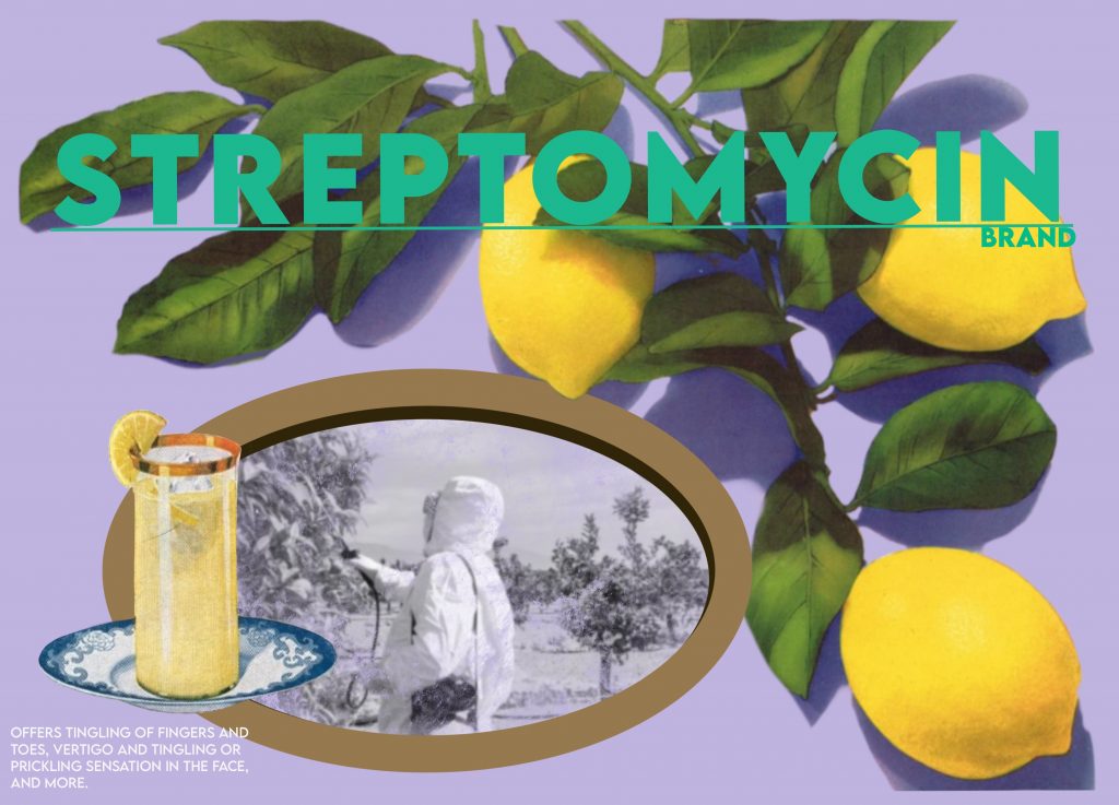
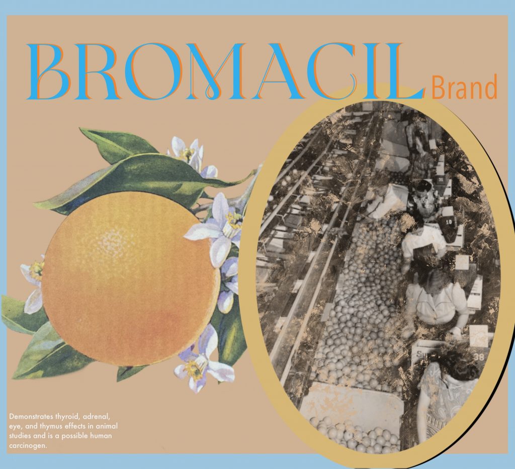
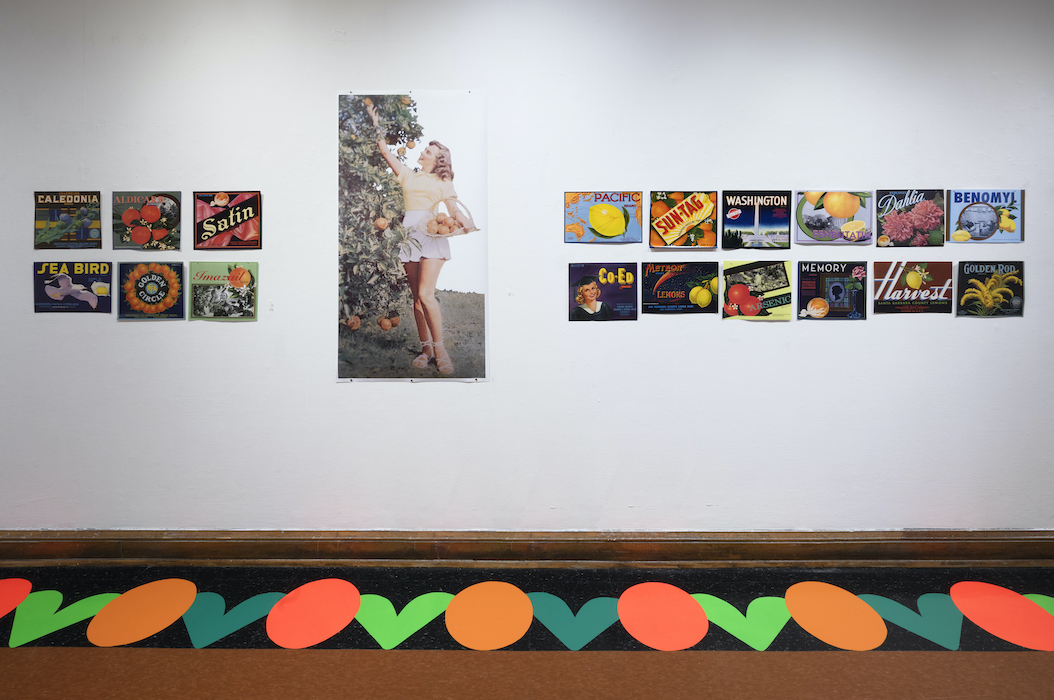
A series of watercolors depict deeply nostalgic “hostess sets”: decorated glassware produced from the 1940s and used exclusively for orange juice. Central in the gallery are wooden crates, stacked and filled with more than 100 slipcast ceramic oranges and lemons; perfect in form but pale in color, they mimic what citrus looks like after being sprayed with pesticides. On the opposite wall, 10 digital prints combine actual citrus-crate labels from the orange industry’s boom era with alternate versions made by the artist that advertise pesticides like arsenic and methomyl. These labels also feature photos of the underpaid, largely immigrant and non-white laborforce of pickers, whose images were left out of company promo; companies opted instead for “orange girls” who, in Kopf’s large-scale prints, pose on ladders with suggestive skirts full of citrus. And finally, a series of collages depict the historic and present-day challenges of orange infrastructure along with illustrations from a 1938 Sunkist coloring book aimed at children.
The work is built on both textual and material research, including a summer 2021 fellowship at the Hagley Museum in Wilmington, Delaware, where Kopf studied orange industry marketing materials like crate labels, logos, and pamphlets from the first half of the 20th century. She also used a grant to hire the artist Hae Won Sohn to teach her how to make plaster slip-cast molds.
Most BmoreArt readers will have already recognized Suzy’s name here as a longtime contributor and former full-time staffer at the magazine. Given these conflicts of interest, it would be impossible for BmoreArt to properly review Suzy’s show, and typically I don’t interview friends. But since I’m from Florida, she’s from California, and this work is about something so central but ordinary in our lives, it seemed like just the right occasion for us to talk about how we feel about oranges, marketing, the sunk-cost fallacy of the orange industry, and whose home state grows superior oranges.


Rebekah Kirkman: I wanted to start off by addressing the rivalry between Florida citrus and California citrus. I know you’ve read this book, Oranges by John McPhee, and this is from the first chapter: “An orange grown in Florida usually has a thin and tightly fitting skin, and it is also heavy with juice. Californians say that if you want to eat a Florida orange you have to get into a bathtub first. California oranges are light in weight and have thick skins that break easily and come off in hunks. The flesh inside is marvelously sweet, and the segments almost separate themselves. In Florida, it is said that you can run over a California orange with a ten-ton truck and not even wet the pavement.” What do you think about that?
Suzy Kopf: Something I never thought about before I started doing research for this work is that oranges grown in Florida are really juice oranges. That is the way that the market went—I think it has to do with climate and what they were having success selling. Orange juice is actually an invention that came about because they had all these oranges that were unattractive (which he gets into in the book), so they needed something to make with them that they could also sell; otherwise, they were taking a pretty big loss. Growing up in California, there was always citrus, and there were always other vegetables in abundance. Here, I feel like the produce is so subpar, and when I take it home, it rots immediately. It’s just a reminder for me that the food we’re buying at the grocery store is not grown here. It’s already had a long journey to get to the supermarket. The massive expense of getting fresh fruits and vegetables, and the privilege wrapped up in that, is something I’ve thought a lot more about since moving to the East Coast.
So in California do stores sell mostly local produce?
A lot of produce in California comes from Mexico and Central America. You can also specifically seek out stores that are selling local produce. There’s this farm stand that has a couple of locations in the area that I grew up in, where it really began as a farm stand, bringing the produce from the field and selling it, but now it’s a full supermarket.
Those used to be super common around where I grew up too, but they have faded, probably because of changing industry.
It’s not profitable to be a farmer in this country anymore, in pretty much any industry, unless you’re doing mono-crops: growing soybeans, growing corn. It’s too bad because we are now completely reliant on other nations for our fresh food. And it has to travel much further, which affects climate change.
I can see how this topic sent you down a rabbit hole. How did you stumble upon this subject of citrus and oranges? And how did it lead into this show?
I was at a grocery store, and I was noticing that the citrus was all imported from South Africa, Central America, and China. I was thinking, wow, this is a really long distance to come to be sold for $5.99 for a whole case. How is anyone making a profit on that? And also, wow, the incredible distance that this has traveled for the convenience it offers. And then I started thinking about the marketing—is Vitamin C as good for us as it’s said to be? Because I grew up in the ‘90s where I was force-fed milk at every single meal, and now I have a lactose intolerance [laughs]. I started thinking about oranges as a symbol and what they mean to people from Florida and California without even really knowing it.
I don’t really like oranges, I don’t eat them, I don’t buy them. But a lot of people do and associate them with home. Fruit becomes a symbol of a region, especially in this country. Oranges are on the Florida license plate. They’re on pretty much any pamphlet that I found for towns in California, really front and center, and they work nicely, they’re beautiful—they have this bright, attractive color. But oranges have been around for a long time. They’re from what is now Mainland China, and Europeans have enjoyed them; if you look at paintings that were commissioned by the Medicis, there’s oranges in them. Oranges are symbols for cities in Italy, like Rome, which considers itself the city of oranges. I see it as a connection to the past, and I also wonder if our children’s children will have this fruit, which is doing really poorly. As a Floridian, do you know about citrus greening?
I was reading about it this morning, but what is it?
A bacteria carried by a pest infects the trees, and once a tree has it, it dies—there’s no cure. But despite this, the Trump EPA approved the use of two of the pesticides I made fruit labels for, Streptomycin and Aldicarb. Streptomycin is used in a hospital setting, and using it on fruit means that if you go to the hospital and you need this antibiotic, you might have built immunity to it. And Aldicarb is known to cause cancer. No other country in the world has approved that for use on food, but we were just like, “Let’s try this thing that doesn’t work. We know it doesn’t work. But let’s just put it on some fruit.” It’s sort of desperate, is how I see it. Those trees are going to die, and either [growers are] going to import new trees at great expense and plant them and hope that the same thing doesn’t happen again, or they’re going to find another solution, which is, let’s face it, going to be another pesticide.
What’s the story behind the painted collages?
I really wanted to tell both the story of citrus historically and the challenges that are facing it now. The original problem was that oranges and lemons were grown in California and Florida, and the people who were growing them wanted them to be in markets all over the country. They had grown the fruit right around the time the railroads were getting all laid out, so they realized they could put their fruit on the railroad, but they had to figure out how to do it so that the fruit wouldn’t get crushed or rot en route. More contemporary problems have to do with splitting, greening, and pesticides.
These collages combine imagery from advertisements through the 1960s from magazines like Life, and those pamphlets on California and Florida from the 1910s. It’s a big span of time in here, and the true linkage between each of these six panels is these little tiny collages I made which are from a Jack-and-Jill-style pamphlet that Sunkist produced that was targeted at teachers and parents to encourage them to give their children citrus every day. It was supposed to be a coloring book, so I did the colored-in version of each of the images from the series, and the titles are part of the text from each of those pages.
For one, part of the title says something like, “it doesn’t rain in California in the summer,” so we have this irrigation system they had to develop. At every single turn with citrus growing in this country, you realize that this was a problem to solve, and people solved it because they thought they could make a lot of money. But at no point was it easy. They were making something that was rotting before they could get it to the store. They were making something that they didn’t have enough water to grow. They were making something that the environment was killing actively with all the bugs.


With these ceramic works, you’re referencing various coatings the fruit gets during production—pesticides, which make it look pale and bad, and then, in some orchards, another coating (Citrus Red 2) to make it look more beautiful and shiny. It makes me wonder, what is the truth of this fruit? What does it really look like? There are all these ways that we try to make something look perfect and more natural, but it’s not actually natural at all.
As a kid growing up in California, my parents had fruit trees in our backyard that the previous owners had planted. During my childhood, I noticed that the fruit on these trees didn’t do very well. It always had some parasite that was eating it, or they were splitting. Citrus splitting is directly related to climate change, as I learned when I was researching for this show. The fruit bursts because the soil gets really dry, the tree dries out, and then it gets a ton of water, which is the weather pattern in California now and has been for the last 20 years. It doesn’t rain, then it rains a ton, then it doesn’t rain, then it rains a ton. And these plants are just not adapted to that, so you get a lot of fruit that’s inedible because the inside has been exposed to the outside and it hasn’t had time to properly ripen.
Tell me more about your research—what were the sources, where did you do it, and how?
I started delving into archive work at Hagley, where I had a fellowship in July of 2021. The things that I asked them to pull for me related to how citrus was grown and how it was sold and packaged. Some of what came out of that was understanding that the citrus boom in this country, the height of citrus, was around the 1920s and ’30s. That’s when people were planting, planting, planting, and that’s when the propaganda was really at its height. What we call today Sunkist, which has been a company since the ‘30s, was originally a bunch of other little companies merging together because they realized that if they shared their marketing dollars, they could get further and have a bigger presence in supermarkets in big cities. It also protected the individual farmers—if you’re part of a co-op, if you don’t have a great year but your neighbor does, you’re okay, you’re sort of supporting each other.
Don Francisco, the ad man for Sunkist, developed ideas about selling health to mothers, for their children, selling to women this angle that citrus will help you keep your slim figure, selling virility to men if you eat an orange. He had a plan for everyone. He had a lot of influence over the way we think about citrus and how it became something that people eat on a daily basis, which was the goal. Orange and lemon producers like Sunkist realized that they needed people to eat every day to make money.
Was advertising to grocers the primary purpose of those pamphlets?
There are the grocers pamphlets, and then there are recipe booklets, which I’m sure you’ve seen at thrift stores. Sunkist produced a ton of those from about the 1910s to the 1950s, and I was able to study those at Hagley. I also collect those, they’re pretty affordable. The language in them is so crazy. They’re targeted at the housewife, and it’s just this fascinating moment in American culture where women were learning to cook by reading propaganda from the individual distributors of the food. So you could get a pamphlet from Sunkist, and that would tell you how to make a grapefruit salad. And then you would get a booklet from Heinz, and that would tell you how to make a truly disgusting-sounding stew using ketchup as the base.
Something I didn’t ask the archivist to pull, but they suggested to me, which I super appreciate, were pamphlets on cities in California and Florida. And that’s when I made this connection that oranges were part of the marketing of the entire state because in the pamphlet, they’re saying, “Come live in our town, here are all the industries that are options for you, and maybe you’ll meet a nice girl.” So the “orange girl” series that I included here is taken directly from these.
Another important aspect of this work is labor. In the wall text for these images of women picking oranges, you note that they almost positively were not actual citrus pickers. McPhee describes what it is like to be a citrus picker in this book; he notes here, at least in the 1960s when he wrote it, three-quarters of Florida orange pickers are Black people. How are you thinking about race and whiteness and labor in this work?
That’s the key part of it for sure. In California, a lot of citrus pickers were Asian immigrants, and some new immigrants like Jewish folks. In my family, the lore is—and it was very hard to get a straight story out of my grandmother—but my understanding is that it was very hard for them to find work, so they were citrus pickers and other fruit pickers. And that was pretty common for large Jewish families at the time, when they were just trying to get settled. Eventually, that part of my family settled in Utah and got other work.
The labor aspect of it is interesting to me because it seems like a really difficult job. And that work is completely concealed from the marketing, from our consideration as consumers. There’s this sort of cleanliness that is very important in the marketing. There’s a lot of WPA-style photographs taken in factories, and mostly they’re featuring white women in clean shirts, very beautifully sorting the fruit. It was quite hard, when I was making these crate labels, to find images of laborers that are not white, but it was important to me to find some. There was not a lot of documentation because that wasn’t something they were featuring at all, that is in complete conflict with the idea of paradise they were selling: “Labor? No, no, this is just bounty, this is just available to us.”
And we as consumers of citrus are exposed to pesticides and other stuff that’s on it, but the people who actually get cancer and actually get sick from it are most likely the laborers. That’s why it was important to me to include both contemporary and historical imagery in the 10 labels that I made, because they’re the people that are exposed directly.
I wanted to ask about your material exploration along with your research. I know the slipcast fruit and label designs were new for you. Can you talk about why you chose to explore through different media?
I’ve wanted to learn mold-making ceramics, slipcasting, for a while, so I wrote a grant and got one from MICA to hire Hae Won Sohn, who is my friend. That was so helpful because I could not have done it without her. I had no idea what I was doing. She really held my hand, especially at the beginning, because we were trying a lot of different things and it wasn’t working and there were a lot of 12-14-hour days in the summer of 2021 where I thought, “Maybe I give this up, this is difficult. I’m a painter.” But I wanted to push myself to try something new, and I am happy with the result. Ceramics are difficult; you spend a lot of time making something and then it could explode.
So the expense, the labor of that was an interesting meditation, too, the repetitive process of mold making, because you don’t just make a mold and then make multiples from it. You make a mold, then you clean the mold, then you pour the clay in, and then you wait for it to sort of solidify, then you pour the extra clay out, then you put a plug in, because these are three-dimensional all the way around. Then you gotta flip it over, wait a little bit longer, then you separate the mold. Then you have to clean it up; it’s not in good shape, or at least mine weren’t when I opened the mold. And then you can still lose it at any point because if it doesn’t harden right, it can sag, and then you gotta get the really fragile greenware into the kiln, and then it could still explode there.
That made me think about the crazy challenge it is to actually grow oranges, as described in this book. Did you think about the slipcasting process as a kind of analog to the actual labor of producing the fruit?
Yeah, and also just the process that the cleaners would go through in the factories to get the oranges all sorted and wrapped up. If you look at these fruit labels, you’ll notice that sometimes the orange is wrapped in tissue paper, and that was how they would put it into the crates for a long time. So that delicate handling, the washing, and then the wrapping and placing, I felt like I was kind of doing that with the flipping and the cleaning.
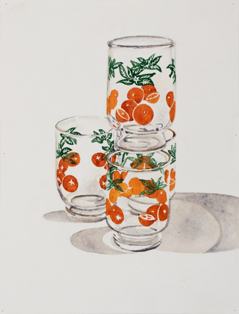
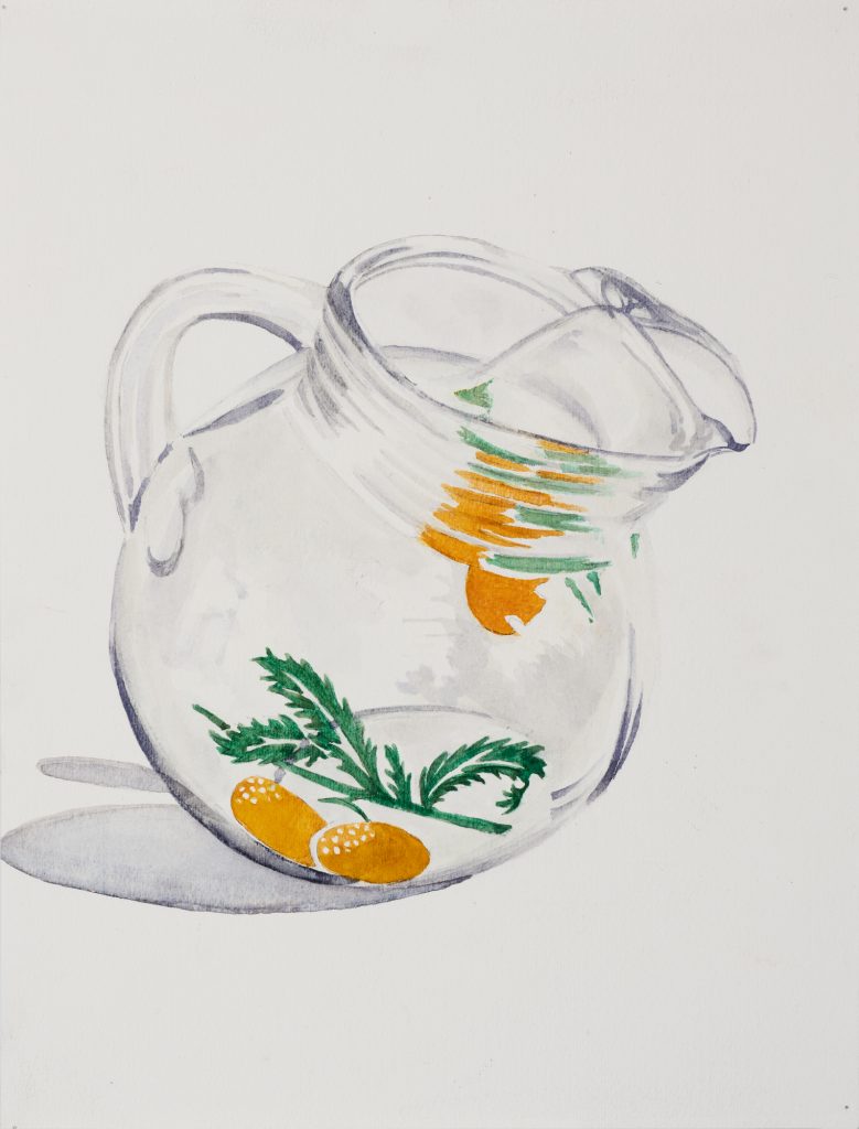
Your curiosity about midcentury aesthetics really shows in the watercolors. Why are you interested in that era of design?
My parents were both born in 1950, and they were the first in their families to go to college, and they were both from immigrant families. I feel like this is the world that my parents grew up in, and maybe by making this work that focuses on it, I feel closer to them. It’s hard to really know our parents, and it’s hard to understand their perspectives sometimes, so this is one of the ways that I do that. I also think about my grandparents and what they wanted, when they were trying to establish themselves when they were in their 20s and 30s, and that aspiration of the American dream that was really prevalent after World War II. Both of my grandfathers were veterans; both of them were working on minimum wage. And buying something like these hostess sets had significance: They were marketed for middle-class families—because of course you were having orange juice, and you had the disposable income to have a vessel that was just for that drink.
Did your grandparents or parents have them?
I’m the only grandchild, and by the time I was old enough to get to know my grandparents, they were quite old and had already divested of stuff. So I’m not sure, but probably. I’m always excited when I can do behind-the-scenes work to figure out who made the designs because they’re so strongly associated with nostalgia and memory for so many people, but we never think about the individual person who made them. I found out that the designers for some of these, specifically the Libbey brand, were a team of Jewish women. The two women are Freda Diamond and Virginia Hamill, and Diamond’s more famous one. I was so excited to learn that and to learn that they influenced this entire aesthetic. They also designed textiles and rugs, all sorts of things for the home and clothing. We don’t think about industrial design or interior design the way that we think about fine art. And these women are going to be completely forgotten. They’re not household names, but they are a part of so many American people’s memories.
Yeah, these are iconic. My grandma had a set. I can tell you put so much into each rendering. There’s something satisfying about watercolor when it’s done well; it looks easy but it’s actually very hard to have so much control. Also, the colors are really nice. I was noticing just how pigmented the orange and green are in these.
That was important to me. The different manufacturers were using different inks to put onto the cups, and then they all age differently, too. But the saturation is part of the attraction, I wanted to make sure to include that. The other thing to note about these is they’re not complete sets, because this is history. The period where people were buying these and making them has kind of passed. You can still buy a new set, but these are all being sold secondhand right now. So they speak to how much time has passed, the people who originally bought the sets probably died or are older. And now these are kind of the scraps.
There is so much to talk about in this marketing of perfection and paradise through objects and material culture.
It can clue you into the hopes of a different generation, like, I understand my grandparents’ generation a little better. I don’t agree with them, but I get that they were hoping for the best.
It helps you understand a certain hegemonic way of thinking—this was the environment in which everyone lived, and it didn’t work for everyone. It mostly favored the white middle-class and upper-class folks.
I think the work is successful if when people see it, they’re like, “oh, that’s kind of obvious, but I hadn’t thought about it.” With the orange girls, for example, what I see when I look at them is the use of women’s bodies to sell a product, the stunning whiteness of these particular women, and the complete divorce from the actual process and labor and work that was being done by people of color to get this product to market. Oh, and by the way, this product is from China, but we’ll never tell you that.
I like being reminded that things are more complicated than they seem.
I’m always thinking about my next project, but this one is gonna stay with me for a while, there’s still so much more I could do. It’s been really wonderful talking to people about their own feelings about citrus because it is this everyday thing that we have sort of stopped seeing and considering. So whenever I can make work that makes people pause, that’s good.
*****
Orange Crush is on view at Notre Dame of Maryland University’s Gormley Gallery through Oct. 7.