DAPS at Platform Gallery Explores Collectivity and Friendship within Curatorial Practice by Joseph Shaikewitz
DAPS is a refreshingly forthright and inventive curatorial premise that frames the current eponymous exhibition at Platform Gallery. Its name—derived from the communal fist bump that, over time, evolves from a clumsy greeting to a personally adapted show of camaraderie—foregrounds the role of friendship, peer influence, and collectivity in any robust artistic climate. However, these values have a tendency to be veiled from the public in the interest of projecting an air of expected decorum. And yet, it is clear in many creative working environments that amity and professionalism must not always be mutually exclusive—and with good reason.
Art critic Catherine Wagley has recently and adeptly prescribed the disadvantages of concealing the inherent amicability of the artistic field across its many practices:
“Art criticism, and art history by association, is frequently written by insiders reluctant to admit how ‘inside’ they are. Readers receive a streamlined, neutral-sounding version of what matters and why. […] If we weren’t so eager to present art as serious, or to conform to existing conventions of newspaper or magazine criticism (objective, authoritative), we might be better positioned to convey a compelling depiction of art’s pull. It’s unfortunate that our notions of transparency and authority rarely go hand-in-hand.”
What Wagley describes as the desire to convey objectivity and authority can likewise be applied to exhibition approaches that so often assume a sterile outward appearance in the final hours.
It’s an ethical predicament that, in many domains of the art world, dilutes the fundamentally cooperative backbone of creative circles.
In response and much like a breath of fresh air, DAPS celebrates the interconnectivity of Baltimore’s artist community and dares to represent it in a more accurate manner, despite the risk of such decisions appearing taboo within an arguably more established strata of museological practices. The primary conduit of this artistic goodwill is local painter, curator, and writer Alex Ebstein who, selected by Platform Gallery, invited fellow artists to show alongside her in a thematically porous group show.
In any other context, Ebstein could be accused of committing an unspoken faux pas of the curatorial field—that is, curating your own work into an exhibition—but that is far from the case here. Rather, Ebstein’s work—neither glorified nor exalted—constitutes one piece of many that collectively forms a vivid constellation of fresh, contemporary painting, textiles, and sculpture. Her inclusion is not that of the all-revered curatorial linchpin but of acknowledging one’s place in a creative community.
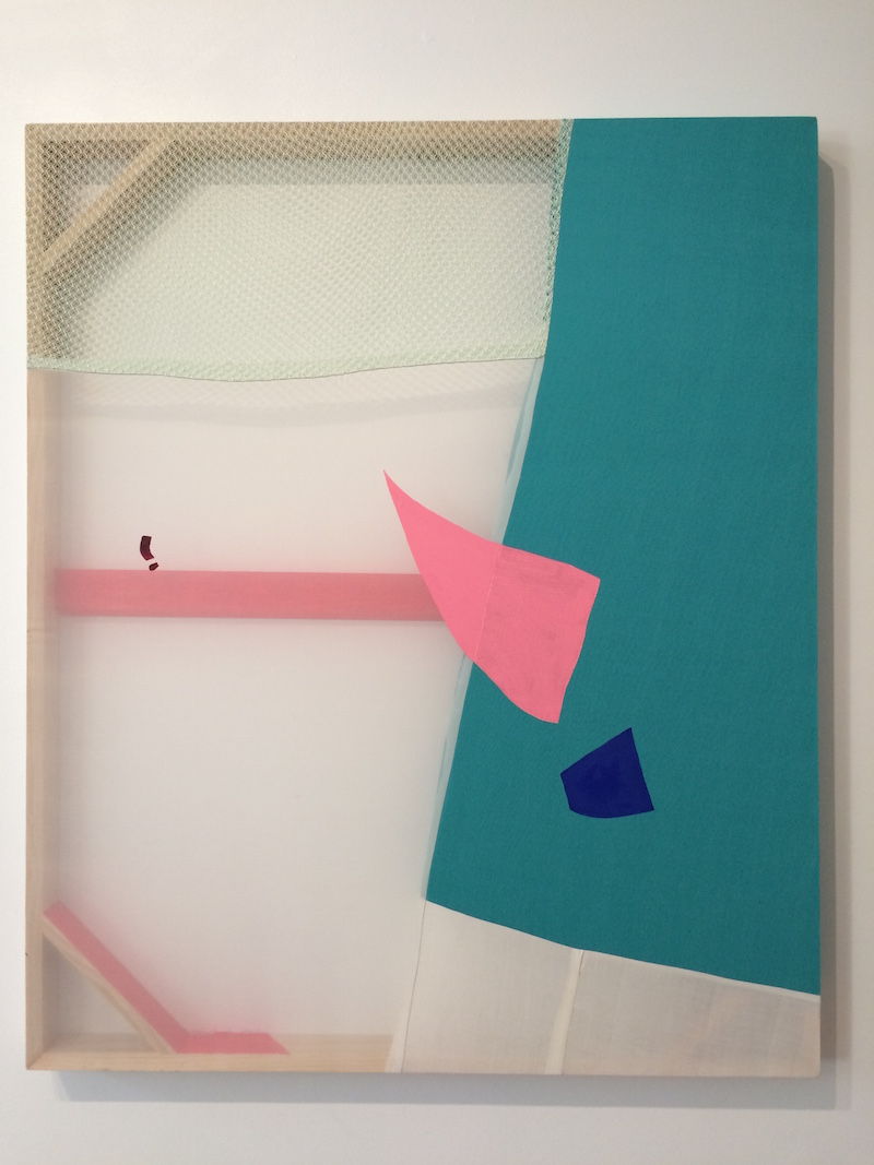
 Alex Ebstein
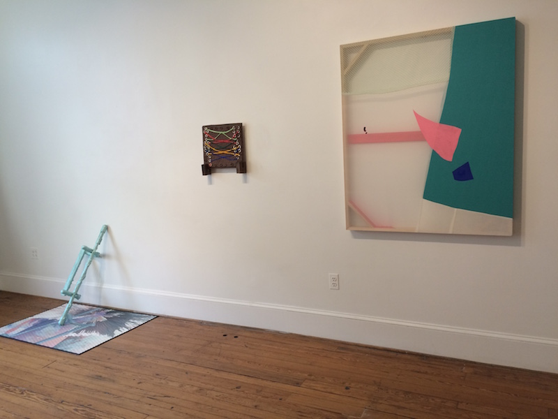
Ebstein’s sole work in the show is nevertheless of note, warmly greeting viewers as they enter the single room of Platform Gallery. I’ll admit to being quite baffled by her newest body of work: graceful abstractions forged from adjoining cut-outs of highly saturated and pedestrian yoga mats. The works potently confound the gestural guise of painting through their inventive technique alone, yet they appear to overlook the full associative weight of their chosen material. Medium aside, the modest example included in DAPS reveals broader formal interests that effectively set the stage for the rest of the exhibition.
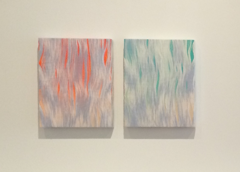
 Cecilia Salama, Amy Stober, and Dana Holgerson
This first iteration of DAPS is, at large, a display of subtleties—works that actively demand to reveal their full force over time. As DAPS facilitator of sorts, Ebstein has chosen to feature seven fellow artists who, among other reasons fittingly unbeknownst to the author, seem to have been selected for the initially understated yet ultimately intoxicating effect of their work.
The show may at first read as sparse, but this appears to echo the quiet impact of the paintings and sculptural work on view—like a carefully curated get-together rather than a blowout bash among acquaintances. Despite the warm feelings of fraternity that inevitably emerge and for the sake of producing fruitful art criticism, I feel nevertheless obliged to identify the successful (and otherwise) aspects of the exhibition—curatorially daring, as noted, but not without its ups and downs where individual artworks are concerned.
 Mandy Lyn Ford
In welcome contrast to Ebstein’s frank images that lay their formal attributes bare to the viewer, Mandy Lyn Ford’s alluring, compact paintings demand that their beholders work in order to grasp their aesthetic splendor. In “Cherry Moon” (2014), for example, Ford cuts through the picture plane with an open geometric expanse to reveal a hollow recess beyond the foremost canvas’s gritty impasto marks. This interior space contains thin vertical lines that provide a resting place from the visual noise and chaos of the exterior surface—purposefully dizzying, at once off-putting and exquisite.
As the eye centers on the supplementary background and its monochromatic respite, it becomes more and more enticing to get up on one’s toes, lean inwards, and peer into the harmonious void. For a work of such small scale and pithy marks, the effect is a testament to Ford’s ability to undermine conventions of the picture plane, visual pleasure, and spectatorship in such a confined space as the painted canvas.
 Sarah Eargle
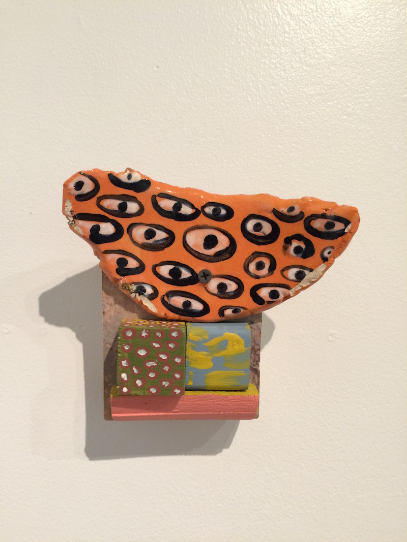
Even smaller than Ford’s pieces are two mixed-media assemblages, measuring in at a mere 6 x 6 inches, by Sarah Eargle. “Aquatic Longing” (2015) and “Surveillance Orange” (2015) present intricate sculptural microcosms with patterned surfaces that function as miniature yet ornate picture planes. Each stack also incorporates various readymades: what appears to be plastic shrubbery in “Aquatic Longing” and a flat screw head in “Surveillance Orange.”
In the latter example, the screw pierces through an orange ceramic fragment embellished with a crude motif of staring eyes. Where the graphic representation of a probing gaze counters that of the spectator’s—allegorizing presence effects vis-à-vis Hans Ulrich Gumbrecht—the raw inclusion of the screw reifies the viewer’s own positioning as spectator and depicts such an act as fundamentally intrusive. In the same vein as Ford’s small-scale paintings, Eargle’s formidable structures convey forceful meaning in spite of—or perhaps due in part to—their petiteness. Her approach is a shrewd reminder of why the monumental impulse in sculpture from the turn of the 21st century faltered in gaining much long-term traction; here, restraint is of the essence.
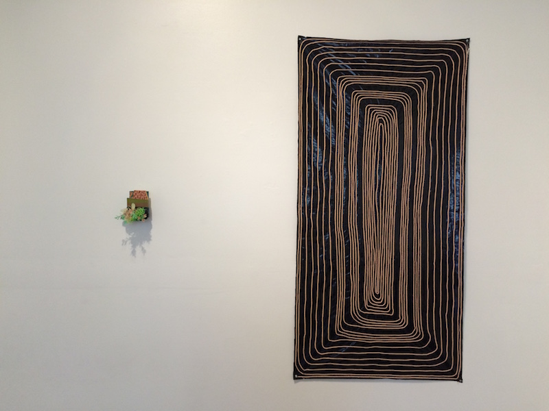
 Cecilia Salama
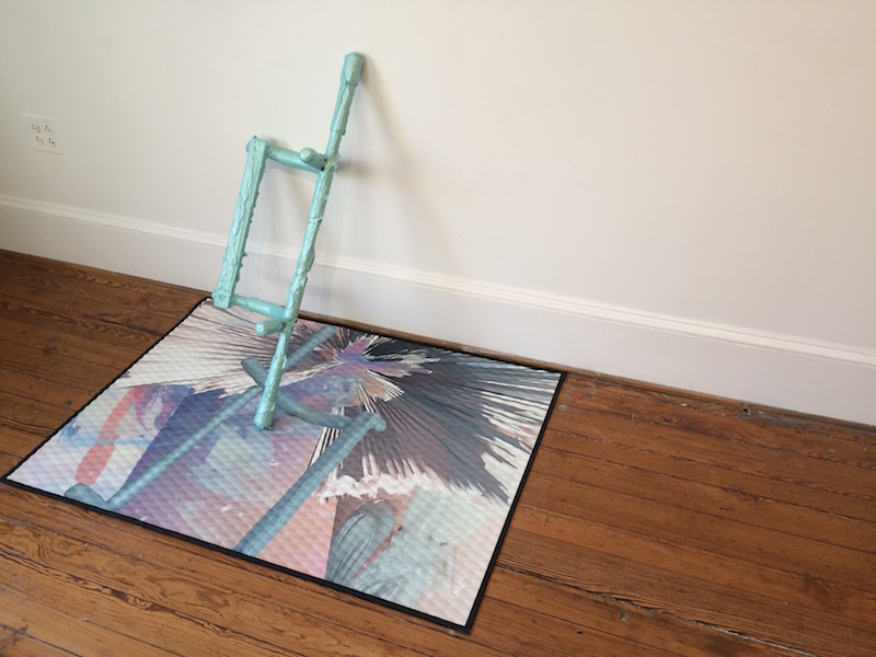
Although represented by one work in the exhibition, Cecilia Salama’s “Well Fit” (2015) is an absolute standout. For the piece, the artist displaces an over-the-door pull-up bar from its common home-gym context, covers it in a thick and alluring coat of cerulean acrylic and iridescent medium, and props it diagonally against the wall. The object sits atop a digitally printed rubber mat bearing a digital rendering of this now-sculptural form across an abstract expanse of pastel color.
“Well Fit” actively and importantly recalls the work of sculptor Rachel Harrison as the two artists transform and incorporate quotidian objects into clumsy, at times amorphous structures despite their origins in all-too-common things. However, Salama in particular follows the social and functional associations of her materials (unlike Harrison’s dissonant cultural iconography), grounding the pull-up bar in an off-kilter assemblage of complementary objects that further her investigation of fitness and recreation as aesthetic informants. The piece ultimately straddles the utilitarian and the aesthetic, craft and clumsiness, to create a stirring still life of the culturally banal and the referentially un-monumental.
 Dana Holgerson: Teething
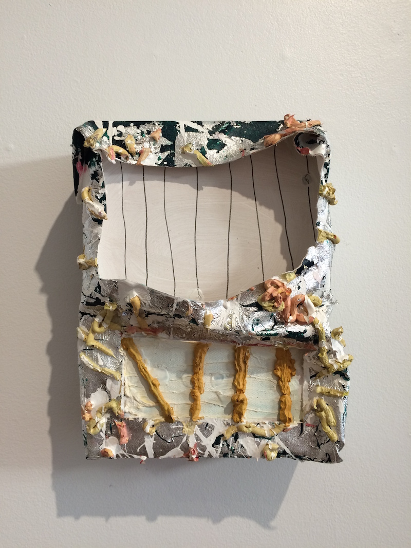
To my mind, Dana Holgerson—through the display of two distinct bodies of work—provides both one of the most impressive and one of the less captivating pieces in DAPS. On the positive end of the spectrum is “Teething” (2015), a sincere and unassuming painting that dissects the conditions of that very medium-specific classification. The artist sews fabrics of varying opacities, elasticities, and permeabilities into a single surface that she stretches at large-scale like a continuous sweep of canvas. The resulting visual language and material complexity flows in and out of the viewer’s awareness; it isn’t until coming face-to-face with the work that a quadrant of lace appears as itself and not a printed design.
This play of material also traverses that of translucencies: the surface ungrudgingly gives way to the underlying stretcher bars to which Holgerson applies a bright red hue across certain segments of the wood. The artist draws our eyes to the sculptural essence of the work in a way that I’ve rarely seen in paintings that toy with sheer surfaces, encouraging an awareness of internal logic based on material structure rather than traditions of illusion.
 Dana Holgerson: Shift
However, Holgerson’s second work in the exhibition (“Shift” [2015]), as well as pieces from Amy Stober, Maddi Seely, and Margaret Wingard, leave me feeling flat by comparison. Whereas the artworks expounded upon above skillfully defy medium while staying true to their respective underlying techniques, the other works are slower to get off the ground; they’re in no way entirely unsuccessful, but rather less daring than those of their peers. Holgerson’s “Shift,” to cite one example, does little to challenge Modernist conceptions of the picture plane through woven forms that rest idly within the surface.
 Maddi Seely: Night Painting at Right
The same can be said of Seely’s yarn on pleather composition “Night Painting” (2015), which, despite an inventive impulse of surface material, does little to differentiate itself from the most ordinary of Minimalist motifs. Stober and Wingard, on the other hand, demonstrate a complex relationship with figuration and allegory, but their anemic application of imagery—be it of thick, looping lines of acrylic in the case of the former or neo-Dadaist inspired musings with the latter—is simply less compelling when abutted against the whole of the exhibition.
For all that a critical evaluation of DAPS’s individual parts might achieve, I walk away from the exhibition in its entirety with an expanded perspective on the interpersonal merit of our immediate cultural community. To pay homage to the strong sense of collectivity that moves artistic hubs forwards is to recognize more integrally its impetus in artistic production at large. Thankfully, this dissolution of outward expressions of cordiality—at least in the realm of the thematic conception of exhibitions—is occurring more and more frequently.
FAMILYFAMILYTREE’s recent group showing in “Positive Reinforcement” at Gallery Four is one of the most meaningful shows that I’ve seen this year and curator Helen Molesworth’s latest exhibition “Leap Before You Look,” which highlights the eminent and diverse community of artists who studied at North Carolina’s Black Mountain College throughout the second-quarter of the 20th century, has been met with critical acclaim. This growing attention towards the ‘group’ sensibility of a group exhibition—its personal overlaps and intersections—appropriately emphasizes the current and continuing value of community, collectivity, and collaboration. DAPS and its organizers skillfully traverse a relatable conceptual starting point and a polished finish product and the impact, I hope, can revamp the impersonal museological axioms to which we’ve grown accustomed.
DAPS will be on exhibit at Platform Gallery through January 4, 2016.
Author Joseph Shaikewitz is a Baltimore-based writer and curator from St. Louis, MO. He is the Gallery Manager at Hamiltonian Gallery in DC and a graduate of Johns Hopkins University.