Ian MacLean Davis on Front Room: Seth Adelsberger at the Baltimore Museum of Art
Since re-opening in November 2012, the BMA Contemporary Wing has welcomed an esoteric series of exhibitions towards extending the scope of the museum’s contemporary collection and highlighting local emerging artists. The current Front Room exhibition highlights recent work by Baltimore based painter Seth Adelsberger.
In his first solo museum show, Adelsberger presents a survey of recent projects, which consistently address a range of concepts including contemporary and modernist painting, domestic spaces, technology, materiality, exhibition design, and the increasingly fuzzy borders that define painting, sculpture, craft, pattern and decoration.
Entering the gallery, the informational wall text frames Adelsberger as a painter, presenting a periodic history of modern art that ties Adelsberger’s work to paintings in the BMA, including the strict formalism of American painters Ellsworth Kelly and Frank Stella, the brushy strokes of Abstract Expressionism, and the material concerns of Italy’s loose Arte Povera movement. The cultural DNA of Adelsberger’s work can be found in these forbearers, albeit in sometimes surprising ways.
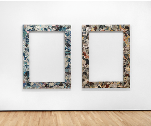
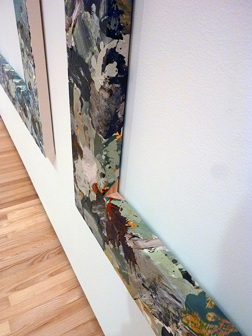
The “Border Painting” pair towers over visitors, constructed of planks of raw construction pine fabricated into a frame. All four sides of each armature are neatly wrapped with yards of painted canvas, leaving the middle of the rectangle as empty wall space. In both works, the wrapped canvas is painted in a consistent color scheme – one warm, the other cool – each rendered in wet, fat marks that create patterns that evoke AbEx painters Willem De Kooning and Jackson Pollock. In Adelsberger’s wrapped frames, Pollock’s layered all-over compositions combine with De Kooning’s brushy surfaces; the resulting patchy fields of color surprisingly resemble upholstery and fabric design as well as 1950’s-style expressionist painting.
The adoption of fine art aesthetics by a wider commercial decorative industry is a theme that appears throughout Adelsberger’s show, and these works represent a strong iteration of that idea. The series title, “Border Painting,” is both simply descriptive and cannily clever. With the frame’s dominant empty middle section, the painted areas are clearly at the ‘border’ of the frame.
However, the title suggests a larger question: How close are these objects to being/not being paintings? They are constructed from the materials – wood, hardware, glue, canvas and paint – of traditional painting. But a painting, aside from material concerns, is also fundamentally a contained plane which offers a composition to be read, usually through indicating an image. The way Adelsberger wraps the canvas around these structures, the image is non-existent and the patterns function strictly as decoration for the wooden frame, secondary to the strong formal presence of the object. Their painted surfaces read functionally as upholstery, curtains, or patterned yardage. As this, the paintings are completely believable and uncomfortably gauche, which is likely the artist’s intention.
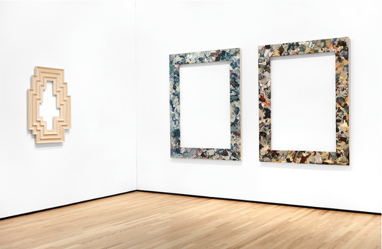
Adjacent to the “Border Paintings” is “Stella Artois 3.” If there is any question about the definition of painting vs. sculpture, this is unambiguously a sculpture about painting. In the piece, the artist has fashioned a frame of 4”x1” unfinished pine, with each outer side bordered with 3/4” quarter-round trim to resemble a painting’s stretcher frame before being covered with canvas. Within this outer frame are two additional, nested layers of the same reiterated pattern, leaving an empty center similar to the neighboring “Border” pieces. The sculpture is an octadecagon (18-sided polygon) designed with deliberate math to illustrate a well-balanced design of regular, repeated horizontal measurements and irregular vertical lengths.
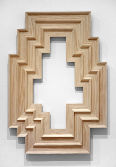
The shape is similar to the design of the 1980’s arcade game “Tempest,” in which players defend the outside border geometry of the board against attacks from the center of the screen layout. The inner rings of this piece draw one’s eye towards the middle in a similar way. Both the title and the form betray a clear art historical reference to painter Frank Stella (more than the popular Belgian lager, although it also applies.) The gallery text directs visitors to a Stella painting upstairs in the museum, “Club Onyx” (1959) with which this sculpture shares similar geometry and design. Moreover, Stella is well known for painting on shaped canvases, often at a monumental scale. Adelsberger’s piece is a size that would comfortably fit on an average living room wall, a “Stella” for a domestic space. This sculpture is the most elegant piece in the exhibition, and the least coy about whether it’s intended as a tribute or a critique of the materials and history it references. The piece is is clever, but not ironic, and even reverent to its namesake inspiration.
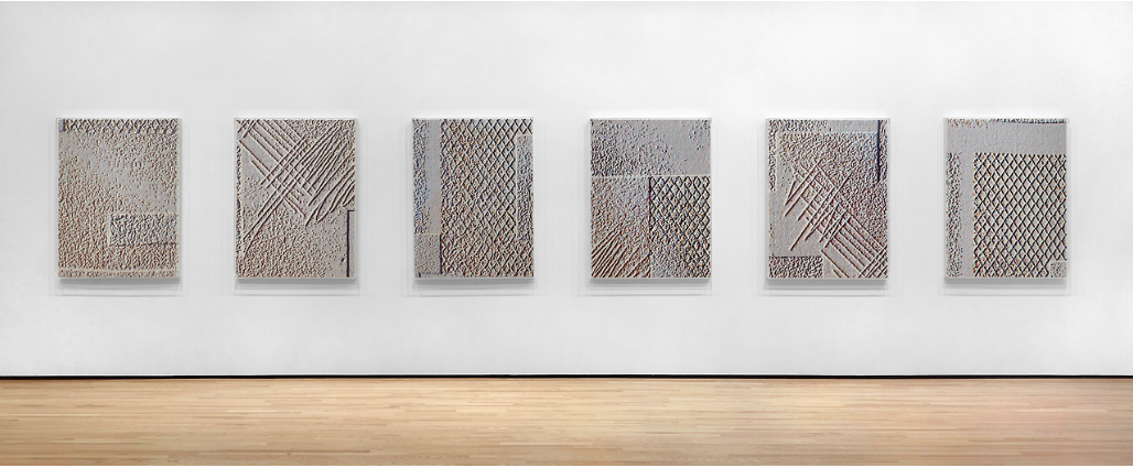
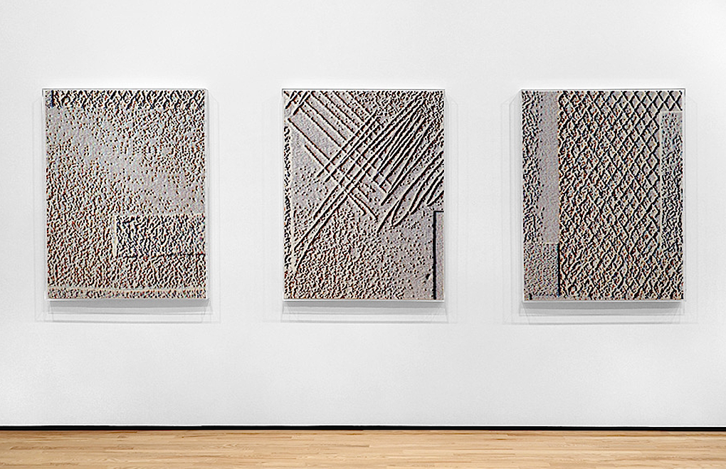
Nearly half the wall space in the gallery is devoted to a series of six uniformly sized, digitally generated compositions rendered via inkjet-printed short pile carpet. They are each roughly the scale of a doormat, or a medium-sized gallery painting. According to the wall text, the series is derived from designs the artist discovered on a website for a commercial carpet company which seemed to him to be inspired by Modernist painting and design. One would imagine interior design of the late 1960’s-1970’s as a good example of the type of designs Adelsberger appropriated for his raw materials and inspiration. He edited the catalog images in Photoshop and had the altered designs printed by a carpet company, which have been mounted to wooden supports and are displayed as a series of paintings on the Front Room’s longest wall.
For this presentation, the artist displays the paintings/carpets within clear plastic vitrine covers. Why are these carpets encased in plastic? Given the heavy texture and tactile nature of carpeting, closing that sensual surface off behind acrylic protection inspires questions about museum influence. Are the covers a part of the original concept or a result of the museum’s requirements? Was the institution concerned that patrons would not be able to resist the impulse to touch the carpets? This could very well be a conceptual choice of Adelsberger’s, considering the ideas which all the work in the exhibition suggest. Like the acrylic boxes that contain Jeff Koons’ famous vacuum cleaners, these cases are emblematic of museum exhibition design and the preciousness that it communicates.

Where the boxes containing Koons’ now-vintage-then-new appliances preserve a moment in modern industrial design, Adelsberger’s carpet cases seal off the works – each of which were created and intended to be understood as fine art. As these protective cases were a deliberate choice of the artist, and not a concession to grubby hands, they still fit into the dominant concept of the show: specific and controlled use of materials as symbols, as well as tools with which to construct aesthetic objects. Whether through utility or design, the vitrines are an unavoidable element of reading these pieces, and at the very least they flatten the images and obscure the sensuality of the carpets.
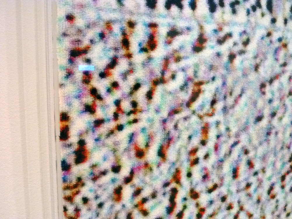
A friend of mine visited the exhibition – a quick visit – without reading the wall text, and did not notice that the works were carpet, due to the way light reflected off the cases. The hard plastic surfaces leave a strong impression. Moreover, the deliberately stark ‘C/M/Y/K + White’ palette and the visual texture of the designs read clearly as digitally derived images. Graphics programs such as Adobe Photoshop have the ability to completely mutate an image into something unrecognizable from its source. In this case, Adelsberger deliberately retains the evidence of his photo-editing steps. These compositions look ‘Photoshopped’ in a rudimentary way to allow the lineage of the original carpet designs to still be read, if not recognized.
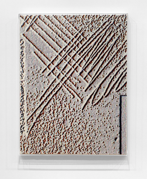
The combination of obviously digitized images with the pixilated texture of printed carpet is a funny conceptual association illustrating a relationship between pixilated digital space and carpet pile. The protective acrylic boxes create discomfort because they cut the pieces off from the air and render them as separate from the room. Since this type of carpet is most common in homes, sat least of a recent era, they extend the tension between decorative domestic space and a formal museum environment, a theme explored throughout the exhibition. Encasing the type of carpet we grew up crawling on behind plastic may preserve the materials, but it distances it from our ability to engage with what it symbolizes. The cases primarily read as museum-grade protection for the carpets, but Adelsberger’s intent in employing this protection is unclear. The domestic/museum theme that I’ve picked up on is secondary, if not purely subjective to reading the exhibition. I can’t decide if my honest response is frustrated by how contained these pieces are, or to appreciate the joke that the work is nearly a tribute to polyester-upholstered couches wrapped in clear plastic dust covers.
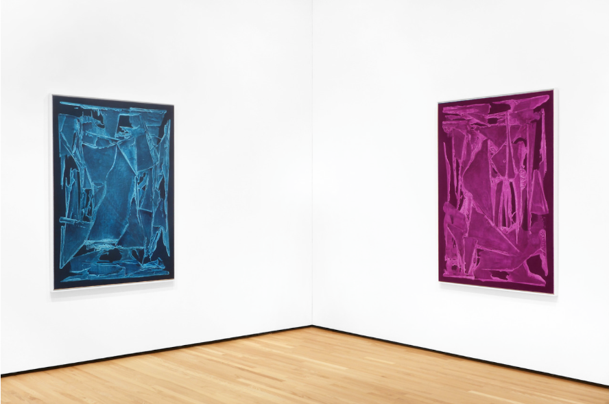
Rounding out Adelsberger’s painting survey, two works from the “Untitled (Large Submersion)” series are the most recognizable as paintings. Simply put, they are canvases stretched over supports to create a surface for gesso and paint application. In each, the image is expansive and full, creating a pictorial window onto which a composition is created.
In each, monochromatic fields are rendered through troweling and squashing gesso onto a dark painted ground. The cuts into these puddles of primer leave organic shapes, which contrast scraped, grainy fields. Once dry, this sculpted surface is glazed-over in intense washes of color that seem to be straight-out-of-the-tube Quinacridone Magenta and Pthalo Blue, referencing industrial printing methods. His glazes create a shallow, electric, neon space reminiscent of the flatness of low-resolution digital screens, like a computer or smart phone display.
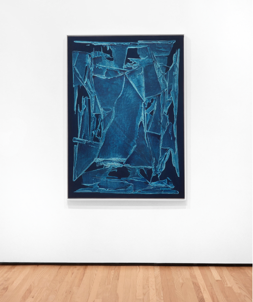
The combination of glazes and marks also very strongly resemble the elegant squeegee gestures of David Reed, but as if his gestures were a pane of glass shattered by a hammer. Reed’s arabesques are commonly distinguished by deliberately similar or repeated gestures that stand distinctly, almost as figures, abut also recede to insinuate space and atmosphere. Where Reed’s scrapes are soft and flattened by glazes of paint into image, Adelsberger’s surfaces are craggy and crazed, highlighting the weave of the canvas surface and creating a shallow, sensual topography that approaches the perimeter of the canvas, and then stops short. In contrast to Reed, Adelsberger’s marks appear unchoreographed and spontaneous, like window cleaning gestures.
At the edges of these canvases – roughly two inches inset from the end of the surface – the flat, dark background color is untouched by gesture. This dark border hems in the marks and organizes the gestures within strict geometry. The gestures never break the visual field of this border, and never the shape of the canvas. Considering Adelsberger’s focus on the history of painting and his informed compositions, visitors may assume that if his marks break the edge of the canvas, that choice implies the continuation of the image or visual field beyond that edge. Decisions such as this direct what viewers see and reinforce the idea that paintings are windows into a pictorial space.
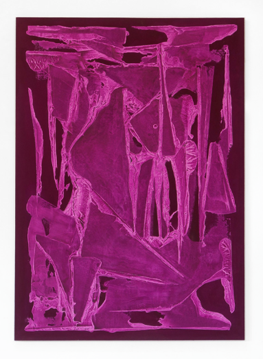
By filling these visual fields with marks, but then containing them so rigidly, Adelsberger manipulates the viewer’s instinct to view the compositions as images. The marks are spontaneous and painterly, yet the containment within this border reinforces the object-like qualities of the works. Even his more-pictorial surfaces read less as windows than as screens. As exploring the ‘borders’ between painting and sculpture is a consistent theme of the exhibition, these pieces may be the most frustrating example of that idea. Of the works in the exhibition, the glowing gesso textures of these compositions are the most closely tied to pictorial space, as the objects these canvases represent are so clearly tied to painting. But, like the “Border” pieces, the physical material expression of this pictorial space emphasizes their material substance over imagistic space.
As either a painter or sculptor (however those terms are useful), Adelsberger is obsessed with surfaces. The rough-but-soft carpet trapped in gleaming acrylic boxes and the impastos of the “Border” and “Submersion” series are satisfyingly smeared in different ways. Clean and clear pine accents peek out from the corners of the “Border” pieces and are the whole material concern of “Stella Artois 3.” It is smart and appropriate that Adelsberger’s 2013 solo exhibition at Springsteen Gallery was titled “Surface Treatment.” Surfaces are important. We live in a visual world where the textures of materials are heavily reproduced, flatly and digitally, without the full benefit of their physical presence. It’s entirely feasible that people may only understand canvas as a texture, but not a material. The artist relies on such distinctions.
Adelsberger is genuine in how he works with materials, regarding them with symbolic and historical value. At the same time, these concerns cast a matter-of-fact quality to the work that rubs against their design and visual strengths. The compositions fight against their materials, creating a frission between experiencing them as images, as opposed to objects. All else aside, the works in the exhibition are unquestionably expressions of the artist’s ideas of what these materials symbolize. Well above such dominant material concerns, Adelsberger is a conceptual artist. However beautiful, ugly, or difficult one might find the exhibit, the flow-chart of ideas that connects all the work is defined by his ideas about the way materials can be presented to be read as both image and object.

There’s a long tradition, particularly in painting, in creating a series of similar pieces to work through an idea in different ways, but I wonder if exhibiting these works in multiples may dilute the impact of Adelsberger’s ideas. In this case, presenting these projects in multiples or series feels like a misstep.
If I walked into a gallery filled only with the “Carpet Sample Set,” or entirely “Submersion” paintings, that would make sense. Galleries exist by the sales of art, and it’s often a priority for those businesses to present a cohesive visual/ material body of work because it’s easier to sell work that way. Museums have no such motivation, which opens alternate opportunities for curation. In a non-commercial space, it’s more reasonable to suggest that the “Carpet Set” series need not be shown as a set of six, or the “Border” or “Submersion” pieces as pairs.
Does having multiple iterations of the same idea and material application reinforce the artist’s idea? There is another model of presenting artwork that is more jewel-like, giving each idea a singular moment, an approach that can be seen in the work of conceptual sculptor Tom Friedman. His works are presented as formally different expressions of a wide idea; each varied in scale, form and scope and rarely repeating a material and process. Towards the goal of best displaying his ideas, Adelsberger might consider presenting his work in a similar fashion. Leaving the exhibition, I was left with questions, less about the unified concept, strong craft and intelligent questions suggested by the art, but more the diminishing returns of the same ideas repeated with the same materials and format.
Front Room: Seth Adelsberger at the BMA Contemporary Wing is up through November 2, 2014.
Ian MacLean Davis is an Artist, Writer, Educator and Curator living in Baltimore City. He is a 2006 MFA graduate of the Mount Royal School of Art at MICA. Hi s artwork has been exhibited nationally and is collected internationally. His art writing has been published by What Weekly and he has been a contributing writer and photographer for Bmore Art since 2012.
[* Alex Ebstein is an Associate Editor at BmoreArt