The title of MONO Practice’s current exhibition, no idea but in things, borrows from American poet William Carlos Williams. He wrote those words to refer to a rejection of heavy handed approaches to themes and concepts. Instead of telling you about love, loss, or grief, Williams suggests that poetry—and perhaps all art—should be filled with discrete and actual objects, and that through those objects emotion and experience can be discerned.
The nod to Williams is an interesting place to start for the exhibition, which combines found-object assemblage with photographs of everyday and unassuming subject matter. Williams is ultimately proposing that an artist show, not tell, the meaning of things, and between Jim Condron’s gathering and Dean Kessmann’s documentation of the everyday object or scene we must assume they follow this call.
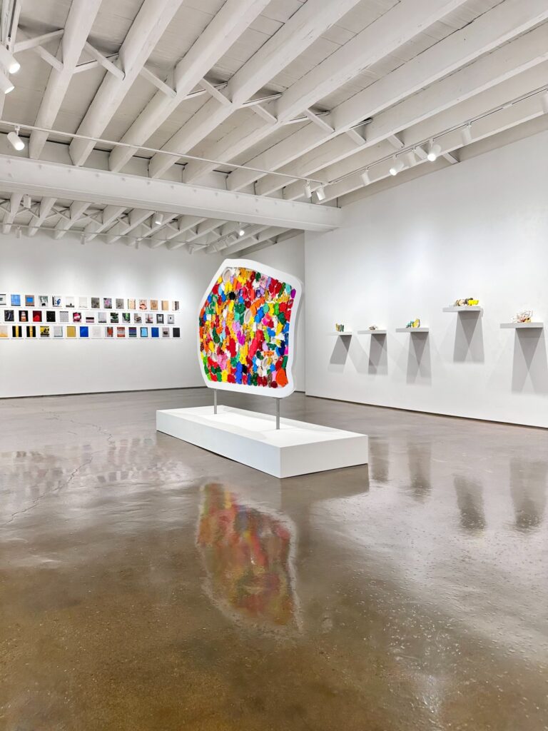
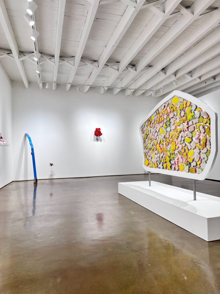
The largest single work in the show is by Jim Condron, a sculptor who earned his MFA from MICA’S Hoffberger School of Painting. “It was like daylight under the fluorescent trays of light” (2026) stands in the center of the gallery and anchors the show. It is the first thing you see upon entering the gallery and it is probably the last you’ll look at. It is a strange, oblong shape filled with brightly colored cookie cutters. The work stands on a large plinth with small steel posts that, in combination with its general flatness, give it the air of a street or highway sign.
The front and the back of the work contrast significantly. The side facing the entrance to the gallery is brightly colorful and heavily saturated. The other side is nearly monochromatic, comprising a limited spectrum of yellows and pinkish tones. It feels to me there is some gesture being made to the presented face and the working face—the side of the cookie cutter that proposes the bright future of fun images that you may soon be lucky enough to eat or share—and the workhorse back side, not as visually appealing and not needing to be for this is just a cast facsimile of the front side.
The relatively monumental scale of this sculpture is in stark contrast to the rest of Condron’s works that sit on a long run of small shelves. The material list is emblematic of the whole exhibition: the ordinary, discarded, or overlooked. Eggshells, crab claws, fur, and scraps of plastic—among many other things—create Condron’s small, discrete sculptures. “So sweet and so cold” (2026), a widely publicized work in the show, is a collection of bright red tubes twisting and interconnecting over a background of maroon paper pulp. With this somewhat standout example Condron displays a commitment to a minimalist design minded approach to composition. The elements are few and curated: red color, semicircles, and the quiet pop of the black screw heads that hold the whole assemblage together.
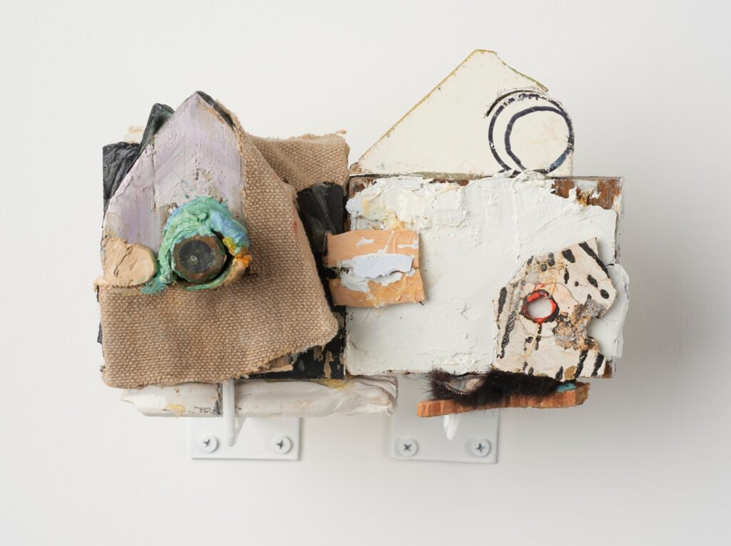
On the other side of the spectrum are works like” I don’t care if you’re not equal to me for a while” (2022), which feel more chaotic in their design. I appreciate the artist showing restraint in his materials list—oil, steel, linen, wood, tile—but the actual visual isn’t so simple. It’s hard to believe those are the only materials when parts look like a rusted copper bolt, smudged clay, even a bit of faux fur. This density of material is emblematic of the majority of Condron’s work in the show.
Of note with Condron’s work are also his titles. The poetic inspiration in the title of the exhibition is in line with his wordy titles for his work. Some examples include “They settled into life together, hers mostly” (2023), “Iowa has more acres of corn and soybeans than any other state. It has a million pigs,” (2020), and “They talked on into the early morning, the high, pale cast of light in the windows, and they did not think of leaving,” (2026). It is a risky approach to titling; the risk being that the title ends up doing more lifting than the forms. In the long line of shelves, a viewer with the works list could get lost in the text at the expense of the work. Generally speaking, I think Condron’s interest in the poetic phrase acts more as material than it does description. The poetic nod of the exhibition’s title is shared in Condron’s titles and for the most part the idea exists beyond them, in the things themselves.
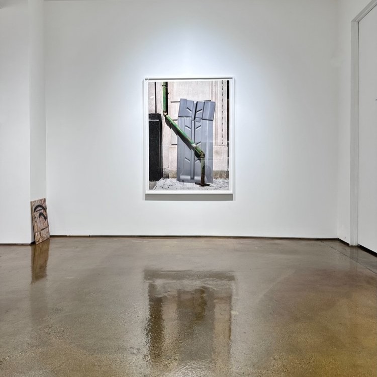
Dean Kessmann takes a quieter route. A DC based photographer and Professor of Photography at the Corcoran School of the Arts and Design, he is showing work from his series realism succumbing to abstraction or is it the other way around. The images come out of a daily walking practice where attention transforms the ordinary or banal into a noteworthy composition. While this process of walking, looking, and observing feels very familiar to me through the lens of photographers I know, what makes Kessmann an excellent pairing with Condron is that his subjects are not people. In fact, they’re hardly places, what they are at their core is two-dimensional design. Just as Condron does in three-dimensions, Kessmann composes with color, form, line, and contrast in a way that doesn’t feel the need to tell you something. Instead, the work plainly asks you to look.
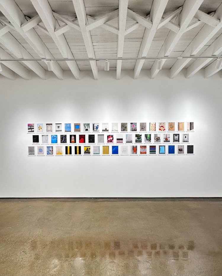
Kessmann’s work is presumably titled in line with the corresponding file number and date with titles like “Untitled 2026-924” (2026). In this piece, a truck with a saturated image of a lone tree in vast rolling hills is parked in front of an actual tree where both sign and signifier line up to nearly create one form, uninterrupted except for the silver framing of the truck.
A standout moment in the show is “Untitled 2025-03086” (2025) and “Untitled 2025-03092” (2025). These two prints mounted to OSB feel markedly more conceptually heavy than the rest of the series as well as much more materially based than the rest of Kessmann’s photos. There is a play here: the image is of OSB, it is mounted to OSB, and so the piece feels almost like just a piece of wood. On further inspection, however, you can see the subtle shift in tone from the image to the exposed edge of the wood, revealing this sort of trompe-l’œil, tongue in cheek art work.
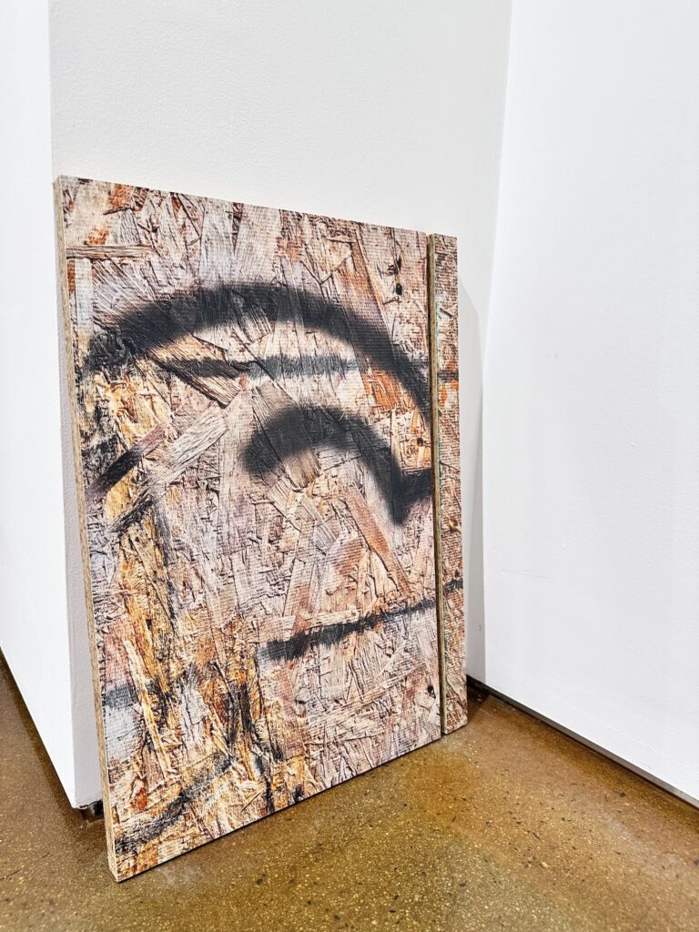
In “Untitled 2025-03086” there is even a small 1.25” sliver of the piece right next to the larger 12.5” section which to me implies a cutting down of lumber, the small offcuts produced from carpentry. I am taken by this work as it feels so different from the rest of the show—everything else on display has a kind of raw honesty, there is no idea but in things. The materials, the image—they are all exactly what they are. But here, the work is quite the opposite, yes, it is OSB, but no, the surface is not OSB. It is a facsimile of the material—a trick of the eye that takes you away from the material perhaps without even realizing it at first. I think there is something beautiful here in relation to Kessmann’s idea of walking and paying close attention, as perhaps the through line here is that this work requires that same level of attention that he takes with his photographic walks.
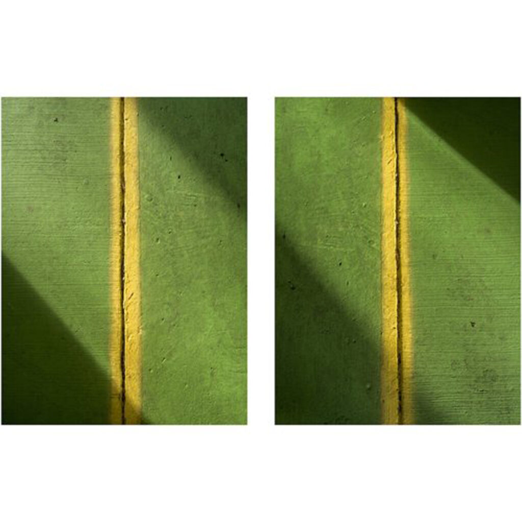
One of the other standout pieces for Kessmann is his framed diptych “Untitled 2025-4028” and “Untitled 2025-4026.” Both images are of the same subject, a flat green interrupted in the center by a stripe of yellow. Like one of Barnett Newman’s zips, the composition is minimal and similarly very much about design and the interaction of a single line and two colors. The two photographs, taken from the same vantage point, were made at different parts of the day or perhaps different parts of the year. The light moves diagonally through the work, leaving shadows in the upper right and lower left corners, but the time of day produces subtle shifts in these few elements. In one, the upper right shadow is darker, and more crisp, while the opposite is true in the other photograph. Also, while the directionality remains the same, one work has a subtly larger section of light. These shifts are delicate but perhaps it is the use of the diptych format that again allows the viewer to engage in the kind of close looking that is foundational to the work Kessmann shows here.
While Condron’s works take things from the world, Kessmann leaves them where they are found, and both transform these things through control of composition. Both artists seem to have a fascination with the overlooked and an artistic practice that centers that fascination instead of trying to tell some sort of story about it. Williams believed poetry should be rooted in things themselves, in what may be evoked through image. It would appear Condron and Kessmann agree. Their work holds the power of showing without the weight of telling.
no idea but in things, featuring Jim Condron and Dean Kessmann, is on view at Mono Practice, 212 McAllister Street, through October 31, 2026. The gallery is open Fridays 4 to 7pm, Saturdays 12 to 4 pm, and Thursdays by appointment