

This is a painting by one of the artists I used to look at a lot when I first began painting (Jules Olitski, 1922-2007). I didn’t have to look far because this is what my art professors were showing us students. And, to this day, I think it was a good beginning. The Olitski painting above washes over you with boldness and energy like a warm ocean wave.
Of course art is about now. It’s about your experience in this moment. Over time, prevailing styles in painting change partly because every generation sees a little differently. After I’d painted for only a couple of years, I began to hear the whispers artists from the past sounding a little louder. What they were saying with their work started to echo how I was feeling.
It is not that older art is better. Actually there was lots of second rate art in the old days, but most of that has fallen away: either thrown out, painted over, or forgotten and covered with cobwebs in some body’s attic. Big and bold hasn’t lost its appeal. At my gym in a group fitness class, I love it when the instructor cranks the music way up and we all blow it out together. But I’ve found alongside of that there is often a depth of feeling in the little things. Quiet and reflective has power too. Take the drawing below by William Waterhouse (British, 1849- 1917). The artist points out to us things we’re likely to overlook in which he found little unexpected pleasures. When we meet someone in real life we’re most likely to focus on the expression in their eyes and their mouth to gauge where they’re coming from.
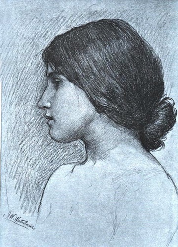
Waterhouse I’m sure did the same. But here he’s taking a side trip to show us other things he felt we should be sure to notice. For example the way he deftly draws the outline of the woman’s chin, neck and shoulder hard and dark and then fills the resulting empty space with a darker tone than in the rest of the background. It’s his way of calling you to attention and saying “look at how great these shapes are.”
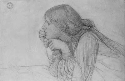
In this other Waterhouse drawing the entire face is toned down in favor of elegant geometry of the woman’s wrist, collar, and the bottom edge of her hair as it climbs and then falls over her shoulder. At their best, old painters like Waterhouse show us a world where they didn’t settle for just any accident or drip of the brush as being good enough. There’s an insistence and a rigorousness to the way they’d go after just a certain look for a shape or a color. They’d even practice their moves to get it right, as in this preparatory oil study below Waterhouse did for his painting The Naiad from 1893.
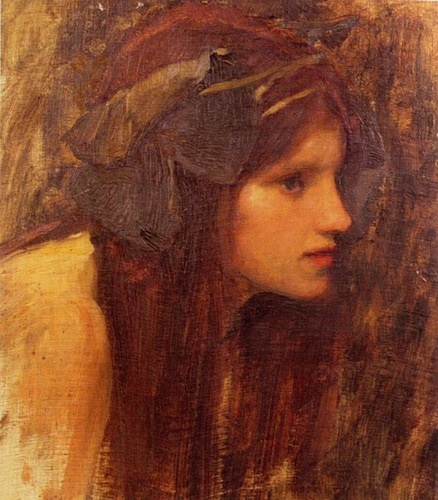
One of the things I get a kick out of is how particular the artist is in his rendering of the face- letting the one eye dominate and in turn softening the contrasts around the Naiad’s nose. Waterhouse knew well that he could overload his viewers with information and took pains to tone down passages he felt less important. Doesn’t the woman above seem to be staring at something? Here’s the entire canvas:
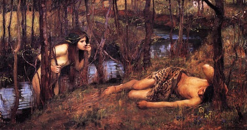
Naiads, by the way, were Greek mythological female water spirits who dowelled in streams and brooks. One gets the feeling life is about to get a bit more complicated for our innocent sleeping figure of Hylas on the stream’s bank.
I know realist painters of our time who dismiss modernism in art and everything it has brought about. Some feel everything since Picasso has gone south. I don’t feel that way.
God knows there is a lot of work done today that ends up more pretentious and downright silly than not. But given time, most of it is going to be forgotten up in that cobweb-filled attic of time. Some pieces from our time will survive and still be valued. Exactly which is any one’s guess.
Read more about Contributor Philip Koch at http://philipkochpaintings.blogspot.com.