The 2015 Sondheim Prize Finalist Exhibition discussed by Ian MacLean Davis, Bret McCabe, and Cara Ober
For the first time in its ten-year history all seven finalists for the 2015 Janet and Walter Sondheim Artscape Prize hail from Baltimore. This year’s selection of six individual artists and one duo were made by Matt Saunders, an artist who teaches at Harvard, Kelly Kivland, assistant curator at Dia Art Foundation, and Naima Keith, an associate curator at New York’s Studio Museum in Harlem since 2011.
In contrast with past years, the 2015 Sondheim Finalist Exhibition at the Baltimore Museum of Art features a number of painters and mixed-media artists, but also includes sculpture, installation, and video. In addition, what makes this group of finalists unique is the way each mines a personal and collective history in an age where personal revelation can be construed as weak or sentimental.
After visiting the exhibition, BmoreArt editor Cara Ober and contributors Ian Maclean Davis and Bret McCabe discussed the finalists entries. Here is part of that conversation.
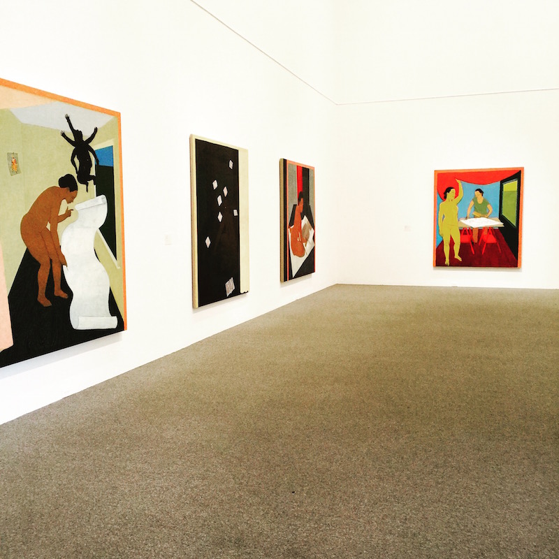
Mequitta Ahuja
Description: Figurative full-figure self portraits that integrate architecture with symbolic elements. The compositions imply physical and psychological spaces. Artist website.
Media: Oil on canvas, all approximately 84 x 80 inches
Ian: As self portraits, the paintings are reflective of the author; the imagery, colors, and painting style indicate female African-American authorship as well as referencing Asian Indian influences. The compositions possess qualities of miniature paintings enlarged 500 percent—but without the ornate patterns and decoration one might expect of that tradition. They’re almost domestic, but spare to indicate emptiness. At the same time, the compressed space of the architecture reminds me of Giotto in its flattened perspective. The shapes are rendered by washy linework and simple planes, described by color shifts almost as flat panels; these paintings feel lonely.
Cara: The consistency in this series of large paintings works well in the museum and comes off as a solid, well-thought out project, but I would also like more surprises. Up close, the surfaces are scumbled with layers of brighter colors popping through top layers of neutrals; the effect is engaging but the central figures have less of this layering and seem a little flat. The one piece that stands out—on the end, where the figure is yellow, “The Artist and Her Model”, is marked as unfinished. This piece is more lively than the rest because of its use of bold color – the underpainting which would later be covered by neutrals. Although it lacks the surface depth of the other paintings, it’s intense and emotional color is powerful. If you look at past series of Ahuja’s work, there’s a quiltlike collage aesthetic developed in their surface and I find this more compelling and active than the straight painted surfaces found here.
Bret: I can’t recall a local solo or group show of her work—the few pieces of hers I’ve seen before have been in Washington, D.C.—so in some ways this exhibition is Ahuja’s local debut, though I think she’s been living here for a few years now. And given the admittedly few examples of her work I have seen, these paintings feel both intellectually ambitious but visually safe, a wealth of ideas being incorporated into the composition but rendered with much less dynamic brio. They’re so patiently polished they approach the sacrosanct, and it’s entirely possible I don’t know enough of her visual language to find my own emotional invitation into their world, a way to navigate how her approach and subject matter inform each other.
Zöe Charlton
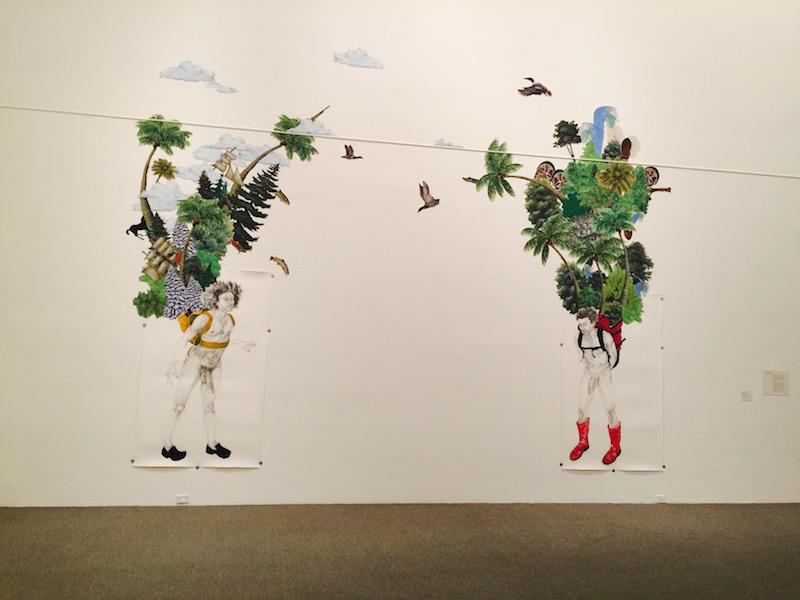
“Companion, Constant” (2105)
Description: Charlton uses a combination of figurative drawing, painting, and collage to discuss cultural/ethnic preconceptions and clichés. Artist website.
Media: Charcoal drawing on paper embellished with laser printed stickers applied directly to the wall
Cara: Charlton has taken previous series of life sized figure drawings of nude women and men and combined this technique with her more recent sticker collages, which were realized at a much smaller scale. Taking the collage technique directly to the wall at a monumental size infuses this work with power.
Ian: The composition’s focus are two life-size drawings of black males, nude except for brightly colored Crocs and Wellies on their feet, and equally vibrant hiking packs on their backs. Stacked and crowded on their backpacks are many various trees, some cartoonish, some more realistically painted—and from many different regions and climates. The attention to detail in the types of foliage and the symbolism of the sticker in the collage is hugely important—as are the various other materials and textures included in the installation. However, I don’t feel that the burden placed on their backs is monumental enough. The weight carried by the figures needed to be greater and more over-the-top to push the image to the necessary level of absurdity and power.
Bret: It’s going to be interesting to read the responses to Charlton’s work in the cultural climate we’re in right now. I consider her part of a generation of contemporary artists who explore how the knotty histories of class, race, economics, and power get written on the body with equal measures of irreverence and intelligence, and they’ve been doing it for two decades now. And in many ways the depth of thinking that has powered Charlton’s work, like Kara Walker’s, is too boldly nuanced for today’s politics of righteousness that wants the comfort of being able to say this image bad, this image good, without having to engage with or examine messy, uncomfortable histories.
Bret: For me “Companion, Constant”—Charlton’s imagining of Kalulu, the slave personal servant and adopted child of Henry Morton Stanley, a British explorer of Africa—is surreptitiously subversive. Yes, there’s the visual cornucopia of the European conquest of Africa that rises out of Kalulu’s backpacks. There’s also the cheeky choice of footwear, a curveball reminder that this human spoil of colonialism was killed during the act of colonialism on the Congo River, exploration that links Stanley to the atrocities of Belgium king Leopold II, the butcher of the Congo. Sure, it’s a curious choice, but it’s also a bit curious that the Wikipedia entries for both Kalulu and Stanley are crowd-sourced written in the calm voice of ostensible objectivity: the thorniness of history doesn’t always scream out at us in easily scannable infographics that tell us exactly what to think and how to feel.
Cara: I have gotten so familiar with this work that I didn’t even consider the shock value of a frontal male nude, especially a black male, in this century. While in the gallery I watched a group of wide-eyed school kids being shepherded out by well-intentioned adults, which, for me, altered the naughty punch of this work as well. If you’ve drawn nude models in art school, this is no big deal. But for members of the general population, this work is provocative in a number of ways.
Bret: After visiting this piece a few times it brought back memories of Geoff Grace’s “It’s the Linger Not the Long” from the 2008 Sondheim exhibition, the year he won. Not because Grace and Charlton share subject matter, media, or even aesthetic sensibilities one bit, but because the work feels like a succinct, immediate, and above all confident distillation of an artist’s headspace right now.
Benjamin Kelley
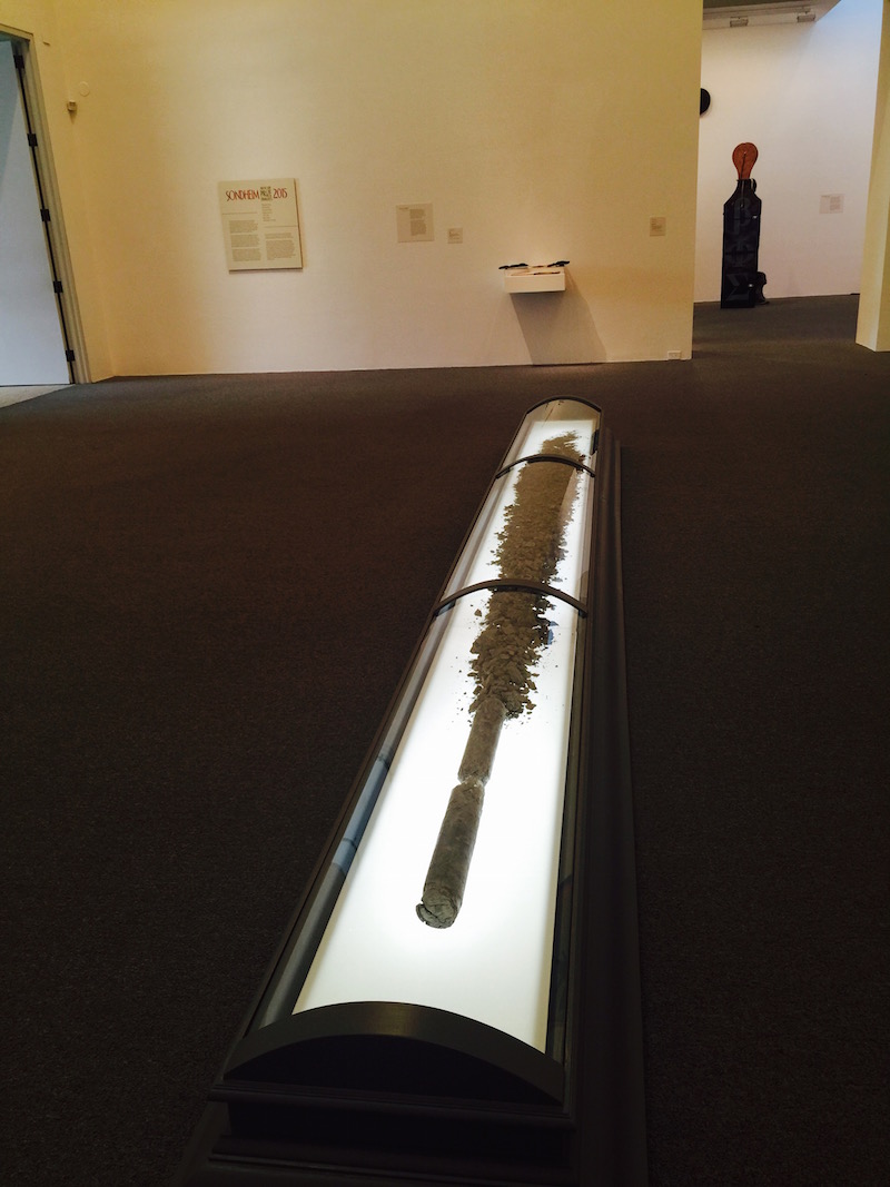
“Vault” and “The Steward”
Description: Sculpture and installation. Artist website.
Media: Kelley has created a coffin-like viewing apparatus for a million year old earth core sample, collected by scientists from the Bering Strait and a wall plinth with a book and iron cast form on it.
Content: This former land bridge between Asia and Alaska is thought to be the way human beings migrated to North America millennia years ago. Question: Is the soil sample and its case is a pseudo-scientific representation of man’s changing role on a changing earth? Or is this about our relationship with science?
Cara: There’s something about the institutional gray of the box coupled with the fluorescent backlit surface that seems intentionally “less than professional” or sci-fi even. I don’t mean the execution isn’t professional — it’s meticulously crafted — what I mean is the artist’s purposeful selection of details seem almost huckstery-churchy, rather than scientific. Why not polished steel to create a medical or scientific cutting-edge association? Is he attempting to turn this soil sample into a sideshow object or religious relic on purpose?
Ian: Kelley’s work is beautiful but intellectually removed. The main piece, “The Steward,” successfully emanates a sense of dread and history, literal and figurative. The piece installed on the wall is a book on a plinth, protected by an acrylic lid, with an organic cast-iron form set atop it. I know from wall text that they are a part of the same narrative. I’m impressed by the craft and presentation, but background research seems to be such a major part of the experience that I feel isolated from the conversation.
Bret: I totally agree with both of y’all: it’s cold and removed, and it’s theatrical, albeit these aspects are kinda what I like about it on first glances. Remember his “Cupid and Psyche” from the 2012 Baltimore Liste exhibition? Kelly sometimes appears to appreciate decay’s dispassionate anarchy. Putting an industrial frame around it—a museum exhibition box, like a coffin around a body turns death into a ritualistic sideshow all its own—so for me there’s something instantly touching about the “The Steward” and it’s august treatment of a deep earth core sample. But after that instant human smallness I’m not sure where he’s taking me, and that is a bit of a pickle. What I am to do with this empathy that he’s conjured? I’d like the work to point me gently somewhere after it establishes this connection.
Magnolia Laurie
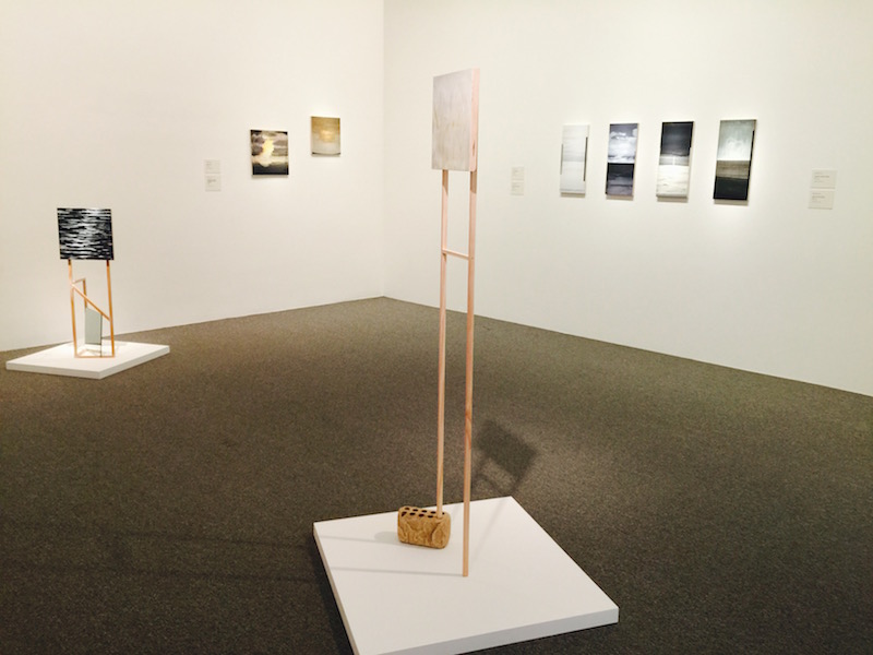
Description: Intimately-scaled formal paintings that dance between referencing brush-conscious gestural landscape painting and minimalism. Artist website.
Media: Oil paintings on wood panels, some with wooden pedestals with found objects.
Content: The process of creating a world through painted marks. Exploring what that world is and how it evolves.
Ian: I’m intrigued by the way Laurie uses materials and mark making to arrive at images that veer from pattern-based abstraction to extremely sensitive, cool landscapes that are fuzzy like desert photography—but also are nearly minimal in the way the spare compositions are rendered. Magnolia’s works are primarily oil paintings on reinforced wood panels. Being on hard panels, brushing and scraping paint across the surface is a huge part of the images she creates. In this exhibition, the marks are both scraped hard and flowing with brush-mark, often isolated from each other.
Bret: I hope Laurie doesn’t take the following comment as a knock but I read her painting vocabulary and approach as visual post-rock, those predominantly instrumental bands of the past 20 years that recombine conventional rock’n’roll instrumentation and ideas with sounds, timbres, and textures from other genres to create a contemplative, highly stylized different place. She even favors the self-aware syntax practiced by many a post-rock outfit—quick, sort the title of a Laurie painting from the Explosions in the Sky album titles: “between here and there;” “take care, take care, take care;” “the earth is not a cold dead place;” “a means to measure change;” “of this and here and now.” Thing is, like a June of 44 album, Laurie creates works that visually recall bits and pieces of things in the aesthetic memory but are entirely her own.
Cara: I have loved Laurie’s work for many years and –full disclosure– I own one of them. What I have observed over past years in her best work is a sophisticated and surprising painting vocabulary where her imagery is an excuse to push the physical boundaries of her medium. Although they depict desolate imaginary places and odd, unravelling structures, Laurie’s paintings are successful because they pair all sorts of weird and hard-to-figure-out brush strokes with thick and glossy areas. For me, it’s her painting language which is so compelling and the imagery has developed to supplement her vocabulary. In this particular body of work, I am looking for more of these thick/ thin contrasts, though. Some of these works feel too thin to me, as if they were a bit rushed.
Ian: Laurie’s environments always felt like a stage for formal concerns, but her move into more atmospheric composition and subject matter changes that perspective. In this work, I’m seeing a shift from geometric, almost structural design to brushwork and colors that focus on light and air in a much different way. The paintings seem to be moving from flat abstraction to atmospheric expressionism. I don’t feel like I can discuss the work without discussing the history of contemporary painting.
Bret: I realize the following comment is completely unfair, but because the scale of her painting is so intimate I think she does herself a disservice by loading her gallery area up with so much work; it feels like a lack confidence in her endeavor. And if you go through the exhibition as laid out you take in most of her works before arriving at her knockout punch here, “on both sides, there was a habit to edit and revise.” For this fiery red diptych her brushing and scraping conjures an emotional wallop with a composition that hovers between monochromatic abstraction and forest-fire destruction, never condescending to settle for having to be one or the other.
Cara: I would have liked to see one or two giant pieces as well, although I was really pleased with the way the quirky wooden structures and stands animate the space and become a part of the painting they display.
Jim Leach
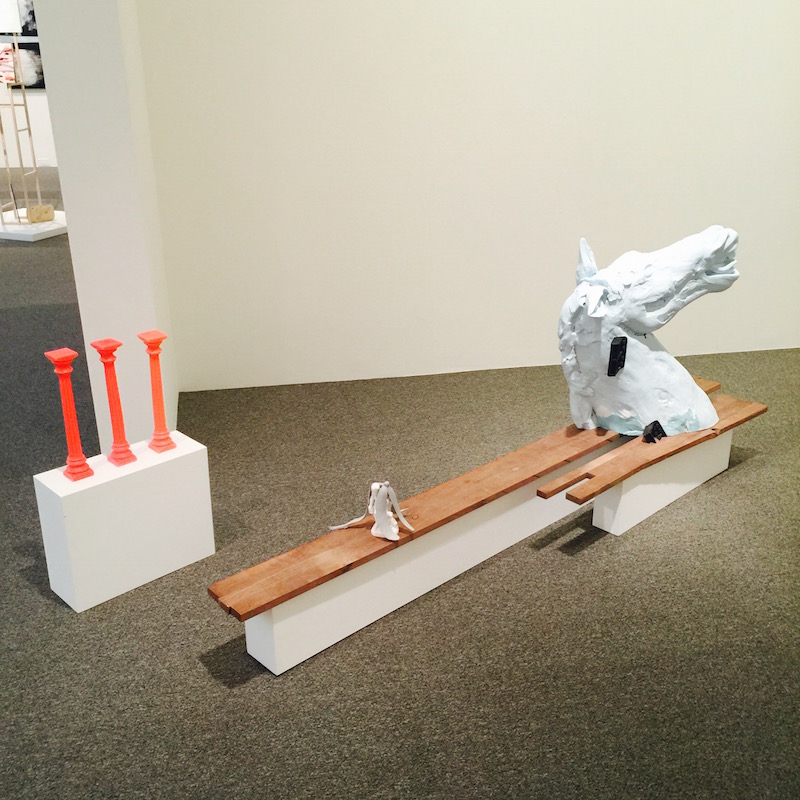
Description: A combination of artist-cast and pre-existing objects and materials are assembled into a series of sculptural vignettes. Artist website.
Content: A poetic exploration of cultural symbols and art history? A postmodern collage of highly charged objects?
Media: Found objects coupled with plaster and wax sculpture
Ian: Leach uses cast resin forms in combination with construction materials to create his large-scale assemblages. They almost function like 3D rebus puzzles in how the cast forms function as symbols put together for us to decode into a comment or statement of some sort. So, I guess that means the content is in the symbols, and that varies from person to person. For instance, his horse heads and candlesticks remind me of board game pieces. A few pieces indicate the desire to combine these objects with mysterious results: Why does a horse head have plastic carrying handles attached to it? Choices like that feel arbitrary, but perhaps are intended to spur imagination. That said, I’m not sure there is any discrete content here beyond how we experience the artwork and what knowledge is triggered by his symbols.
Bret: Going only by the works presented here I feel like Leach is in the process of developing a visual language—one rooted in taking the ordinary and making it something else—but he’s still figuring out what he wants to say with it. There’s a refreshing sense of exploration in this pursuit, and a welcome disregard for high/low divides—the assemblage “Acciaccatura,” with its covered violin and kinda/sorta musical notation allusion, reads like the set-up for a three-panel comic trying to visualize a Dadaist joke—but the vocabulary hasn’t transcended its verbal baggage yet and started articulating its own ideas. I can’t wait to find out where this work is taking him.
Cara: Did anyone else read the wall text? Among other ridiculous things, Leach lists a ‘sack full of cats’ as one of his materials in “The Difference Between a Fruit and a Vegetable.” From what I can see and smell, there are no actual cats here, but his tongue-in-cheek reference to girl fights and fetishes imbues the work with a sense of oddball humor. For me, this makes all the difference in work that is so stringently edited, so minimal and exact, and transforms it into something human rather than remote. If you look closely, you will notice there is a plaster cast banana peel placed over a tiny sculpture. What’s more joke-worthy than a banana peel? It’s almost a joke in itself. Leach employs the language and ridiculous minimalism of postmodern work but turns it silly for those who chose to pay attention. I like this.
Ryan Syrell
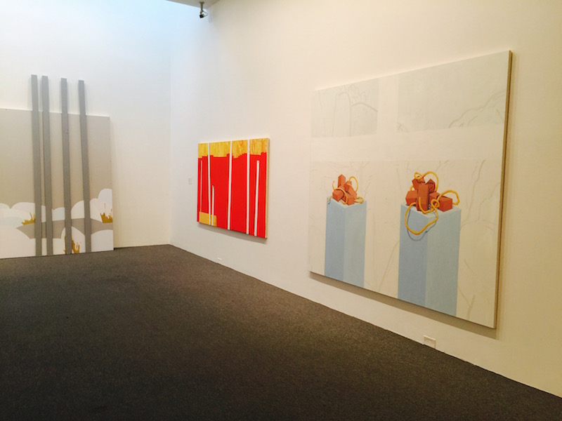
Description: Pop, pattern-based paintings that reference nature and landscape. Artist website.
Media: Vinyl and latex paint on drywall, also a pile of faux rocks
Content: What is nature? What is man-made? What is the difference and does it still matter?
Bret: Syrell’s works here occupy that place where abstraction and memory overlap: each can sometimes summon incomplete and/or imprecise information and yet it’s enough for a feeling, mood, time, and place to snap into sharp focus in the brain. They bring to mind Melissa Thorne’s ability to use color, form, and composition in ways that play with representation and emotional chutzpah.
Cara: To me, these paintings are caricatures of nature. The color and complexities of natural forms are summarized according to a rigorous and consistent system for simplification. It’s not unlike what the Impressionists did in developing a system for delivering light onto canvas, except, in Syrell’s case, he’s employing the flat surfaces and commercial colors of pop art. In his pile of faux rocks, placed like a pyramid in a corner, I love that each rock is painted a slightly different pastel “rock shade”–from purple to gray to brown–and that each is painted one flat color. It’s like he is painting the idea of a rock, translating it through one exact color, almost like an interior designer presenting an array of “natural” hues.
Bret: Of this year’s batch of artists, Syrell is the only one interested in sensual beauty for its own sake. The geographic component of the paintings—see the floor installed “Overcast Lake (Oswego)”—functions in a similar way as Proust’s madeleine, a sensory key that unlocks some narrative feeling. Not that the work is trying to tell a story, but spend time with it and you start inventing some entryway into their space on your own. “Painting on Blocks (Vermont Ascent),” the oil-on-canvas work on the very last wall of the exhibition galleries, is arguably this year’s most pleasing single image: a composition that tangles straight lines and curves into the surface of a forest rendered in a hot-color palette that feels like something out of a cartoon adventure.
Cara: These works are bigger and more unfinished than Syrell’s previous works. I believe that he completed these paintings recently and their great size is an effective strategy for confidently filling this big, museum-sized room. I know I sound like a broken record at this point, but I would like to see more small surface details and surprises in these pieces up close, but at the same time, there’s an wild energy and freedom in them that I really respond to. The visible text on the drywall pieces where background has been left raw adds new content around industrial materials and their relationship to natural objects as well.
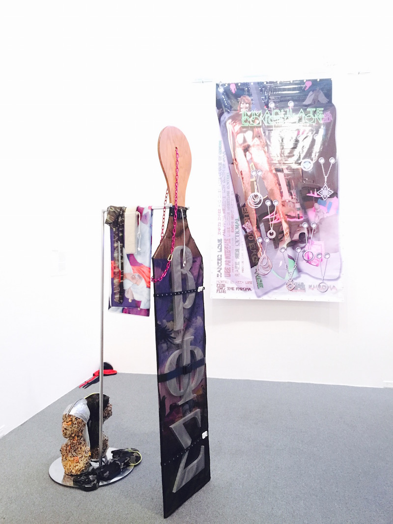
Wickerham & Lomax
Description: Installation, sculpture, graphic design, interactive digital. Artist website.
Media: Wood, vinyl posters, birdseed sculptures, clothing, mesh, video, and sound
Content: Wickerham & Lomax explore what it means to be a part of, or excluded from, various gay sub-cultures, some real and some invented.
Cara: I love their anything and everything approach—giant, wooden fraternity-style paddles encased in mesh and restraints, vinyl party and club posters for virtual or invented situations, fashion items from various groups or clubs, and multiple videos exploring pseudo-reality TV mixed with original video game and virtual worlds. And birdseed sculptures. Everything in this room is extremely well crafted.
Bret: Wickerham & Lomax, like their previous incarnation as Duox, know that everything is content—not just in the writer’s sense that all experiences can be mined, but in the sense that everything from actual conventional artistic media (paint, video, objects, etc.) to all material other people, artists, and corporations have created/manufactured can be used and reused. Even better, they recognize that if you’re not a white heteronormative male in 21st-century America, then you’re already living a kind of sci-fi existence, a time and place where the world as you might desire it hasn’t become reality yet.
Cara: Using fraternities and birdhouses as a metaphor for closed communities that the viewer can only observe through artifacts and ephemera, the artists set the viewer up as an unwitting voyeur, unable to break through and be fully accepted in the club, physically illustrating the historical marginalization of LGBT in mainstream society. It’s brilliant.
Ian: The installation is the most contemporary and confrontational among the finalists. More than any other, it reflects digital technology and popular culture as an aesthetic and means of conveying ideas. There are two wall pieces that reference painting, but only in that they are hung on a wall as a flat design. The digitally printed vinyl banners freely hang from one end on polished and tooled armatures (engraved with the subject of each poster’s names, which came about from an interview process), their aesthetic pure Photoshop graphic design. In fact, all the work has a strong element of the mechanical in it—which stands in stark contrast to the hand-made aesthetic of every other finalist. It’s visually loud and saturated with bold, loaded symbols—calling into mind the late Jason Rhodes.
Bret: I keep waiting for the power of their critical brains to match the profundity of their imaginations, because I know they have it in them. They’re operating in that area where what used to separate the creative producer from the creative consumer has completely collapsed. Their online “BOY’Dega” and “BOY’Dega Bootleg” project—and the invented fraternity paddles and “Immaculate Conception” and “Anti-Gravity” mixed-media works—is an entire interactive universe, as detailed and sprawling as the sandbox worlds of the Grand Theft Auto games. Even as they turn to that virtual realm for their own uses, however, they’re still operating in a visual arena that’s entirely defined by its relationship to the status quo—much as fan fiction is an obstreperous hijacking of so-called copyrighted material and a user-generated advertisement for that very content. And their work is way too smart and exhaustively conceived for them not to have more to say about the illusion of individualized space in the virtual, social and virtual spaces as instruments of control, and creative labor in an age of creative work’s near total commercialization.
The 2015 Sondheim Prize Winner will be announced July 11 at 7 p.m. at the Baltimore Museum of Art, and the exhibition runs through Aug. 9, 2015. Who do you think will win this year???
