Sara Vanderbeek’s Solo Exhibit in the BMA’s Front Room Leaves Me Cold
By Cara Ober
It’s always dangerous for an art critic to meet the artist in the gallery.
Especially in the case of Sara Vanderbeek, who is gorgeous, charming, and erudite, I can’t help but try to project the artist’s persona onto the works on display. This contrast, between the coolness of the actual objects and the warmth of the artist’s explanation of them, is the reason it’s taken me months to review this show. Although I developed an immediate art-star crush, along with a familiarity and respect for the impact of Vanderbeek’s work over the past decade, the more I thought about it, the more this particular show became unsatisfactory to me. I did not want to write this review.
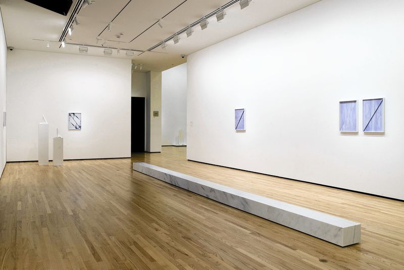
When you enter the gallery in Front Room: Sara Vanderbeek, you are met with a heaping portion of emptiness. White walls. White marble. White surfaces. The giant and mostly vacant walls feature six small photographic prints of marble surfaces and three smallish sculptures, all intentionally dwarfed by the scale shift to empty space.
In one corner, the unadorned white column, “Neo-Classical,” made mostly of fiberglass-reinforced plaster and wood, with a tiny slice of marble at the bottom, sits off by itself. It’s not large enough to be intimidating, but not small enough to be precious. Its blank, smooth surface didn’t add any clues and its presence didn’t interact with the other pieces in the room. “Neo-Classical” filled the space, but felt temporary, like a store-bought canvas waiting to be realized.

In the other corner, the sculpture “Modern Symbols” is displayed on two white pedestals and features a small triangular slab of marble and a second slab, about the same size, of fiberglass-reinforced plaster on each. Although elegantly posed at differing heights, the four white triangles don’t provide enough information to have a conversation with. The piece is intellectual and cold, lacking enough specificity to draw me in. The sculpture doesn’t play by the rules of minimalism either, where an imposing size presents an opportunity to relate on a bodily level. Something is missing. If “Modern Symbols” is a mystery, I am not feeling any compulsion to solve it.
According to museum wall text, “The Baltimore native’s new works are inspired by Baltimore-based dancers, urban architecture, a salvage yard, and the BMA’s collection.” And according to the artist herself, the exhibit “connects to the museum and its collection, but its also about memory and returning to a city I grew up in.” More than the work itself, these statements about the site-specificity or site-reponsiveness of the exhibit have presented a significant barrier in experiencing this show. Every artist is entitled to their own interpretations, but Baltimore is not a minimal town. Baltimore is not a cold or quiet or pristine town. I don’t recognize any aspect of Baltimore in this show, despite the fact that all the works were made here or were based on the artist’s visits to Baltimore, and this is frustrating.
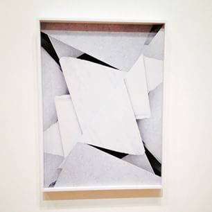
Of all the works in the exhibit, Vanderbeek’s six digital chromogenic photos offer the most specificity and cordiality. When viewed up close, the photos of marble slabs found at Second Chance warehouse and other Baltimore locations are formally satisfying. Toned purpley-bluish like an antique Cyanotype and then bisected diagonally, reprinted, and arranged like a relief sculpture, each photo is successful as an object of beauty. Each references classical architecture and emphasizes the minute natural details in unique marble surfaces, which is alluring eye candy. Turned into a diagonal low relief sculpture with repeated symmetry, each photo is a curious mixture of techniques not usually used together, and their visual cohesion is stunning.
However, if you are looking for Baltimore-centric content in these photos, you will be dissatisfied. While each offers a romantic vignette of a piece of marble found here in town (and one features the legs of dancers from UMBC), marble is hardly a specific material symbol for Baltimore. Marble possesses a much larger history and neatly references the architecture of ancient civilizations, while its contemporary cultural currency revolves around kitchen counter tops and HGTV. (I found myself considering new kitchen countertops while gazing at them and this wasn’t unpleasant, but it did seem beside the point.)
Pondering the utilitarian uses of marble is fine, but in an exhibit billed as an artist’s homecoming to Baltimore after two decades of successful art-making in New York, Vanderbeek’s attempts at site specificity are frustratingly vague. Although the photographic images were shot in Baltimore, they don’t tell me anything about this city, about the artist who grew up here and left, or much about anything except the physical qualities of marble. While beautiful to look at and I enjoy looking at them, I am disappointed in their minimalistic approach to content. Too much is assumed in them without empathy for their intended audience.
The largest sculpture in the exhibit, “Steps,” is the centerpiece of the show. Composed of five white marble slabs, cut to the same size as a typical Baltimore stoop, this piece is intended to relate to Baltimore’s cultural history, but it doesn’t. Arranged in a long, low row, “Steps” bisects the gallery in half, but more out of inconvenience than power; you’re going to get yelled at by a security guard if you step on it or touch it.
Unlike a Baltimore stoop, visitors are not allowed to sit on the marble slabs, so they are forced to engage with it from above. From a standing position, looking down on an object that is just a foot or so tall is underwhelming. This piece could benefit from some height or a different placement. Arranged in the center of the room, a visitor must give it a wide berth, and this constricts your movement in the gallery, an unfriendly move. Rather than channelling a Baltimore stoop, a place to hang out and socialize, “Steps” feels more like a tombstone or memorial and gives off a somber aura. If the artist really intended to reference Baltimore stoops, why not repurpose marble formerly used as a stoop? There’s plenty of this around. Why cut new pieces of marble to the exact size of a Baltimore stoop and then not allow visitors to engage with them? I find this incredibly exasperating, especially compared to the lovable, climbable Franz West sculptures in the next room.
Delving into the artist’s personal history might offer some clues as to what this exhibit is really about. Sara Vanderbeek’s biography reads like the best of novels. It became easy for me to imagine biographical details creeping in, and also why the artist might want to separate her work from the large burden of history.
Sara Vanderbeek grew up in Baltimore and attended the Baltimore School for the Arts before attending Cooper Union in NY, like her father. After graduation, she built a career in NY with brother Johannes involving curation, founding the popular gallery Guild & Greyshkul. Then Vanderbeek made the transition from curator to world-class exhibiting artist. Her first solo museum show was at The Whitney in 2010 and she is represented by Metro Pictures. Looking back to her early Baltimore roots, the artist’s family moved to the area so that her father, acclaimed independent filmmaker, Stan Vanderbeek, could run the film and visual art department at UMBC.

Stan Vanderbeek studied at Cooper Union and then at Black Mountain College, where he became acquainted with John Cage, Merce Cunningham, and Buckminster Fuller. Vanderbeek became world famous for his independent art films, experimental animation techniques, and he worked with Claes Oldenburg, Allan Kaprow, Ken Knowlton and Bell Labs. Known as “a pioneer in the development of experimental film and live-action animation techniques,” Stan Vanderbeek passed away in 1984, when Sara was just eight years old.
When you consider the largeness of Stan Vanderbeek, as an artist, thinker, and father, and the impact of his loss, I have to wonder if Sara’s homecoming as an artist to Baltimore is in fact an homage to her father. Or, at least an exploration of the loss that must surely be more palpable when visiting the place where they once lived together, where she grew up without him. Taken in this context, the overwhelming emptiness and white, understated details become a metaphor for deep loss, and the work (well, except for the column) becomes achingly beautiful. How do you re-create the feeling of absence? The inconvenience and incoherence of loss is all here if you look deeply enough and, within this context, this exhibit becomes poignant and personal and touching.
While it is entirely possible that I am projecting my own sentimentality onto works so open-ended I don’t know how to read them, there is a palpable chill, an absence in this gallery. Rather than assuming a lack of interest or effort on the part of the artist in exploring Baltimore as a site-specific subject, I believe that Vanderbeek is mining her own personal history here and the language around the exhibit should be changed to reflect this.
The aestheticism of personal loss has been historically realized in marble statues, plaques, and tombstones for thousands of years. Rather than being specific to Baltimore, this beautiful white surface, etched with gauzy gray veins, is a universal symbol for bereavement, remembrance, and absence. Sara Vanderbeek: Front Room is not a joyful homecoming or an exploration of Baltimore’s architecture and history; it is a requiem.
Author Cara Ober is Founding Editor at BmoreArt.