Katherine Bradford’s Mother Paintings feel exhaled into being. Not easily or simply, but breathed out from a profoundly interior place. The paintings speak of care, worry, relief, anxiety—the lungdeep breath of loving. The figures populating this series live among slabs of heavy, humid air, hypersensitized in their responses to claustrophobic and caustic atmospheres.
There is so much play between space and compression, filling and emptying, that viewing the show is like being pulled through lungs. Paintings feel like the gulped, choking air of fever dreams; breaths gently meeting and synchronizing between bodies; the rapid, shallow, shrinking inhale of panic; held breaths. But maybe most, they feel like deep breaths exhaled into a changed world.
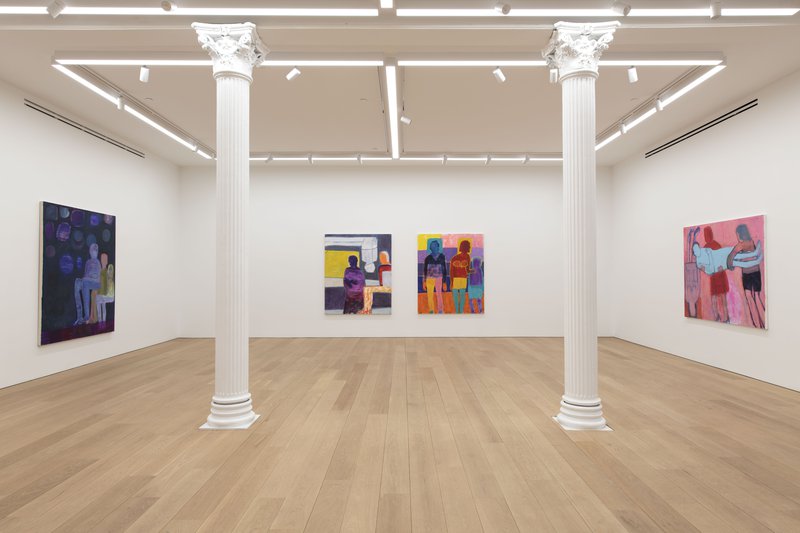
I saw Bradford’s Mother Paintings at Canada a couple of weeks ago, and they inhabit that rare space held by works that register an unsteady in-betweenness. They eloquently and viscerally explore the limitless subjects of motherhood, while building upon the artist’s painterly language in a way that allows them to address unfathomable changes and losses thrust upon the world in the last year. Bradford has depicted many mothers, children, and families throughout her career, but these eleven large paintings broaden the emotional resonance of her subjects.

These figures are shimmering and inevitable, like immutable sigils, gesturing with striking fluency at the gulf that touch and bodies can cross, but that language can’t traverse. Congruent limbs, echoes of hands and feet slide across surfaces and between generations, join in fleeting moments of resolution, but not without effort.
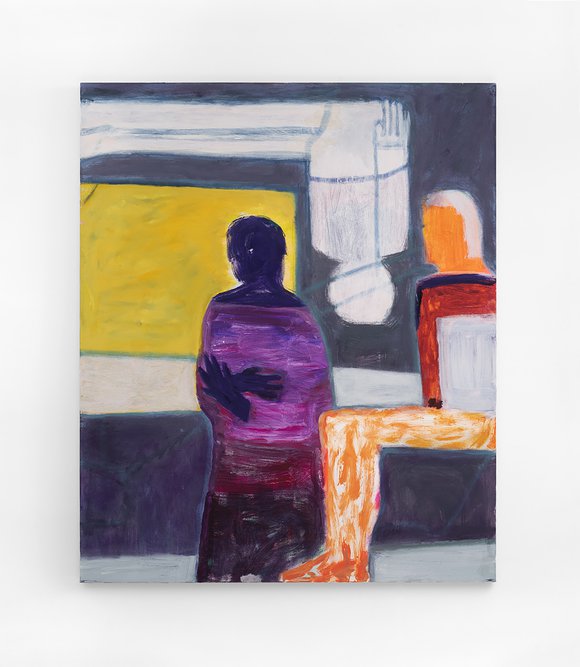
The burning, murky red/ochre/pink of “Mother’s Lap” is the opening line of Bradford’s show; it’s the first thing you see moving down the long corridor to Canada’s main gallery. It’s a wise choice to set the tone: it immediately places us in the dynamics between comfort and discomfort.
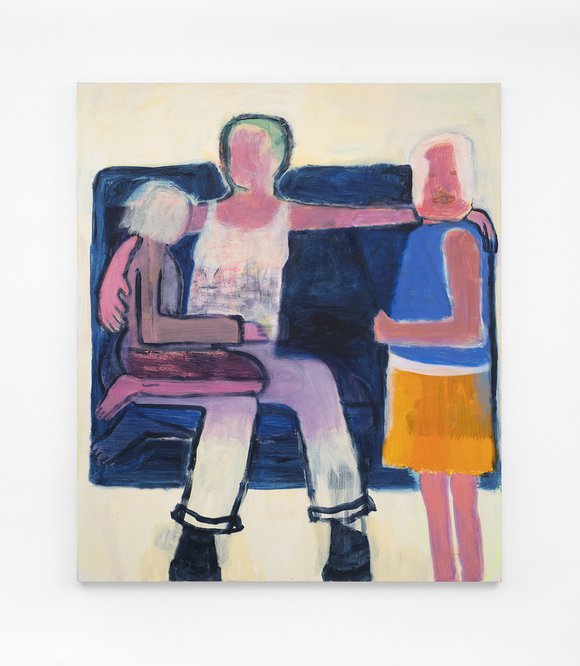
We see the backs of three heads and the radically reduced profile of a fourth. The mother figure’s pink pair of legs, with feet weighted down to the edge of the canvas, support the cantilevered burden of two children, as well as her own angular, displaced upper body. Those feet are supporting a lot. With a narrow arm compressed against the left edge of the canvas, her form appears locked in place by weight and friction—she is both anchored and anchoring. A third small figure on the right lends an arm of support, ostensibly helping to balance this mother’s burden, but in terms of painting, this figure also does just the opposite.
Everything about the color, edges, and figure/ground relations of this last figure add up to amplify the pressure upon those two pink legs. This is wonderful painterly poetics, and it’s done with incredible economy.
The mother figure's pink pair of legs, with feet weighted down to the edge of the canvas, support the cantilevered burden of two children, as well as her own angular, displaced upper body. Those feet are supporting a lot.Ryan Syrell
To its left is “Motherhood”: A mother/child trio this time, standing, seated, and kneeling together in a space that’s more about listening, speaking, and comforting (or maybe explaining). The standing child on the right directly addresses the viewer, and it’s one of the few moments in the show where a face appears and looks straight out of the surface. This gesture invites us into this intimate space; we become a fourth figure that enters the circle.
Comparing these two mothers’ arms—slivers of pink or ochre, with faint, washy contours—it’s always striking how much range Bradford conveys through such spare forms. The sense of weight couldn’t be more different between these two pieces: “Motherhood” echoes so many of the forms from “Mother’s Lap,” but reconfigures them in such a way as to spread its pressures out across the scaffold of figures, ourselves included.
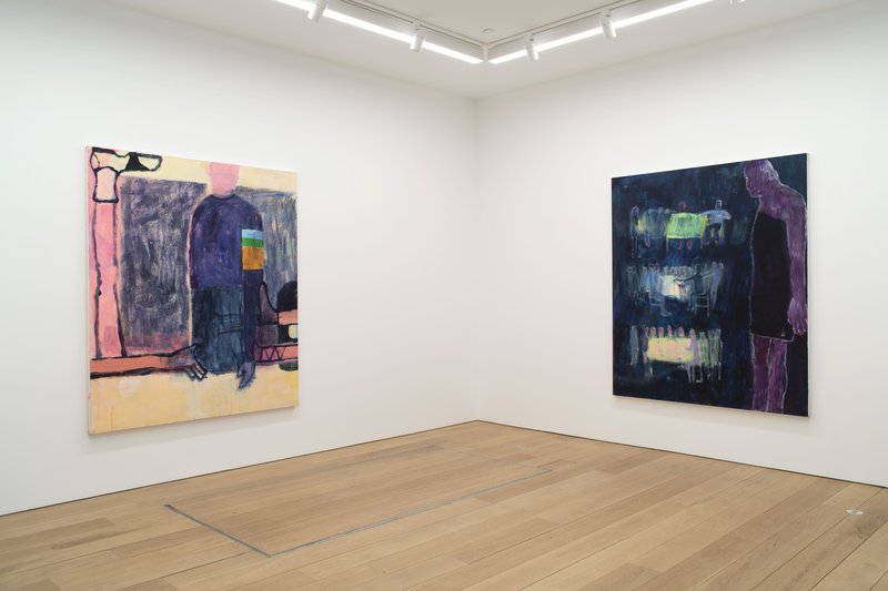
“Fear of Dark” and “Fever” resonate with one another across the gallery, though they are built with contrasting painterly means. “Fever” relies on firm contours to articulate the boundaries between bodies, with heat welling up from the recumbent figure, flowing into the hand pressed upon its forehead. In “Fear of Dark,” nearly all contour is lost; we find ourselves in low, phosphorescent light, nightmare light, with ruptured, dissolving edges.

“Fever” is all clear action, direct touch, and attention outlining a daily and hourly clock of caring for an ailing loved one, and where time is dilated with sweat, fatigue, and thirst. There are moments of clarity with vast expanses lost to sickness. By contrast, “Fear of Dark” is almost frozen. Its three darkly sparkling figures are motionless, welded to one another in anxious contemplation of the real or imagined forces encroaching upon their void. It’s easy to imagine “Fear of Dark’s” central seated figure is also burning up, a fading glowing ember projecting wildly into a hallucinatory night.
I keep thinking about resonances that I hadn’t previously felt through Bradford’s work. A few of the Mother Paintings brought to mind Goya’s Leocadia and parts of Giotto’s Feast of Herod from Santa Croce—paintings that become presences. Maybe it has to do with the directness, the backdrop of anxiety, and the willingness to look with an unremitting eye at the intrinsic precarity within all human endeavors. But it also has to do with the roughness of the surface, the unnameable quality of light, and a unique awareness of time.
Time feels richer here than in Bradford’s previous paintings. Worn, rather than worked, they feel as though they were painted from within and without. The choreography of their surfaces, as well as the figures they present, play out across wildly far-reaching senses of time. I’m not just talking about the standard sense of time innate to a heavily worked painting. Their incredibly fluid way of shifting between portrait and icon activates a sense of the immediate present and the vastly distant past.
*****
Header image: Katherine Bradford, Upsetting Times, 2020, Acrylic on canvas, 72 x 60 inches