Kerr Houston on John McNeil Whistler’s Etchings of Venice at The Freer
Seated in the Johns Hopkins Special Collections reading room, I’m looking at an odd little booklet. Assembled in conjunction with an 1883 show of etchings by James McNeill Whistler and distributed by the artist himself, it’s a compilation of derogatory remarks written about Whistler’s works by a range of London critics.
“They say very little to the mind,” complains an F. Wedmore. “So little in them,” mourns a P.G. Hammerton. And on, and on: the list feels, initially, like a morbid exercise in masochism. Read in sequence, though, the dismissive remarks soon begin to suggest instead the shallowness of the critics’ own positions: their insults become mere entries in what The World soon called a dictionary of critical ignorance. “Criticism is powerless here,” an exasperated critic had written of Whistler, trying to imply that his work was beyond help. In Whistler’s hands, however, that remark was recast into an admission of the emptiness of much writing on the arts.
Whistler, in short, wasn’t one to go down without a fight. And he seems to have felt that the etchings that he had produced in Venice in 1879-80 were especially worth fighting for. Having fled England, where he had been embroiled in a costly and bitter dispute with the critic John Ruskin, Whistler gave himself over to the evocative alleys, marbled surfaces, and delicate harmonies of the city on the water. And while he was far from the only English-speaking artist in Venice – to the contrary, he often joined peers at the city’s best cafés – he soon came to feel that his work was somehow singular.
“I have learned to know,” Whistler wrote in a letter to the Fine Art Society, which had underwritten his trip, “a Venice in Venice that the others never seem to have perceived, and which, if I bring back with me as I propose will far more than compensate for all annoyances delays and vexation of spirit.”
A month later, Whistler was back in London, and he included twelve of the etchings in a show that was hosted by the same Fine Art Society. It did not go well. Critical response was mixed, and only eight sets of the etchings sold; despite an encouraging note from the painter Millais, Whistler must have been dispirited. And yet, even as he bitterly collected the most negative critical reactions, he continued to return to the plates, pulling further impressions and then arranging for the production of what is now called the Second Venice Set: a suite of 26 etchings that were completed in 1887. And it was in that year that a Detroit industrialist and emerging art collector named Charles Lang Freer, in New York City on business, happened to pay a visit to a dealer’s shop. There, he was introduced to Howard Mansfield, who owned a number of prints by Whistler – including what Mansfield termed particularly “fine impressions” of that second set.
Freer was initially dubious. In fact, Mansfield later recalled, Freer frankly wondered “why anyone in the world should make any fuss over Whistler as an artist.” But as Freer looked at Mansfield’s portfolios, he was converted: soon after viewing the prints, Freer apparently announced, “I have no words to express my admiration for the genius of this man.” A few days later, he put his money where his mouth was, buying his own edition of the set and thus setting into motion a remarkable relationship between artist and collector that helped to define Freer’s taste and aesthetic philosophy and that eventually yielded a vast collection of printed works, drawings and paintings by Whistler that are now housed at the Freer Gallery, on the Washington Mall.
Like the Walters (which recently re-installed its fourth floor in a way that emphasizes the collecting habits of William and Henry Walters), the Freer is currently in an openly self-introspective mode, and for the next few months it will highlight the ties between Freer and Whistler in two concise shows. The larger (Freer and Whistler: Points of Contact) features 23 oil paintings and makes a broad argument that Freer’s aesthetic taste was largely shaped by his relationship with Whistler.
But it’s the second show (Fine Impressions: Whistler, Freer, and Venice, which opened on October 18 and is scheduled to run indefinitely) that leaves, to my mind, a more memorable impression. In a single gallery, we can study 21 of the 26 etchings that comprised the Second Set. At once, then, it offers a chance to consider Whistler’s talents as a printmaker and an opportunity to ponder Freer’s developing interest in his work. The result, in short, is both seductive and historically illuminating.
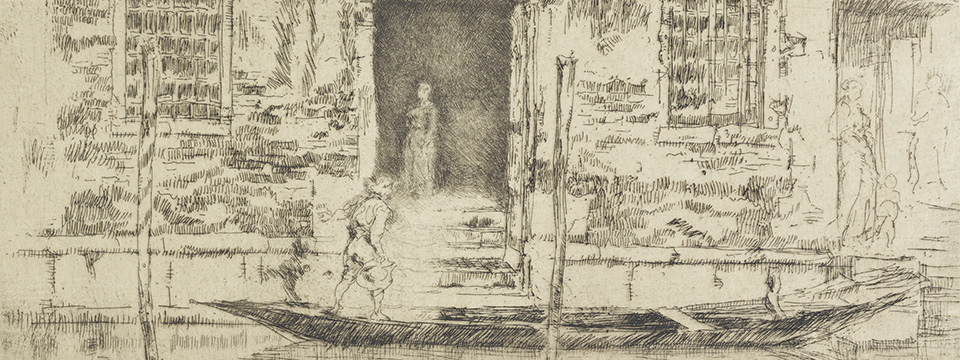
Certainly there’s no doubt about Whistler’s remarkable skills as a printmaker. As Katharine Lochnan has noted, Whistler remained devoted to etching over the course of his career, and was sometimes compared to Rembrandt by contemporaries. And yet, among Whistler’s 450 etchings, the plates that he made in Venice stand out. That’s partly due to their scale, which is consistently – indeed, one might even say combatively – modest.
Mocking what he saw as the bulky, oversized format of printmakers working for the Venetian tourist market, Whistler used plates that were at most nine inches wide, and he abandoned traditional etching needles for dentist’s tools that allowed a finer line. Such decisions, in turn, yielded a certain delicacy – and delicacy, his friend and fellow printmaker Otto Bacher later observed, was a central goal of Whistler’s in 1880.
“Delicacy seemed to him,” Bacher wrote, “the keynote of everything, carrying more fully than anything else his use of the suggestion of tenderness, neatness and nicety.”
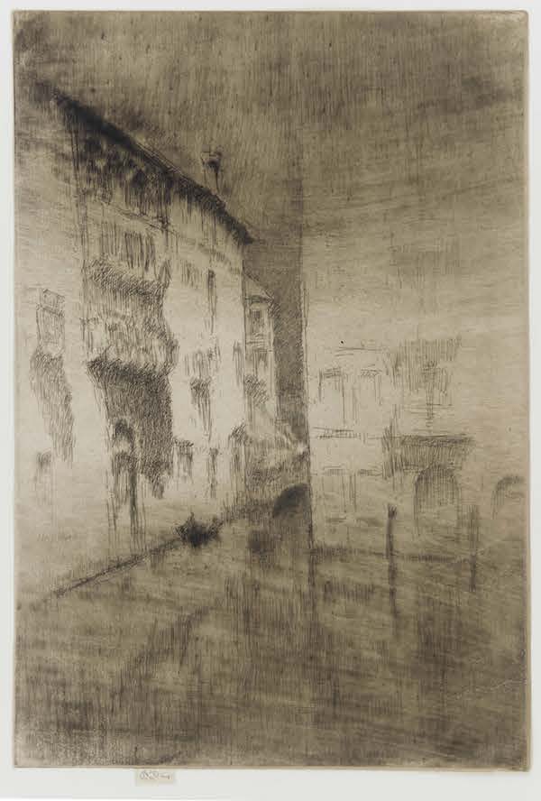
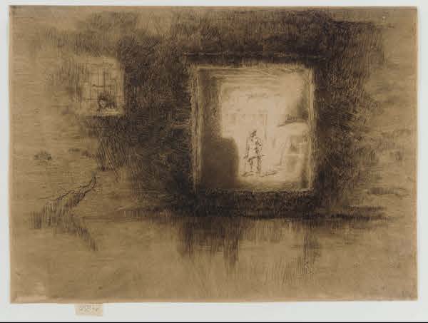
But it would be unfair to read these etchings as merely delicate, or simply nice. For one thing, some of them are undeniably dark in tonality and emphatic in their artistry. By using drypoint in many of the prints, Whistler achieved a rich, inky effect, and the result (in a piece such as Nocturne: Palaces) is weighty, solemn, and self-aware. The sheer accretion of blacks, in such a work, is surprisingly assertive, and it weakens our sense of spatial depth: this is, we realize, ink spread on a page. At the same time, though, the prints also incorporate a dazzling and diverse vocabulary of marks. The rapid hatchings in Fruit Stall, for instance, yield a compressed sense of detail, while the open outlines in The Bridge S.M. hint at an almost ethereal character. Again and again, Whistler efficiently conjures solid form out of mere marks – only to suggest that solid form can melt into air.
The prints also imply an abiding interest in abstract forms. Whistler seems to have been consistently intrigued by the soft tension between the gentle arcs of gondolas and the resolute verticals of stone Venetian palazzi. He also repeatedly pairs planar architectural surfaces with deep, recessive cavities, generating a sense of push and pull, of surface and depth.
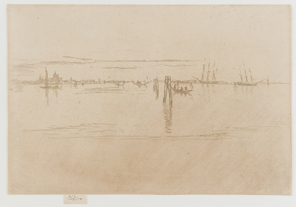
At the same time, as Lochnan has pointed out, Whistler often began with a central subject and worked outward, so that the primary subject evolves in a series of concentric rings, each of which is parallel to the picture plane. And then, too, he generally refused to sketch in reverse, thus printing familiar views in a manner that surprised and annoyed tourists and connoisseurs. Such a complex privileging of form is especially clear in Long Lagoon, where the masts of tall ships loosely repeat the shaft of a campanile and bands of clouds find a match in the ridges of wavelets on the lagoon’s surface. Whistler, here, is focusing upon underlying and essential structures: he is, in a word, abstracting, and such a print might thus be said to anticipate the experiments of Piet Mondrian, who would also rely upon restrained mark making in weakening any absolute distinction between pier and ocean, or structure and water.
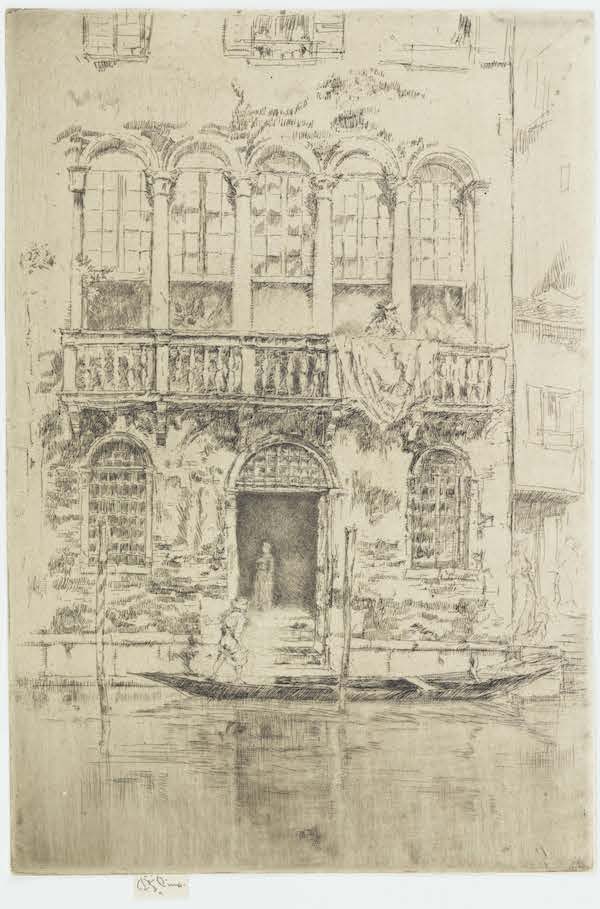
Of course, Whistler (who died in 1903) didn’t live to see Mondrian’s revolutionary early works, which were painted during World War I. But he was familiar with, and impressed by, another strand of Dutch art: that is, the 17th-century genre paintings of artists such as Pieter de Hooch. Whistler clearly admired the lucid spatial geometry and intricacies of such works, and his interest is evident in prints such as The Balcony. Arguably, too, Whistler’s treatment of figures recalls certain Dutch precedents. Most of his prints are peopled (and some of them quite densely), but the figures are typically remote from us, and absorbed in their labor or conversations. A distant gondolier bends in his boat, tending to something; small knots of figures gesture; a salesman arranges his goods for a passing pedestrian. None of these figures is entirely available to us – they are too distant, and hastily rendered – but they play roles in a larger theater. Rather like the tiny figures who stroll through Pieter Saenredam’s architectural studies, they impart a sense of life and scale to the city through which they move, even as they are subsumed by it.
Or maybe we should say that they are subsumed by Whistler’s art. In a letter to his mother, Whistler claimed that “the people with their gay gowns and handkerchiefs… seem to exist especially for one’s pictures and to have no other reason for being!” Consequently, he seems to have felt no reservations about adding or altering figures (as Alastair Grieve has observed, in Whistler’s Venice, he often inserted figures after the fact, in order to soften symmetries or to heighten the sense of theatricality). Indeed, the resulting groups sometimes have a rococo feel to them – a trait that is perhaps hardly surprising, given the fact that Whistler admired the Venetian paintings of Canaletto and Guardi. Indeed, he may have come across drawings by Guardi for sale in the stalls of Venice, and Lochnan has reasonably argued that the gondoliers in Whistler’s Upright Venice might have derived from similar figures in Guardi’s Santa Maria della Salute. In any event, it seems clear that even as Whistler sought to create an original impression of often-depicted Venice, he drew on a variety of European models and precedents.
Articulating such transhistorical affinities may seem grossly simplistic, but in fact it was rather typical of Freer, who knew of Whistler’s interest in Dutch and Venetian art but also saw the artist’s work as markedly close in spirit to earlier Japanese examples. In turn, the current show accents that final connection: a vitrine at one end of the exhibition displays a painted Japanese fan and a 19th-century sake bottle, and contends that the harmonies and delicate traceries meaningfully resemble Whistler’s work. Certainly, a Japanese air is evident in Whistler’s love of two-dimensional pattern, and several of the works in the Second Venice Set were printed on a lush Japanese paper that Whistler managed to acquire in London. Even his biting technique, in which he used a feather to lightly brush a mixture or nitric acid and water across the surface of the plate, might fairly be called associatively Japanese, as it echoed the use of a feather brush at the Kobikichō school.
All of that said, though, there are also real differences here: Whistler was very much his own artist. His lines, for instance, rarely feel calligraphic; they are rapid hatchings and hasty ticks, rather than extended, fluid gestures (the St. James’s Gazette called them, not unfairly, “short, scratchy lines”). And then, too, there’s the fact that nature is granted a distinctly secondary position in most of these etchings. In the Japanese bottle on display, Kano Tangen’s tiny figures glide under a canopy of arching trees, not far from a sprawling body of water. Whistler’s work, by contrast, is resolutely urban in its sensibility: here, bridges are draped with drying laundry, and the few trees are framed and tamed by tiers of stone. That’s partly a result of Whistler’s choice of subject, of course – Venice is resolutely urban – but the fact remains that Whistler chose that subject. And, in that vein, it’s worth noting that Venice was commonly seen as a fusion of Eastern and Western traditions. As such it appealed to the artistically catholic Whistler, who had adopted as his emblem a butterfly with a stinger. Both Venice and Whistler, in other words, frustrate easy or reductive analogies. If his etchings evince a Dutch or Japanese sensibility, they do so only partially.
But they please, we might say, more than partially. This is a modest show, but a richly rewarding one. Operating on several levels simultaneously, it offers us a sense of Whistler’s abilities as an etcher and printer, while also placing his work within larger artistic and institutional contexts. In studying these prints, you can begin to understand the growing admiration that Freer felt as he examined them in 1887. But you can also gain a sense of the raw appeal of prints, in general. One of the first aids that Freer bought, when he began to purchase art in the 1880s, was a book titled The Print Collector. In that text, Joseph Maberly contends that “To enjoy a gallery of painting, or statuary, we must walk about it, and we must have daylight.” By contrast, he adds, “a portfolio of prints may be laid on the table, and give variety to the amusement of a winter’s light…” Happily, the Freer has placed four of Whistler’s prints in a vitrine, flat and unframed, as if to clearly illustrate Maberly’s point. But in fact even the framed and hung etchings work to the same end, as they lend a warm variety to the amusements of an approaching winter.
Criticism may have seemed impotent, in 1883, to an indignant Whistler. But even a critic, nowadays, can find much to appreciate in these works.
Fine Impressions: Whistler, Freer, and Venice is currently on view at The Freer Gallery, part of the Smithsonian institution on the National Mall in Washington, DC.
Author Kerr Houston teaches art history and art criticism at MICA; he is also the author of An Introduction to Art Criticism (Pearson, 2013) and recent essays on Wafaa Bilal, Emily Jacir, and Candice Breitz.