The 2017 Sondheim Finalists Reviewed by Angela N. Carroll, Bret McCabe, and Cara Ober
This year’s Sondheim Finalist Exhibition is haunted by an odd and eerie spectre: the 1980s in all its optimistic, commercial, and self-involved glory. Of the seven Baltimore-based finalists, only a few can personally remember the ’80s, and it is this sense of wide-eyed reinvention, devoid of postmodern irony, that feels both strange and familiar.
It’s a strong show, full of beautiful and challenging work: colorful paintings that give off the dusky aroma of oil paint, readymade pop sculpture, poetically arcane clay, futuristic scientific specimens, and performance art that explores musical body rhythms. There’s just one video piece and the one inclusion of photographic prints are so digital and abstract they look like pattern paintings. There are no collaborations, no makerspaces, no digital animations, no veneer of socially conscious work, and no overt politics.
Not unlike Arte Viva Arte, the much-critiqued international group show curated by Christine Macel at the 2017 Venice Biennale, this year’s Sondheim Finalist exhibition features artists who embrace staunchly personal content rather than the collective or social.
This year’s Sondheim artists give process, autobiography, metaphor, and material culture top billing; a refreshing and liberating experience.
Clearly, we are no longer in the ’80s, no matter how much our president and his followers wish to return to the good ol’ days, but it is interesting to see such a willful optimism on display, despite that decade’s well-known cautionary tales of excess, cocaine, and bad hair. The ’80s weren’t all bad and the rich legacy of the art made in this time is our proof. Whether it functioned as a respite from or a rebellion against the return to conservative politics and Ronald Regan, the 80s have become a place of nourishment and influence for artists in 2017. Our sudden return to conservative, idiotic politics has impacted the output of artists, as well as the aesthetics of jurors, and it’s a global phenomenon, not a local blip.
On display at The Walters, there is a palpable desire to escape to a place of purity within the studio and a collective withdraw from tainted politics into personal awareness and healing. (Cara Ober)
Mequitta Ahuja
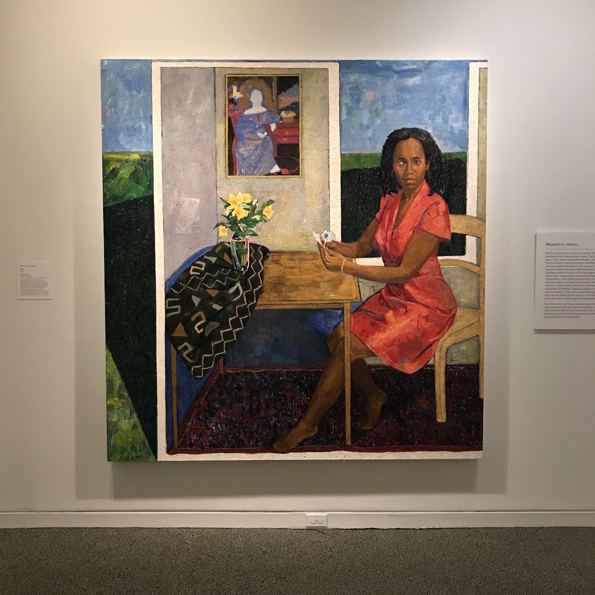
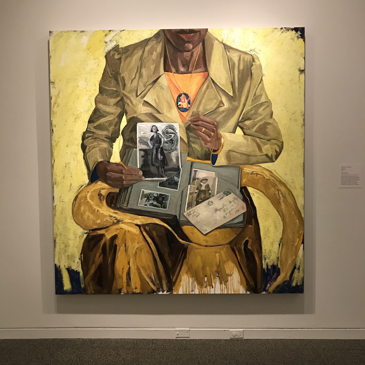
Inspired by early American figurative painting, Mequitta Ahuja’s huge portraits critique and engage the tradition of painting and the greater art historical canon. By featuring masterly rendered images of black women, primarily self-portraits in classical poses, the collection produces what Ahuja terms, “meaningful fictions,” to make atypical subjects, and the typically unnoticed compositional and aesthetic conventions of early figurative painting more visible.
As a whole, Ahuja’s collection fits appropriately within a greater dialogue in the contemporary art sphere in which historically marginalized artists refresh old traditions.
Ahuja’s appropriation of classical motifs, as well as the repetitive use of her own image in the portraits she creates stir interesting questions about revisionist art histories, process, and the inherent politicization and subcategorization of portraits that center black bodies as primary subjects. Her figurative paintings rarely focalize the subject sitting for the portrait, rather, the portraits reveal the process of their construction, and position Ahuja as both subject and author in the images she portrays.

“Sales Slip,” a portrait of Ahuja holding a canvas with “Renaissance Woman” (one of the portraits displayed in the collection), and a bill of sale, is a wonderful example of the way Ahuja presents herself as both a subject in the art she creates, and also as an artist with literal agency over her own self-image. “Close Quote” presents similar dualities; Ahuja presents herself pulling back a grand blue curtain to reveal a large self-portrait and a smaller reference painting of a portrait by John Greenwood from 1749.
As a whole, the collection fits appropriately within a greater dialogue happening in the contemporary art sphere in which historically marginalized artists refresh old traditions. This engagement should not be taken lightly, for it is through these small acts of defiance and inclusion that historical narratives expand, and make visible the presence and equal import of non-white subjects. (Angela N. Carroll)
Mary Anne Arntzen

Don’t get too lost in the bright colors and geometric layers of Arntzen’s 14 paintings here. Yes, her canvas-stretched-over-panel works grab your attention by the shirt collar with their kinetic layouts of lines, shapes, and hues: in “Medium,” Arntzen places a white triangle inside a gray rhombus atop the square backdrop of dark and light blue vertical lines; around the triangle winds a pinkish tube that connects to itself, a diverting ileostomy as Moebius strip.
Eyeballs steeped in the 2000s intersections of contemporary art and DIY culture might see a little Jessica Ciocci or other Paper Rad-ish enthusiasms for op-esque abstraction snuggled up to information density in Arntzen’s works, but I suspect she’s exploring much more explicitly painterly concerns
. Wrapping canvas around board yields a surface durable enough to work and rework, and she renders her otherwise complex compositions in a refreshingly unfastidious manner. Arntzen combines the compositional color and form dazzle of Edna Andrade with the rawer neo-expressionist brushwork of Ross Bleckner’s canvases and Elizabeth Murray’s cartoon-informed approach to coloring and line to create bold personalities on canvas.
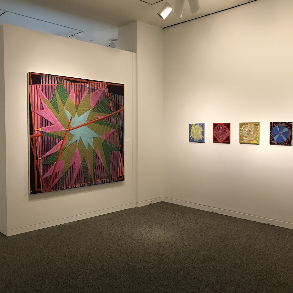
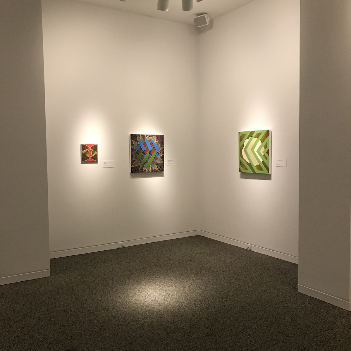
Moreover, mulling over Arntzen’s vocabulary with her titles on the mind—”Electronic Fog,” “Transfer,” “Poor Men Want to Be Rich, Rich Men Want to Be King”—leads to some rewardingly confusing intellectual terrain.
Arntzen combines the compositional color and form dazzle of Edna Andrade with the rawer neo-expressionist brushwork of Ross Bleckner’s canvases and Elizabeth Murray’s cartoon-informed approach to coloring and line to create bold personalities on canvas.
“Bad Priestess” features a cloud-like shape in the center of the square canvas, its body filled with what appears to be a series of overlapping guillemets—”«” and “»”—painted blue, brown, and green. This arrow-cloud shape resides inside a pale green-lined starburst explosion, the kind of pointy speech balloon that would contain the pow! sound effect of a fist hitting a face in a comic book. Filling in the space surrounding the starburst is a pattern of alternating pink and black diagonal lines. The collisions of lines and forms are jarringly discombobulating; the colors convey a clashing soberness. And when thinking about this visual impression in the context of the feminine figure invoked by of title—I suspect that’s not a bad-meaning-good “bad,” but more the Merriam-Webster sense of failing to reach an acceptable standard, morally objectionable, and inadequate or unsuited to a purpose—and you begin to wonder if Arntzen is visually commenting on ideas that get culturally embedded into language.
This epistemological reflection really pays off when Arntzen works large, as she does in two paintings here: “Siren,” that screaming piece of technology attached to emergency vehicles that hopefully encourages people to get out of their way and the mythological, partly human female creature whose songs lure sailors to their death, and “Dead Reckoning,” that navigational method of determining your current position based on a known fixed spot. Seen together you might wonder if the paintings are asking us how we know where we’re heading if we don’t know where we’ve been, if we’re listening for the warning sounds coming up behind us, or if we’re merely willing chugging along smilingly toward our inevitable demise. (Bret McCabe)
Cindy Cheng

Heavily influenced by the mechanics and structure of drawing, Cindy Cheng mines the histories of her own identity with formalist rather than figurative constructions. “I don’t want my work to be overtly about identity or identity politics,” Cheng shared in the displayed artist statement. “This is where formalism comes in—as a buffer and lens through which to make the content of self open, inclusive, and poetic.”
It is appropriate that Cheng refers to her largescale assemblage sculptures as poetic—each has a distinct rhythm, scale and movement like the experience of listening to music, reading literature or recognizing varied cadence and speech patterns.
To view one of her sculptures is to peer into an excerpt from her personal narrative. Viewers travel through abstract constructions, strange and seemingly functionless contraptions depicting real and imagined narratives from Cheng’s life. Though the sculptures are stationary, each reminded me of a Rube Goldberg machine post-reaction. Standing in one spot and staring passively at the sculptures from a distance is one way to engage, but I am curious about employing a more interactive approach with this work.
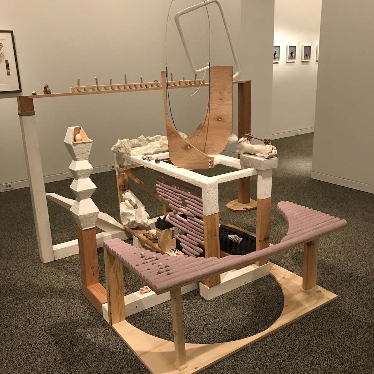
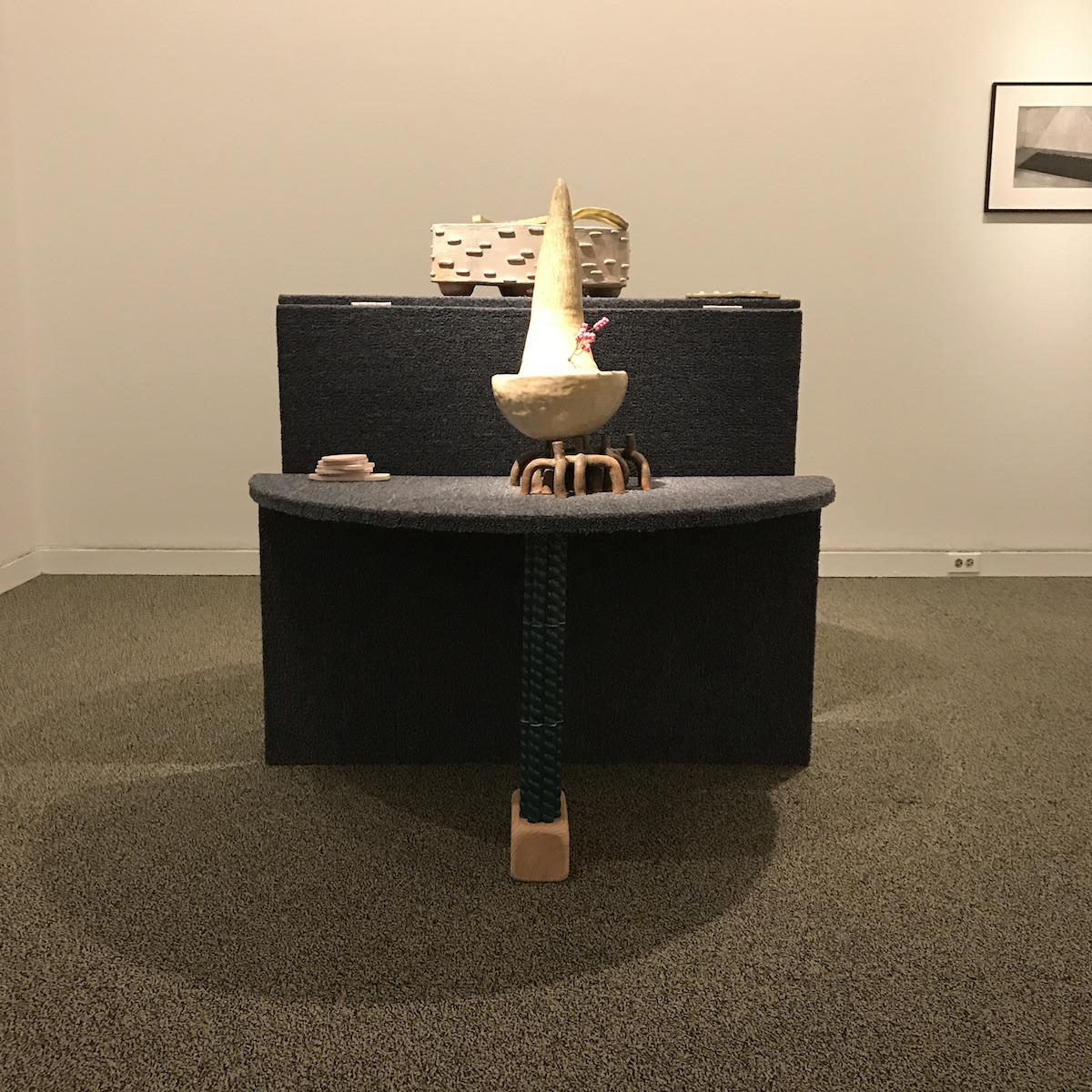
Either way, I enjoy walking through the worlds Cheng has created and imagining their possibilities. Bend over “Signal/Lookout” and take in the contents of its chasm, squat low into the styrofoam and wooden pits of “Portal Shelf” and then rise to peer into the void of the portals; I observed the sculptures from as many angles as the crowds would allow and noticed that every vantage point revealed a new sculptural element previously hidden by the singular perspective one maintained. Only by moving into a new position around the sculpture can new clarity be gained: a profound metaphor for the singular perspectives we maintain about each other and our own identities, and the potential paradigm shifts that are possible if we are open to those shifts.
Cheng’s sculptural practice is based in drawing, although stylistically her pencil and collage drawings of architectural interiors are diverse. “Souvenir Room” #3, #6, and #7 are also featured in the collection and, juxtaposed with the sculptures, the drawings help to contextualize Cheng’s thought process in three dimensions. As a note, Cheng does not use sketches to create the works, rather, she considers each sculptural form and the culmination of those forms drawings in and of themselves. In this way the 2D drawings and 3D sculptures present an exquisitely odd assortment of imagined landscapes that incite play and are worthy of extended exploration. (Angela N. Carroll)
Sara Dittrich

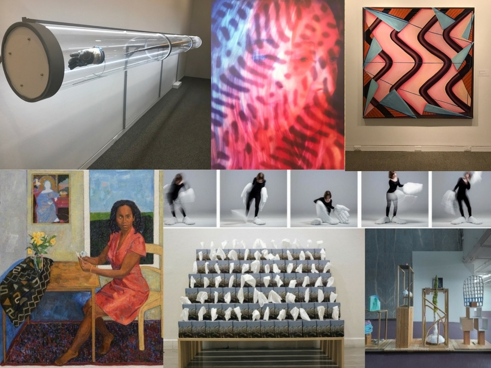
Dittrich may have the most fully realized, stand-alone body of work in this year’s finalist’s batch, even though her assortment of photographic documentation, sound sculpture, and clay and paint on panel is an odd assemblage of media at first blush. Even better, once you drink in what the sculptor/performance and installation artist is exploring with these pieces, you realize that she’s still kinda working through some ideas about the body and the space(s) it occupies and with which it interacts.
Her wall text discloses that this work was inspired by her reading of Henri Lefebvre’s Rhythmanalysis, the final book that the Marxist French philosopher/sociologist penned before his death in 1991. It’s a collection of essays that think through understanding and reimaging the relationship between the body and space in terms of rhythm, the frequency of repetitions we experience.

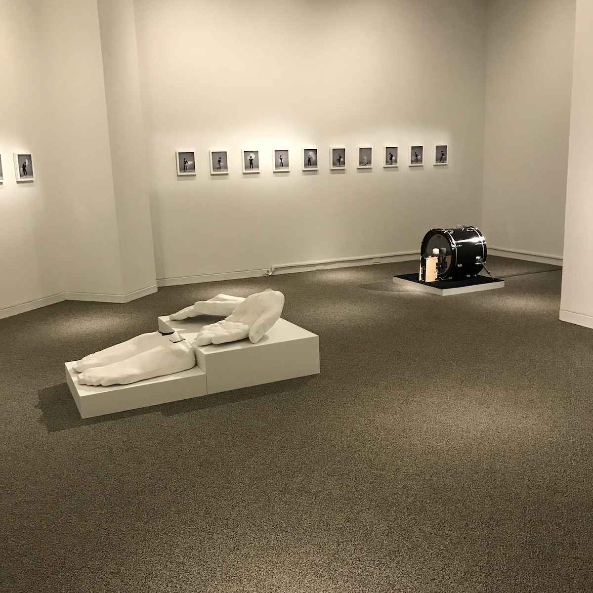
How Dittrich opts to explore Lefebvre’s concept of rhythm as a way of analyzing the lived experience is what makes her work here so intellectually daft and visually disarming. “Going/Staying (Walters Art Museum)” is a sound sculpture featuring a kick drum and electronics. The drum is struck based on the cadence of Dittrich’s footsteps as she walked through the Museum.
Musically we’d call it an arhythmical beat because the drum strikes don’t mark set intervals, sounding almost randomly generated. The work turns the rhythm of walking into something abstract and foreign. The series of 20 photographs document her “Arrhythmia of the Body” dance qua performance, for which she wears a pair oversized feet and hands that she crafted. The photos—in which a Dittrich is seen going through a series of quotidian movements with these cartoonishly giant appendages—move from quietly comic to surreptitiously captivating. Those feet and hands—prosthetics fabricated from Celluclay, foam, shoes, gloves—are painted bone white and look like props you’d expect to see in a disorientingly bleak Eastern European play. The performance with them is intended to take her out of the comfortable rhythms of her everyday life; seeing how clumsy and unwieldy they are, you wonder if she could’ve achieved that less drastically.
How Dittrich opts to explore Lefebvre’s concept of rhythm as a way of analyzing the lived experience is what makes her work here so intellectually daft and visually disarming.
The radical disruption of the norm is the explicit point of Dittrich’s work. Lefebvre started thinking about out how capitalism colonizes reality through bureaucracy and consumption in the late 1940s, and his three-volume Critique of Everyday Life became one of the French texts that catalyzed thinking about how the politics of time and space impact the body in pockets of English-speaking critical radicalism in the 1980s. Dittrich’s work here isn’t so much rekindling that discussion as demanding a reinvestigation of the ways in which the politics of time and space define our bodies and their aesthetic universes.
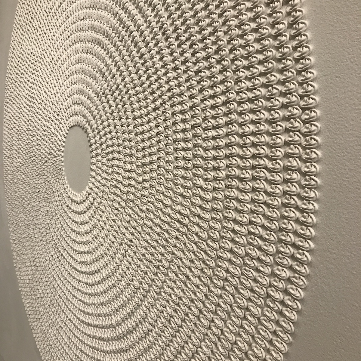
“Variations on Listening #5” at first looks like a white-on-white abstract painting of a circle made of shapes arranged in concentric circles on a rectangular background. As you inch closer to it you see that those white shapes are physical pieces, sitting atop the panel. And inch a little closer and you realize those pieces are small clay ears. Each concentric circle is an orderly single row of ears.
It’s kinda stunning, slowly becoming more and more discomfiting as you take it in. You might try to summon what kinds of human activities produce large quantities of body parts—cloning and genocide immediately sprang into my mind—before moving onto what other kinds of human activities so neatly put objects into order, and you may wonder who’s supposedly doing the listening here. And just as quickly as “Variations on Listening #5” looks visually gorgeous, it moves into the creepily totalitarian. (Bret McCabe)
Benjamin Kelley

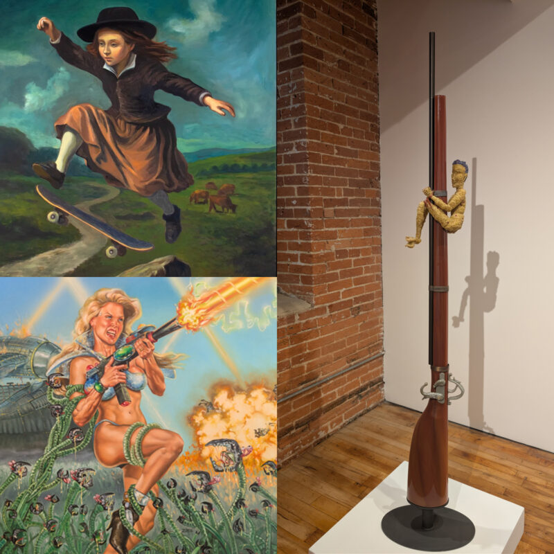
Benjamin Kelley’s “The Healer,” a hanging faded blue conservationist lab coat, is installed high on the wall opposite “Residual Evolutions,” in which a skeletal hand carved from a piece of ancient bog oak, a carved steeple made of plywood in varying stages of erosion, and the right glove of astronaut Dr. Bonnie Dunbar’s space suit are encased within a giant plastic cylindrical container.
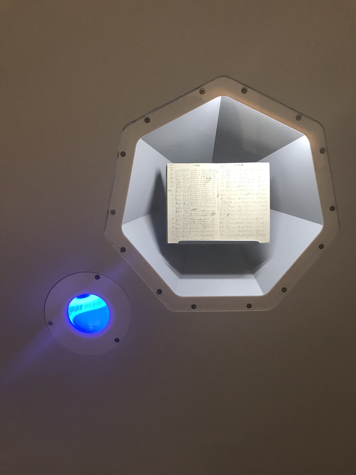
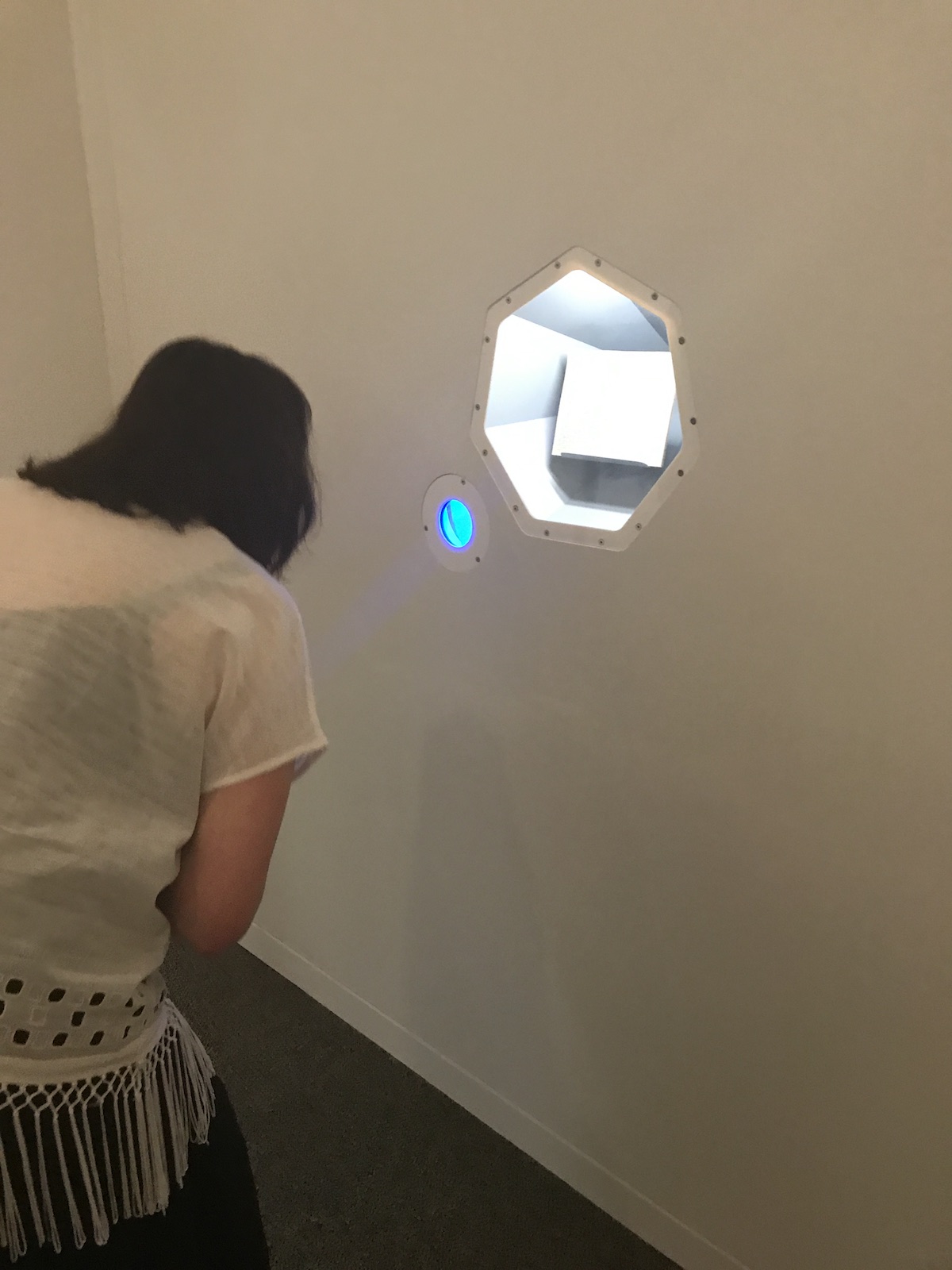
Through an arcane collection of elements and technically precise display mechanisms, Benjamin Kelley presents the future as a sterile and sparse museum. Time, the role of the archivist, and the narrative threads that mark an object sacred enough for preservation are major beats within the collection. The work is not necessarily an interrogation of the museum, rather it is an uncovering, a re-presentation of museums as archival apparatuses. Kelley displays objects associated with archival and conservation as artifacts. Thus, he draws parallels between the function of the museum and the archival tools museums employ to create his own futurist arrangement.
The work is not necessarily an interrogation of the museum, rather it is an uncovering, a re-presentation of museums as archival apparatuses.
What intrigues me most about the collection are the uneasy historical associations and fantastical prospects Kelley’s juxtaposition present; the coupling of real and fabricated objects with imagined narratives ruptures ideals about the stability of historical accounts, and passively probes the intent of archival institutions. In Kelley’s museum, archivists are authorities and potential interlopers claiming and redisplaying mundane objects as hallowed artifacts. The collection compounds and conflates histories with found and fabricated objects, and elicits subtle queries about established hierarchies within conservationist institutions as well as the artist’s timeless ability to create real and faux historical records. (Angela N. Carroll)
Kyle Tata

From a distance, Kyle Tata’s digital C-Prints appear to sit squarely within the genre of zombie formalist paintings. Each is comfortably apartment-sized, slightly blurry, vertical for viewing on a phone, and feels vaguely metacritical. Intricate patterns swirl and semi-transparent colored shapes overlap like Josef Albers exercises on crack, but closer inspection reveals they are not paintings at all, but digital photo collages.
If you take a step deeper into Tata’s work, his handsome, medium-sized works aren’t even abstract: there are people lurking and staring in there. Each is a portrait of someone he knows, rendered through the proprietary visual security patterns of the financial institutions where each individual keeps their money. For Tata, the metaphor of big data and specifically, one’s stunted identity rendered through digital financial transactions, is apt for the function of individuals in society at large. The artist’s message that we’re all just a number, a barcode, another brick in the wall is not particularly specific, but neither are these images.
A level of ambiguity makes these works challenging to navigate like a detective, and the artist gives just a few clues and the most tenacious viewers will get it. As your retina (and your phone if you’re attempting to photograph Tata’s work) struggles to land on solid ground in these dancing, collapsing surfaces, you occasionally land on a face, an eyeball, a hand, or an obvious envelope as a clue. In “052001633_4_Bank of America,” a robust composition that segues from a net of crimson to blue-violet, a giant human face haunts the composition with one almost-focused eyeball returning your gaze. Like a Magic Eye mall art poster, once you’ve seen the face you cannot un-see it, but it’s easy to miss in the rich and unpredictable patterns Tata has built.

In several works, Tata includes images of aluminum coin trays and in a few, the envelopes become more obvious. You can enjoy these pieces simply as colorful abstractions if you ignore the wall text, but the artist’s ideas enrich and personalize each piece in a way that makes them more engaging to navigate. Besides wall text, other clues available to the viewer can be found in Tata’s esoteric titles, like “054000030_11_PNC” and “22000046_13_M&T Bank.” If you take the time to scan past the generic list of numbers and realize that each references a specific bank, the artist’s ideas become more focused and your search through these visual fields becomes one of purpose rather than a simple sensory experience, which may be more rewarding for some visitors and less for others.
While Tata’s works are visually stunning and offer a relevant critique of contemporary culture, at times this Orwellian storyline feels forced. The bank envelope patterns offer a rich array of beautiful patterns, but their embellishment makes me wonder if Tata is more interested in them as formal visual elements, rather than as a metaphor for all that is wrong with capitalism. There are a number of contemporary artists who use popular culture as a springboard into aesthetic ideas, but don’t reach popular acclaim unless the work is imbued with a relevant social backstory. Sometimes the backstory is more interesting than the work and, as a result, eclipses and carries it.
Tata’s newest body of work leaves me unsettled and curious: what could this artist accomplish if he abandoned the intrusion of a story and made work in purely visual terms?
Could these comely works hold up without a contemporary parable to back them? My guess is yes and my evidence is the most subtle, easy-to-miss detail in all of these works: a layer of clear, etched glass in matching patterns over top of the compositions like a thin veil of snakeskin.
You can only see the patterns if you tilt your head sideways, and it’s most visible in his darker pieces. This top layer feels purposeful yet superfluous; it’s a decadent, even baroque decision, and adds a veneer of playful, formal thinking that offers no social context. For this reason their inclusion is the most powerful element in this body of work, an odd embellishment that could function just as well without the underlying photos. (Cara Ober)
Amy Yee
Don’t be surprised if your first response to Yee’s work is to giggle nervously and not quite know why you feel so anxious and tickled. Her grouping of sculpture, digital video, and two-dimension pieces flirt with the representational, only her subject matter pushes nonchalance to absurdist extremes. Yee’s work turns silly jokes into the eerie, where the punch-line to the who’s there? reply of her art’s knock-knock call is making you aware of the blank stare of reality’s infinite void.
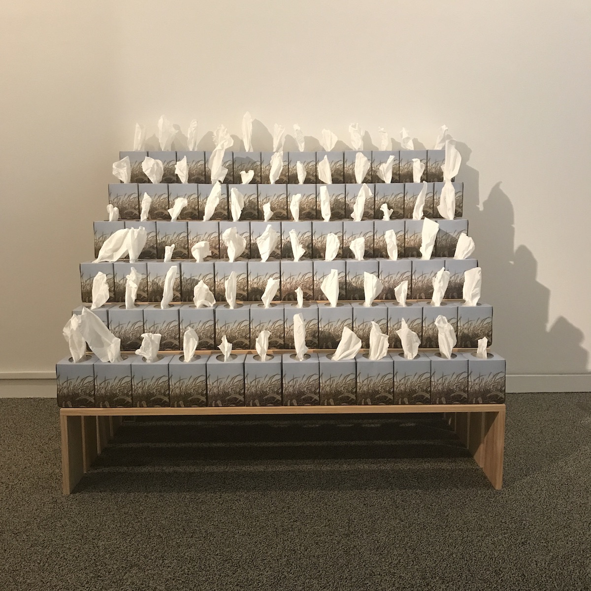
With “The Field (Expanded)” and “Wall Art,” Yee uses ordinary commercial products to make other quotidian things. “Wall Art” is little more than a Lazertran decal of a light switch stuck on the wall higher up than one would be mounted. Like Gary Kachadourian’s life-sized reproductions of objects, there’s something cheeky about an artist representation of something standing in for Kant’s the thing itself, and Yee’s deliberate high wall placement strips the thing of its typical functionality and turns it into a curiosity.
Yee’s work turns silly jokes into the eerie, where the punch-line to the who’s there? reply of her art’s knock-knock call is making you aware of the blank stare of reality’s infinite void.
“The Field (Expanded)” is even more ridiculous. For it, Yee has made a series of six wooden risers and arranged Giant-brand Kleenex boxes on them. The packaging of the tissue boxes features an image of a field of tall grasses wrapped around the box. Yee lines these up on the risers to create a field of product grasses, a single sheet of exposed tissue in each box visually echoing that grass. “The Field” isn’t simply an artist winking at natural world through her media. It’s the artist winking at a commercial representation of nature that was made to be a decorative item in the home. There’s so many layers to the abstractions from an observed object going on here, there’s not really any there there.
And I think the infelicity of what we observe is what interests Yee’s artist brain. Baudrilliard’s Simulacra and Simulation essay was almost immediately seized upon by film, television, and the nascent online thinkers after it was published in 1981, and Baudrilliardian ideas became a cornerstone of the novel virtual world. In the 21st century, though, the virtual and the actual IRL world can kinda feel as common as air, both at times completely insufficient mediums for understanding the moments in which we exist.
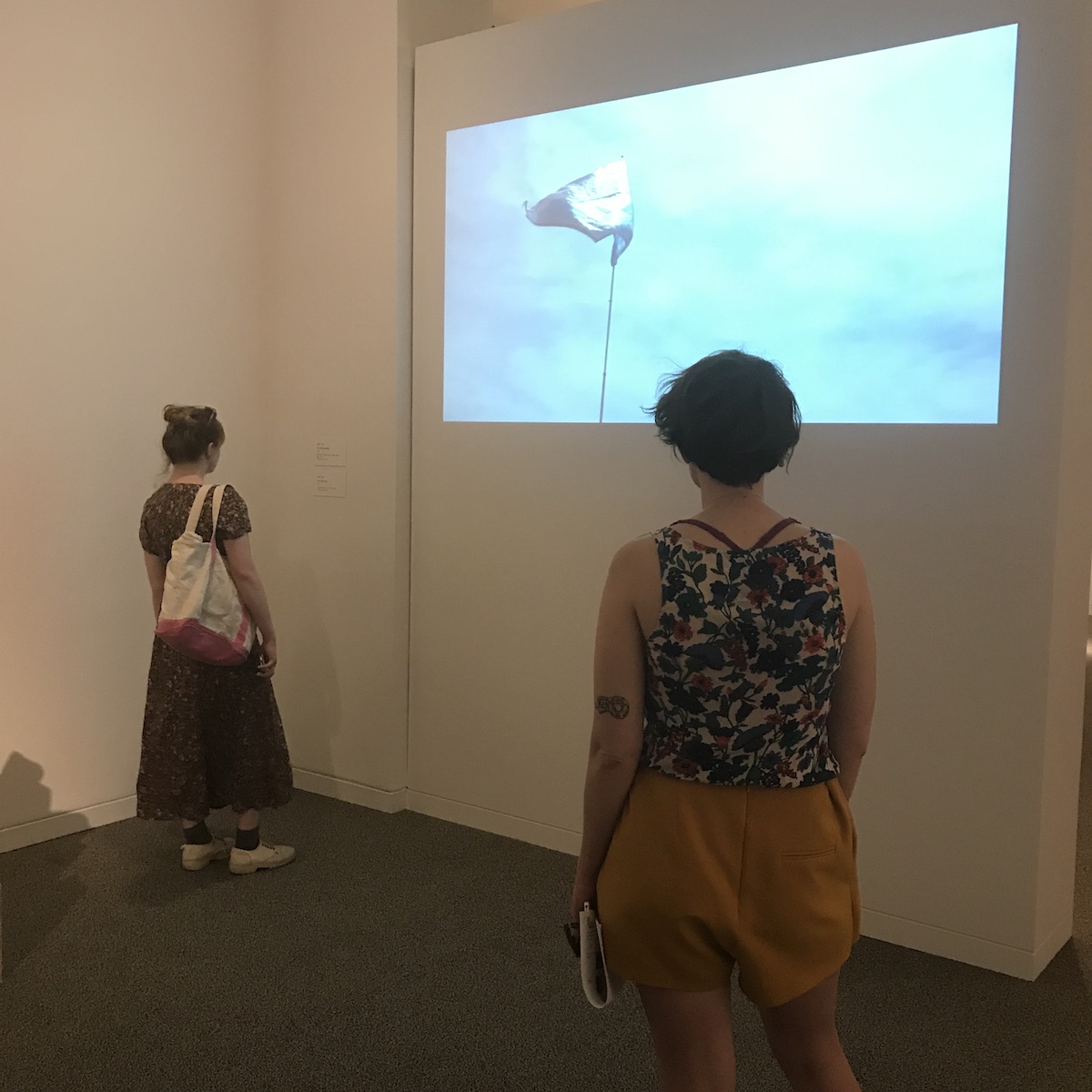
And so Yee’s “Pictures of a Live Stream” inkjet prints and “A Far-Off Country” video loop hit the eyes with a powerfully uncanny emptiness. “Pictures” captures sporting competition sites during the 2016 Olympic Games in Rio—archery, fencing, equestrian, badminton, rhythmic gymnastics, athletics—when nothing was going. These are the sites of spectacles sites stripped of their drama, less anticlimactic than utterly absent of narrative, spotlighting the vacuity of the eventual sporting events themselves. Even better, “Far-Off”—a simple digital loop of a light blue and white flag, the kind often seen attached to poles on golf courses, fluttering in the wind—is a complete and utter annihilation of aestheticized nihilism found in, say, that insipid plastic trash bag scene in American Beauty: Sure, sensitive middle-class white suburban kid, find your moment of overwhelming Zen in the randomness of capitalism’s detritus. Here, behold the wonder of wind moving flag. Sometimes there’s so much beauty being projected onto complete and utter nothingness in the world, I feel like I can’t take it and my heart is just going to cave in. (Bret McCabe)
About the Authors:
Angela N. Carroll uses illustration, citizen journalism, documentary film, words, and experimental animation as primary mediums to contribute to and critique the archive. Music and meditation are her medicine. She is an artist-archivist; a purveyor and investigator of culture. Follow her on IG @angela_n_carroll or at angelancarroll.com.
Cara Ober is Founding Editor at BmoreArt. She was a Sondheim Semi-Finalist in 2013. Follow her on IG @caraober.
Bret McCabe is a haphazard tweeter, epic-fail blogger, and a Baltimore-based arts and culture writer.
More Sondheim Info:
The Walters and the Baltimore Office of Promotion & The Arts are partnering to present the Sondheim Artscape Prize Finalists’ Exhibition, one of summer’s most anticipated events. On view at the Walters Saturday, June 17 through Sunday, August 13, the exhibition showcases the work of the seven finalists competing for the Janet & Walters Sondheim Artscape Prize, a $25,000 fellowship that is awarded each year by an independent panel of jurors to a visual artist or visual artist collaborators living and working in the Greater Baltimore region. This year’s finalists are all based in Baltimore.
The winner will be announced at an award ceremony and reception at the Walters on Saturday, July 15, at 7 p.m., with extended gallery hours from 10 a.m. to 9 p.m. This year’s jurors are: Ruba Katrib, curator at SculptureCenter in Long Island City, New York, where she organizes exhibitions, educational and public programs, and publications, and coordinates program presentation; Clifford Owens, a New York-based contemporary artist who works in performance, photography, text, and video; and Nat Trotman, associate curator at the Solomon R. Guggenheim Museum.
The Janet & Walter Sondheim Artscape Prize is held in conjunction with Artscape, America’s largest free arts festival, and is produced by the Baltimore Office of Promotion & The Arts. Artscape runs from July 21 through July 23 along Mount Royal Avenue and North Charles Street. Additionally, an exhibition of the semifinalists’ work is shown in the Decker and Meyerhoff galleries at the Maryland Institute College of Art (MICA) Friday, July 21 through Sunday, August 6.