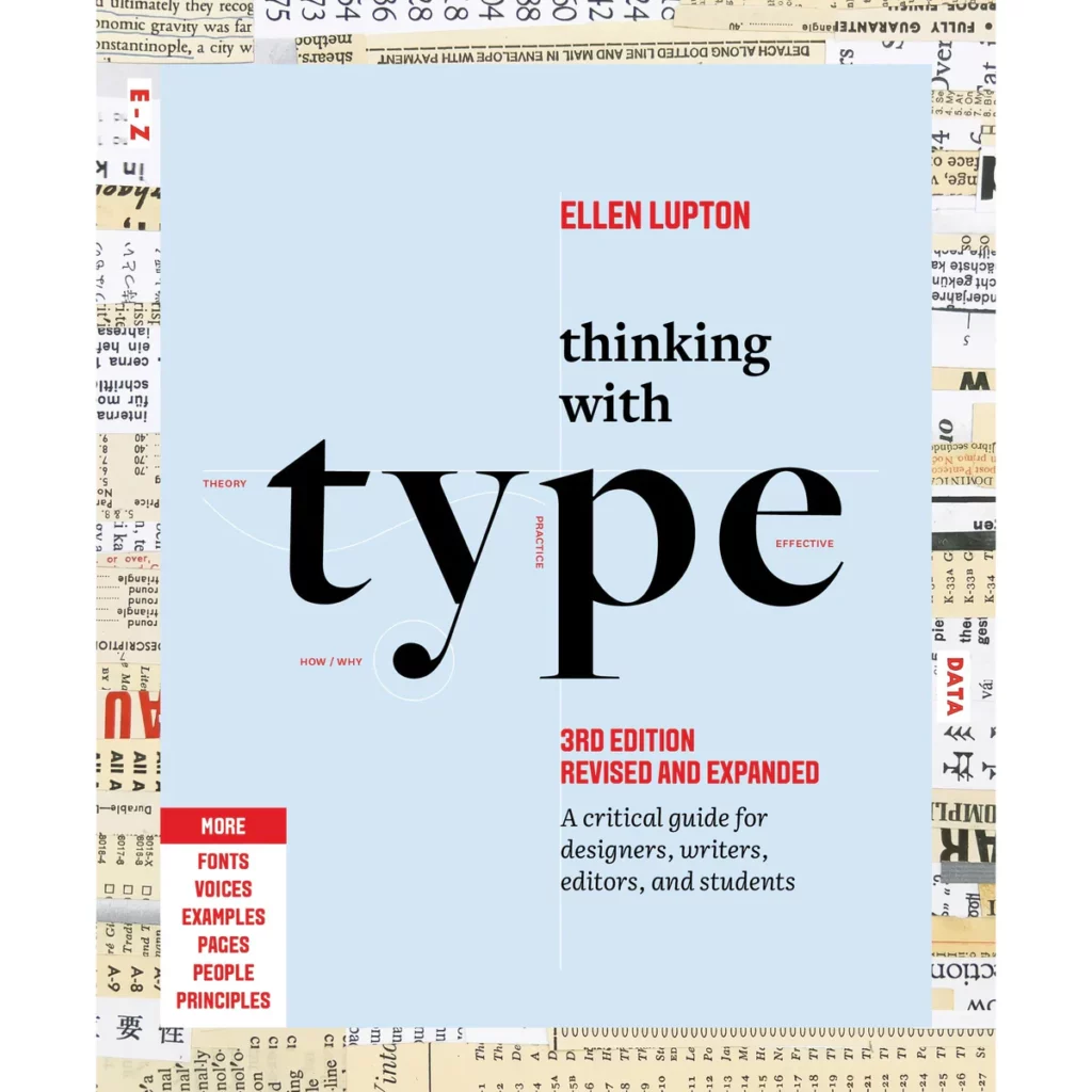
Letters, numbers, and punctuation marks: the characters we use to build language, these are the building blocks of typography. The field of study once felt to me like a closed club. As an aspiring designer in Brazil, the books I first encountered were intimidatingly technical, often so dry and impenetrable that they felt more like barriers than bridges between the reader and the material. Then in 2006, Thinking with Type by Ellen Lupton was published in Portuguese.
In this groundbreaking book, I discovered a new way to understand design theory. Lupton presented her perspective with humor, clarity, and a contagious sense of curiosity. The book did more than teach about type; it invited me in. Each spread felt like a conversation—full of visual play and wit, transforming the history and practice of typography into something approachable and fun.
One of the defining qualities of Lupton’s books is their inclusivity. “I imagine a reader who’s not from the US, whose English is not their first language, who’s creative but not already an expert,” she explains. “When you have that person in mind, it makes you answer questions like, why? Why is this important? How can I make it clear?”

Every design choice Lupton makes, from table of contents to two-page spreads, reflects this philosophy, layering text with visuals to make dense subjects inviting and enjoyable. Her books are like treasure maps, each spread a self-contained gem, yet together they tell a larger story.
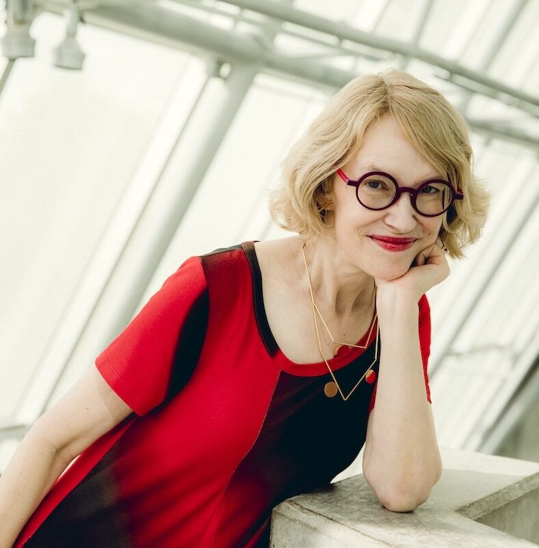
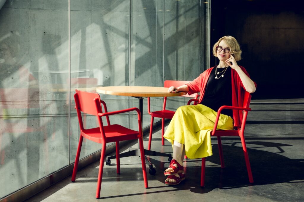
Thinking with Type, first published in 2004 and now, in its third edition, has become a rite of passage for designers worldwide. Lupton jokes about dog-eared, coffee-stained copies in students’ hands as the book’s greatest compliment. They show it is being lived with. She has written over thirty books, including Design is Storytelling and Extra Bold: A Feminist, Inclusive, Anti-racist, Nonbinary Field Guide for Graphic Designers, each drawing readers into design with the same balance of rigor and joy.
“I’ve always believed that design is for everyone,” she says. “And the design profession has sometimes hid behind our expertise, perhaps defensively, to keep what we do special. But what we do, it will always be special because we spend our whole life doing it.”

Raquel CastedoHer books are like treasure maps, each spread a self-contained gem, yet together they tell a larger story.
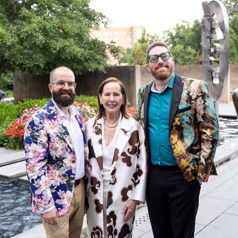
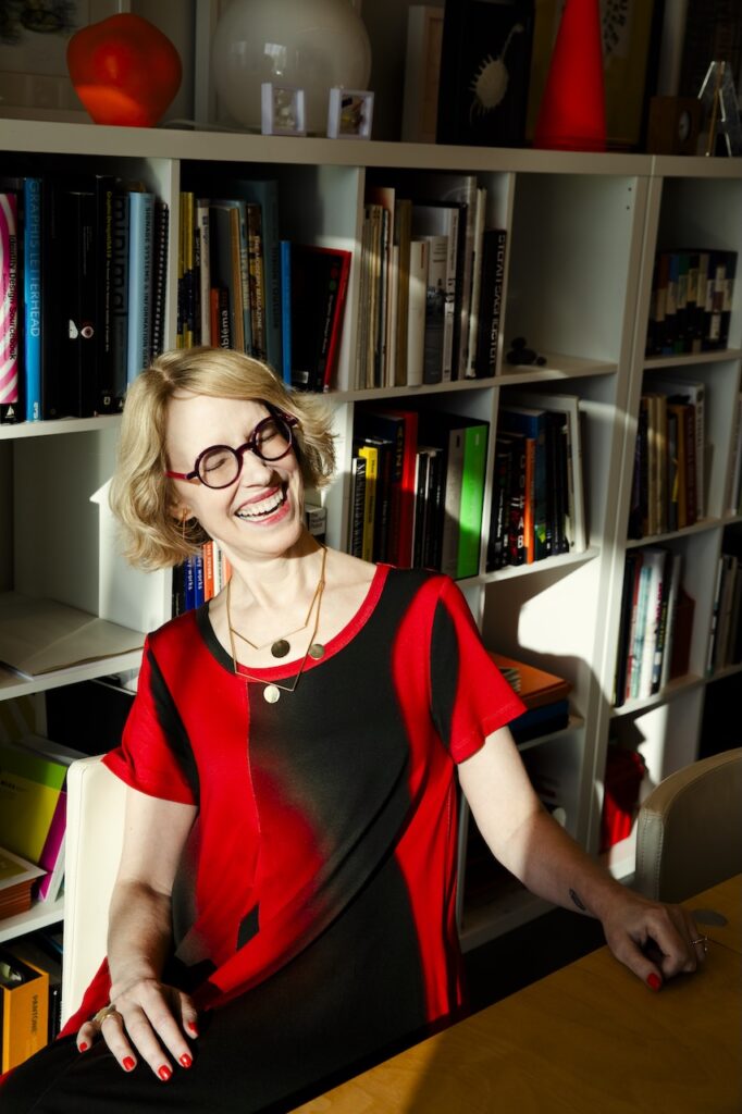
That balance between seriousness and joy makes Lupton both a design writer and a design rockstar. She has a global following but remains deeply rooted in Baltimore. After studying at Cooper Union and curating at the Cooper Hewitt, she returned to co-found and direct MICA’s MFA in Graphic Design program in 2004, a magnet for students worldwide.
I came to Baltimore from Brazil to study with Lupton in 2015. By that time, I was a graphic designer writing my PhD dissertation on publication design. Many more have been drawn to this city because of her influence, including Tony Venne—BmoreArt magazine’s designer; he designed this issue, if you read it in print.
Lupton teaches and mentors with the same accessibility she brings to her books, encouraging experimentation and asking questions that shift how students see their work. How can this be clearer? How can this reach more people? How can theory be transformed into something someone actually wants to read?
Her curatorial work at Cooper Hewitt often redefined what design could be. The Senses: Design Beyond Vision (2018), for example, expanded design into touch, sound, and even taste; inviting diverse audiences, including those with sensory disabilities, into a more inclusive experience.
“Exhibitions have to account for the expert and the novice and for people who are going to spend an hour and people who are going to spend literally five minutes,” says Lupton. “And they’re all legitimate. Those are all experiences that are worthwhile.” She treats curation as a democratic platform—using exhibitions, publications, and classrooms to amplify historically excluded voices. Extra Bold offers a feminist, anti-racist, queer, and accessible lens on a traditionally male-dominated field.
More recently, Lupton has been exploring new platforms and playful formats. Her Instagram persona, “Type Mom,” offers approachable design lessons to followers worldwide. She has also been experimenting with baking, often turning letterforms into edible typefaces. “I love baking because it’s design,” Lupton explains. “It’s painting and sculpture; it’s logistics. How do I get it in my car, what are the portion sizes, how do the materials behave? It’s all pure design.” These ventures reveal a side of her practice that is exploratory and joyful.
Her impact on the field has been indelible, yet, for me, it is also deeply personal. Working under her mentorship at MICA changed how I see design as storytelling, as cultural practice, rigorous and generous. Championing real connection between writer and reader, teacher and student, designer and audience—this is Lupton’s legacy.