A Review by Ian MacLean Davis, Marcus Civin, and Cara Ober
Now in its 9th year, the Sondheim Finalists Exhibition is firmly established as a reliable and heavily interrogated survey of contemporary art in the region. Like the Whitney Biennial, the Sondheim never fails to elicit debate about the types of art and artists that should be included, if there appears to be a conceptual through-line linking the artists, and even what the very purpose of the competition is.
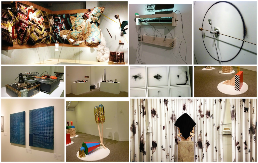
This year’s exhibit, featuring works by finalists Lauren Adams, Kyle Bauer, Shannon Collis, Marley Dawson, Neil Feather, Kyle Tata, and Stewart Watson, is notably more accessible than in past years. Jurors Claire Gilman, Sarah Oppenheimer, and Olivia Shao chose sculptors as five of the seven finalists, but they all share a fixation on materials, process, and formal visual concerns over conceptual ideas or specific social commentary.
Whether it distracts from or enhances each artist’s message, this year’s exhibition of finalists is beautiful to behold and inhabits The Walters’s special exhibition gallery remarkably well. If the purpose of the Sondheim Prize is to highlight the area’s best contemporary art, this year’s exhibit will leave most viewers feeling satisfied by the sophistication and variety of work presented.
Cara Ober on Marley Dawson
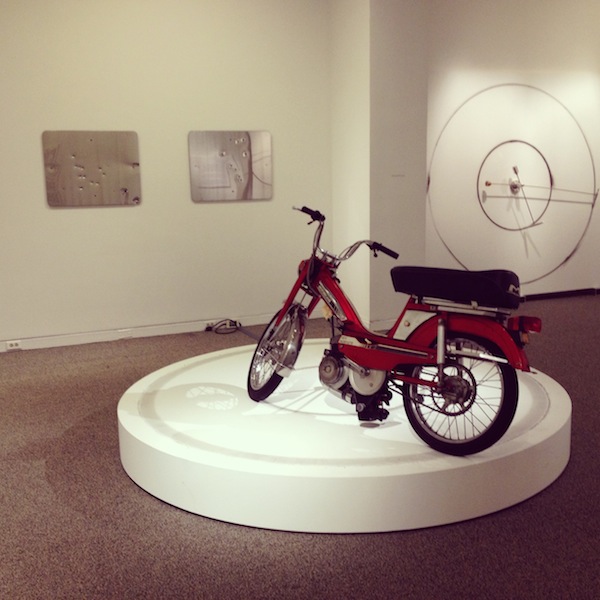
Upon arriving at The Walters, Marley Dawson lit a few rockets, searing pristine white surfaces with circles of ash. Typically, Dawson bolts sleekly crafted, metal rotors to gallery walls, ignites one end, and allows the circular trail to burn the walls. Since this wasn’t allowed at The Walters, Dawson had to settle for giant wooden panels, which are leaning, situated on aluminum cubes, so that they wouldn’t come off as paintings. The Australian, now DC-based, artist aestheticizes the destructive and creative power of machines in several minimal bodies of work in the Sondheim Exhibit including the aforementioned Circle Work (rocket assist), boards 1–5.
Like contemporary artist Cai-Guo Qiang, who often ignites fireworks and gunpowder in his work, many of Dawson’s pieces present the after-effect of an explosion or burn, where the audience is left only the drawing tools and a carbon trail. In contrast to this process, Dawson’s Sign (Landscape/Constellation) #11–#17 presents highly reflective metal street signs that the artist collected while visiting the American Pacific Northwest. Each sign had been shot with a gun, and displays a range of pockmarks and perforations. Marley then stripped their surfaces and polished them to a mirror-finish.
Both the burned circles and shiny street signs present a range of lustrous metallic objects and basic geometric shapes, so initially I approached them as I would a David Smith cube – as an exercise in minimalism where you consider your body in relation to the ‘thingness’ of the thing. However, to approach Dawson’s work this way would miss the point.
Dawson’s pieces document violent mechanical acts. One pivotal piece, Slow Burn, situated in the center of the gallery, is the key in understanding all the rest. On a low, white, circular pedestal, a vintage moped is bolted to the center axis by a metal armature. The bike travels slowly in a circle, and the friction of the movement marks a rubbery path of gray tire track. Unlike the other work in his exhibition, this is the only drawing-sculpture combo that we are allowed to witness in the act. All others are documentation of action. Although the objects created are beautiful and stand on their own as formal visual constructs, it is difficult to appreciate the artist’s intent without at least a video illustrating the significance of their creation. If you don’t understand they were fashioned by an extravagant and violent act, they read as pretty minimalism.
What’s most striking about Dawson’s objects at The Walters is their willingness to explore testosterone-laden concerns in a direct and unapologetic way. Dawson’s aesthetics are firmly rooted in all things macho: rockets, machines, steel, geometry, explosions, motorbikes, and gunshots. He delights in these items and their material qualities. Although the gunshot-laden street signs might seem insensitive in Baltimore City, Dawson’s work celebrates male fascination with a beautiful, creative kind of violence but tempers it into quiet objects. This work isn’t complicated conceptually, but it doesn’t need to be. He has found a way to access a pure level of fascination – he has taken the joy of thirteen-year-old boys lighting stuff on fire to watch it burn and imbued that excitement into objects of sophisticated beauty.
The only thing missing, except in the bike piece, is the action. This static quality leaves the work slightly flaccid; they’re already spent and we missed the big boom. Enjoying the artifacts from the activity is satisfying if you understand what they are, but the viewer’s experience with the work would benefit from involving us more directly with the cathartic acts that created the art. Explosions are exciting, and seeing the process of the work will enhance our appreciation of their result.

Marcus Civin on Shannon Collis
University of Maryland Professor Shannon Collis has got me thinking about sound. The vast majority of sound is wasted; it collides with unconcerned ears. The full spectrum of sound is completely surprising; it does not resemble popular music or conventional language, but oscillates from every movement of every device and from delicate anklets and inside the walls between apartments. Sound is trucks flooring it, and sound is an infinite series of patter, ever-scrolling uninterrupted mini-gestures. Sound is millivolts, and sound is an epic double bass, long athletic fingers gliding endlessly and almost imperceptibly catching cool strings.
For Iterations [2014] Collis inks up long film scrolls. The scrolls are transparent lyric skins, crisp scores of marks that look like black blocks, agitated cut strings of triangles, or grids of dots. Collis motorizes and lights-up these scrolls of abstractions; they are rolling continuously up and around.
If I understand correctly, the variation of the abstractions operate somewhat like needle grooves in a vinyl record or like the hole-punches in the paper rolls that act as sheet music that govern player pianos. Digital light sensors read how light travels around Collis’ abstract marks and these sensors trigger quick subtle electronic taps on taut wires. For Frequencies [2012] Collis captures tough black particles and makes them dance in clean white frames on top of speaker vibrations. The particles might scatter, then they might form fingerprint patterns, or stage any number of refusals to make a solid picture. Collis’ abstractions are calculating abstractions, capable abstractions. They work; they are intelligent and faithful.
Collis builds sculptures in order to draw sound and to position sound to make it draw. She is a machine-maker without any particular attachment to color, figure, narrative, or social reference. She is quiet and disciplined, but I think somehow Collis could invest in content. In this way, she could open her laboratory screen–door a little more and let us in. There is great joy for me in discovering these experiments. I’m watching and listening. Realizing hints of their science is like the never-to-be-repeated delight of my first driving lesson – making a car go, translating much energy by simply releasing the break. It might increase the appeal and importance of these experiments if Collis could test cultural ideas in addition to testing sound and its relationship to visual form. Or she could otherwise inject just a hint of a reference to socially distinct forms or reveal a peculiar intimacy.
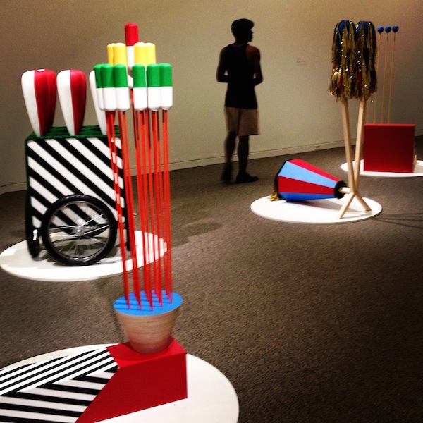
Cara Ober on Kyle Bauer
From afar, Kyle Bauer’s human-sized structures resemble giant Lego towers or tiny versions of monumental public sculptures. Their bold geometric patterns, smooth surfaces, and bright primary colors are reminiscent of playground equipment, but you are not allowed to touch them. At The Walters, their non-functionality is neatly reinforced by the flat white discs they sit upon, which set them apart from your walking path, but without distracting from the work.
The contrast between the cartoon appearance and “hands-off” inaccessibility of these beautifully crafted works creates a tension. You find yourself wondering about the purpose of sculpture and question your impulse to experience the objects more fully – to fondle them.
Bauer, a self-described formalist, builds his structures vertically by stacking an assortment of elements. He is a ceramicist, but that’s not obvious until you read the artist materials. Historically, it’s not kosher to touch sculpture. On the other hand, most works made of clay were intended to be experienced both visually and through tactile means. If you want to fully appreciate the craft and power of a clay object, color and form are important, but it’s essential to caress it: to feel its weight, touch its surface. Perhaps it’s this history, inherent in ceramics, which invests Bauer’s playful and happy-go-lucky works with conflict.
Bauer moved to Baltimore in 2011 to be an Artist in Residence at the Baltimore Clayworks, where he currently teaches. Although he employs traditional and alternative ceramic processes, his mixed media works don’t appear to be made of clay. He combines slip cast porcelain with wood, fiberglass, paint, metal, Formica cardboard, contact paper, streamers, and AstroTurf into lean, vaguely architectural and Dr. Seuss-like structures that resemble injection-molded plastic.
Why would an artist want to painstakingly craft structures out of clay but make them look plastic? Bauer’s work tickles. It’s a tease. Through a number of highly accessible, visually appealing cues, Bauer draws the viewer to his work. In Tropical Bomb Pop (Thanks, John), the artist adds a festoon of streamers, just in case your inner toddler isn’t already dying to cop a feel. And in Composition │12 6 2│, the artist adds a bit of Astroturf to the construction, which looks like an ice cream cart dispensing phallic bowling pins, just to test your resolve.
Once you come in close, the world Bauer creates is seamless and perfect, but something is awry. This discomforting itch stays with you. You want to interact physically with these figures, but you can only look. Bauer’s compositions mimic the preening dance of mating birds and the flirtation that happens in the beginning of a relationship, but there is a dose of irony, too. Despite a seemingly plastic veneer, much of Bauer’s work is made from the earth.
Ian MacLean Davis on Lauren Frances Adams
Lauren Frances Adams takes on the role of a sociologist and historian within her practice, mining the cultural record as a source for drawings and environmental installations that use decorative art traditions as a language of critique.
There are two distinct bodies of work included in Adams’ Sondheim entry at The Walters. Decorum (Elusive Contact) is an exhaustive series of small, framed drawings presented salon-style on a long wall, a selection from an ongoing series of works on paper. Each drawing functions as an episode in a story of the global history of slavery. Taken as a group, the drawings present an overwhelmingly active visual field of calligraphy, image and color. Examination of this work is a rich experience, each image dense with marks and text. Colors are applied in vibrant, watercolor washes that occasionally veer towards the psychedelic.
The way Adams combines text, appropriated image, and decorative pattern resembles book illustration, and occasionally both postcards and journal entries. There’s a patchwork/vignette quality to the drawing installation, like experiencing several stories audibly overlapping each other.
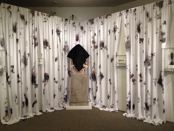
Opposite the drawings, Adams presents an environmental installation, which works to link the colonialist history of the drawings with The Walters itself. With Precarious Prototypes, the artist temporarily appropriates items from the museum collection, re-contextualizing them through juxtaposing presentations. The center of the wall holds the marble sculpture Bust of Giacomo Maria Stampa by Follower of Leon Leoni (1553) on a pedestal. The majority of the bust is covered by a black cloth like a shroud, negating the subject but also evoking death. Stampa, the subject of the portrait, was a Senator of Spanish lineage who served in Rome during a period of Spanish rule. (This information is almost exclusively available on The Walters’ website.)
Given Adams’ interest in antiquated power structures and colonialism, the choice of Stampa is apt, but what she intends by covering it is unclear. Other objects from The Walters’ collection presented here include Egyptian relics of slaves and servants, a weirdly small 18th century European bust of an African boy (c.1700), and an object of German jewelry inspired by African culture from the same general time period. The amount of gallery space covered by these antiquities is relatively minor. White curtains dominate the space between the relics. From a distance, the composition of patterns on the digitally printed curtains resemble a Toile motif, which traditionally features a pastoral theme. Here, closer inspection reveals that this pattern is composed of antebellum-era black slave illustrations, calligraphic text and inky spills neatly arranged among photo images of African sculptures.
Using imagery and objects from antiquity and mining history as inspiration for contemporary art is not unusual, but any discussion of slavery, colonialism, and empires remains complicated. In her posted statement about this work, Adams establishes that her intent in using references to this history of craft and decoration “do not simply reflect the spirit of a given culture, but are tools of critique.” While critique is her goal, making beautiful installations and paintings about such terrible events remains more disconcerting, than illuminating. Working with this specific narrative image bank will inevitably elicit wildly subjective responses from her audience. As exhaustively researched and impeccably crafted as the work is, I find her critique is too subtle to transcend the aesthetic pleasure the art elicits. It’s certainly not that it’s “too soon” for this discussion, but rather that her point isn’t sharp enough.
Marcus Civin on Kyle Tata
Kyle Tata, an Instructor at The Baltimore School for the Arts, exhibits a series of exquisite photographs that span a range of approaches, from geometric still life, to grainy images of mysterious origin, to photograms (photographic images made without cameras). The wall text that accompanies the group of pictures proposes that we read them in part as a loose exploration of the personal relationship between formidable Modernist architects Ludwig Mies van der Rohe [1886-1969] and Phillip Johnson [1906-2005].
Tata pays gleeful homage to Mies and Johnson. He also tries to run after these men, to tease them, and perhaps bring them down to size, making them artists like other artists, competitors, colleagues. The problem with this historically-referential approach to object-making is that it is easy to get wrapped up in the reference and forget what’s right in front of you.
Chicago, 1942 [2014], a black-and-white inkjet print, shows the blurry back of an older man, hunched slightly but still vigorous-looking. I assume he just turned. He wears a thick suit jacket. It must be a Christmas party; I think I see ornaments. I can almost hear loud jazz music and smokers cooing by the big French doors. A Broken Shot Glass for Mies [2014] is another black-and-white inkjet print showing two nails and shards of the shot glass pressed up against the picture plane. In the photograph, the nails are longer than my head. That shot glass would hold a bucket of alcohol.
I am no expert on the now-buried rivalries, indiscretions, transgressions, and passions of the two Modernist architects Tata references. Their many buildings are muscled wallops of marble, steel, and so much glass that they can reveal as much as they contain. The two architects worked together closely. When they worked independently, they still ended up with a lot in common. Johnson’s Glass House in New Cannan, Connecticut [1949], for instance, and Mies’ Farnsworth House [1951] in Plano, Illinois, are close cousins—open-plan glowing jewel box homes in dramatic natural settings with long horizontal slabs sandwiching-in walls of windows.
By emphasizing early photographic techniques and architectural photography, Tata wants to propel us back to the heady boundary-defying artistic milieu that informed these men early on—an environment where photography could be every bit as abstract as painting, and many artists and designers were working across media, deeply concerned with re-organizing space to elevate human experience. The cyanotype is an old-school photographic developing process that produces a blueprint that appears otherworldly. Tata’s gorgeous cyanotypes feel delicate, pleasurably immeasurable, and undefined, made by placing grates down on photosensitized canvas and exposing the canvas to light. The resulting blue compositions evoke sections from elevations for skyscrapers, ghostly checkered handkerchiefs folded in suit pockets, and cracked bathroom floor tile.
Tata’s project suggests a hazy-boozy fictionalized account of hidden intimacies between two bold, austere aesthetes. Strangely, even considering Tata’s more vague and poetic photographs, I can nudge my mind to imagine squabbles, coarse gaffs, or revelatory moments on-the-job by a pile of offcuts or between puddles in the alley behind a corporate parking garage. But perhaps I am going too far, associating too much. The link from Tata to Mies and Johnson is tenuous. It provides a good story to run wild with, but without explanation, any reading of this connection would be very difficult to pick up and puzzle through. In the end, one wonders what it is about the Modernist story that draws Tata in. It may be worth a romp with rough overblown monuments men, but what is meaningful and relevant from what we discover there?
Cara Ober on Stewart Watson
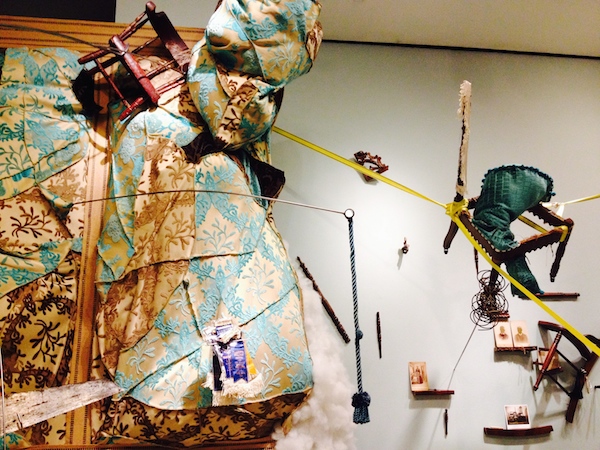
Familial relationships are at the core of Stewart Watson’s sculptural installations. Rather than isolating family artifacts and relics under glass with proper labels and dates, Watson transforms them into an immersive topsy-turvy experience where the elusive nature of memory and the twisted web of family are tangibly fraught. In her room-filling Sondheim exhibit, titled follmers fourth defluxion, Watson assembles two hundred years of family items, including antique photos and tintypes, fabric, like bits of her great-great-grandfather’s bowties and grandmother’s wedding dress, furniture and upholstery, letters, and even ‘DNA dirt from 1300.’ She then elevates and animates them with arching and twisting steel rods and embellishes with vinyl and polyfill to create an environment both goofy and menacing.
In Watson’s work, integrity of materials is central. To understand the work, it is crucial to know that her materials are not only historically authentic, but personal. Everything in follmers comes directly from a horde of family resources preserved obsessively by the artist. (In a recent attempt to purge her studio, Watson sold some of her grandparents’ chairs, only to purchase them back weeks later.) In the small, centrally located piece, The Trunk of Letters, you must read the wall text to understand that the leather chest contains “cherished correspondence between family members 1862–1978, random legal documents that I am to keep safe for something.” Watson’s overwhelming inventory of wall text at The Walters emphasizes her history and romantic ties to these items, but reads like poetry.
The poignant relationship between the sentimental and the absurd is reinforced both visually and materially in Watson’s work, especially when her relics are transformed, and even destroyed, in the process. For example, in Set a chair, Jenny, for the gentleman” said she to the child, the artist suspends a chair in front of an inky colored wall, painted from the carbon ashes made from burning one of her great-great-grandfather’s chairs along with further ancestral documents. In Has your gran-ma’s pock-et Bunch o’ keys and mo-ney? antique family photos are permanently masked with 23-carat gold leaf to hide each subject’s face. She can never bring the faces back again, which makes their loss purposeful.
The physicality of Watson’s largest piece at the Walters, the Way of Life and the Road to Destruction, a sprawling mass of rich, brocaded fabric rippling over two walls and embedded with gobs of smaller familial objects, is Watson at her best. Bulky and overwhelming, this piece fully captures the Herculean effort of preserving all these family memories, properly respecting and appreciating them, while attempting to carve out a space for the present.
In life, Watson is a mother, an educator, and the director of a sprawling artist-run warehouse space called Area 405 that hosts studios for 30+ local artists. In a sense, she is a mother to many of Baltimore’s creative makers. Knowing this, it is obvious that her work is an attempt to simultaneously honor the relationships she constantly nurtures and to express the unwieldy and even monstrous responsibility of it all. In addition to all the comforting and familial objects, Watson uses steel rods to both skewer and support the soft, rich upholstery, which threatens collapse onto visitors. In this world, everything is precious, yet precarious.
After knowing Watson’s work for a decade and seeing a brocade pillow uncomfortably pinned to a gallery wall here and there, and not finding them particularly menacing, follmers fourth defluxion succeeds wildly in comparison, manifesting the power and fury of Watson’s vision.
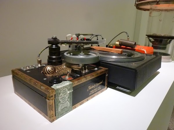
Ian MacLean Davis on Neil Feather
Walking into Neil Feather’s exhibition space sets off a chain reaction: Arduino-controlled sensors respond to your presence and send signals to his series of gizmo-sculptures, each of them generating mechanical sounds which construct a minimal, clanking orchestral score. Arduino is a programming language and set of hardware modules popular among contemporary tech hobbyists. As technology, it fills a similar space as Crystal Radio kits did in the 1950’s, adjusted for our current level of sophistication. A reliance on antiquated DIY hobby-tech is a foundation element of Feather’s work, so it’s appropriate that he uses the newer technology as the “brains” for his eccentric interactive installations.
Feather is a working musician and inventor who has been developing unconventional sound instruments in Baltimore for over 35 years. For most of this time, his practice was engaged with the city’s deep experimental audio/music scene. In Feather’s installations at The Walters, the distinction between experimental musician and fine artist is established through his aesthetic sense. This is music to be watched and heard.
The Rube Goldberg Variations features two tables arranged kitty-corner that might briefly be mistaken as a DJ station, as they prominently feature a pair of spinning turntables and a stage amplifier. The resemblance passes quickly as much of the gear is recognized as cigar boxes and other antique-looking junk. The “junk” consists of beautiful old boxes, flywheels, springs, marbles, musical instruments and other ephemera re-purposed into compelling mechanisms. These constructs are at once intricate and lean; every element seems to be necessary to perform a specific function in a vibrating, spinning whole.
Number Five is a vertical wall-mounted piece composed as a series of balls and springs hanging from a small motor. The motor turns a length of wire spring connected first to a billiard ball, then a bowling ball, and finally a fist-sized rubber ball. When a critical level of tension from the motor is stored in the springs, mediated by the weight of the bowling ball, the “tail” suddenly swings to hit a cymbal placed next to it on the wall. A third piece places electro-magnets beneath another bowling ball at the end of a hanging guitar string, creating a plumbline that sways as the magnets repel each other. As the string moves and vibrates in front of a pair of electric guitar pickups, a low and varying hum is generated.
The design and engineering of the sculptures present a mad-tinkerer workshop quality, which reads as pure experimental pursuit. Rube Goldberg (b.1883, d.1970) was an engineer, cartoonist and inventor so famous for designing chain-reaction mechanisms that his name has become the dictionary definition of “accomplishing something simple through complicated means.” Feather’s sculptures certainly fit this description, but ‘complicated’ and ‘simple’ are relative to the viewer’s understanding of electronics and physics.
Regardless of such semantics, there is sophistication in Feather’s use of antiquated technologies and mechanisms. Despite the concrete quality of spinning flywheels and coils of wire and circuits, and even with a series of adjacent photographs displaying the innards of his box components, they remain mysterious.
Particularly with Feather’s own Rube Goldberg installation, the technology is so charmingly old-fashioned and ramshackle, you still don’t really understand how they work any more than you understand how your own smart phone does. This work is “neat” and “cool” because it feels like it comes from the artist’s personal obsessions regardless of what current ideas of “cool” are. Culturally, they are unstuck in time.
Conclusions by Cara Ober:
There is a reason the Sondheim is called Baltimore’s most prestigious art prize, and not just by BOPA. It’s not the $25,000 prize money, which is considerable, but the same amount as the three annual Baker Artist Awards. It’s not the museum exhibition necessarily either, because several other art awards exhibit winners in museum settings. Although there is a dark and divisive side to all art competitions, and many artists who think they should be gotten rid of altogether, an upside comes directly from the contest structure.
The Sondheim Exhibition of Finalists will be on view at The Walters Art Museum June 21 – August 17, 2014. The competition winner will be announced at the awards ceremony at the Walters on July 12.
To see more photos of the work, click here.
Author Bios:
Marcus Civin has written in response to many artists including Baltimore artists Chul Hyun Ahn, Timothy App, James Bouché, Carol Miller Frost, Christopher Lavoie, Andrew Liang, Joyce Scott, and Joshua Wade Smith. Civin’s writing has appeared recently in Afterimage and Sculpture Magazine. He is Acting Director of Curatorial Practice at Maryland Institute College of Art.
Ian MacLean Davis holds his MFA from the Mount Royal School of Art at the Maryland Institute, College of Art and was a Hamiltonian Fellow (Washington, DC) from 2008-2010. He exhibits nationally and is collected internationally. Ian lives, works, and teaches in Baltimore and its outlying counties. He’s obsessed with the effects of mass culture and its images. And with food.
Cara Ober is the Founding Editor at BmoreArt. She has published art reviews for Art Papers, ARTnews, The Journal of Surface Design, Urbanite Magazine, The Baltimore Sun, Baltimore Style Magazine, Baltimore City Paper, Art US Magazine, and numerous curatorial and catalogue essays.