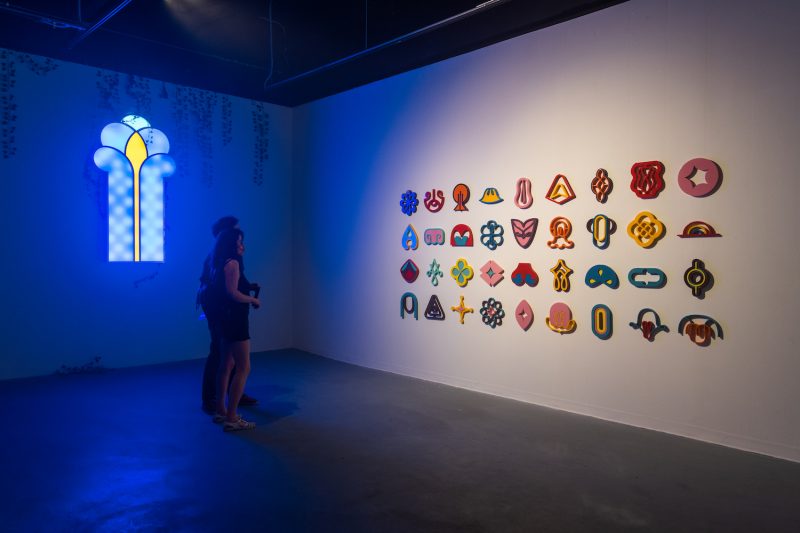
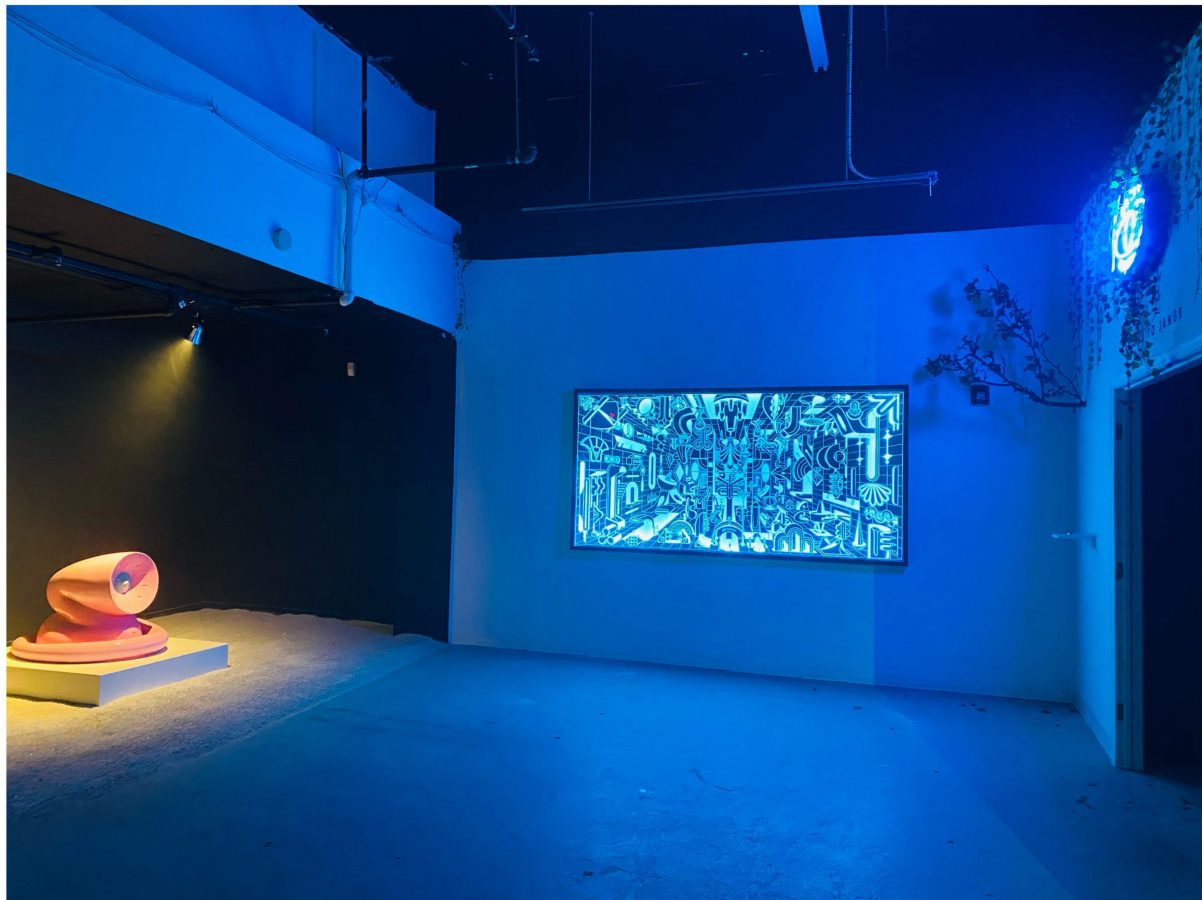
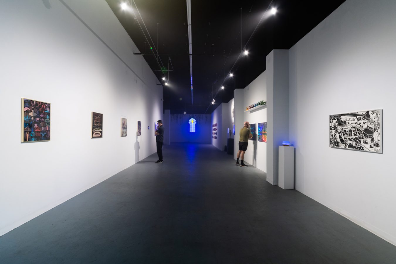
Overwhelming in every sense and incredible in scale, scope, and color, the Orbis Tertius -Hlaer-to-Jangr- exhibition at ICA Baltimore is a feast for the senses. Not just in the cavernous L-shaped gallery that other ICA shows have commanded, this exhibit by MICA Illustration MFA graduate Eduardo Corral (aka TlaLoC) is realized also in the North Avenue Market’s back rooms and giant storage hangars, a series of creepy basements, and a decrepit upstairs bowling alley. In every space, the artist transforms the site with neon and darkness, video projection and sculpture, as well as smoke, sound, and smell.
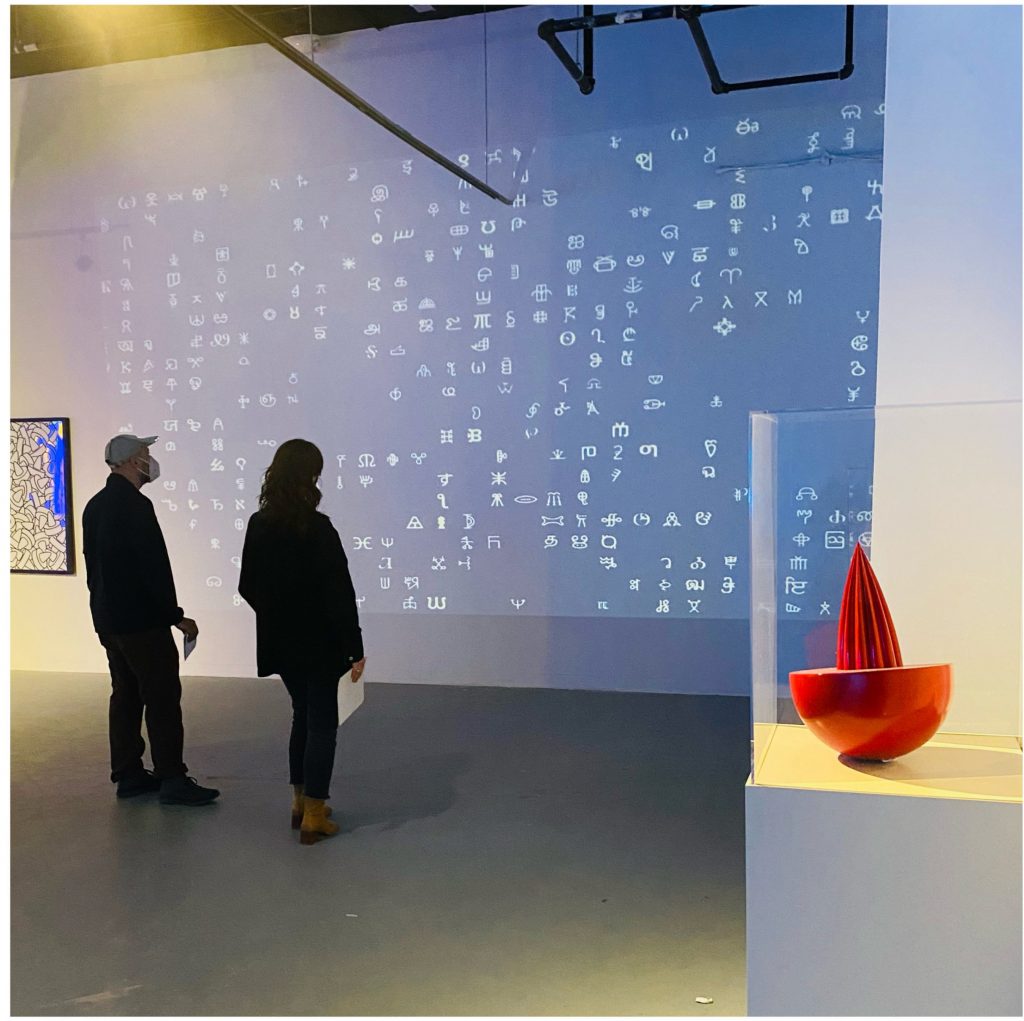
Even from the smaller 2D framed images in the front of the gallery, Corral hints at linguistic gymnastics and imagined worlds, where the artist repeats a specific abstract alphabet of shapes and symbols and experiments with placing them in varying environments. Tellingly, some of these imagined spaces offer the illusion of space and others are flat and patterned, offering insight into how interchangeable these ideas of space are for this particular artist, and suggesting that the space you are entering is primarily literary and linguistic, a space one usually visits through books and not the physical body.
Corral, an interdisciplinary artist, illustrator, graphic designer, and educator born in Monterrey, Mexico, takes this new language and conflates, inflates, and translates it into three-dimensional objects, projected video, and dystopian spaces that surround you in magical and menacing ways. This exhibit is layered and complex, maximal in every possible way, and the North Avenue Market, as a vague historic site representing Baltimore’s past, is complicit in this wild ride. Each gallery visit was appointment-based and required a tour guide to direct a small group through cavernous, dark spaces, creepy stairs, and seemingly endless hallways, with the building actually mirroring this idea of history and the accessibility of hidden worlds if you dare to explore them.
After a first visit, and a second tour with the artist, I still had many questions about this fascinating show, so I reached out to the artist. The following is our conversation, edited for clarity.
Cara Ober: The Orbis Tertius -Hlaer-to-Jangr- exhibit is deliberately mysterious in the language around the show, and the title of the exhibit is a work of creative fiction as well. Can you talk about the importance of language and metaphor in your work in this show, as well as explain the specifics around the artist’s persona and exhibition title?
Eduardo Corral: Orbis Tertius -Hlaer-to-Jangr- is a direct allusion to the short story “Tlön, Uqbar, Orbis Tertius” by the famous Argentinian writer Jorge Luis Borges. The exhibition is allegorical to the story; my intention is to show the exact point where his world and mine converge.
To briefly summarize the most important components I borrowed from Borges story: Orbis Tertius is described as a secret society of intellectuals that embarks on the colossal mission of creating a world (Tlön) from the ground up. “Hlaer To Jangr” (a title written in a mysterious Tlön language) refers to the name of one of the numerous volumes that are part of the secret encyclopedia that holds the extensive contents of Tlön.
The story explains that, at some point, this fictional world becomes SO vast by its incredibly rich description and documentation, that suddenly many of its imaginary elements start to materialize in real life.
At the very end of the story, Tlön (a world that only existed on paper) progressively takes control of reality, until it finally engulfs the world.
I was pleasantly surprised when I found out that many of the gallery visitors recognized the Borges reference right away. According to this particular audience, being familiar with the story added another layer that was helpful to navigate the narrative of the exhibition.
As the artist, how did you decide to use the pseudonym, TLaloC, which is the name of the Aztec supreme god of rain, earthly fertility, and water?
My pseudonym, “TLaloC,” is just a nickname someone gave me and that I later adopted. It is basically a wordplay for my short name: Eduardo = Lalo (Ex. William = Bill) and the first letter of my last name, Corral. So, “Lalo + C” sounds almost the same as “TLaloC.”
And what about the letter “T”?
Well, that is a mystery.
Can you talk about your own background, being originally from Mexico, and how Mexican literature, traditions, and historic religions and myths have informed your ideas and aesthetic?
I was born and raised in Monterrey, Mexico, “La ciudad de las montañas” (“The city of mountains”). A wealthy and industrial city located about three hours (135 miles) from Texas. It is a place I jokingly refer as “The Connecticut of México.” Weirdly enough, it is not its traditions, historic religions, or myths that have informed my aesthetic, but my actual upbringing and the city itself.
I grew up in a lower-middle-class family with strong work ethics, and somewhat lax religious beliefs. Culturally speaking, Monterrey has always been highly influenced by the US, being geographically close to it and basing its economy in bilateral exchange. I never studied art, but I’m aware that the aesthetic and style I have developed through the years is the result of being heavily influenced by many pop culture references from the TV.
On the other hand, Monterrey city’s aesthetics are incredibly peculiar. I spend most of my childhood living in pocket areas surrounded by monumental factories. The places where my family lived were located near metal foundries and aluminum, paper, soap, chemical, and cement plants. The urban landscape of this treeless city is heavily defined by gigantic exhaust pipes, towering metal structures, high-tension towers, steam whistle sounds, and the smell of molten iron, rust, and chemicals. This is the México I portray in my work.
How long have you been working on this project? There is so much work in this show, and the whole thing is so dramatic in the way it is displayed. When did you start this project and how has your thinking and output changed?
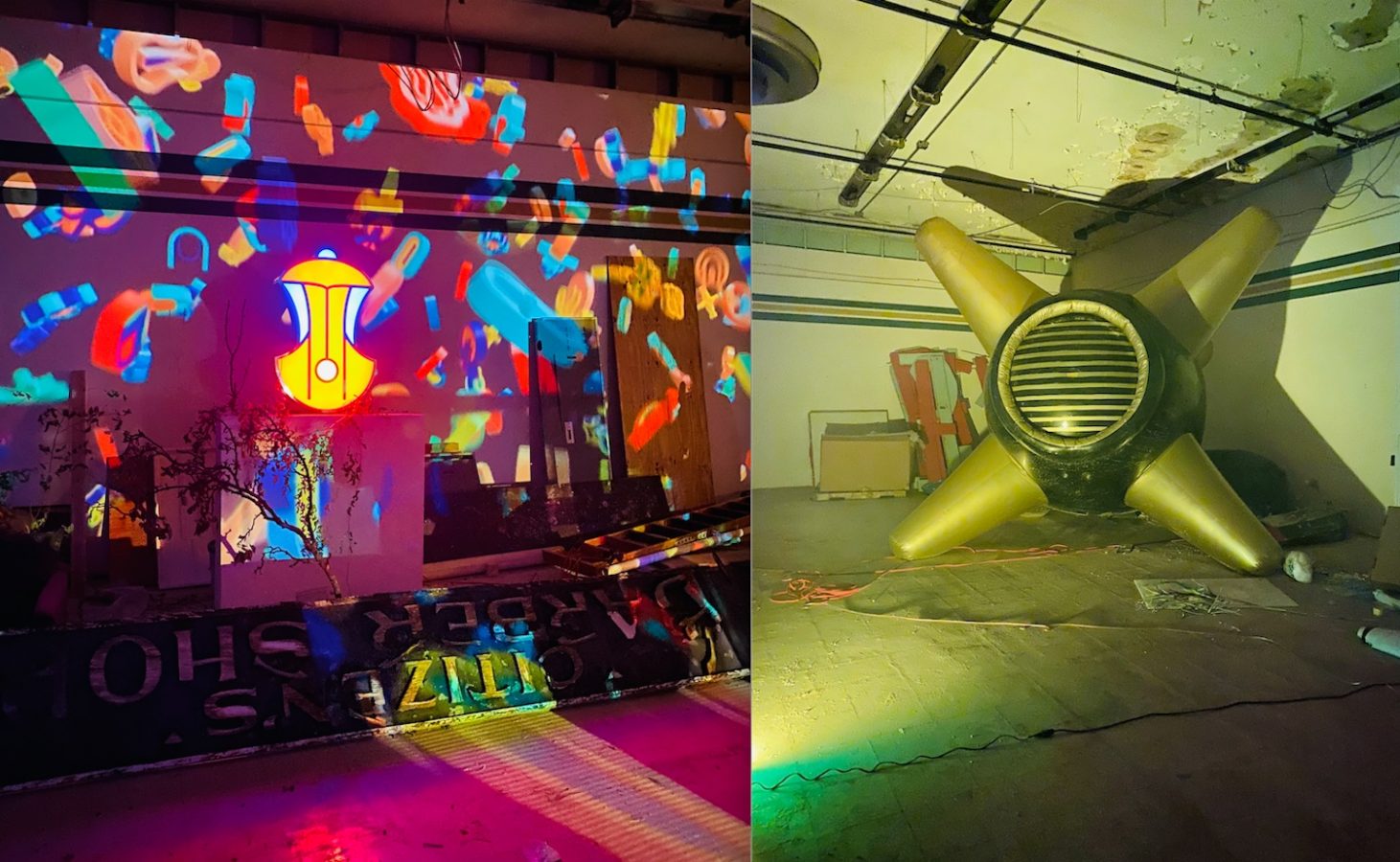
The oldest artwork displayed at the ORBIS TERTIUS -Hlaer to Jangr– exhibition is “THE PIG,” the black and gold inflatable sculpture located at the backroom area of the exhibition. This specific piece was created as part of my MICA thesis show in 2014, and I included it as a tribute to my student years, and to reference the visual catalog of misplaced artifacts that this universe is capable to contain. The rest of the exhibition covers eight years of work, although about half of the content was created in 2021.
Interestingly, Elgreen Project has been officially existing since around 1998. I can say, without a doubt, that the project has completely evolved since its humble beginnings. But this particular exhibition, ORBIS TERTIUS -Hlaer to Jangr-, has shown me what the future of my work will be like.
You now live in Baltimore; you came here to attend MICA for graduate school and you now teach MICA students. How has Baltimore changed you as an artist? How has your perspective as a transplant informed the way you think about Baltimore? For example, what do you know and want to share with Baltimore, from living elsewhere, that people here should know or consider?
I spent two of the best years of my life pursuing my MFA at MICA. Coming back to Baltimore and working as a full-time teacher in the FYE (First Year Experience) department at MICA has brought me to a full circle, and a new beginning. As a fun fact, I graduated with an MFA in Illustration Practice, but the running joke with my Mount Royal and Rinehart friends back in the day, was that I am NOT an illustrator, but a sculptor in disguise. I take that as a huge compliment.
Regarding the city of Baltimore and what people should know, I think the tight-knit community of artists living in the city is by far one of the most incredible things about it. “Smalltimore,” as it is lovingly referred to, is not an exaggeration. Becoming part of the welcoming artistic movements in the city is truly a gift. Being surrounded by incredible artists in the city feels almost like a commitment to represent the area, and at the same time, the perfect place to raise a voice to make our community visible through amazing art.
In many ways, this poetic exhibit is about language, literature, and the collective epic mythologies that govern our consciousness, as individuals and as larger groups.
The multisensorial nature of the exhibition is an unavoidable invitation to get lost into oneself. In addition, the premise of my work grants the viewer freedom to interpret its meaning. The language I use at the exhibition (both literal and metaphorical) is constructed on the same pretense.
The materials involved in this exhibition include such a wide variety—it’s mind-boggling. Can you talk about your favorite materials, many of which appear fabricated, and how you use specific types of materials for an intended visual or emotional effect? (For example, giant inflatables vs. small ceramic versions of the same shapes, or the impact of neon and glowing laser-cut “signs” with interior light sources)?
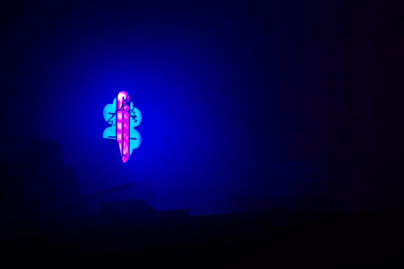
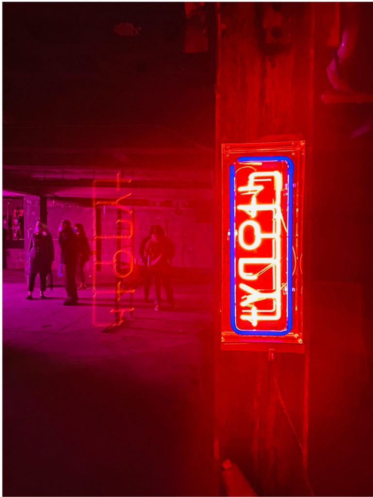
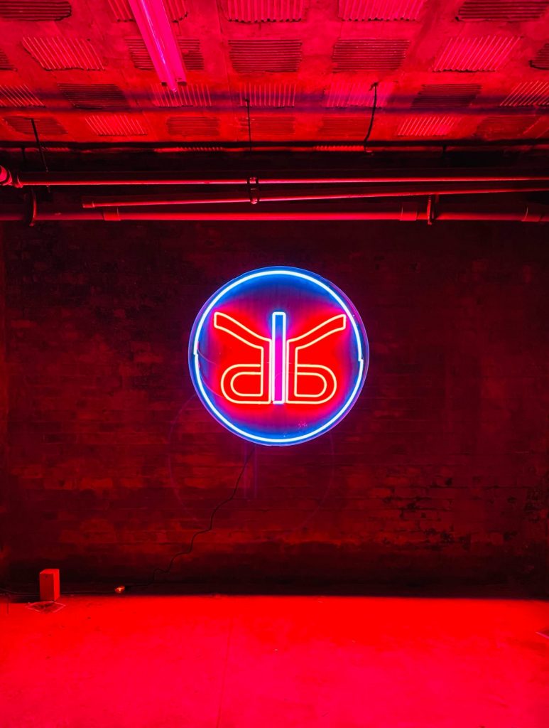
I think of my work as an ongoing exploration of materials and processes that tries to find the best way to express a particular idea. A good example of this principle are the neon signs at the exhibition. It is very easy to associate neon and logos to a specific time period. Neon signs were widely popular in the ’60s and I purposefully capitalize on this allusion to instill an anachronistic feel to them. Therefore, the selection of materials is intended to generate both a visual and an emotional effect to the viewer.
I really cannot say that I have a favorite material to work with (although I LOVE the aesthetic of shiny vintage plastics). But on the other hand, I DO have a few favorite methodologies for my projects. As an illustrator and designer, I often find myself challenging the limitations of two-dimensional art.
The extensive use of vector-based software in most of my work has inevitably created a bridge that connects the two-dimensional work with more “hands-on” manufacturing processes. With this approach, the gap between “the image on the screen” and “the tangible” is virtually invisible.
A clear example of this type of process in my work is the use of laser cutting technologies over wood or acrylic sheets, as the immediate outcome suggests the possibility of a “puzzle.”
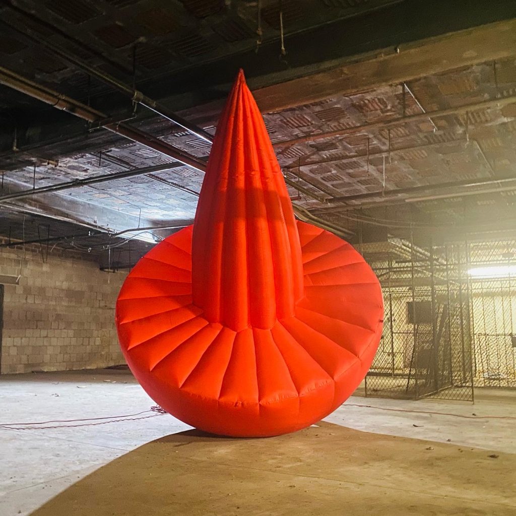
In relation to the criteria of scale, material, and iteration, a good example would be the artwork I call “Artillero” (or as artist Sasha Fishman called it, “a sophisticated red lemon squeezer”). This sculptural object, created in collaboration with the amazing artist Pete Karis and Paradise Labs, is first introduced in a process involving two main components: a hand-polished styrofoam half-sphere and a subsequent 3D-printed grooved cone glazed in red automotive paint. This is later translated into a large-scale inflatable sculpture iteration of the small-scale model, constructed with 500D Nylon. This dramatic shift of scale is, of course, deliberate, and is intended to generate a disorienting effect in the viewer. In addition, the thoughtful placement of the small artwork in the gallery space, followed by the large-scale model in the basement, is created purposefully to contrast the narrative of the real world (Baltimore) to the secret dimension that lurks in the spaces beyond the gallery walls.
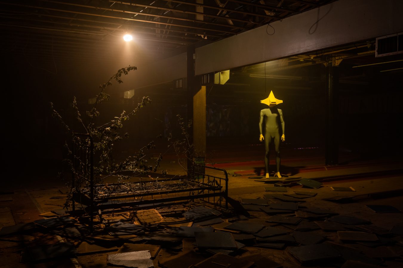
As one last example of “iteration and emotional effect,” I would like to highlight “Funes” (the intimidating character based on Borges’ Funes el memorioso story, that inhabits the abandoned bowling alley). What started as a vector illustration later became the complex endeavor of translating the geometry of the head of its protagonist to a life-sized 1:1 helmet capable to fit an actual head. This was particularly challenging, as the project was developed between countries (México-US) in teamwork with the architect Salvador Amaro, via ZOOM calls, measuring the body in the US and 3D printing and assembling the “omnidirectional head” in México.
The precision of the project was incredible considering the long-distance collaboration, and the result was uncanny, successfully capturing the distinct eeriness of the pivotal character of the show.
This exhibition is site-specific and takes over the entirety of the cavernous North Avenue Market space—including the ICA Baltimore gallery, giant storage areas full of detritus, basement, and now-defunct upstairs bowling alley. The impact of your work within these very specific spaces—coupled with smoke, smells, sound, projected video—creates a multisensory and overwhelming experience that is dramatic and offers a post-apocalyptic vision of Baltimore architecture, history, and future. Can you talk about how this location inspired you? What did you use from it toward this project, and how is this exhibit transformative to this historic location?
To fully understand how the ORBIS TERTIUS -Hlaer to Jangr- exhibition came to be, it is important to mention one critical fun fact: I was absolutely unaware that all these historical “secret” spaces even existed back when I proposed the exhibition.
I remember pitching the project to the ICA Baltimore crew at my apartment. I was showing them some of the artwork that I was planning to include at the gallery space, when suddenly one of the members said, “We should totally use the other space.” I didn’t understand what he meant by that until, several months later, Lou Joseph (ICA Baltimore director) gave me a tour through the gallery and showed me to the so-called other space. This mysterious area (called the “backspace”) is located at the very end of the gallery and is essentially a gigantic storage space only known (and used) by the staff and some of the artists that have previously shown their work at ICA Baltimore.
I remember being absolutely blown away when I realized that it was actually larger than the gallery itself. And not only that: the aesthetic of the space was something I had been dreaming about for years. This place could be described as an enormous abandoned-looking bunker with a plethora of forgotten artifacts scattered around. As if that was not enough, later that same week, Jaimes Mayhew (Baltimore ICA member and the building manager) mentioned two more “secret” spaces: “The Basement” and “The abandoned bowling alley.” My jaw dropped to the floor when he gave us a tour through these unreal places. Both areas are essentially historical relics frozen in time, unknown to the public. Urban myths, basically.
What happened next was truly a convincing labor to grant access to these secret areas. I decided to illustrate a very detailed map showing a “render” of the artwork I had already created at the time, interacting with the architecture. In addition, I took the risk to propose new large-scale artworks designed expressly for these otherworldly areas. After weeks of deliberation, I received the good news that Mike (the owner of the building) had granted us full access to these spaces. “Do whatever you want” is what he said, according to Lou Joseph, a gift for which I will be eternally grateful.
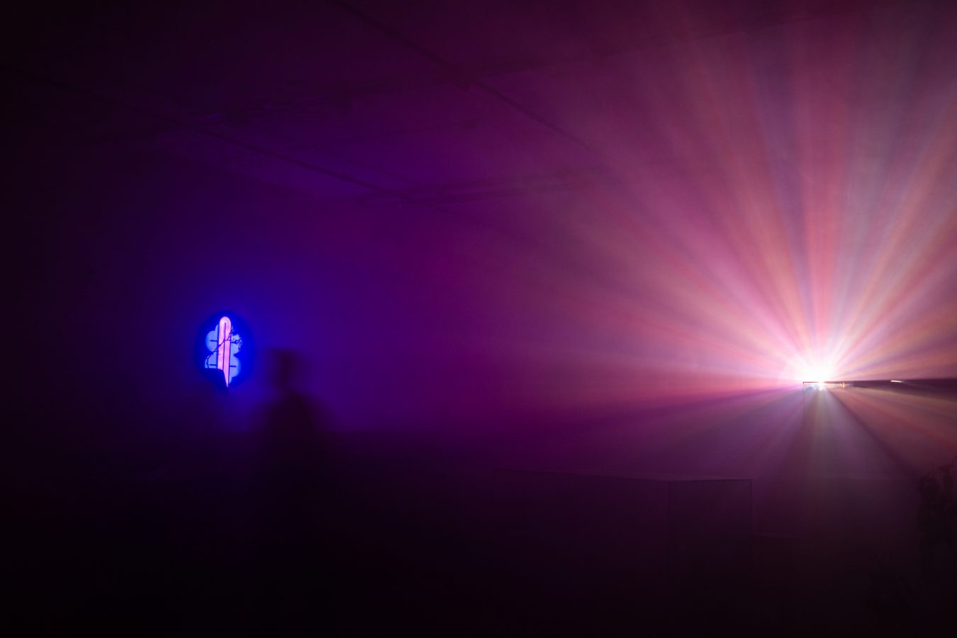
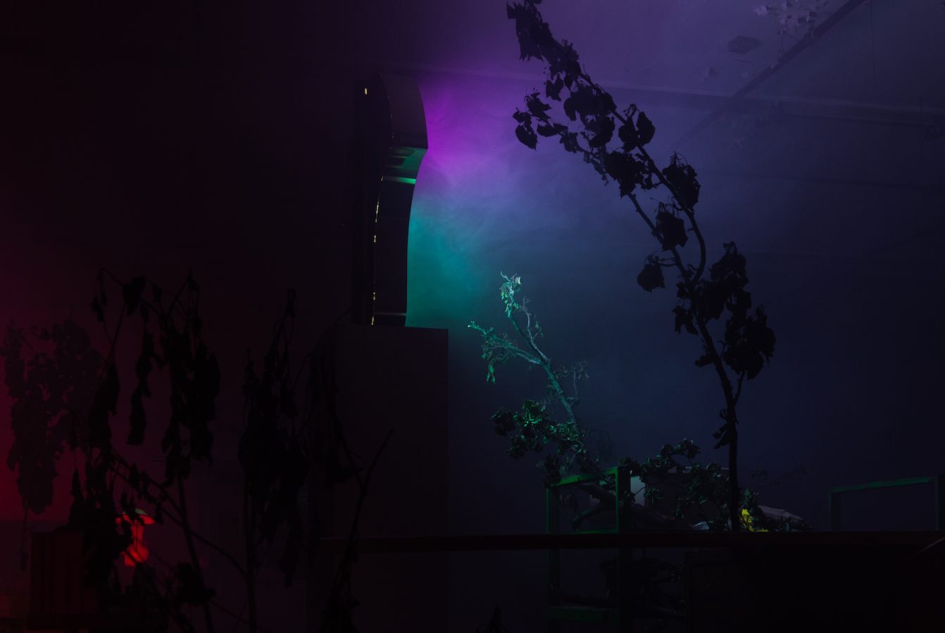
In consequence, the planning of the whole show was entirely guided by the space itself. The placement of the artwork was driven by organic conversations between the architecture and the art. The fog, the scent, the sound, the projected videos, even the name of the exhibition itself, ORBIS TERTIUS -Hlaer to Jangr-, were a direct product of this happy accident, as I finally found a space capable to express the narrative of a “progressive decay” or “dimensional shift” from one reality to another.
Despite so much variety and so much artwork, there are common themes that unite all the works in the show, from small framed prints to projected video to wall text to neon to giant inflatable sculptures. The shapes and designs indicate a specific language or alphabet, and it feels familiar yet also universal—prehistoric or a visual language system of the future or both? Can you talk about the original text that inspired this project and how you think about language in visual work?
The connections behind the 2D to 3D work shown at the exhibition follow the same constant metaphor of Borges’ “Tlön, Uqbar, Orbis Tertius” story. In the same way the imaginary two-dimensional world of Tlön just exists on paper until it suddenly bleeds into reality, the two-dimensional framed illustrations function as direct portals to the physical spaces in the gallery, as they depict and contain many of the physical sculptural elements and narratives that populate the exhibition.
The same metric applies to all the more abstract elements that are present in the gallery space. The ominous spellbinding music for each area consists of interpretations of Borges stories Tlön, Uqbar, Orbis, Tertius, El Zahir, and Funes El Memorioso, all of it written by the amazing Mexican jazz drummer and composer Miguel Soto.
Finally, regarding the overall peculiar visual language of the exhibition, every shape, symbol, color, and overall aesthetics present at the gallery is a direct reference to Elgreen Project, which is an ongoing personal project based on an exploration of the human fascination with the unknown, driven by an instinctive and playful reinterpretation of nostalgia. It is inspired by the curious search for obsolete manmade objects that serve as tangible links to an era in a distant past. This translates into the continuing creation of a collection of mysterious artifacts with no identifiable function or certifiable existence. This is a universe populated by fictional art objects that come together to create dream-like environments populated by strange anthropomorphic creatures and impossible architecture.
I essentially channeled this universe to give Borges’ ORBIS TERTIUS -Hlaer to Jangr- a visual and tangible voice, while making a respectful tribute to his everlasting literary legacy.
This exhibit is truly multisensory and envelops all of the senses. What are the smells included in the copious smoke machines throughout the show that unite all of the spaces? How did you select these and what impact do you want them to have on the visitors?
As all the other components in the exhibition, the chosen “scents” in the selected gallery locations are intended to provide a distinct tangibleness to the atmosphere of this “otherworldly dimension.” The smell instills an almost visceral reaction to the viewer that generates a deeper association with the space. This invisible layer tries to convincingly transport the viewer to an unknown territory.
The selected scents at the gallery exhibition are in some way self-referential (except for the backspace scent, which specifically tries to replicate the smell of rain and petrichor). After a lot of research, I found a way to flood the gallery space with some of my favorite niche perfumes using cheap oil diffusers. In some way, I use this artifice to extend my presence through the space, as the creator or the keyholder of the portal to this reality.
As a direct inspiration, I was lucky to visit Marguerite Humeau’s Birth Canal exhibition at the NYC New Museum in 2019. I was absolutely blown away by the implementation of scents at her show. Being a hardcore perfume aficionado myself, I recognized this as the perfect opportunity to make use of this olfactory device for my solo show.
One of the most impactful aspects of this show is scale. There are tiny pieces presented in accumulative arrangements, as well as giant sculptures and videos projected on huge walls that overwhelm the viewer. For you, what is the meaning of scale and variety, and how does it help you to think or envision? If you had to choose a favorite size to work in, which would it be? Or do you need a variety of scaled objects to think in different ways?
As I previously mentioned, many of the elements of the show were a direct result of the physical spaces at the exhibition and their inherent architectural narrative. The mind-blowing dynamic animations were made in collaboration with artist Braulio Dominguez, and they reference the mysterious candy-colored wall symbols at the gallery, as well as the cryptic language video animated by graphic designer Hayelin Choi. Both were an inherent response to the massive space architecture. The result from both collaborations was incredibly effective, as it created an inescapable immersive experience for the spectator.
Regarding the scale and variety, the rationale behind the recurrent size-shifting elements in my work is a direct allusion to my childhood. The recognizable shapes on my work are reminiscent of didactic toys fused with unknown elements from a bygone era. The intention to present them in many materials and variable scale is to recreate the same playful process I had as a kid: playing with a vast array of objects, rearranging them and interchanging their meaning, building cities, tearing them down, and building them up again from scratch. The variety in dimension is crucial to transmitting the underlying narrative in my work.
This exhibit feels very sci-fi and dystopian, and it’s also a commentary on the creative reuse of commercial architecture in Baltimore. What is your relationship to or interest in science and technology and the way it intersects with a physical space, city, or culture?
The signature of my work is intentionally made to resemble machine-made objects, alluding to the idea of a large-scale serial manufacturing factory. To accomplish this illusion, I heavily rely on specific processes and materials. I consider the exploration of new technologies indispensable to my work.
The aesthetics of my work, in juxtaposition to the extended spaces beyond the “white-cube” gallery space, are inevitably reminiscent of many cultural references that are ingrained in our collective memory.
On more than one occasion, I have been told that the exhibition experience is reminiscent of the movie Blade Runner or the “Silent Hill” videogame franchise. Both references might not be entirely accidental, as I’m a fan of both. Those are definitely two of the biggest compliments I have ever received.
Regarding the space itself, the site-specificity provided by the North Avenue Market is almost impossible to replicate. If you think about it, it is incredibly unlikely to find an art gallery that casually connects to an abandoned historical area like this. Honestly, I’m still in absolute disbelief of this unexpectedly lucky occurrence.
I think that the most unexpected outcome of this exhibition was the possibility to unearth a piece of history from Baltimore. The opportunity to tear layers of time, creating a portal that granted public access to this “secret spaces” on post-pandemic times, an unforeseen way to present art “beyond” the gallery walls, that truly makes me wonder about all the other existing spaces in Baltimore.